The Calming Bedroom Color Palette That Makes Every Space Feel Cozy And Inviting
You want a bedroom that shuts your brain off the second you slide under the covers, right? Not a Pinterest mirage—an actual retreat that makes your shoulders drop. Good news: the right color palette can do the heavy lifting while you sleep. Let’s build a calming bedroom that feels cozy, inviting, and very “I actually have my life together.”
Why Color Choices Matter More Than You Think
Your brain reacts to color before it registers shape. Wild, right? That means your walls and textiles can hype your nervous system up or tuck it in with a warm blanket. We’ll choose hues that lower visual noise, soften shadows, and make even a tiny apartment room feel like a boutique hotel.
The Core Palette: Soft Neutrals With Soul
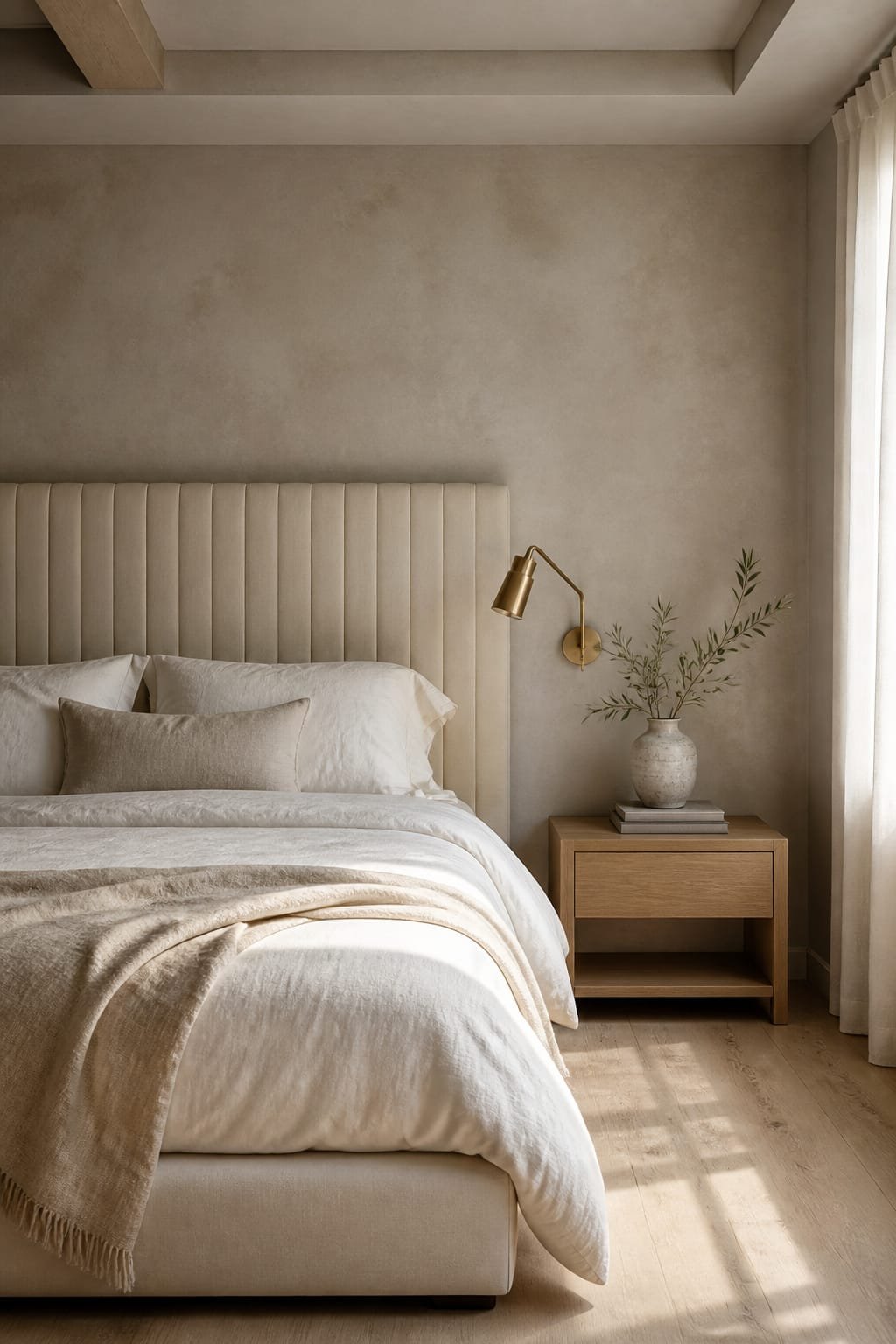
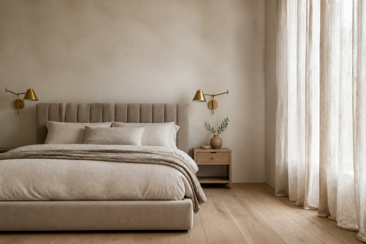
Think of your bedroom like a latte: mostly creamy, with just enough depth to feel luxurious. Start with a base of airy neutrals and layer in warmth and texture so it never looks sterile.
- Warm Off-Whites: Cream, almond, or linen keep things bright without feeling clinical. Look for undertones of yellow or peach, not blue.
- Gentle Greiges: The gray-beige sweet spot calms the room and pairs with literally everything. It’s the introvert of colors in the best way.
- Muted Taupes: Adds quiet sophistication. Use on an accent wall or headboard upholstery for a subtle “hug.”
Undertones: Your Secret Weapon
Your “white” might read purple at night. Fun. Always test swatches on multiple walls and check morning, afternoon, and evening light. North-facing rooms handle warmer undertones best; south-facing rooms can take cooler neutrals without going icy.
The Restful Accents: Blues, Greens, And Earth Tones
Once the base feels balanced, layer calming hues that come from nature. Nature rarely screams, and your bedroom shouldn’t either.
- Soft Blue-Grays: Mist, slate, or dusky blue reduces visual clutter and feels spa-like. Perfect for bedding or curtains.
- Sage And Eucalyptus Greens: Green equals restorative energy. Use for throw pillows, a quilt, or a painted nightstand.
- Earthy Clays And Terracottas: A touch of baked-clay warmth keeps the palette from feeling chilly. Think lumbar pillow or woven throw.
How To Balance Warm And Cool
Use a 60/30/10 formula:
- 60% soft neutral base (walls, large rug)
- 30% cool calming accent (blue/green textiles)
- 10% warm grounding pop (terracotta, brass, wood)
FYI, this keeps the space cohesive without feeling matchy-matchy.
Texture: The Cozy Multiplier You’re Probably Skipping
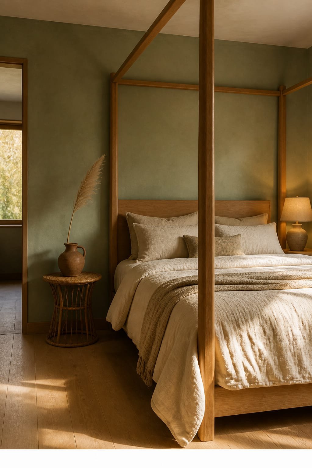
You can nail the colors and still miss the vibe if everything feels flat. Texture creates shadow play, which adds depth and comfort.
- Chunky Knits + Linen: Layer a linen duvet with a knit throw for breathable softness.
- Matte Over Gloss: Matte paint absorbs light and relaxes glare. Gloss = energy. We want snooze-town, not disco.
- Natural Fibers: Jute or wool rugs, rattan lamps, wood nightstands. Nature, but inside.
Pattern, But Make It Calm
Keep patterns low-contrast and large-scale. Thin stripes or tiny florals can buzz in your peripheral vision. Go for watercolor prints, wide ticking stripes, or tone-on-tone geometrics.
Lighting That Flatters Your Palette (And Your Face)
The most soothing palette can look wrong under harsh lighting. Let’s not sabotage the vibes.
- Warm Bulbs (2700–3000K): Cozy glow without yellow soup. Dimmable if possible.
- Layered Sources: Overhead on a dimmer, bedside lamps, plus a soft accent like a picture light or sconce.
- Shade Matters: Linen or parchment diffuses light beautifully. Clear glass feels edgy and bright—save it for the kitchen.
Window Magic
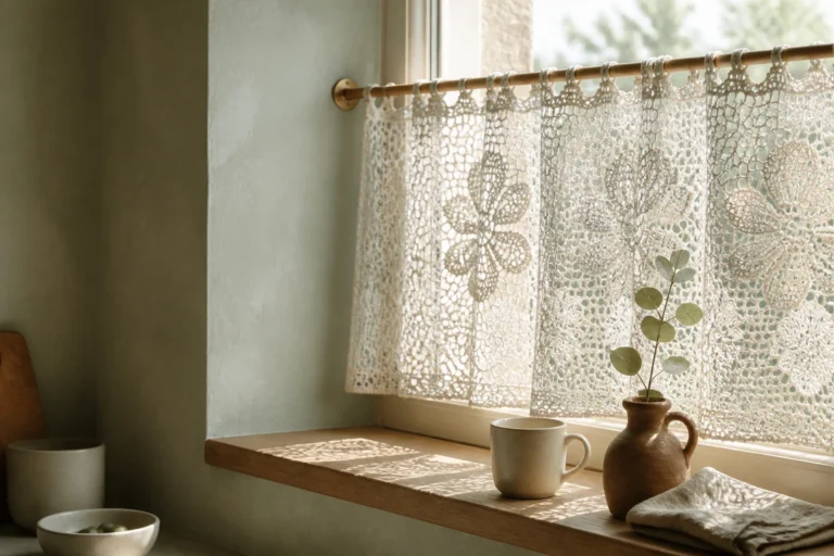
Sheer curtains filter daylight into a soft wash that flatters everything. Add blackout drapes in a textured neutral for sleep mode. Bonus: two curtain layers = instant boutique-hotel energy.
Real-World Palettes You Can Steal
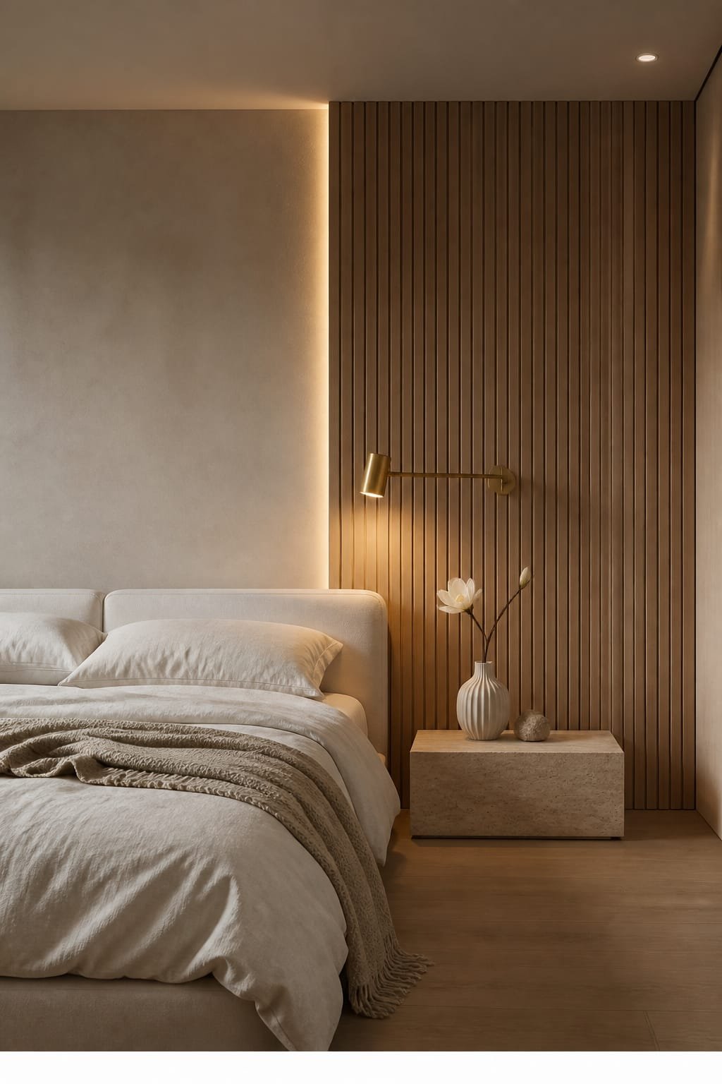
Steal, borrow, make your own—no judgment. IMO these combos just work.
- Coastal Calm: Warm white walls, slate-blue quilt, striped linen shams, driftwood nightstands, brass lamps, sandy jute rug.
- Forest Retreat: Greige walls, sage velvet headboard, cream bedding, walnut side tables, terracotta lumbar, black metal accents.
- Minimal Luxe: Almond walls, taupe linen curtains, charcoal throw, ivory boucle bench, soft gold picture lights, wool rug in oatmeal.
Paint Pairings (General Undertones, Not Brand-Specific)
- Walls: Warm off-white with a creamy undertone
- Trim: One step lighter, same undertone, satin finish
- Accent: Muted blue-gray or soft sage in matte
Test at least three samples and live with them for 48 hours. Your evening lamps will tell the truth.
Small Room? Rental? Chaos? Here’s The Plan
Not everyone can bust out a paint roller. You can still nail the palette.
- For Rentals: Go neutral with removable wallpaper behind the bed. Layer calming bedding and curtains to do the color heavy lifting.
- For Tiny Rooms: Keep walls light, match curtain color to walls, and pick a rug close in tone to your floor. Visual continuity makes the room feel bigger.
- On A Budget: Upgrade pillow covers, a throw, and lamp shades first. Small changes, big vibe shift.
Declutter Without Suffering
Hide visual noise in pretty bins. Corral surfaces. Limit open shelving in bedrooms. Your brain can’t relax while it’s tallying charger cords.
Styling Finishes That Seal The Cozy Deal
Details matter. A few intentional choices will make the whole palette sing.
- Wood Tones: Medium woods (oak, walnut) warm up cool accents and feel timeless.
- Metals: Mix softly—brass with black or bronze. Keep it matte or brushed.
- Art: Calming landscapes, abstracts with muted palettes, or black-and-white photography. Nothing too high-contrast over the bed.
- Greenery: A snake plant or eucalyptus stems add life without adding chaos.
FAQ
What single change gives the biggest calming impact?
Swap your bedding and lamps. Choose a soft neutral duvet with a muted blue or sage quilt, then add warm, dimmable bedside lamps. You’ll feel the difference on night one, no paint required.
Can I use dark colors in a calming bedroom?
Yes—strategically. Deep blue-gray or olive on an accent wall or headboard can feel cocoon-like when balanced with light bedding and warm wood. Keep contrast low and texture high for softness.
How do I keep it from looking boring?
Layer textures and vary sheens. Combine linen, velvet, and knit with matte walls and brushed metals. Add one warm pop—terracotta or caramel leather—so the space feels alive, not sleepy-boring.
Do cool colors always feel calmer than warm ones?
Not always. Cool tones read calm, but too many can feel cold. Blend them with warm undertones, wood, and soft lighting. Balance beats temperature every time, IMO.
What if my room gets zero natural light?
Lean into warmth. Choose creamy walls, high-texture textiles, and bulbs around 2700K. Use mirrors to bounce lamp light and pick matte finishes to stop glare and hotspots.
How many colors should I use total?
Three to five. A base neutral, one or two calming accents (blue/green), one warm grounding tone, and a metal finish. Keep saturation low and undertones compatible for a zen result.
Conclusion: Your Snooze-Friendly Color Game Plan
Choose a soft neutral base, layer gentle blues or greens, and ground everything with warm textures and glowy lighting. Keep patterns low-contrast, finishes matte, and clutter out of sight. You’ll build a bedroom that whispers “sleep now” the second you walk in—no white-noise machine required. FYI, once you nail this palette, your mornings start calmer too. Coincidence? Not even a little.

About the Author

Krisztina P.Rendes, Founder of Home Style Vibes
Founder of Home Style Vibes
Krisztina Puskásné Rendes created Home Style Vibes as a cozy-modern lifestyle space where homemaking meets inspiration. Her goal is to help women create beautiful, organized, and peaceful homes they truly love — without overwhelm. You’ll find here heart-driven content on home decor, cleaning tips, easy family recipes, organization and decluttering, DIY home projects, plants, and seasonal ideas — all designed to bring more calm, comfort, and style into everyday life.