The Best Bedroom Color Scheme That Makes Any Room Look Beautifully Put Together
Want a bedroom that looks like you hired a designer without emptying your wallet? Color does the heavy lifting. The right scheme makes your room feel bigger, calmer, and way more intentional. Today, we’ll build a foolproof palette (with options) that works in any space, under any light, for any style. Ready to make your bedroom look “wow” without trying too hard?
The Foolproof Base: Soft Neutrals That Always Work
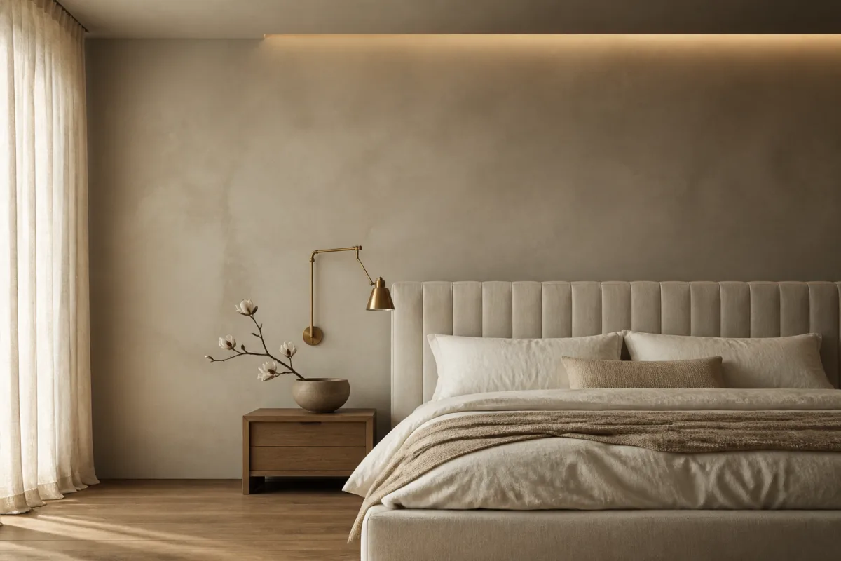
Start with a base that flatters everything else. You want walls that soothe, not shout. Think soft neutrals that earn compliments: warm greige, creamy off-white, pale taupe, or muted mushroom. These shades handle weird lighting, mismatched furniture, and your favorite chaotic throw pillows.
Why Soft Neutrals Win
- They bounce light and make small rooms feel bigger.
- They hide imperfections better than stark white.
- They play nice with wood tones and metals.
Designer-Favorite Wall Colors (By Vibe)
- Warm and cozy: Gentle greige, pale oat, linen white.
- Airy and crisp: Soft ivory, cloud white (not bright gallery white).
- Moody-lite: Light mushroom, stone, or putty.
Add Depth: One Saturated Accent, Used Smartly
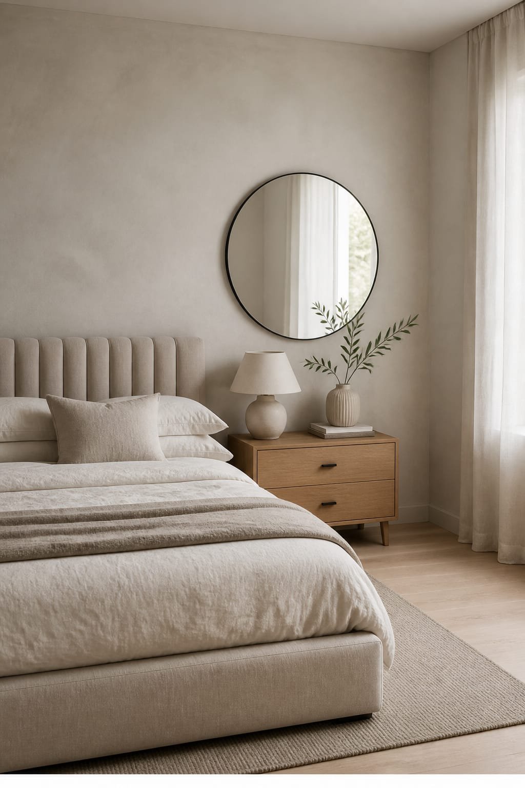
You want one rich color that gives the room backbone. Not an overload—just enough to feel intentional. Choose a hue that complements your base: inky navy, forest green, dusty plum, or earthy terracotta.
Where To Use It
- Headboard wall if your room needs drama (no migraine paint jobs, promise).
- Textiles: Duvet, quilt, or a chunky throw.
- Furniture: Painted nightstands or an upholstered bench.
Pro Tip on Saturation
Match the mood to your room size. Smaller rooms love deeper accents on fewer surfaces (it cocoons). Larger rooms handle more saturation across textiles and art without feeling heavy.
Balance the Mood: Calming Mid-Tones for Layers
This is your tie-it-all-together zone. Mid-tones bridge the base and accent so everything looks cohesive. Great picks: sage, muted clay, slate blue, warm camel, soft blush.
Use Mid-Tones Here
- Window treatments: Lineny drapes in sage or camel feel polished.
- Rug: A mid-toned rug anchors the bed and hides dust (FYI, lifesaver).
- Pillows + shams: A couple in the mid-tone keep your accent from shouting.
Metallics and Wood: The Secret Finishers
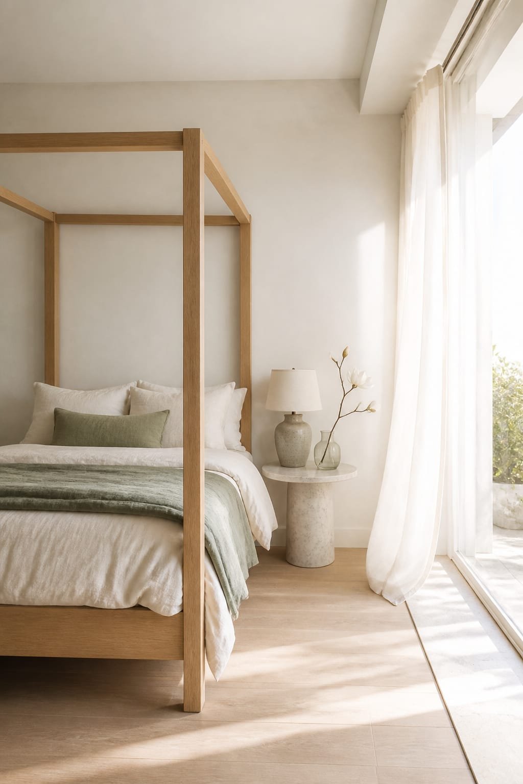
You’ve got color. Now add texture and shine so the room doesn’t read flat. Warm metals (brass, aged gold) cozy up neutrals. Cool metals (matte black, brushed nickel) bring contrast. Wood tones add soul—just keep them consistent-ish.
Easy Combo Ideas
- Greige + Navy + Brass + Walnut: Classic, hotel-chic, always works.
- Off-White + Sage + Black + Oak: Modern organic, calm but crisp.
- Mushroom + Terracotta + Aged Gold + Medium Oak: Earthy, elevated, very “designer.”
Textures Make It Look Expensive (Even If It Isn’t)
Color is great; texture makes it believable. Mix matte, nubby, and a little sheen. Think linen, boucle, velvet, washed cotton, and a hint of leather.
Your Texture Checklist
- One nubby piece: Boucle pillow or woven throw.
- One soft sheen: Velvet cushion or sateen shams (just one element, IMO).
- One natural fiber: Jute or wool rug, rattan basket, or cane detail.
Light Changes Everything: Day vs. Night Strategy
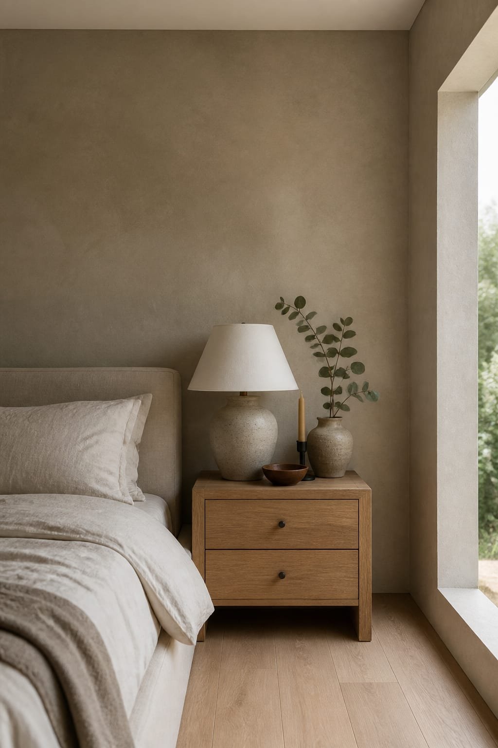
Your perfect paint can look tragic under the wrong bulb. Match your scheme to your light.
If Your Room Faces North (Cool Light)
- Choose warmer bases: Creamy off-whites, warm greiges.
- Accents: Terracotta, olive, or warm navy (not icy blues).
- Lighting: 2700K bulbs for cozy evening vibes.
If Your Room Faces South (Warm Light)
- Choose balanced bases: Soft ivory, mushroom, light stone.
- Accents: Forest, charcoal, or slate to cool it slightly.
- Lighting: 3000K bulbs to avoid yellow overload.
Layer Your Lighting
- Overhead: Dimmable, diffused.
- Task: Bedside lamps or sconces at eye level.
- Accent: Small lamp or LED strip behind headboard for luxe hotel energy.
A Simple Formula You Can Copy-Paste
Use this 60/30/10 rule to nail balance:
- 60% Base Neutral: Walls, large rug, large curtains.
- 30% Mid-Tone: Bedding layers, secondary furniture, art mats.
- 10% Accent: Throw, bold pillows, feature wall, statement lamp.
Want a little extra spice? Add a 5% metallic moment (hardware or picture frames). Small, but mighty.
Real-World Combos For Different Styles
Minimalist But Warm
- Base: Soft ivory
- Mid-Tone: Light mushroom
- Accent: Inky navy
- Finishes: Black metal, oak wood
Cozy Cottagecore
- Base: Creamy white
- Mid-Tone: Sage
- Accent: Dusty plum
- Finishes: Aged brass, pine or maple
Modern Boho
- Base: Pale greige
- Mid-Tone: Camel
- Accent: Terracotta
- Finishes: Woven textures, matte black
Moody Luxe
- Base: Light stone
- Mid-Tone: Charcoal
- Accent: Forest green
- Finishes: Antiqued gold, dark walnut
Common Mistakes (And Easy Fixes)
- Too many accents fighting: Pick one hero color. The rest support it.
- Bright white walls with warm floors: Switch to creamy or greige to reduce clash.
- Ignoring undertones: If your rug reads pink-beige, don’t pair it with yellow-beige. Keep undertones cousins, not strangers.
- Flat everything: Add texture or one gloss moment (ceramic lamp, lacquer tray).
FAQ
What’s the easiest color scheme if I’m nervous?
Go with creamy off-white walls, camel mid-tones in a rug or curtains, and a navy accent in pillows or a throw. Add brass and oak finishes. It looks grown-up, timeless, and safe—but not boring.
Can small bedrooms handle dark colors?
Yes, if you balance them. Paint one wall a deep hue or use dark textiles, then keep the other surfaces light and textured. Small rooms can feel luxe and cocoon-y with contrast, IMO.
How do I mix cool and warm tones without chaos?
Anchor with a neutral that leans slightly warm, then add one cool accent (like slate or navy). Use a mid-tone that bridges both—mushroom or sage works great. Keep metals consistent so it feels intentional.
Do I need to match my furniture wood tones?
No, but aim for harmony. Stick to 2 wood tones max, then repeat each tone at least twice. Your eye reads repetition as “planned.”
What paint finish should I use in a bedroom?
Use eggshell or matte on walls for softness. Satin or semi-gloss on trim for durability and a subtle highlight. Headboard wall in matte looks richer and hides texture—FYI, lifesaver for older walls.
How many pillow colors are too many?
Cap it at three: base neutral, mid-tone, accent. Vary texture and pattern size so it’s interesting without chaos. Your bed shouldn’t look like a pillow store exploded.
Wrap-Up: Your Room, But Cohesive
The best bedroom color scheme that makes any room look beautifully put together follows a simple plan: soft neutral base, one confident accent, a bridging mid-tone, and thoughtful finishes. Layer texture, consider your light, and keep undertones friendly. Do that, and your room will look curated—not complicated. Now go pick your hero color and let the compliments roll in.

About the Author

Krisztina P.Rendes, Founder of Home Style Vibes
Founder of Home Style Vibes
Krisztina Puskásné Rendes created Home Style Vibes as a cozy-modern lifestyle space where homemaking meets inspiration. Her goal is to help women create beautiful, organized, and peaceful homes they truly love — without overwhelm. You’ll find here heart-driven content on home decor, cleaning tips, easy family recipes, organization and decluttering, DIY home projects, plants, and seasonal ideas — all designed to bring more calm, comfort, and style into everyday life.