7 Beautiful Front Home Garden Ideas That Boost Curb Appeal Now
You know that pang when you pull into the driveway and think, “Something’s just… flat”? The porch looks tired, the walkway feels like an afterthought, and the front beds are a jumble of random plants with no rhythm. Let’s fix that. These 7 beautiful front home garden ideas don’t just tidy things up—they layer in light, texture, and shape so your entry feels composed, inviting, and downright photogenic. Think sun-warmed stone, glossy leaves, soft grasses that sway at golden hour, and lighting that grazes across textures for that designer glow. Each idea solves a specific curb appeal frustration and makes your front garden feel like a lifestyle upgrade, not a chore. If you love a space that looks pulled-together on Tuesday night and stunning on Saturday at sunset, you’ll find your match here.
1. Sculpted Serenity Entry With Low-Maintenance Evergreens
We’ve all been there: you plant a few things from the weekend nursery run, and by midsummer the front bed looks chaotic—some bits overgrown, others sad and patchy. This design gives you control back. It’s calm, deliberate, and quietly luxurious: a rhythm of clipped boxwood balls, architectural yews, and a few modern stone planters that make your entry feel like a European boutique hotel. The mood? Modern classic—structured but soft, minimal but not cold. It works beautifully for real homes because evergreens provide year-round interest without high maintenance, and the symmetrical shapes instantly read as “expensive.” Lighting plays a huge role here: low pathway lights and subtle uplights under specimen evergreens graze the foliage and create dramatic shadows at dusk.
Why it looks expensive: sculptural shapes. When you edit the palette and repeat forms—think three matching planters flanking the steps and a trio of clipped spheres down the path—you bridge the gap between DIY and designer. You’re not just planting; you’re composing. Materials lean refined: honed limestone stepping stones, charcoal gravel, smooth concrete planters, and brass-toned hardware on the door if you want to echo the warmth. Photographing this setup looks crisp because you have clean lines, deep greens, and shadow play—the ultimate trio for curb appeal that reads high-end in real life and in photos.
Variations: On a budget, swap out custom stone for concrete pavers and use nursery-grade boxwood you can shape over time. Small-space version? One large sculptural planter next to the door plus two low boxwood globes along the walkway still creates rhythm. Renter-friendly swap: keep everything in matching planters and line them along the porch; you’ll take your “garden” with you when you move.
Key Design Elements:
- Main materials: concrete planters, limestone or concrete pavers, charcoal gravel mulch
- Color palette: deep green, soft gray, black accents, warm brass
- Lighting strategy: low-voltage uplights on evergreens, downlights at the door, path lights
- Furniture silhouettes: simple bench or a small metal bistro set if space allows
- Texture layers: clipped foliage, smooth stone, fine gravel, matte planter finishes
- Accent details (hardware, decor pieces, plants): brass door knocker, house numbers in black, boxwood, yew, dwarf holly
How To Recreate This Look:
- Start with structure: define the path edges with clean pavers or metal edging.
- Add sculptural evergreens: plant in odd groups at consistent spacing for rhythm.
- Layer groundcover: charcoal or black mulch/gravel to make green foliage pop.
- Install lighting: uplight 2–3 key evergreens; add subtle path lights for safety.
- Style with symmetry: match planters on either side of the door and a simple bench.
Why This Looks Expensive: Fewer plant varieties, repeated in sculptural forms, create visual discipline and a sense of investment. It says “intentional” from 30 feet away.
Common Mistakes To Avoid: Avoid mixing too many evergreen species or staggering plant sizes randomly—chaos kills the look. Don’t skip the mulch; raw soil reads unfinished and cheap.
Pro Styling Tip: Shoot at golden hour when uplights and natural light overlap—the rounded evergreens cast soft shadows that add depth and a magazine-level silhouette.
Keep scrolling if you want something softer, wilder, and way more romantic—like a front garden that looks kissed by morning dew.
2. Cottage-Casual Border With Wildflower Drifts
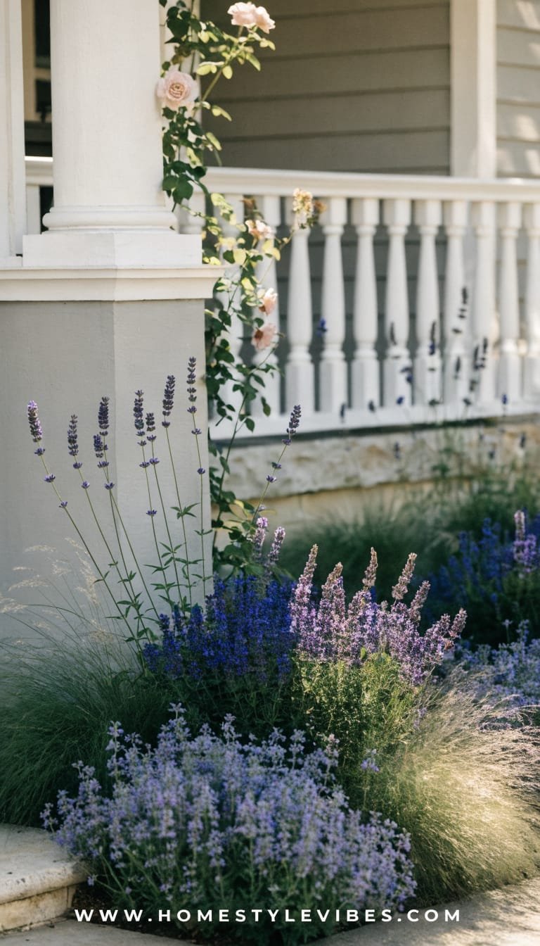
It’s that one corner that always feels off—too bare in spring, too crispy by late summer. You’ve tried a few perennials, but it still looks sparse and awkward. A cottage-casual border weaves in drifts of blooms and airy grasses, so you get movement, texture, and color across the seasons. The mood leans storybook-meets-editorial: think lavender sway, salvia spikes, catmint clouds, and a blush climbing rose near the porch. Real-home friendly? Absolutely. These perennials, once established, want decent sun and a seasonal trim—low lift, maximum charm. Light filters through the grasses at sunrise and sunset, turning the whole front walk into a glow-up moment. Bring your camera—this one’s Pinterest candy.
Why it works: layered heights. A low edging of thyme or sweet alyssum, mids of catmint and yarrow, and taller anchors like penstemon or coneflower. By staggering heights, you create a soft amphitheater around your path. Budget-wise, you can start with smaller nursery pots and plant in generous drifts. Materials skew natural: brick or reclaimed pavers, pea gravel, and unsealed terracotta pots for porch steps. Photographs beautifully because the wispy textures catch light and create depth; blooms pop against natural stone like a couture dress against a simple backdrop.
Variations: Budget-friendly? Prioritize 3–4 varieties in large drifts for impact. Small porch? Plant a micro-cottage border just along one side of the path and cheat more “volume” with two overflowing planters near the door. Shadier site? Swap in foxglove, astrantia, and hardy geraniums.
Key Design Elements:
- Main materials: reclaimed brick edging, pea gravel path, terracotta planters
- Color palette: lavender, blush, soft white, sage green, silver foliage
- Lighting strategy: string lights along the porch, low path lights tucked into foliage
- Furniture silhouettes: vintage-style metal chair, wicker planter stands
- Texture layers: feathery grasses, velvety lamb’s ear, glossy rose leaves
- Accent details: copper watering can, woven door mat, climbing rose trellis
How To Recreate This Look:
- Start with edges: lay brick or metal edging to shape the border cleanly.
- Add soil prep: enrich with compost to support perennials for the long haul.
- Layer plants: low groundcovers at front, airy mids, taller anchors in clusters.
- Install a simple trellis: give a rose or clematis a vertical moment near the door.
- Style with terracotta: two overfilled planters by the steps for an effortless spill.
Why This Looks Expensive: Intentional drifts and repeated colors mimic high-end English gardens; restraint in hardscape makes the planting feel luxurious.
Common Mistakes To Avoid: Don’t sprinkle singles everywhere—scattershot planting looks messy. Avoid bright red mulch; it fights with the softness of the palette.
Pro Styling Tip: Photograph from a low angle across the path so blooms overlap, creating layered depth and a dreamy blur in the foreground.
Craving structure with drama at night? The next concept turns your walkway into a runway—subtle by day, cinematic by dusk.
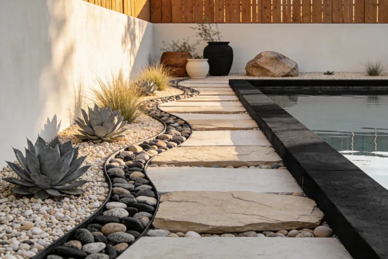
3. Moonlit Modern Pathway With Grazing Lights
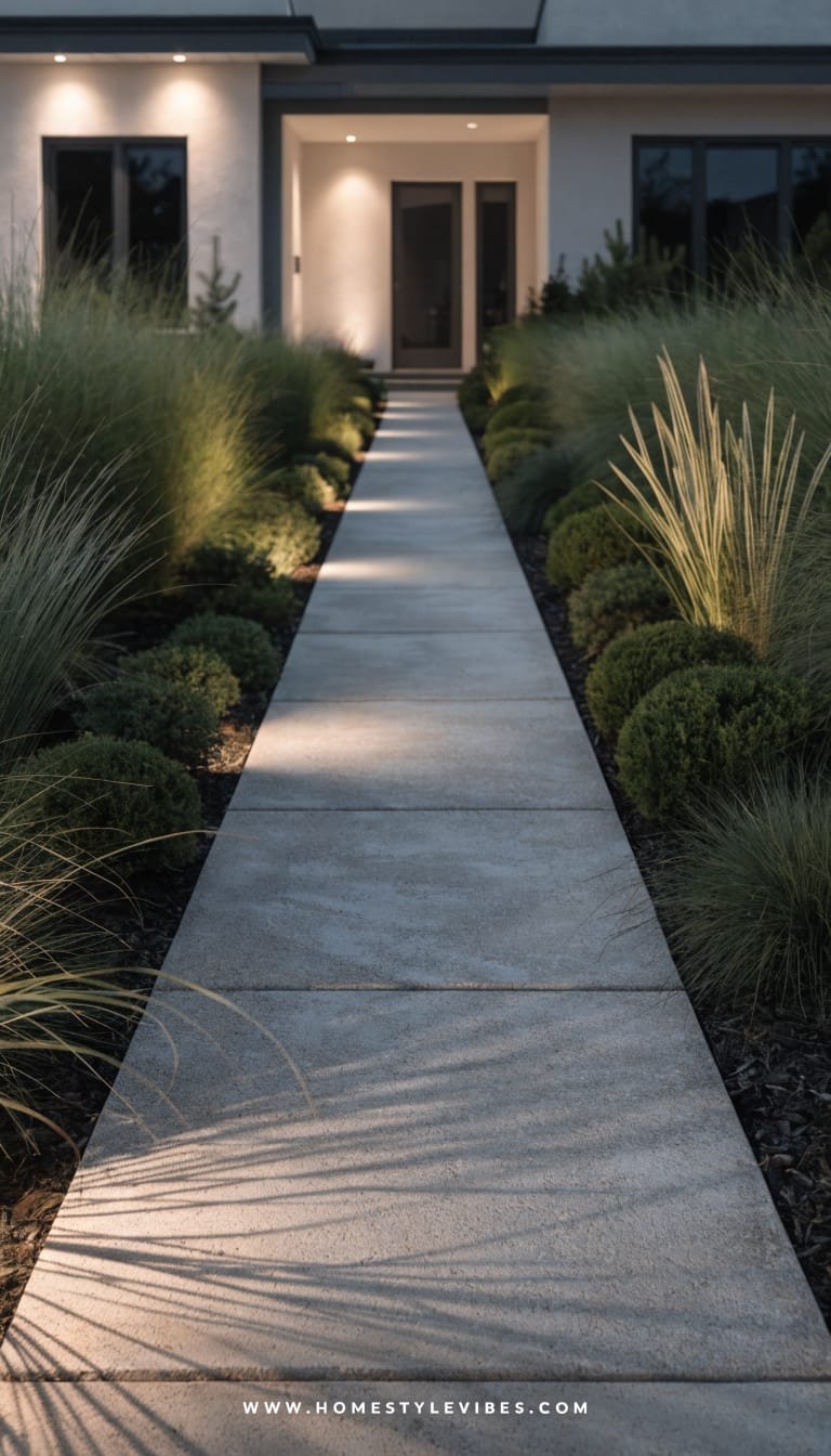
You’ve got a path. It’s fine. But at night? It disappears. Guests fumble for steps and your front garden loses all personality after 6 p.m. Enter the moonlit modern pathway: wider pavers, controlled plantings, and a lighting plan that sculpts shadows like a Hollywood set. The vibe is minimalist resort—sleek, grounded, and quietly impressive. Real-home win: wider stepping stones feel safer, look cleaner, and reduce weedy gaps. Lighting from below and above (hello, eave downlights) frames the architecture and makes your entry read more architectural.
Why it works: grazing light along textured surfaces—like ribbed stucco, fluted concrete planters, or vertical cedar slats—adds drama without showiness. Materials go cool and refined: large-format pavers, black gravel joints, board-formed concrete, and matte black fixtures. Plant minimalists will love this: think one grass species (such as Sesleria or feather reed grass) and one sculptural plant (agave or yucca) repeated. It photographs with crisp highlights and inky shadows—high contrast that screams designer finish.
Variations: Budget version? Use concrete stepping stones and solar bollards with a warm color temperature. Small-space? One oversized paver landing at the steps with a pair of fluted planters still delivers the aesthetic. For a warmer twist, use cedar slat fencing as a backdrop for the grazed light.
Key Design Elements:
- Main materials: large pavers, black gravel, fluted concrete/ceramic planters
- Color palette: graphite, soft white, black, deep green
- Lighting strategy: wall grazing lights, eave downlights, in-step LEDs
- Furniture silhouettes: simple bench with slim metal legs
- Texture layers: ribbed surfaces, smooth pavers, fine gravel, glossy leaves
- Accent details: black house numbers, minimalist mailbox, sculptural agave
How To Recreate This Look:
- Start with scale: widen your walkway by at least 6–12 inches for presence.
- Add pavers: choose large-format for fewer grout lines and a custom feel.
- Layer texture: use black gravel joints and a single grass species to soften edges.
- Install lighting: grazing lights on walls/fences and warm LEDs along steps.
- Style with restraint: two matching planters, one bench, one bold plant form.
Why This Looks Expensive: Architectural lighting does the heavy lifting. When light skims textures and creates depth, the whole façade reads custom—even if the bones are simple.
Common Mistakes To Avoid: Don’t mix color temperatures; keep all fixtures warm (2700–3000K). Avoid cluttering the path with too many small plants—go bold and simple.
Pro Styling Tip: Photograph at blue hour with lights on; the contrast between cool sky and warm path glow feels cinematic and editorial.
Want a front garden that practically takes care of itself—and saves water? The next look is dry, dramatic, and drop-dead chic.
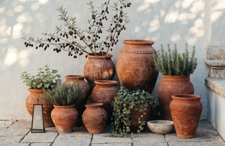
4. Mediterranean Gravel Garden With Olive Trees And Aromatic Herbs
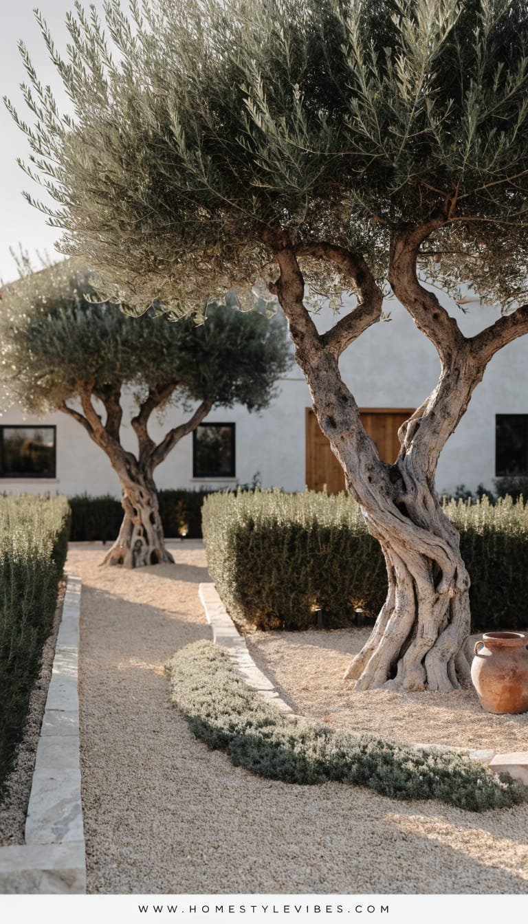
You’ve watered. You’ve mulched. Still, everything sulks by August. A Mediterranean gravel garden flips the script—heat-tolerant plants that adore neglect, plus gravel that looks polished year-round. The mood is coastal hillside meets modern farmhouse: silvery olive foliage, rosemary hedges, thyme that spills over edges, and the occasional terracotta jar. It works for busy households because once established, these plants prefer you to leave them alone. Lighting stays low and warm; tiny uplights under olives create painterly shadows on the façade.
Why it works: contrast and repetition. Silvery leaves against pale gravel look bright and editorial. Uneven mounds of thyme and santolina create soft geology; a couple of sculptural elements (amphora planters or a corten steel bowl) give focal points. Materials? Crushed limestone or decomposed granite, raw terracotta, limewash planters, and simple metal edging to hold the shape. Photographs like a vacation because the palette stays cohesive and sun-friendly—think matte textures and a gentle sparkle from the gravel.
Variations: Budget route? Start with one olive in a large planter plus three rosemary shrubs in-ground, then expand the gravel over time. Small-space balcony or townhouse? Create the look with all planters: olive, rosemary, lavender in clay pots. Cooler climates? Swap olive for Russian olive or a hardy bay laurel cultivar.
Key Design Elements:
- Main materials: decomposed granite or pale gravel, terracotta, steel edging
- Color palette: soft sage, silver, sun-bleached neutrals, warm terra tones
- Lighting strategy: discreet uplights at specimen plants, warm lantern at door
- Furniture silhouettes: slender bistro chair, weathered wood bench
- Texture layers: gravel crunch, velvety sage leaves, woody rosemary, limewash
- Accent details: clay amphora, woven doormat, antique-style door lantern
How To Recreate This Look:
- Start with site prep: remove turf and lay a weed barrier where needed.
- Add gravel: 2–3 inches deep with crisp metal edging for neat boundaries.
- Layer plants: anchor with an olive or bay; repeat rosemary and lavender in drifts.
- Install accents: one terracotta jar and a corten bowl for sculptural interest.
- Style the entry: a limewash planter by the door and a warm lantern-style sconce.
Why This Looks Expensive: The restrained palette and sun-bleached textures create a vacation-home vibe. It whispers “Provence,” not “I just mulched.”
Common Mistakes To Avoid: Don’t mix too many gravel colors; keep it cohesive. Avoid overwatering; these plants resent soggy feet and lose their crisp forms.
Pro Styling Tip: Capture the micro-shadows cast by rosemary at midday; the fine textures pop beautifully against pale gravel for an artful close-up.
If “neat freak” meets “nature lover” sounds like your personality, the next idea balances both with texture-forward simplicity.
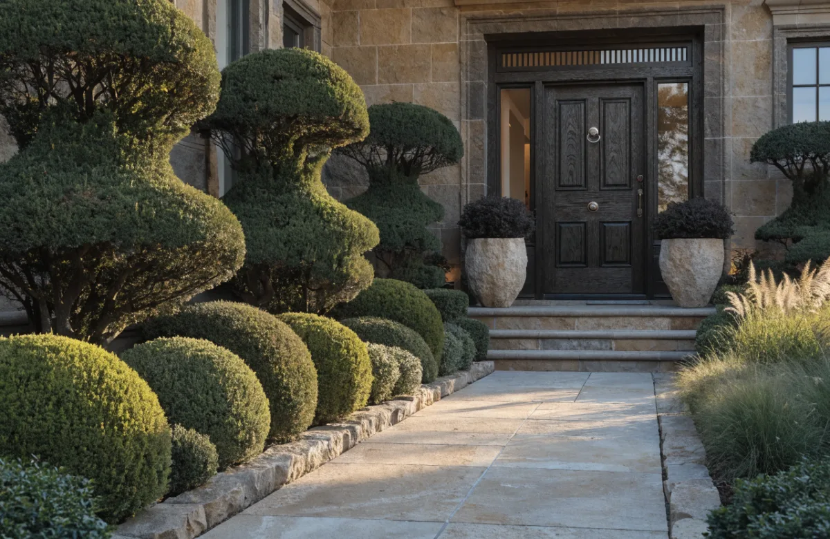
5. Layered Evergreen Hedging With a Statement Specimen Tree
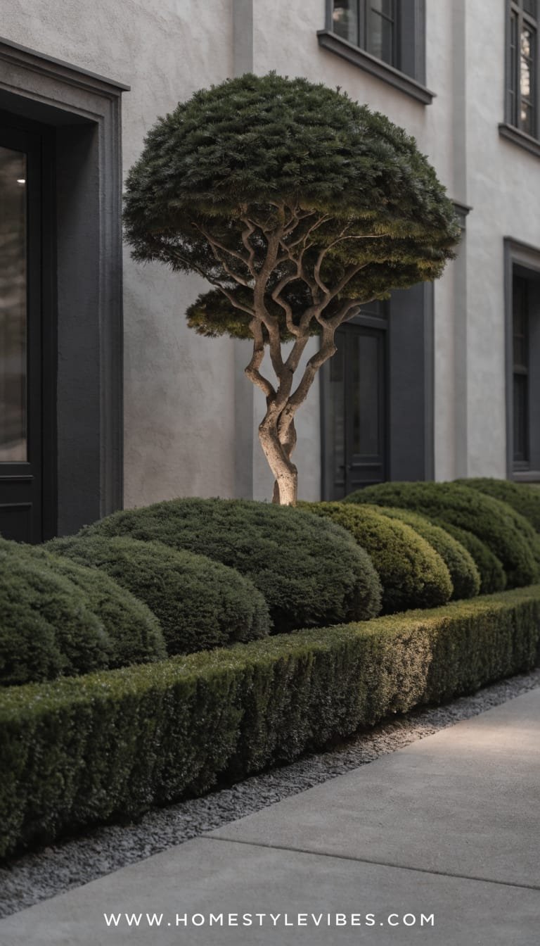
You’ve tried to hide the utility boxes with a few shrubs, but the front still feels busy and uneven. This layered evergreen approach creates a living backdrop—clean, evergreen hedging at the base and a single hero tree as your vertical exclamation point. The mood is serene urban garden: tidy bones with one big flourish. Real-home wise, you get privacy, year-round structure, and minimal replanting. Light skims the hedge at night and spotlights the specimen tree—instant drama with zero seasonal panic.
Why it works: hierarchy. A low hedge (boxwood, inkberry holly, or compact laurel), a mid layer (pieris or camellia in milder zones), and one sculptural specimen—Japanese maple, serviceberry, or a columnar hornbeam if you like architectural lines. Materials stay polished: bluestone or concrete walkway, black edging, and matte ceramic planters. Photographically, the hedge acts like a studio backdrop so the star tree—and your front door—pop in every shot.
Variations: Budget tweak? Start with a partial hedge and fill in as you go. Small lot? A narrow columnar maple or hornbeam preserves walkway width. Renter-friendly: large faux boxwood planters aligned as a “portable hedge.”
Key Design Elements:
- Main materials: bluestone/concrete pavers, matte planters, metal edging
- Color palette: evergreen hues, charcoal, slate, warm wood accents
- Lighting strategy: hedge wash lights, single spotlight on specimen tree
- Furniture silhouettes: slim console shelf by the door, simple bench
- Texture layers: tight hedging, glossy leaves, smooth pavers, matte pots
- Accent details: oversized doormat, modern door knocker, subtle water bowl
How To Recreate This Look:
- Start with the star: choose a specimen tree that fits mature size and light.
- Add the base layer: plant a low, continuous evergreen hedge to ground the space.
- Layer a mid-height interest: 2–3 shrubs with seasonal bloom or color.
- Install lighting: soft wash along the hedge; one focused uplight for the tree.
- Style the entry: a large mat, minimalist planters, and matching house numbers.
Why This Looks Expensive: A deliberate focal point surrounded by consistent greenery creates restraint—designers live for that kind of discipline.
Common Mistakes To Avoid: Don’t pick a specimen that outgrows the space. Skip mixing hedge species; one continuous species looks neater and pricier.
Pro Styling Tip: Frame your shot so the hedge fills the lower third and the tree canopy spans the top—your entry sits center stage with balanced negative space.
Ready for warmth and charm that makes neighbors slow down? The next design turns your porch into the friendliest welcome in the neighborhood.
6. Porch-Potted Welcome With Layered Planters And Seasonal Swaps
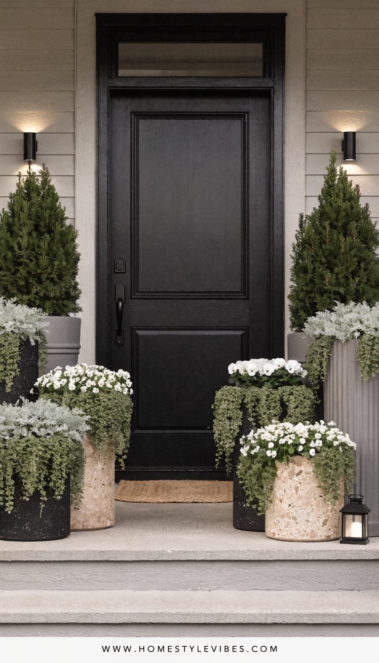
You’ve got a cute porch, but it never looks finished—pots here and there, a tired doormat, and seasonal chaos. This concept turns your porch into a curated moment with layered planters in varied heights, a streamlined color palette, and plants that age beautifully together. Mood-wise, it’s relaxed-cozy with a hint of boutique café. It’s perfect for renters or commitment-phobes because everything lives in containers, and you can swap seasonals without redoing the whole garden. Lighting is simple: warm lanterns or battery-operated candles for evening glow, which makes your entry feel intimate and softly lit.
Why it works: tiered silhouettes. A tall planter with a structural plant (dwarf olive, ficus pumila on a trellis, or a bay standard), a mid planter with mounding blooms, and a low bowl with textural trailing greens. Materials skew tactile: ribbed ceramic, woven fiber, or matte metal. Choose a tight color palette—maybe black, cream, and sage—so plants shine. Photographs beautifully because you create a vignette with height, texture, and rhythm against the door color. Swap in wintergreens and lanterns in December, herbs and petunias in summer. It looks deliberate year-round.
Variations: Budget-friendly? Use lightweight fiberglass planters and DIY paint to get a stone finish. Small stoop? Two planters—one tall, one low—still give dimension. Shade porch? Rely on ferns, heuchera, and trailing ivy for lush volume.
Key Design Elements:
- Main materials: ribbed ceramic/fiberglass planters, coir doormat, woven basket
- Color palette: black, cream, sage or dusty blue accents
- Lighting strategy: lanterns or solar step lights; warm 2700K temperature
- Furniture silhouettes: narrow bench, slim side table if space allows
- Texture layers: ribbed pots, glossy leaves, soft trailing vines, woven mat
- Accent details: brass bell, understated wreath, seasonal stems in a vase
How To Recreate This Look:
- Start with the base: pick 2–3 planters in different heights within one palette.
- Add structure: a tall evergreen or small standard tree in the tallest planter.
- Layer softness: mounding seasonal flowers or foliage in the mid-height planter.
- Install trailing: ivy, dichondra, or creeping jenny in a low bowl for spill.
- Style the porch: oversized doormat, lantern pair, and a simple wreath to echo tones.
Why This Looks Expensive: Cohesive containers and restrained color feel curated, not cobbled together. The tiered heights read like a styled editorial moment.
Common Mistakes To Avoid: Avoid too many tiny pots—they clutter and look cheap. Don’t mix five colors of flowers; pick one or two and repeat for impact.
Pro Styling Tip: Angle your planters slightly so trailing greens cross in the foreground—that overlap creates instant depth in photos.
Prefer something bold and architectural that also champions pollinators? The final idea gives you graphic lines and ecological heart.
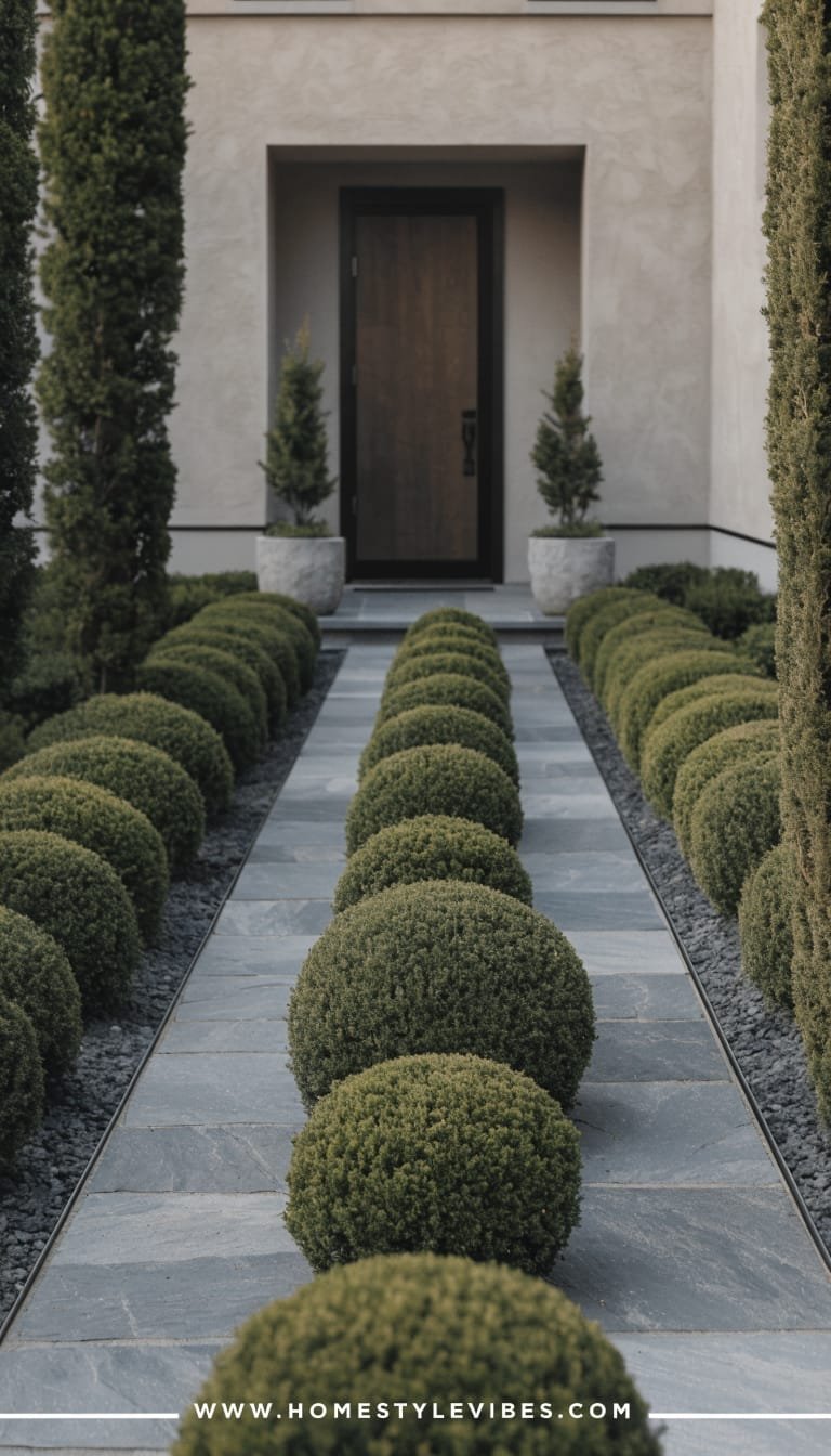
7. Pollinator-Friendly Prairie Edge With Architectural Grasses
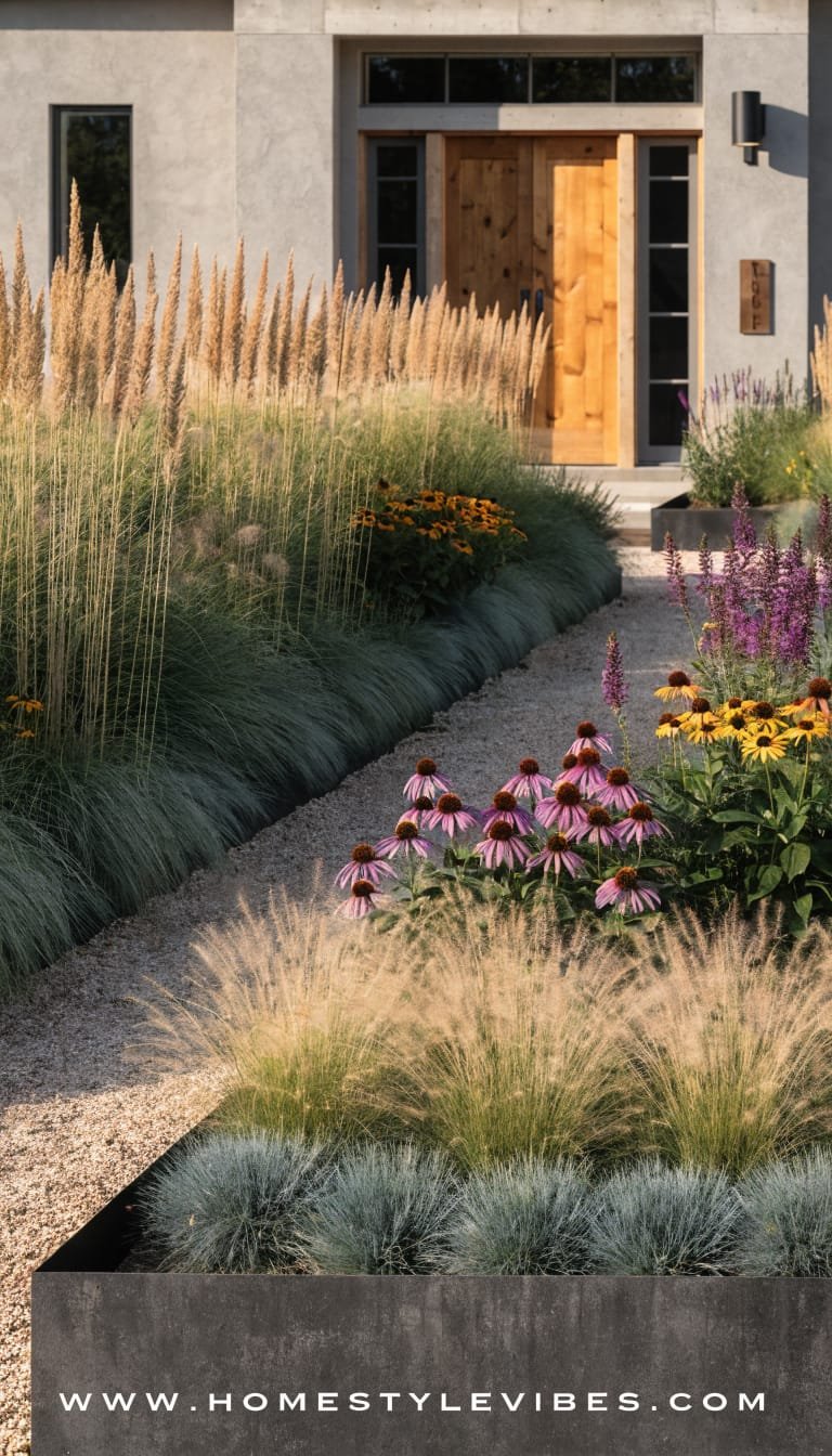
You’ve got a sunny front lawn that eats water and serves exactly zero purpose. You’ve tried adding a birdbath or two, but the overall look still lacks presence. This prairie-edge design swaps thirsty turf for a sculptural, ecological planting that hums with life—and it looks stunning, not messy. The mood is modern prairie: upright grasses, clean steel edging, and punchy blooms in carefully curated blocks. It works for real homes because you can start small, it reduces mowing, and it supports bees and butterflies. Lighting skims tall stems at dusk, creating dramatic silhouettes that make every evening feel like a mini nature show.
Why it works: graphic structure. Use steel edging to carve out a bold crescent or rectangular bed along the sidewalk. Fill with architecturally strong grasses—switchgrass, feather reed grass, or little bluestem—and interplant with blocks of echinacea, rudbeckia, and allium for seasonal color. Materials feel industrial-chic: corten steel, dark mulch or fine gravel, and a bold house number plaque. Photographing this garden is a dream because the vertical lines create strong shadows and the seed heads catch side light like jewelry.
Variations: Budget-friendly? Start with plugs instead of gallon pots. Small lot? A 2–3 foot border along the front edge still delivers big impact. Prefer a moody palette? Choose purple echinacea, deep salvia, and burgundy ninebark as a background shrub.
Key Design Elements:
- Main materials: corten steel or black metal edging, dark mulch/gravel, native grasses
- Color palette: tawny grasses, rich greens, pops of magenta/gold/purple
- Lighting strategy: adjustable spike uplights on taller clumps, warm path lights
- Furniture silhouettes: none required, but a simple corten mailbox looks sharp
- Texture layers: fine grass blades, bold seed heads, matte metal, subtle gravel
- Accent details: modern house numbers, shallow birdbath, native wildflower signs
How To Recreate This Look:
- Start with shape: define a bold bed line using steel edging for crisp geometry.
- Add structure: plant 3–5 repeating clumps of a single grass for rhythm.
- Layer color: intersperse blocks of echinacea, rudbeckia, and salvia for staggered bloom.
- Install lighting: low spike uplights aimed through grass clumps, not at them, for glow.
- Style details: add a simple birdbath and modern house numbers to tie it together.
Why This Looks Expensive: Crisp edging plus bold, repeated plant blocks read like a designer’s hand. The strong geometry turns a wild palette into curated art.
Common Mistakes To Avoid: Don’t overmix species—keep it to a handful for clarity. Avoid shearing grasses in fall; leave seed heads for winter interest and wildlife, then cut back in late winter.
Pro Styling Tip: Shoot side-on at sunset so every blade backlights—those glowing halos around seed heads look straight out of a glossy magazine.
Here’s the part most people skip: choosing just one idea and actually starting. You don’t need to redesign your entire front yard this weekend. Pick the concept that solves your biggest pain point—maybe your path feels unsafe at night (hello, Moonlit Modern Pathway), or your porch never looks finished (the Porch-Potted Welcome will change your life, seriously). Start with structure, repeat a few elements, and let the textures do the talking. Luxury isn’t about price tags—it’s about restraint, rhythm, and lighting that loves your plants.
Trust me, curb appeal shifts when you treat the front garden like a room: set a mood, edit the palette, layer textures, and add lighting that flatters. When you pull up to your home and see sculptural greens, warm highlights, and soft movement in the breeze, it changes your whole evening. This is the quiet kind of luxury—one you feel every time you step onto your path and hear the crunch of gravel or catch a hint of rosemary in the air.
So choose your favorite from these 7 beautiful front home garden ideas and give your entry the glow-up it deserves. You’ll feel the difference when neighbors pause, when packages land neatly on a styled stoop, and when your front door suddenly looks like it belongs in a magazine. Texture, lighting, and a little restraint—those three will carry you, season after season.
About the Author

Krisztina P.Rendes, Founder of Home Style Vibes
Founder of Home Style Vibes
Krisztina Puskásné Rendes created Home Style Vibes as a cozy-modern lifestyle space where homemaking meets inspiration. Her goal is to help women create beautiful, organized, and peaceful homes they truly love — without overwhelm. You’ll find here heart-driven content on home decor, cleaning tips, easy family recipes, organization and decluttering, DIY home projects, plants, and seasonal ideas — all designed to bring more calm, comfort, and style into everyday life.