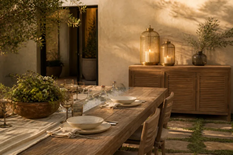
4 Room Color Schemes That Make Every Space Feel Calm Cozy And Inviting
You want rooms that feel like a soft exhale—calm, cozy, and quietly beautiful. But your reality? Harsh lighting, mismatched undertones, and that one wall color that looked great on Pinterest but goes weirdly green at 4 p.m. You crave layered textures, golden light, and a color palette that hugs you back. These four room color schemes fix the exact frustrations that make spaces feel cold or chaotic—and they do it with real-life-friendly materials and lighting that flatters everything it touches.
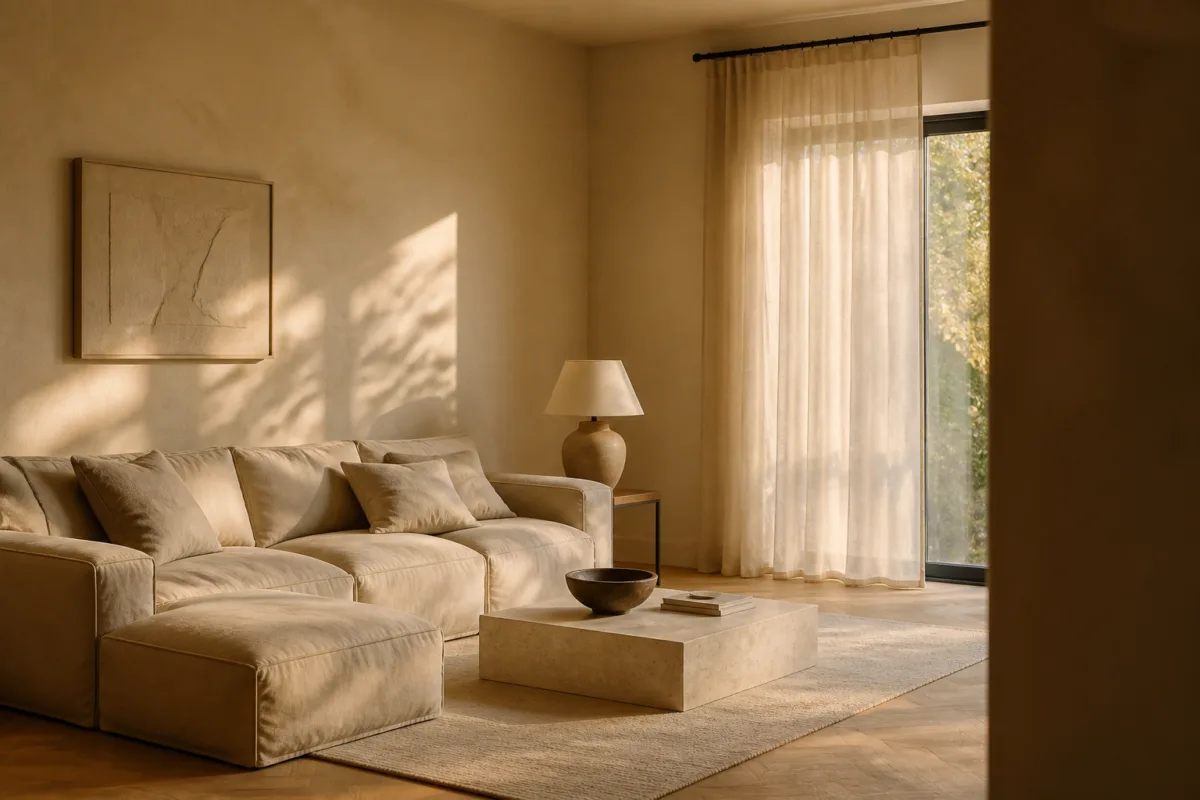
Expect colors you can actually live with, textures that photograph like a dream, and tweaks you can pull off over a weekend without spending more than $2,000 per room if you’re resourceful. Each design is a complete world—soothing, modern, and genuinely comfortable. If you’re into rooms that feel like Sunday morning and look Pinterest-worthy by Tuesday, you’ll love what’s ahead.
1. Oatmeal Limewash Living Room With Dappled Afternoon Light And Oversized Slipcovered Sofa
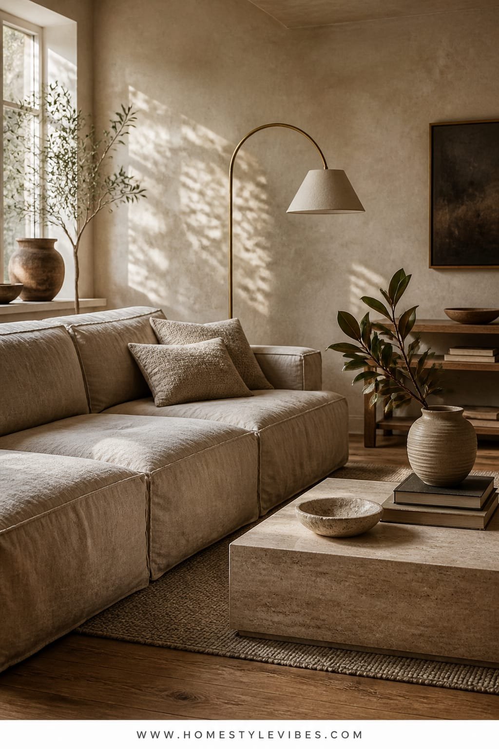
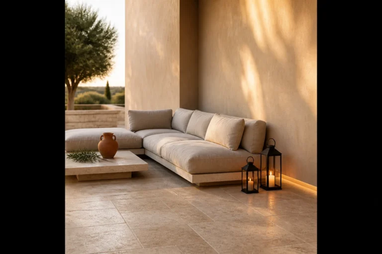
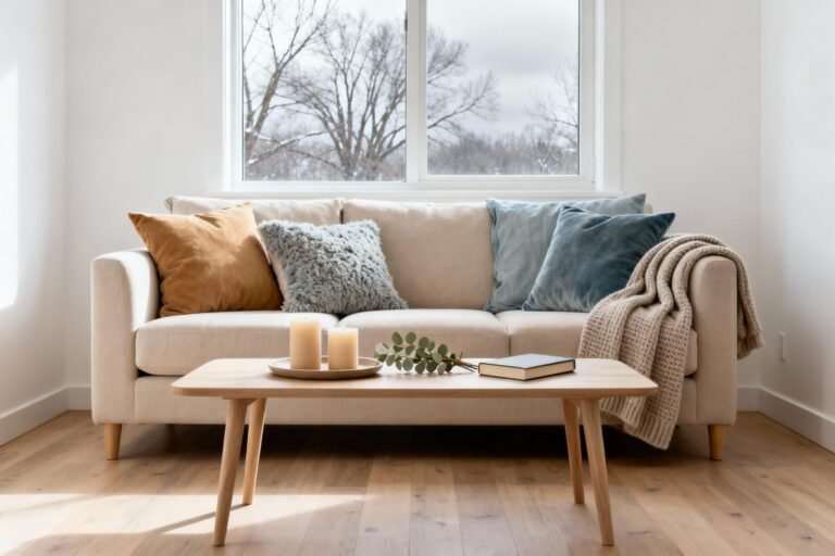
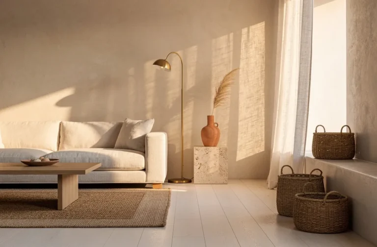
We’ve all been there: the living room that never quite feels finished. You’ve tried three rugs and a fiddle leaf fig, but the vibe still reads “temporary.” This color scheme leans into warm neutrality with nuance—oatmeal limewash walls that create soft, chalky movement, highlighted by dappled afternoon light. It’s cozy without being muddy, minimal without feeling sterile. The big move? A generous slipcovered sofa that says, sink in, stay awhile.
This palette reads like calm personified: layered off-whites, stone, and fawn, supported by matte black accents for contrast. It works in real homes because it’s forgiving—kid-friendly slipcovers, patina-happy materials, and paint that hides minor wall imperfections thanks to limewash’s natural variation. The lighting carries the room. As the sun moves, the limewash creates shadow play that photographs beautifully—no fancy filters needed. It’s the kind of living room that looks high-end at noon and candlelit-chic by night.
Material-wise, you’re anchoring with limewash paint, pale oak, chunky linen, and a nubby wool rug. The star is texture: flanged cushions, stone side tables, and a woven pendant that throws a warm pool of light. If your room loves to absorb light, this warm neutral scheme balances it with matte finishes and gentle contrast.
Variations to try:
- Budget-friendly: Use a limewash-effect roller technique with standard eggshell paint in a layered application. Faux the look with two close tones—one warm, one neutral.
- Small-space version: Choose a low-profile slipcovered loveseat, float it away from the wall by 8 inches, and use leggy side tables to keep air moving around the pieces.
- Darker mood: Swap oatmeal for tobacco-linen walls and go ecru on upholstery. Add black linen shades for a cocooning evening feel.
- Renter-friendly: Hang a large neutral canvas tapestry (ivory with tonal stripes) to mimic the movement of limewash without paint.
Budget Breakdown:
- Limewash paint and primer: $150–$400
- Slipcovered sofa (8–9 ft): $1,200–$2,800
- Nubby wool or wool-blend rug (9×12): $350–$1,200
- Woven pendant + warm LED bulb: $120–$350
- Stone or concrete side table: $180–$500
- Linen curtains + black metal rod: $120–$400
Total Estimated Cost: $2,120 – $5,650
Best For: Medium to large living rooms with decent natural light. Perfect for families or pet owners who want a forgiving, soft palette that looks expensive but cleans up easily.
Key Design Elements:
- Main materials: Limewash paint, pale oak, linen, wool, stone
- Color palette: Oatmeal, ivory, soft fawn, matte black punctuation
- Lighting strategy: Single large woven pendant + floor lamp with a linen shade; 2700K bulbs
- Furniture silhouettes: Low, deep slipcovered sofa; rounded stone tables; artisanal ceramics
- Texture layers: Nubby rug, fringed throw, slubby linen cushions, patinaed trays
- Accent details: Black metal curtain rods, olive branches in a crock, handmade pottery
How To Recreate This Look:
- Start with limewash walls in a warm oatmeal tone; work in X-shaped strokes for movement.
- Add a deep, slipcovered sofa in soft ivory—look for removable covers and bench seating for a luxe line.
- Layer a textured rug large enough for front legs of all seating to sit on it.
- Install a woven pendant centered over the main seating area, not the room; it feels more intentional.
- Style with matte black accents, a stack of art books, and a single oversized vessel with greenery.
Why This Looks Expensive: Limit the color count, then push texture. The matte limewash plus wool and linen reads custom and collected. The contrast of matte black against creamy neutrals sharpens the look, so nothing feels flat.
Watch Out: Don’t pick a rug that’s too small. A postage-stamp rug kills the calm and makes the room feel disjointed. And avoid cool-white bulbs; they fight the warmth you just created.
Pro Styling Tip: For photos, pull the curtains 6 inches past the window frame so the fabric stacks off-glass—light looks fuller, and the room photographs wider.
Quick Tip: If your wall color looks dingy at sunset, your bulbs are probably too cool. Swap to 2700K or 2400K LED and watch the palette mellow instantly.
Pause here and breathe. You don’t have to nail every layer at once. Start with walls and lights; the rest can evolve slowly—like the best rooms always do.
2. Soft Sage Kitchen With Northern Light And Fluted Oak Island
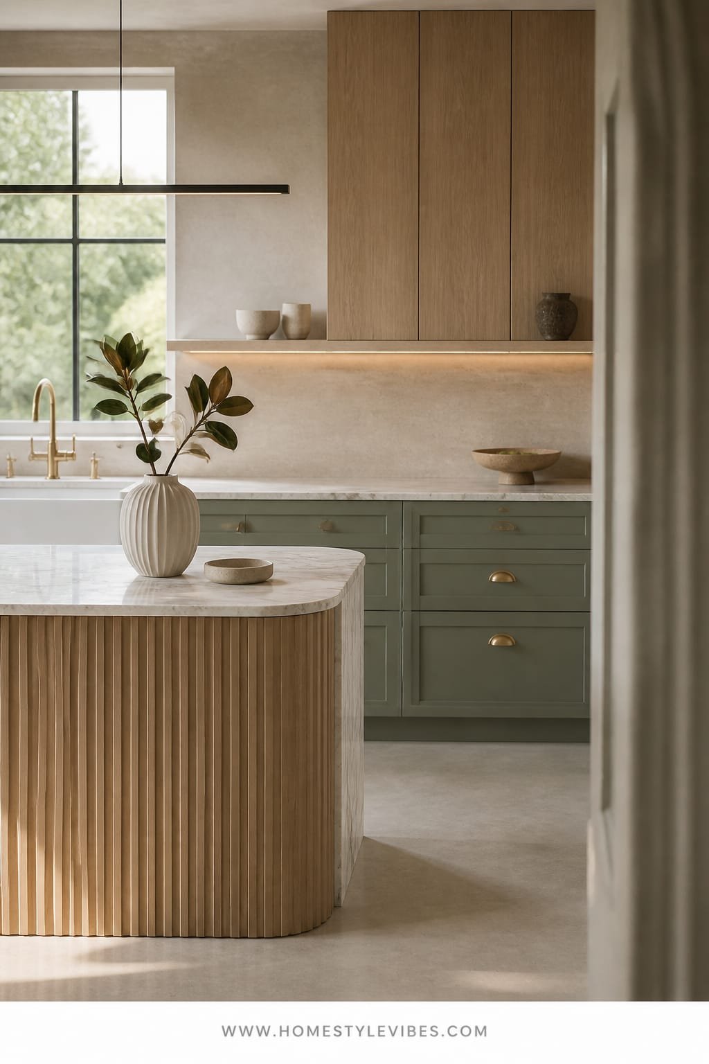
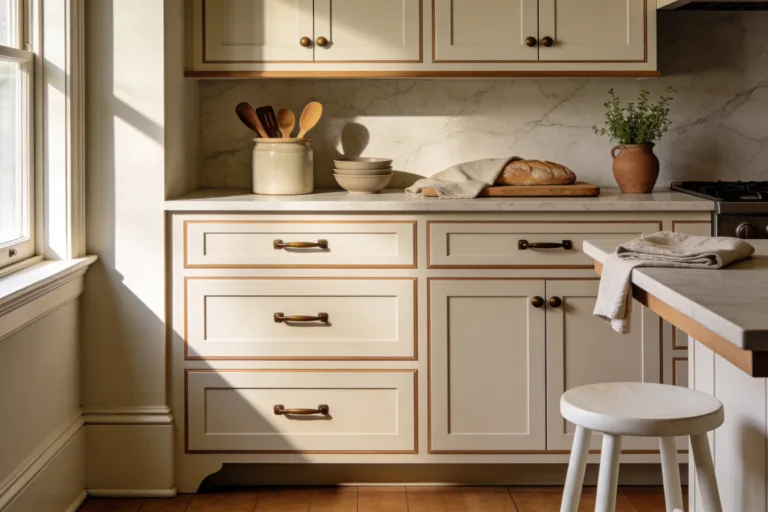
It’s that one corner that always feels off: stark white cabinets that glare by morning and turn icy by late afternoon. You’ve tried adding bar stools or a fruit bowl, but it still reads cold. A soft sage and oak kitchen is the antidote—cool-leaning, yes, but with warmth in the wood and a grounding fluted island that adds rhythm and shadow. This color scheme feels fresh, calm, and a little botanical without going full cottagecore.
The mood? Modern Mediterranean meets Scandinavian pantry. Soft sage cabinetry plays beautifully with the bluish tints of northern light, while fluted oak adds movement and hides daily wear (FYI: flutes forgive scuffs in a way flat panels don’t). Sage lives in the midpoint between neutral and color, which works wonders for resale; buyers sense color but see versatility. Why it photographs so well: the fluting creates repeating shadows, and the sage adds just enough hue to carry a camera without overexposing like bright white.
Lighting is more strategic here. Under-cabinet LEDs wash the backsplash, and a diffused globe pendant releases that clinical edge many kitchens suffer from. A honed stone or quartz with mild veining keeps it soft. Brass or brushed nickel hardware? Either works—pick one and stay loyal across fixtures for cohesion.
Variations to try:
- Budget-friendly: Paint only the island sage and leave uppers white. Add fluted stick-on panels to the island front for a texture upgrade.
- Small-space version: Use lighter sage on uppers and a slightly deeper shade on lowers to add depth without closing in the room.
- Darker mood: Go deep olive on the island, keep lowers sage, and choose bronze hardware for a moody bistro vibe.
- Renter-friendly: Sage vinyl on the backsplash, wood-look peel-and-stick on the island, and sage cabinet stickers on select doors.
Budget Breakdown:
- Cabinet paint (pro-grade enamel): $180–$450
- Fluted oak panels for island: $250–$700
- Hardware (20–30 pieces): $120–$400
- Under-cabinet LED strips: $90–$220
- Globe pendant and dimmer: $140–$350
- Countertop upgrade (honed quartz): $900–$2,400 (optional)
Total Estimated Cost: $780 – $4,520
Best For: Kitchens with cool light or shaded exposures. Great for open-plan homes where you want the kitchen to feel calm, not shouty.
Key Design Elements:
- Main materials: Painted cabinetry, fluted oak, honed quartz, ceramic tile
- Color palette: Soft sage, pale oak, warm white, satin brass or brushed nickel
- Lighting strategy: Under-cabinet wash + one sculptural globe pendant + 2700K task bulbs
- Furniture silhouettes: Rounded-edge counter stools, slim legs, no backs if space is tight
- Texture layers: Fluting, ribbed glass canisters, linen runner, matte ceramics
- Accent details: Herb planters, oil bottle tray, subtly veined stone
How To Recreate This Look:
- Start by color-mapping: paint a large poster board sage and observe it morning and afternoon for two days.
- Add fluted oak to the island face; align panels precisely at corners for clean lines.
- Layer lighting: install under-cabinet LEDs and a dimmable globe over the island.
- Update hardware in one finish across pulls, knobs, and faucet; keep shapes simple.
- Style with a restrained palette: a linen runner, two cutting boards, and one potted herb cluster.
Why This Feels Designer: Restraint. Sage offers character, fluting brings craftsmanship, and the honed finish avoids glare. The mix looks built-in, not cobbled together.
One Thing To Avoid: Don’t pair a cool gray countertop with sage if your light skews blue. It’ll feel chilly. Warm up with creamier quartz or a putty-toned stone.
Pro Styling Tip: For photos, turn off pot lights and use only the pendant and under-cabinet light—shadows soften, and the sage reads richer.
Did You Know? The gap between the cabinet top and ceiling makes rooms feel shorter. If you can’t close it, paint the gap and crown the same color as the cabinets so it visually disappears.
Remember, this isn’t about recreating a showroom. It’s about building a space that actually feels like yours. If one idea resonates more than the others, that’s your starting point. You don’t need all of them.
3. Smoky Taupe Bedroom With Candlelight Glow And Channel-Tufted Headboard
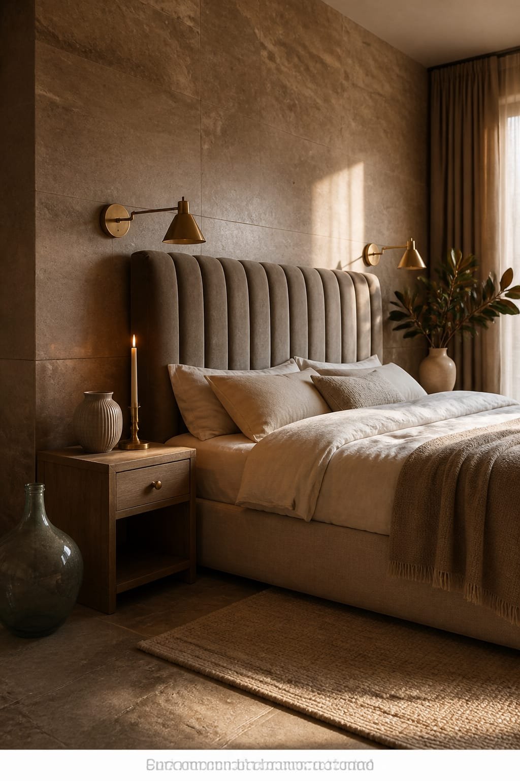
You love crisp bedrooms, but your space feels more like a waiting room at midnight—overbright, echoey, and somehow drafty. The smoky taupe scheme fixes that with layered neutrals that lean cozy, not beige. Think: a moody taupe on the walls, a channel-tufted headboard in velvet or performance suede, and lighting that mimics candlelight. Suddenly, your bedroom becomes a sanctuary where emails feel illegal.
This mood walks the line between boutique hotel and quiet luxury. Smoky taupe offers depth without going full charcoal; it flatters skin tones and reads expensive in low light. It works beautifully in real homes because you can swap bedding seasonally without fighting undertones. For lighting, use shaded sconces with a dimmer and a tiny spotlight hidden under the bed for a faint halo. That glow around the rug? That’s what makes photos stop the scroll—soft edges, layered shadows, and subtle sheen in the textiles.
Materials do the heavy lifting: velvet or faux suede for the headboard, washed percale or linen sheets, a tonal quilt, and a wool-mohair throw at the foot. The channel tufting adds vertical rhythm, elongating the wall without artwork overload. If you need storage, floating nightstands keep the floor visible and the room feeling serene.
Variations to try:
- Budget-friendly: Paint only the headboard wall smoky taupe and keep the rest warm white. Add a pre-made channel headboard panel behind a simple metal bed.
- Small-space version: Choose a low, wide headboard and mount sconces to free up nightstand space. Go tone-on-tone bedding to avoid visual clutter.
- Darker mood: Go deep espresso on the walls and keep the headboard taupe for contrast; add leather pulls to nightstands.
- Renter-friendly: Use peel-and-stick fabric panels in taupe behind the bed; clip-on sconces to a picture rail for non-wired light.
Budget Breakdown:
- High-quality interior paint + primer: $120–$260
- Channel-tufted headboard (queen/king): $300–$1,200
- Shaded sconces (pair) + dimmer: $160–$480
- Bedding set (linen/percale): $180–$500
- Area rug (8×10 or 9×12): $280–$1,000
- Floating nightstands: $160–$450
Total Estimated Cost: $1,200 – $3,890
Best For: Primary or guest bedrooms that feel too bright or sterile. Great for anyone craving a cocoon, shift workers who need restful light, or screen-free zones.
Key Design Elements:
- Main materials: Velvet/suede, wool, washed linen, painted plaster
- Color palette: Smoky taupe, soft ecru, tobacco, antique brass
- Lighting strategy: Dimmable shaded sconces at 2400–2700K + hidden toe-kick LED under bed
- Furniture silhouettes: Low, upholstered headboard; floating nightstands; simple bench
- Texture layers: Matelassé quilt, mohair or wool throw, sateen piping on pillows
- Accent details: Antique brass frames, ceramic nightstand dish, dried stems in a stone vase
Why This Reads High-End: Monochrome layers with high-contrast textures (matte walls, plush headboard, crisp sheets) look intentional. The candlelight temperature bulbs warm the taupe so it never goes drab.
How To Recreate This Look:
- Start with the wall color and test a large swatch behind the bed to check shadows.
- Add a channel-tufted headboard that’s wider than your mattress; it amplifies visual presence.
- Layer bedding in two similar neutrals with one darker accent throw for depth.
- Install shaded sconces on dimmers; set bottom of shades around 42 inches above the mattress top.
- Style with one tray, one book, and a single stem vase—let negative space do the talking.
The Most Common Mistake: Hanging curtains too low. Mount rods 2–4 inches below the ceiling and let drapery kiss the floor for softness. High mount = taller room, calmer vibe.
Pro Styling Tip: For shoot day, slightly “ruffle” the duvet by hand instead of karate-chopping every pillow. Gentle imperfection photographs more inviting than rigid hotel corners.
Quick Tip: If your taupe reads purple, your bulb temp is too cool or your trim is stark blue-white. Shift to warmer bulbs and paint trim a creamy off-white to correct undertones.
Micro-story time: I tried this smoky palette in my own bedroom last fall. The first night with the dimmed sconces and the mohair throw at my feet? I slept like I’d checked into a small Paris hotel, minus the $18 sparkling water.
4. Clay Terracotta Dining Nook With Golden Hour Window Light And Round Pedestal Table
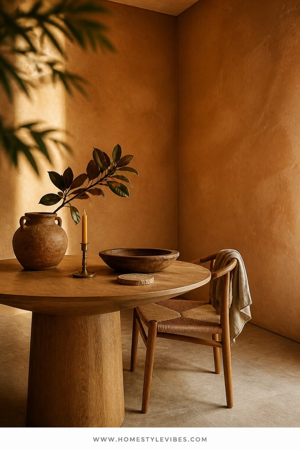
You want dinner to feel like an occasion, but your current dining corner feels utility—too angular, too bright, too “leftover space.” Warm terracotta walls with a clay finish shift everything. They glow at golden hour, turn candlelight to amber, and make every meal look like it belongs on a magazine page. Add a round pedestal table that keeps legroom generous and conversation easy. Suddenly, Tuesday pasta tastes like a plan.
The mood sits somewhere between Spanish farmhouse and modern California. Terracotta is bold on paper but shockingly livable in practice, especially in a smaller nook where you want character fast. It works beautifully because it brings skin-friendly warmth, flatters wood and brass, and hides minor scuffs. Round tables solve layout friction—no corner clashes with chairs—and a pedestal base adds visual lightness. Photographs love this room: the clay finish absorbs glare, while the curved table and chairs cast beautiful crescent shadows.
Lighting takes the lead here. If you have window light, keep treatments simple and high. For fixtures, a linen drum pendant or small alabaster chandelier on a dimmer turns terracotta into a candle-lit sunset. On the table, a single ceramic bowl with seasonal fruit is all you need. Over-styling kills the romance; restraint lets the color breathe.
Variations to try:
- Budget-friendly: Paint only the lower two-thirds of the wall terracotta and cap with a small chair rail; keep upper walls warm white.
- Small-space version: Choose a 36–40 inch round table and armless chairs with open backs; a slim bench against the wall saves space.
- Darker mood: Go deeper—rusted clay—and choose walnut chairs with leather seats; add a dim alabaster sconce for evening glow.
- Renter-friendly: Use removable terracotta wall panels or large art canvases painted in color; a round drop-leaf table doubles as a console.
Budget Breakdown:
- Clay or mineral paint: $140–$320
- Round pedestal table: $280–$1,400
- Dining chairs (set of 4): $300–$1,200
- Linen drum pendant + dimmer: $130–$360
- Rug (flatweave, 6×9): $180–$600
- Sheer linen roman shade or curtain: $120–$350
Total Estimated Cost: $1,150 – $4,230
Best For: Breakfast nooks or dining corners with at least one window. Perfect for hosts who prefer long, cozy dinners, or anyone who wants a social hub in a small footprint.
Key Design Elements:
- Main materials: Clay paint, linen, wood, leather accents
- Color palette: Terracotta, warm white, walnut, burnished brass
- Lighting strategy: Linen drum pendant on dimmer + candles; curtain stack mounted high and wide
- Furniture silhouettes: Round pedestal table, curved chairs, optional bench seat
- Texture layers: Flatweave rug, linen shade, ceramic bowl, leather seat pads
- Accent details: Woven placemats, small branch in a stoneware vase, brass candlesticks
How To Recreate This Look:
- Start by painting walls a mid-tone terracotta; test at sunrise and sunset to confirm it glows, not glares.
- Add a round pedestal table sized to your space—leave 36 inches clearance around for chairs.
- Layer a flatweave rug slightly larger than the table’s footprint to keep chairs from catching.
- Install a linen drum pendant centered over the table, hung 30–34 inches above tabletop.
- Style with a single focal piece: a ceramic fruit bowl or a short branch in stoneware.
Why This Looks Intentional: The round table, curved chairs, and warm walls share a theme: softness. Repeating curves and one dominant color tell the story, so nothing feels random.
Don’t Do This: Don’t pick a high-gloss terracotta. It reflects patchy light and can veer pumpkin. Stick to clay, mineral, or at least matte.
Pro Styling Tip: For photos, set two plates, a linen napkin casually folded, and one candle—leave negative space. The breathing room looks editorial and lived-in, not staged.
Did You Know? Cheap pendants often cast a weird scalloped shadow on nearby walls. A linen drum with a diffuser gives you even light and happier skin tones at the table.
True story: A friend of mine spent weeks agonizing over paint colors before realizing the real problem was her kitchen nook lighting. We swapped her cold LED for a linen drum and dimmer. She texted me a photo that night: “Same paint, new mood. My pasta just got an upgrade.”
Quick Checklist
- Test large color swatches in morning and evening light
- Choose 2700K bulbs for warm, calm rooms
- Anchor each room with one statement piece
- Limit your palette to 3–4 core tones
- Use matte finishes to reduce glare
- Mount curtains high and wide to elongate windows
- Layer textures: one rough, one smooth, one plush
- Keep hardware finishes consistent
- Right-size rugs so front legs sit comfortably on them
- Edit styling: one hero object per surface
Frequently Asked Questions
How do I choose the right undertone so my “calm cozy” color doesn’t turn weird at night?
Paint two large poster boards in your top picks and move them around the room for two days. Check them at sunrise, midday, and evening with lights on. If a shade reads green or purple at night, adjust your bulb temperature to 2700K and test again before ruling the color out.
My space is small—won’t darker or richer colors make it feel cramped?
Not if you control sheen and lighting. Matte or clay finishes absorb light for softness, while sconces and pendants on dimmers create depth. In tight rooms, go tone-on-tone with furniture so shapes blend rather than compete.
I’m on a tight budget. Which upgrades make the biggest visual difference fast?
Prioritize paint, lighting, and a correctly sized rug. Those three decisions reshape the entire mood. Slipcovers and new hardware come next if you have a little extra to spend.
What about maintenance—are limewash and clay paints hard to live with?
They’re more forgiving than glossy finishes because they hide small scuffs. For high-traffic zones, keep a small jar of touch-up on hand. In kitchens, use clay or mineral paints rated for scrubbability and avoid splash zones behind the stove without a proper backsplash.
I rent—how can I try these color schemes without painting?
Use removable wall panels, large painted canvases, peel-and-stick textures, and fabric drapery to introduce color. Lighting on dimmers (plug-in), slipcovers, and layered textiles carry most of the mood without touching the walls.
Final Thoughts
Pick one idea and start small. Paint the walls, swap bulbs, or bring in that one statement piece that sets the tone. You don’t need a full overhaul to make a room finally feel like it matches your life.
The truth is, luxury comes from texture, lighting, and restraint. Choose a calm color scheme, then repeat it in layers: matte walls, soft textiles, flattering lights. Edit the extras. Let your home breathe.
Seriously—your space can feel calm, cozy, and inviting by next weekend. Trust yourself, trust the process, and remember: when the light hits just right and the colors hum together, you’ll know you got it. You’re closer than you think.
About the Author

Krisztina P.Rendes, Founder of Home Style Vibes
Founder of Home Style Vibes
Krisztina Puskásné Rendes created Home Style Vibes as a cozy-modern lifestyle space where homemaking meets inspiration. Her goal is to help women create beautiful, organized, and peaceful homes they truly love — without overwhelm. You’ll find here heart-driven content on home decor, cleaning tips, easy family recipes, organization and decluttering, DIY home projects, plants, and seasonal ideas — all designed to bring more calm, comfort, and style into everyday life.