7 Kitchen Cabinet Colors That Will Make You Fall in Love with Your Kitchen Again Guide
You want a kitchen that makes your shoulders drop and your eyes soften the second you walk in. You crave light that skims across velvety cabinet fronts and highlights a space that feels collected, not chaotic. But right now? The colors feel muddy, the shadows fall wrong, and nothing photographs the way you pictured. These five ideas fix that—specifically the color issue—while dialing in texture, light, and scale so your cabinets finally carry the room.
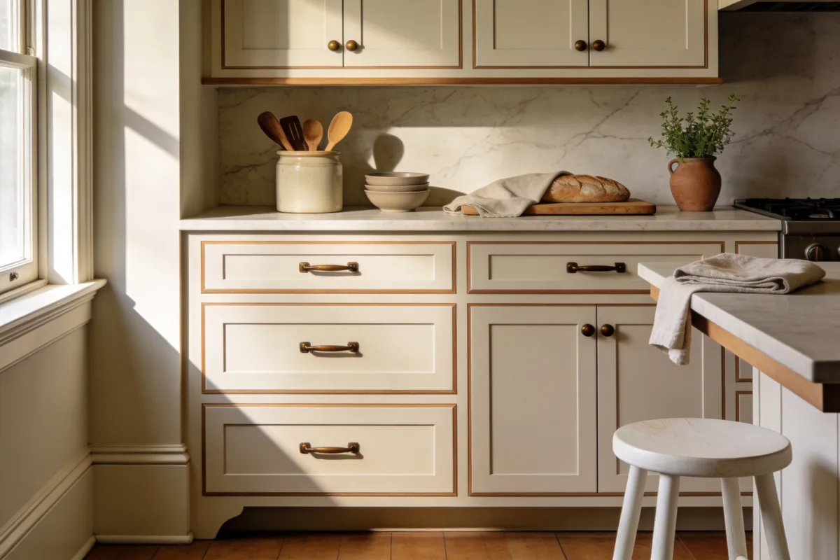
We’ll zero in on paint, wood tones, and finish details that feel luxe without a huge spend. Most of these kitchen cabinet colors can be done in a weekend with a $500–$4,500 budget, depending on scope, and every concept includes a renter-friendly version. Expect photogenic, Pinterest-ready results with high contrast, layered textures, and cabinets that look like they were always meant to be there. If you love kitchens that feel calm, intentional, and quietly rich—this is your sweet spot.
1. Sun-Warmed Oatmeal With Oil-Rubbed Bronze and Quiet Stone
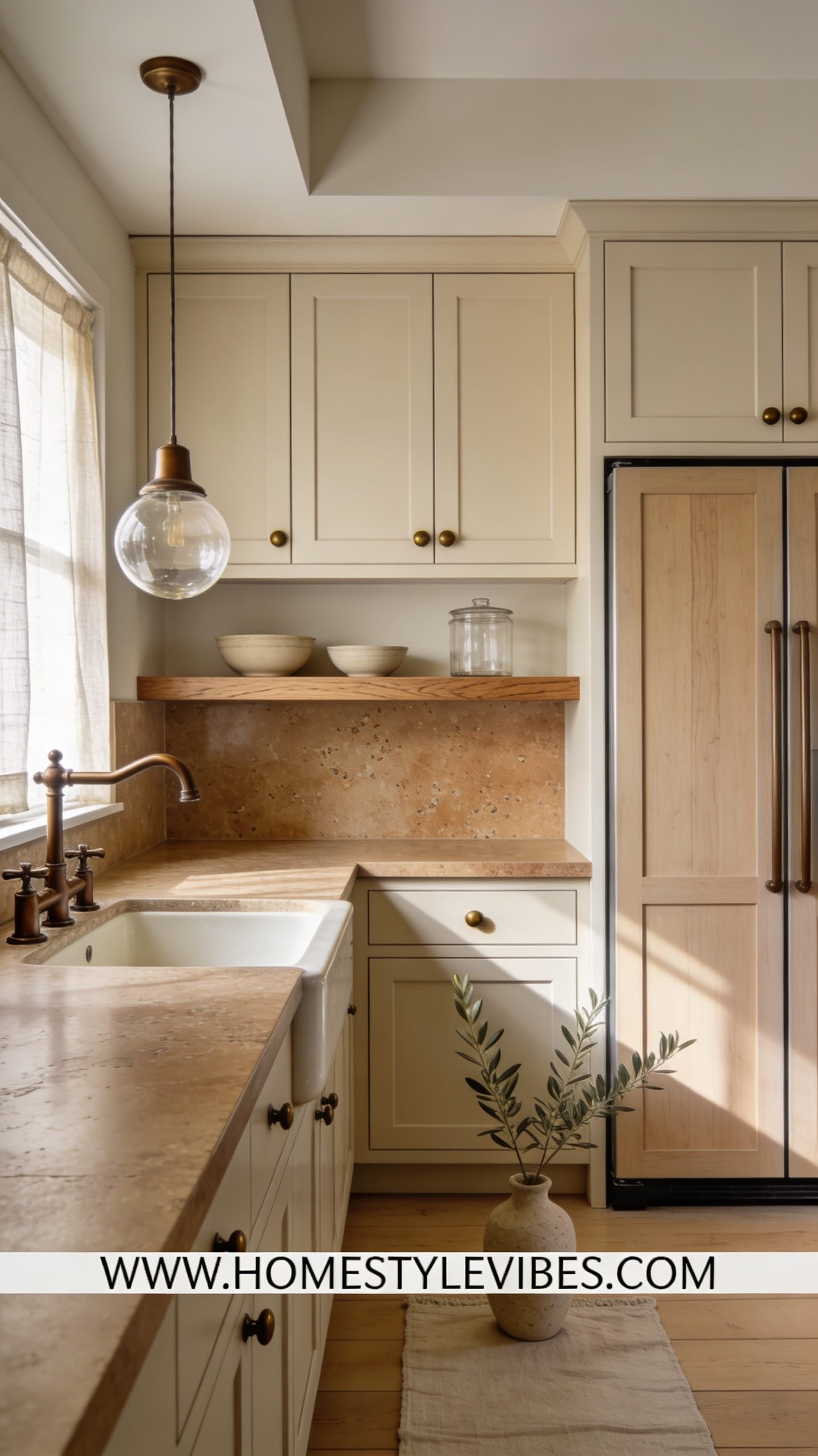
We’ve all been there: you went “safe” with a basic white, but the room reads dingy and sterile, especially on cloudy days. Sun-warmed oatmeal is the not-too-beige, not-too-gray neutral that rescues that problem. It leans creamy without yellowing, has enough pigment to hide dust, and loves morning light. Think soft linen on cabinet doors, subtle grain on white oak accents, and oil-rubbed bronze hardware that looks like jewelry against matte paint. The mood? Cozy-tranquil—like a slow breakfast with honey on toast.
This works in real homes because the undertone plays well with common counters—laminate that pretends to be marble, true quartz, even older speckled granite. It doesn’t fight your floors. Under warm LEDs, it glows; under cool daylight, it stays sophisticated. The magic for photos comes from contrast: creamy fronts next to deeper hardware, plus one grounded element like a stone-look backsplash with light veining to add shadow and depth.
Variations you’ll actually use: a small-space version with slab fronts and slim, horizontal pulls to visually widen the room; a budget choice using high-adhesion paint over existing cabinet boxes and replacing only doors; a richer, darker variation on the island—mushroom taupe—to keep the perimeter airy while anchoring the center. Renter? Use peel-and-stick vinyl panels on flat doors to fake a Shaker look, then switch in bronze bar pulls you can keep forever.
Budget Breakdown:
- Cabinet paint (high-adhesion enamel in “oatmeal” tones): $90–$160 per gallon
- Oil-rubbed bronze hardware (20–30 pulls/knobs): $120–$480
- Peel-and-stick backsplash in light stone pattern: $120–$350
- Under-cabinet LED strips (dimmable, warm): $60–$200
- Wood filler, sandpaper, angling brush set, primer: $60–$140
Total Estimated Cost: $450 – $1,330
Best For: Small to mid-size kitchens with north or east light; homeowners who want warmth without yellow. Great if your flooring is cool gray and you need balance.
Key Design Elements:
- Main materials: Satin enamel paint, oil-rubbed bronze, light stone-look backsplash
- Color palette: Oatmeal, soft linen, bronze, warm white, pale stone
- Lighting strategy: Warm (2700–3000K) under-cabinet LEDs to enhance the creamy undertone
- Furniture silhouettes: Clean Shaker or slab cabinet fronts
- Texture layers: Matte paint, brushed metal, subtle veining
- Accent details (hardware, decor pieces, plants): Bronze pulls, a bowl of citrus, trailing pothos
How To Recreate This Look:
- Start with thorough cleaning, a bonding primer, and two coats of satin oatmeal paint on doors and drawer fronts.
- Add oil-rubbed bronze hardware with a consistent finish across knobs and pulls for cohesion.
- Layer a light stone or faux-stone backsplash with soft veining to create gentle shadow play.
- Install warm under-cabinet lighting to make the cabinet faces glow in the evening.
- Style with a creamy runner, a wood cutting board stack, and one leafy plant for life.
Why This Looks Expensive: The bronze against matte oatmeal reads intentional and calm. Neutral cabinets + textural stone create quiet contrast, the kind design photographers chase because it makes edges feel crisp and the room look finished.
Watch Out: Don’t choose an oatmeal with strong yellow or pink undertones. Test big swatches near your floors and counters at night and in morning light. Lighting exposes undertones ruthlessly.
Pro Styling Tip: For photos, kill overheads and shoot with daylight plus under-cabinet glow—your cabinet faces will look velvety, not shiny.
Keep scrolling—the next palette is moody in the most elegant way, like a tailored coat in a cozy bar.
2. Inky Blue-Black With Smoked Brass and Honed Marble
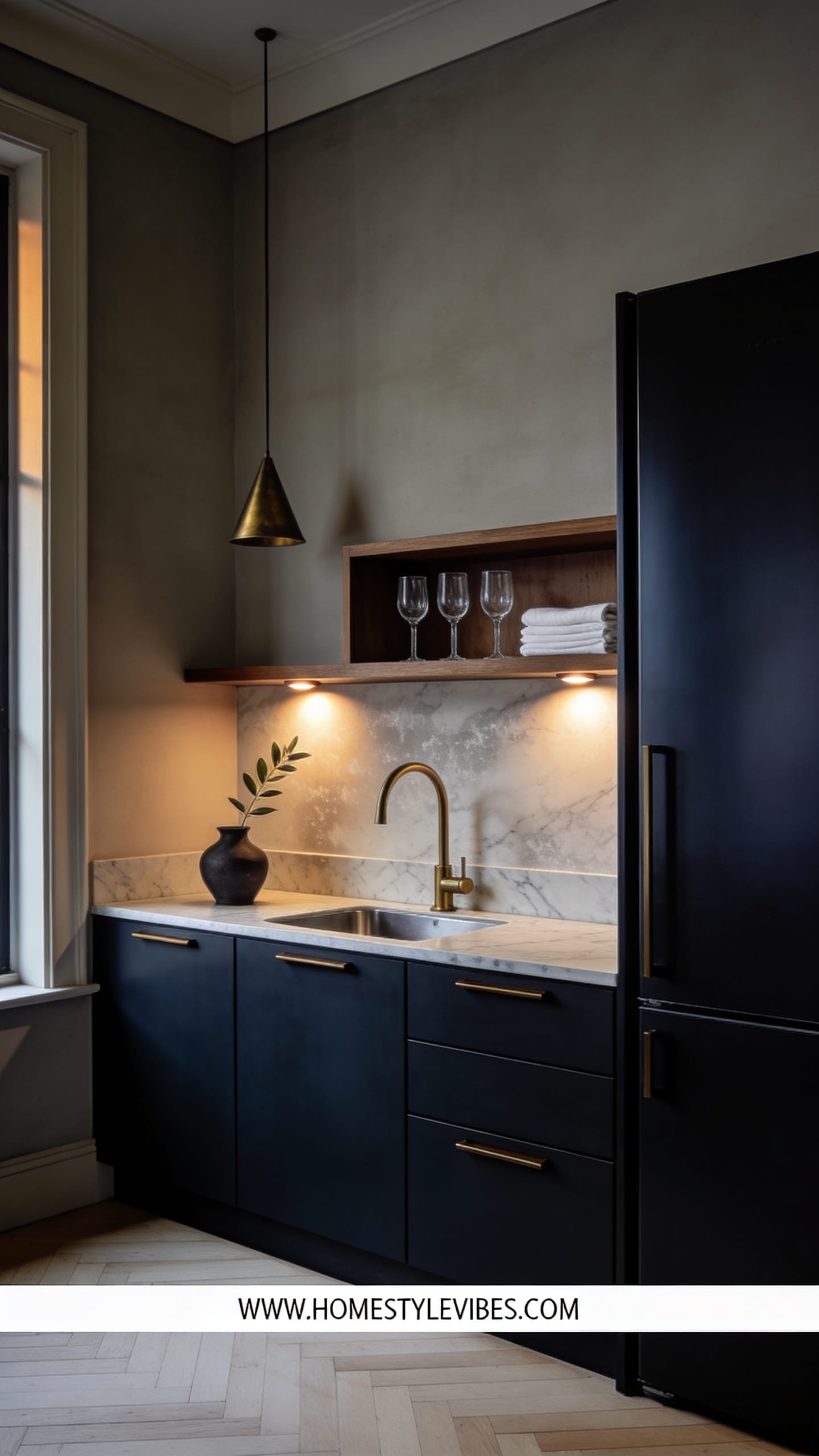
It’s that one corner that always feels off—flat, shadowy, slightly messy no matter how you style it. Deep blue-black solves it by owning the shadows. This cabinet color creates a tailored, modern-European mood: think moody bistro with candlelight, where the honed marble reads chalky and the smoked brass warms everything. At night, the cabinets recede just enough, making your counters and glassware pop like a still life.
Here’s why it works at home: In smaller spaces, dark lowers visually “disappear,” letting your backsplash and uppers carry the light. Smudges hide better than on glossy black. Plus, this blue-black (with a touch of green or charcoal) plays nicely with stainless appliances, which suddenly feel intentional. Photographs love the depth; edges carve out against the darkness, and wood cutting boards look artful instead of utilitarian.
Variations: a studio-friendly version with only the base cabinets painted blue-black; a renter setup using contact-paper fronts in a deep navy matte and swapping only the hardware; a family-friendly path using scrubbable satin finish and finger-pull rails to reduce smudge prints. If your kitchen leans dark already, bring in white or pale gray plaster on the walls and a lightly veined backsplash to keep it balanced.
Key Design Elements:
- Main materials: Blue-black satin enamel, smoked brass hardware, honed marble or marble-look quartz
- Color palette: Charcoal navy, smoked brass, chalky white, walnut, soft gray grout
- Lighting strategy: Layered—globe pendants with warm bulbs and a dimmer, under-cabinet task lighting
- Furniture silhouettes: Slab doors or slim Shaker with narrow rails
- Texture layers: Honed stone, satin paint, brushed metal, grainy wood boards
- Accent details: A single brass rail for mugs, matte black faucet, linen tea towels
Budget Breakdown:
- Satin blue-black paint (2–3 gallons): $180–$420
- Smoked brass hardware (20–30 pieces): $200–$650
- Honed marble or marble-look quartz (if replacing): $1,200–$3,500
- Dimmer switches + warm LED bulbs: $40–$120
- Open brass rail + brackets: $80–$200
Total Estimated Cost: $500 – $4,890 (wide range depending on counters)
Best For: Mid-size kitchens, open concept spaces craving drama, evening entertainers, or anyone pairing with stainless appliances.
How To Recreate This Look:
- Start with a highly pigmented blue-black in satin; sand between coats for that soft, almost-velvet finish.
- Add smoked brass pulls and a matching slim rail for a quietly luxurious detail line.
- Layer a honed or matte countertop—stone or realistic quartz—to reduce glare and add depth.
- Install globe pendants on dimmers; avoid cool bulbs, which make the blue read cheap and flat.
- Style with edited pieces: one big board, one bowl of dark fruit, one petite vase with greenery.
Why This Feels Designer: The restrained palette and soft finishes let form lead. You’ve got shadow, you’ve got sheen control, and every contrast point—brass against blue-black, white stone against dark—feels intentional.
One Thing To Avoid: Don’t mix too many metals. Pick brass as the star and let stainless be the supporting actor. Copper plus brass plus chrome equals visual noise.
Pro Styling Tip: For photos, leave a 6–8 inch negative space on counters; empty space next to the dark cabinets creates rhythm and lets the light read cleanly.
Lean into color confidence—up next is a fresh green that reads like a garden window even in a rental.
Remember, this isn’t about recreating a showroom. It’s about a kitchen that suits how you move, cook, and gather. If one idea pings your gut—start there and ignore the rest for now.
3. Herb-Garden Green With Aged Nickel and Terra-Cotta Notes
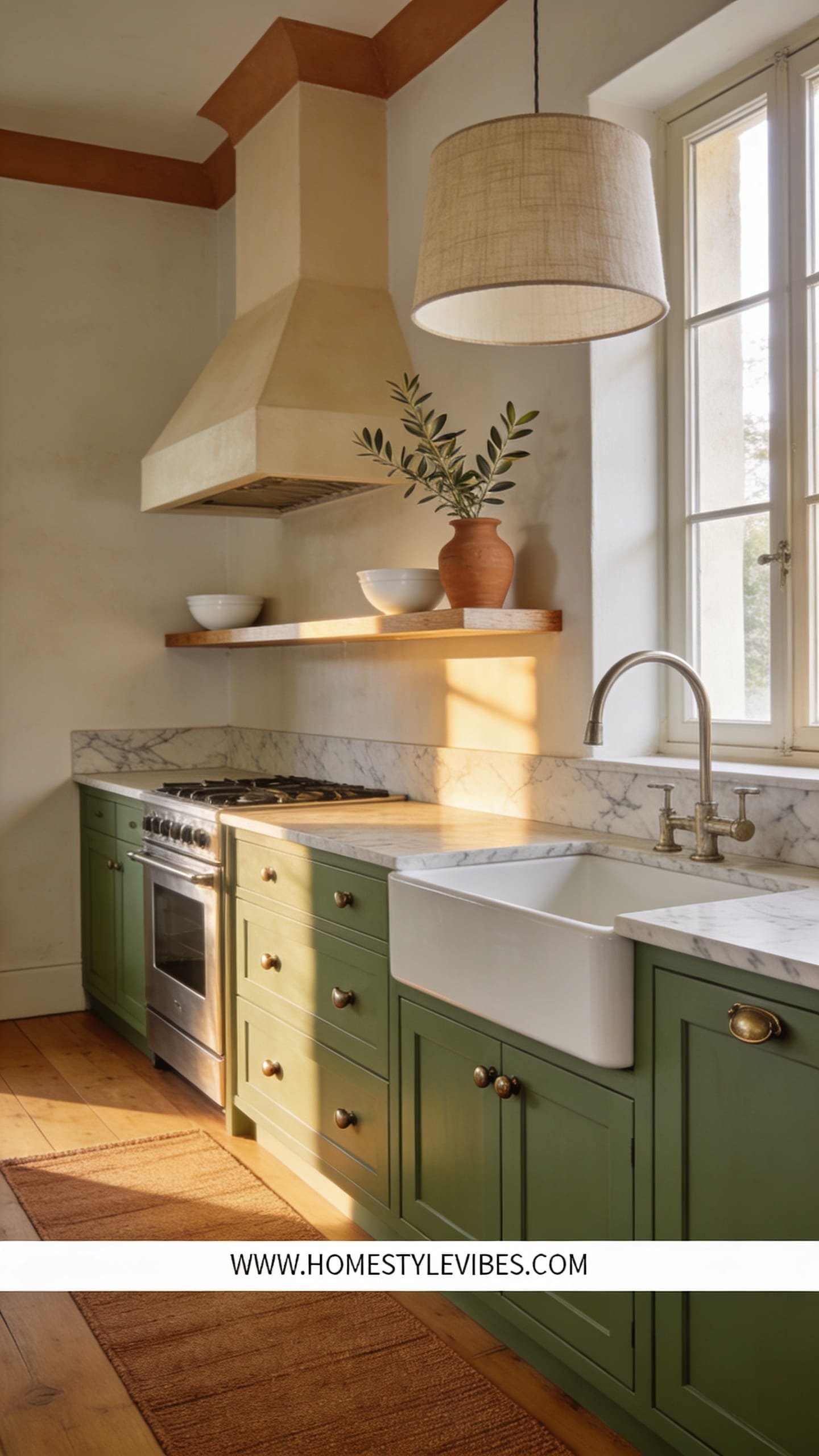
You’ve tried all the “safe” neutrals, but the space still feels lifeless. Herb-garden green is your living color—fresh without screaming, earthy without going muddy. Imagine the soft green of a sage leaf right after you crush it between your fingers; pair that with aged nickel hardware and a terra-cotta runner. The vibe is modern Mediterranean-meets-cottage, which weirdly works in both city apartments and 1920s bungalows.
This green survives real life because it forgives scuffs and plays well with butcher block, stone, and even older tile that leans cream. Natural light makes it bloom; artificial light pulls it into a soothing, grayed green that feels like a deep breath. Photos? They love it. Green brings life to skin tones and food shots, so your pasta night suddenly looks editorial.
Variations: For small galley kitchens, go herb green on lowers only and keep uppers warm white to bounce light. For a darker, moodier take, shift to an olive with brown undertones and add black hardware. Renter trick: use paintable removable wallpaper on flat cabinet faces, then roll on your green—comes off in strips when you move.
Budget Breakdown:
- Herb-green cabinet paint (2 gallons): $180–$320
- Aged nickel hardware set: $150–$500
- Terra-cotta runner: $60–$240
- Peel-and-stick limewash-look backsplash: $100–$280
- Open wood shelf for herbs: $40–$120
Total Estimated Cost: $530 – $1,460
Best For: Daylight-loved kitchens, cooks who display produce, and anyone craving warmth with a little color. Works beautifully with white, cream, or natural stone counters.
Key Design Elements:
- Main materials: Satin herb-green enamel, aged nickel, butcher block or warm stone
- Color palette: Sage, olive accents, cream, terra-cotta, aged nickel
- Lighting strategy: Wall sconces over the backsplash and dimmable under-cabinet strips
- Furniture silhouettes: Shaker or beadboard doors for texture
- Texture layers: Soft-matte paint, nubby linen towels, clay planters, woven runner
- Accent details: Potted herbs, a wooden salt cellar, matte ceramic utensil jar
How To Recreate This Look:
- Start with a mid-tone herb green at 20–30% gray for sophistication; go satin finish for wipeability.
- Add aged nickel cup pulls on drawers and slim knobs on doors; keep hardware lines consistent.
- Layer a limewash-look backsplash (peel-and-stick if needed) for that hand-touched texture.
- Install a small open shelf with trailing thyme or basil in clay pots near your prep zone.
- Style with a terra-cotta runner and linen towels to bring in warmth underfoot and at hand height.
Why This Reads High-End: The tonal play—green with clay and cream—feels borrowed from nature, which always photographs expensive. The nickel finish keeps it mature, not cottage kitsch.
The Most Common Mistake: Overdoing the green. Keep walls and backsplash lighter and neutral. Let the cabinets be the star and everything else whisper.
Pro Styling Tip: Set a bowl of lemons or apricots on the counter—yellow-orange against green is a color theory cheat code for instant magazine vibes.
Next up, a tone that flatters every countertop—and hides the chaos of family life like a champ.
Small confession: I once picked a green that turned neon under my stovetop LED strip. It took me two days to realize the bulbs were at 5000K. Swapped them to 2700K and suddenly my calm sage reappeared. Lighting is ruthless—but you can make it your friend.
4. Putty Greige With Brushed Chrome and Fluted Moments
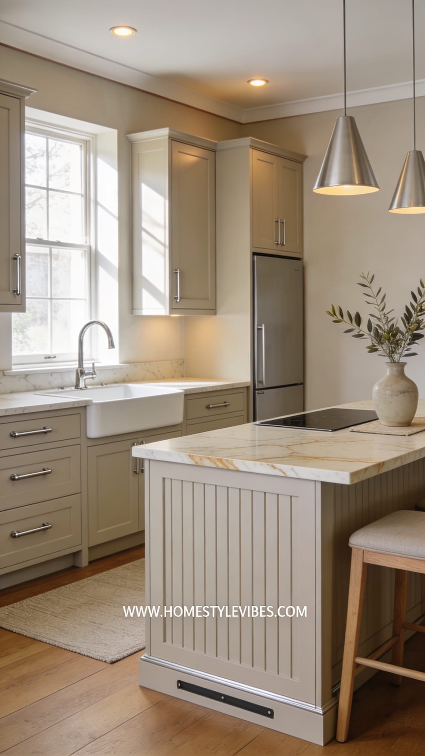
You love calm kitchens that don’t feel plain. You hate when “neutral” reads builder-basic. Putty greige is the bridge—earthy enough to feel warm, cool enough to feel crisp. This palette lands in that modern-classic mood: hotel breakfast nook at home. With brushed chrome hardware and a few fluted panel moments (think island or side panels), it turns the volume up just enough.
Putty works almost universally because it harmonizes with both cool and warm counters. If you plan to sell in the next few years, this color is resale gold. Lighting softens it into a stony beige at night and lifts to a linen-tinted gray by day. For photos, the magic is in the micro-shadows fluted details create—texture shows up even on your phone camera, making the kitchen look more custom.
Variations: Small-space version uses putty on both uppers and lowers but adds mirrored or glossy backsplash tiles to bounce light. Darker room? Pair with a pale oak floor runner and reflective pendants. Budget-friendly version uses DIY fluted panels with half-round molding painted to match the cabinets. Renter option: adhesive fluted strips on the island only and brushed chrome magnetic handles.
Key Design Elements:
- Main materials: Satin putty greige, brushed chrome, fluted MDF panels
- Color palette: Putty, creamy white, pale oak, soft graphite
- Lighting strategy: Bright but warm ceiling lights, reflective pendants, and targeted task lighting
- Furniture silhouettes: Clean Shaker or modern flat with applied fluting on end panels
- Texture layers: Fluted profiles, matte paint, linen runner, stoneware bowls
- Accent details: Slim chrome rails, pale oak stools, a graphite kettle
Budget Breakdown:
- Putty greige paint (2 gallons): $160–$320
- Brushed chrome hardware: $120–$450
- DIY fluted panel materials: $120–$380
- Pendant lights (2): $160–$500
- Glossy backsplash tile (optional): $200–$700
Total Estimated Cost: $560 – $2,350
Best For: Family kitchens that need calm and easy maintenance; homes planning for resale; spaces with mixed undertones in floors/counters.
How To Recreate This Look:
- Start with a mid-depth putty greige; confirm it doesn’t skew pink near sunset in your room.
- Add brushed chrome hardware in consistent lengths—long bars on big drawers, small tabs on doors.
- Layer fluted panels on your island ends or tall pantry cabinet for subtle custom detail.
- Install bright but warm ceiling lights to keep the putty from reading dull or dirty.
- Style with pale oak accents and one graphite or black item for contrast.
Why This Looks Intentional: The texture strategy—smooth fronts plus fluted accents—creates depth without chaos. Controlled repetition of finishes (chrome, pale oak) reads like a planned collection, not random buys.
Don’t Do This: Avoid pairing putty with high-yellow warm bulbs; it can go muddy. 3000K is your sweet spot for crisp warmth.
Pro Styling Tip: Angle your runner slightly for wide shots; the diagonal line makes the room feel larger and adds movement.
One more to go, and it’s pure confidence. Think studio loft meets warm gallery—understated but unforgettable.
If one idea resonates more than the others, that’s your starting point. You don’t need all of them. Pick the cabinet color that solves your actual issue—bad light, busy floors, or bland everything—and go all in.
5. Smoked Clay Taupe With Blackened Steel and Walnut Accents
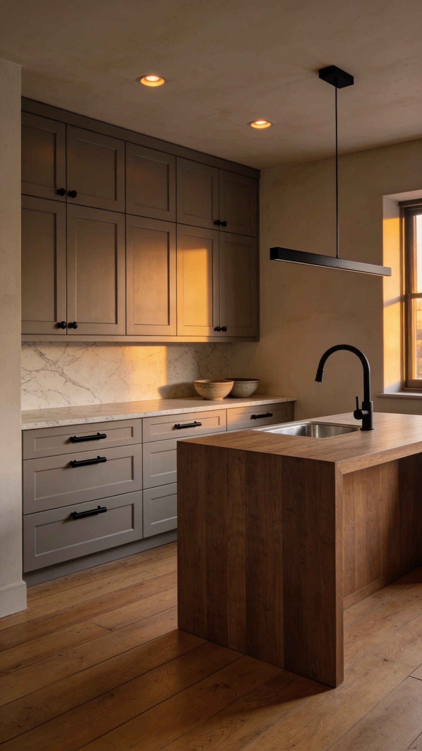
You want sophistication that doesn’t feel cold. But every time you try gray, it reads office-y, and every brown feels too rustic. Smoked clay taupe splits the difference with a subtle mauve-gray-brown undertone that looks editorial in any light. Paired with blackened steel hardware and walnut touches, the mood becomes quietly dramatic—art gallery meets working kitchen.
Here’s why it works in real homes: it flatters warm and cool counters, hides kid fingerprints better than dark paint, and pairs with existing stainless or black appliances. In morning light, it leans soft and clay-like; by evening, it deepens and frames your counters beautifully. Photos reward the tone-on-tone approach—taupe with walnut and black reads layered, not loud.
Variations include a condo-friendly version with only the island in smoked clay and perimeter cabinets in warm white; a deeper version skewing toward mauve-taupe for rooms with very cool daylight; and a renter path using removable cabinet skins in taupe plus stick-on black rails. If your floors are orange oak, this palette calms them—you’ll get instant harmony.
Budget Breakdown:
- Smoked clay taupe paint (2 gallons): $160–$320
- Blackened steel or matte black hardware: $140–$520
- Walnut edge banding or shelves: $80–$280
- Matte microcement-look backsplash (peel-and-stick panels): $130–$360
- Dim-to-warm under-cabinet lighting: $80–$220
Total Estimated Cost: $590 – $1,700
Best For: Open-plan homes, spaces with mixed woods, and anyone wanting a grown-up neutral with personality. Great across seasons.
Key Design Elements:
- Main materials: Satin taupe paint, matte black hardware, walnut shelves/accents
- Color palette: Smoked taupe, walnut, black, bone white
- Lighting strategy: Dim-to-warm task lights to shift from crisp prep to cozy dinner
- Furniture silhouettes: Slab cabinets with softened edges, low-profile pulls
- Texture layers: Matte paint, subtle grain walnut, microcement-look backsplash
- Accent details: One sculptural vase, black pepper mill, linen runner in bone
How To Recreate This Look:
- Start with smoked clay taupe in satin; check against your flooring at dusk to ensure it doesn’t redden too much.
- Add matte black or blackened steel pulls; keep shapes slim and linear.
- Layer walnut via floating shelf or a single edge-banded panel on the island.
- Install dim-to-warm LEDs under cabinets for mood control and evening glow.
- Style with bone-colored linens and one sculptural element to keep the look edited.
Why This Looks Expensive: It’s all undertone harmony. Taupe with walnut and black creates low-contrast layering, which reads custom. The matte finishes avoid glare, so your eye reads form and texture, not shine.
Watch Out: Skipping sample boards is the mistake. Taupe can swing purple or muddy fast. Paint a full door and look at it under your actual bulbs before committing.
Pro Styling Tip: Photograph with side light across the cabinet faces; the soft raking light reveals texture and makes the walnut glow.
Micro-story time: A friend spent weeks agonizing over a perfect “greige” and still hated it. The real issue? Her builder pendants cast a cone shadow right at cabinet height. We swapped them for frosted globes, warmed the bulbs, and suddenly the greige felt intentional—no repaint needed. Sometimes the fix isn’t more color; it’s better light.
Quick Checklist
- Test cabinet colors on a full door, not just the wall
- Choose hardware finish before finalizing paint undertone
- Confirm bulb temperature (2700–3000K) with your chosen color
- Add one grounding material (stone, wood, or fluting) for depth
- Repeat finishes at least twice for cohesion
- Keep counters 60–70 percent clear for a clean read
- Use under-cabinet lighting to control nighttime color
- Balance bold lowers with lighter uppers or backsplash
- Photograph with daylight and task lights, not overheads
- Edit decor to three hero items per zone
Frequently Asked Questions
How do I pick the right kitchen cabinet color if my counters and floors already clash?
Start by identifying undertones. If floors are orange-warm and counters are cool, choose a bridging neutral like putty greige or smoked clay taupe. Test large swatches near both surfaces at different times of day; your best pick will soften one and calm the other.
I’m on a tight budget—what’s the smallest change that makes the biggest visual difference?
Paint and hardware. Refinish the doors in a carefully tested color and install consistent pulls in a single finish. Add warm under-cabinet strips. That trio does the heaviest lifting for the least spend.
My kitchen is tiny and dark. Should I avoid bold or dark cabinets?
You can use dark lowers if you keep uppers light and reflective. Blue-black bases with a pale backsplash and bright task lighting can make the room feel deeper without shrinking it. Glossy or honed light counters help bounce light back.
What finish is best for painted cabinets—matte, satin, or semi-gloss?
Satin wins in real kitchens. It’s wipeable without the glare of semi-gloss, which shows every brushstroke. Matte photographs nicely but scuffs too easily if you cook daily.
I rent. How can I try one of these looks without losing my deposit?
Use removable cabinet skins or paintable temporary wallpaper on flat doors, swap in your own hardware and keep the originals, and add peel-and-stick backsplash panels. Restore everything when you move.
Your Turn: Start With One Door
The truth is, you don’t need a full renovation to feel the shift. One perfectly chosen cabinet color, paired with right-now hardware and honest lighting, can make the room feel finished. Texture and undertone do the quiet heavy lifting, and restraint keeps it looking premium.
Pick the palette that solves your pain point: warmth without yellow (oatmeal), drama that behaves (blue-black), life without loudness (herb green), resale-safe sophistication (putty), or artful calm (smoked taupe). Paint a single door, live with it for two days, and trust your eyes. You’re closer than you think.
When you walk in and your kitchen smiles back—that’s the win. You’ve got this. And when the light hits just right and you catch yourself taking a photo for no reason at all? That’s when you’ll know you chose the right color.

About the Author

Krisztina P.Rendes, Founder of Home Style Vibes
Founder of Home Style Vibes
Krisztina Puskásné Rendes created Home Style Vibes as a cozy-modern lifestyle space where homemaking meets inspiration. Her goal is to help women create beautiful, organized, and peaceful homes they truly love — without overwhelm. You’ll find here heart-driven content on home decor, cleaning tips, easy family recipes, organization and decluttering, DIY home projects, plants, and seasonal ideas — all designed to bring more calm, comfort, and style into everyday life.