8 Flower Arrangement Ideas for Birthdays Mother’S Day and Every Special Occasion
You know when a bouquet looks… fine, but not “stop-and-stare, snap-a-photo, who-designed-that” gorgeous? The stems slump, the colors fight, and somehow the whole thing feels more grocery run than grand gesture. Let’s fix that. These 8 flower arrangement ideas for birthdays, Mother’s Day, and every special occasion solve the exact frustration: how to make florals look designer-level—structured, sculptural, and wildly flattering to your space—without requiring a florist on speed dial.
Expect layered textures, intentional color stories, and sculptural shapes that bring your room to life (think powdery blush peonies against stoneware, inky ranunculus with brushed brass, meadowy wisps in smoked glass). These ideas elevate everything they touch—mantels, entry consoles, breakfast nooks—because they control height, shadow, and negative space like a pro. They’re Pinterest-bait photogenic and home-friendly in equal measure. If you love a look that reads sophisticated, soulfully romantic, and a tad editorial, you’re in the right place.
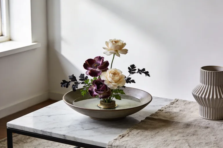
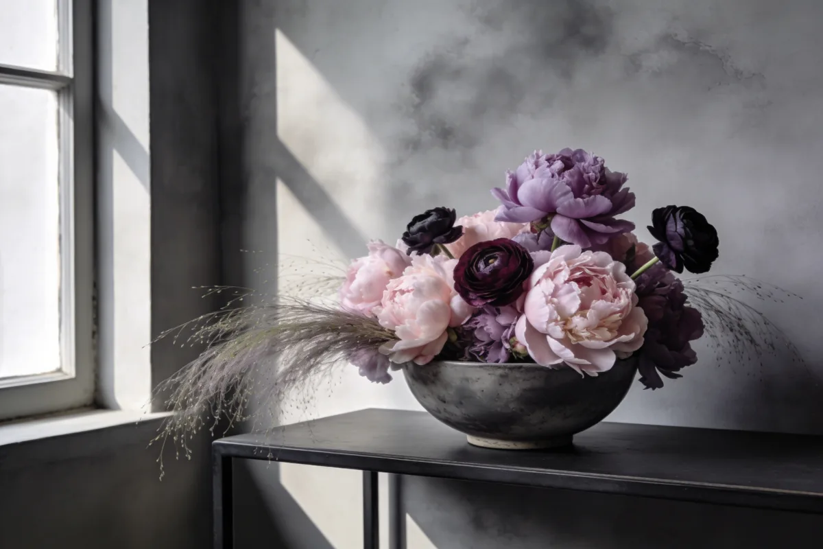
1. Moody Peony Cloud In A Low Stone Bowl
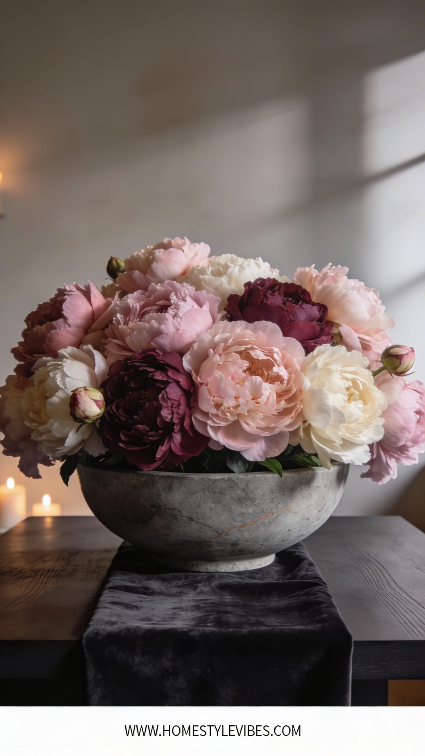
We’ve all been there: you plop peonies upright in a tall vase and they look stiff, like they’re waiting in line. This “cloud” solves that instantly. It creates a soft, luxe mood—think candlelit dinner, piano playing in the next room, velvet drapes grazing the floor. The low bowl lets blooms billow horizontally, like a romantic fog sitting over water, and the stone adds an earthy counterpoint that keeps the sweetness grounded. It thrives in real homes because it’s low-profile (hello, dinner table conversation) and works in small spaces without visually crowding a room. Place it near a window and watch petals glow; place it under warm dimmable lights and it turns cinematic.
Why it looks expensive: The shallow vessel gives you that designer trick—expansive spread instead of bouquet tower. The composition embraces negative space between blooms, creating those delicious petal-to-shadow gradients you see in editorial shoots. Stoneware or travertine bowls add weight and texture against soft peony ruffles, bridging DIY to high-end. Materials sing here: matte stone, silk-soft petals, wispy filler, and maybe one sculptural branch to add tension.
It photographs beautifully because the peony’s satin finish catches light at the edges, the bowl reads as a textural anchor, and the dome silhouette offers depth without blocking sightlines. Variations? Budget: swap peonies for garden roses + carnations in tonal shades. Small-space: scale down to a 6–8 inch bowl. Darker mood: use deep raspberry and burgundy peonies with a charcoal stone vessel. Renter-friendly: protect rented surfaces with a felt pad and use a frog or tape grid instead of floral foam.
Key Design Elements:
- Main materials: Low stone or travertine bowl, floral frog or clear tape grid, peonies, airy filler (asparagus fern or plumosa)
- Color palette: Shades of blush, shell pink, cream; for moodier, add wine or beetroot tones
- Lighting strategy: Side light for petal glow; dim ambient for moody shadows
- Furniture silhouettes: Round dining table, narrow console, coffee table tray
- Texture layers: Matte stone + silk petals + feathery filler
- Accent details (hardware, decor pieces, plants): Brass candleholders, linen runner, slim taper candles
How To Recreate This Look:
- Start with a low, heavy bowl and place a pin frog inside or create a tape grid across the rim.
- Add a base collar of greenery, keeping it low and slightly asymmetrical.
- Layer peonies in odd numbers, facing some slightly outward and some up for a cloud effect.
- Install a single thin branch (optional) to add height tension and a designer touch.
- Style with slim brass candlesticks and a linen runner to echo the softness.
Why This Looks Expensive: Depth and restraint. You’re not cramming—you’re sculpting negative space and letting premium textures breathe.
Common Mistakes To Avoid: Overfilling the bowl so the shape turns blob-like; skipping structure (frog/grid) so stems topple; mixing too many colors loses the cloud effect.
Pro Styling Tip: Shoot from table height with side light for petal translucency; pull a few petals forward to create foreground blur and depth.
Keep scrolling—next up is all about light-catching glass and draped stems that feel like silk in motion.
2. Hand-Tied Cascade In Smoked Glass
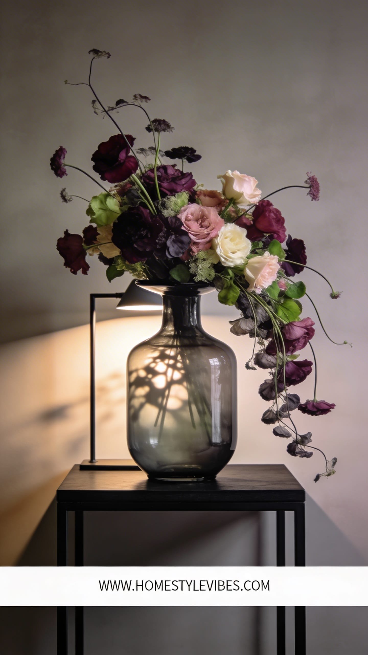
It’s that one bouquet that always looks rigid, like it forgot how to breathe. You’ve tried fluffing, but it still reads upright and formal. Enter the cascade: a hand-tied bundle designed to spill with intention. The mood is modern romantic—moody glass, elongated lines, and just enough drama to say “I’m the moment.” Perfect for entry tables and living room consoles because it draws the eye upward, making ceilings feel higher. Lighting loves smoked glass; warm lamps cast delicate shadows through the vase, creating ripples on your wall. Chef’s kiss.
Why it works in real homes: You can assemble it in your hand and drop it as one piece into the vase—fast and controlled. It suits narrow surfaces because it takes height over width, and the smoked glass hides stem chaos. Materials matter: ranunculus, lisianthus, trailing jasmine, and orchids for drape; smoked or amber glass for mood; maybe black ribbon to tie the neck. It bridges DIY to high-end with its shape: the cascade telegraphs floral fluency without complex mechanics.
Photogenic wins: the S-curve created by trailing stems. Deep glass adds contrast against light petals, making them pop. Variations? Budget: use alstroemeria + mums for body and trailing eucalyptus for flow. Small-space: keep the spread tight and emphasize vertical lines. Darker version: use inky calla lilies with deep plum ranunculus. Renter-friendly: stick felt pads under the vase to avoid surface scratches.
Key Design Elements:
- Main materials: Smoked or amber glass cylinder, hand-tied bouquet, trailing jasmine or amaranthus
- Color palette: Cream, blush, caramel with hits of chocolate or plum
- Lighting strategy: Place near a warm table lamp for wall shadows; avoid harsh overheads
- Furniture silhouettes: Narrow console, entry table, fireplace mantel
- Texture layers: Glossy glass + velvety petals + ribbon
- Accent details: Ceramic bowl for keys, framed art leaning behind for backdrop
How To Recreate This Look:
- Start with your hero blooms (ranunculus or roses) angled slightly forward in hand.
- Add support flowers around, keeping stems slanted to encourage the cascade.
- Layer trailing elements last so they fall naturally from the front and one side.
- Install a tight ribbon tie, snip stems evenly, and drop into a third-filled vase.
- Style with a lamp behind and a textured tray for a composed vignette.
Why This Looks Expensive: The silhouette. Designers use gravity and line to tell a story; the cascade reads authored, not accidental.
Common Mistakes To Avoid: Over-stuffing so nothing can drape; water too full so stems splay; ignoring backdrop clutter (it kills the drama).
Pro Styling Tip: Angle the bouquet so the cascade faces camera; backlight lightly to rim-illuminate trailing greens.
3. Meadow-In-A-Jug For Breakfast Nooks
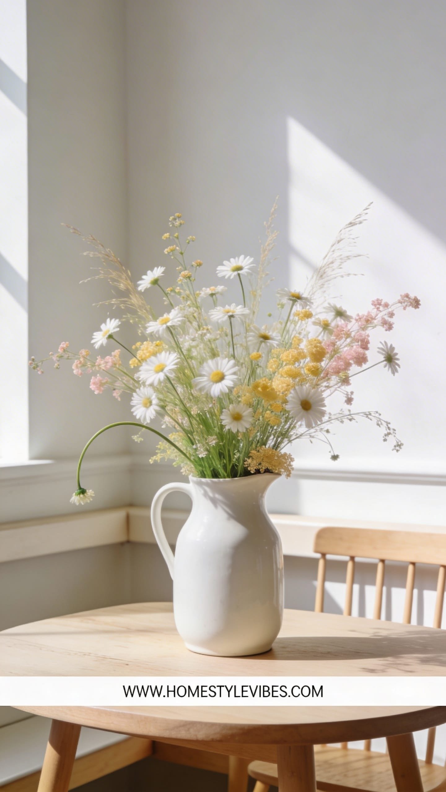
You’ve got the cutest nook but every bouquet you try feels formal or fussy. You’ve tried tulips in a straight line; it still looks like a conference room. The “meadow” brings a field-to-table mood—airy, sunlit, breakfast-with-honey vibes. It’s happy, unpretentious, and ridiculously charming. Real-home friendly? Completely. It’s all about light stems that last, easy water swaps, and an arrangement that looks intentional even as it loosens over the week.
Why it looks expensive: It channels European market flowers—mismatched heights, delicate blooms, and a ceramic or enamel jug that feels collected, not store-bought. Think chamomile, cosmos, sweet peas, nigella, and grasses. The jug’s matte or lightly speckled surface softens everything. Under morning light, petals look dewy and wild, the shadows soft and dancing.
Photographs beautifully because the mix of tiny and medium blooms creates micro-contrast and depth; negative space between stems lets background color peek through like sky between branches. Variations? Budget: daisies + baby’s breath + greenery. Small-space: single-color meadow (all white or all blush) in a smaller jug to avoid clutter. Darker version: moody meadow with scabiosa, chocolate cosmos, and smokey grasses. Renter-friendly: perfect—no mechanics, minimal mess.
Key Design Elements:
- Main materials: Ceramic or enamel jug, delicate wildflower mix, airy grasses
- Color palette: Buttery creams, soft blush, lemon, lavender; or monochrome white
- Lighting strategy: Natural morning light; avoid heavy overheads that flatten detail
- Furniture silhouettes: Bistro table, built-in bench, cafe chairs
- Texture layers: Matte ceramic + feathery blooms + linen napkins
- Accent details: Woven placemats, vintage sugar pot, citrus in a bowl
How To Recreate This Look:
- Start with the jug one-third full of water and a loose greenery framework.
- Add wispy stems in varying heights—think little hills and dips.
- Layer focal blooms sparingly; keep them scattered, not clumped.
- Install grasses last for playful movement and to catch the light.
- Style with a striped linen and a small plate stack for a lived-in feel.
Why This Looks Expensive: It feels “found” and seasonal, not staged. The jug reads artisanal; the airy structure reads designer restraint.
Common Mistakes To Avoid: Over-packing the jug; cutting all stems the same height; using glossy, heavy vases that fight the meadow vibe.
Pro Styling Tip: Photograph slightly overhead to capture the undulating heights; let a few stems arc beyond the frame for a candid, editorial edge.
Ready for drama? Let’s talk sculptural branches and minimalist restraint that screams gallery-level.
4. Single-Branch Statement In A Tall Cylinder
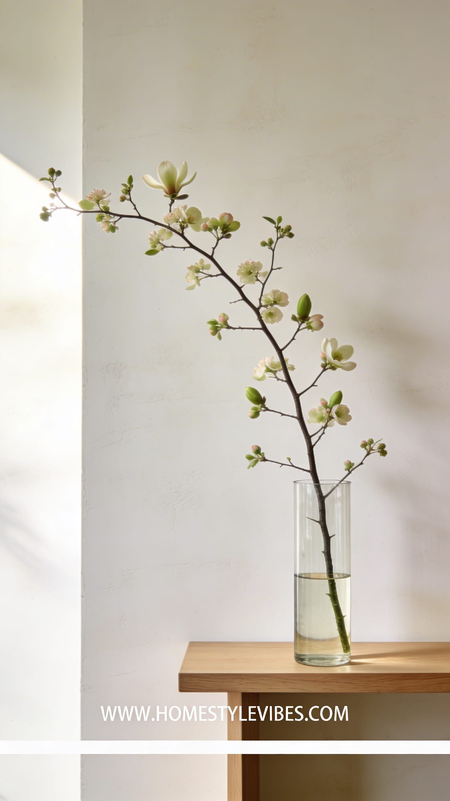
You’ve tried every bouquet on your sideboard and it still feels cluttered. Too many petals, not enough presence. The cure: one sculptural branch in a tall, clear cylinder. Mood-wise, it’s Japandi meets art gallery—calm, intentional, soothing. It works everywhere from narrow entryways to bedroom dressers because it keeps sightlines clean and floors the eye with silhouette and scale.
Why it looks expensive: Simplicity plus scale. A flowering quince, magnolia, dogwood, or forsythia branch wears blossoms like jewelry. In a clear cylinder, the long line of the branch becomes architectural. Lighting makes magic—side light throws dramatic shadows that crawl across your wall. Materials dominate quietly: glass, wood, and living sculpture.
It photographs beautifully because high-contrast lines read crisp, and the negative space around the branch turns into part of the composition. Variations? Budget: eucalyptus or curly willow. Small-space: use a medium cylinder and a single, slightly bent stem for asymmetry. Darker version: smokey glass with inky foliage (chocolate loropetalum). Renter-friendly: zero mess aside from the occasional petal—easy yes.
Key Design Elements:
- Main materials: Tall glass cylinder, single flowering or leafy branch, clear water
- Color palette: Natural greens with soft blossom color; smokey glass for mood
- Lighting strategy: Side or backlight to dramatize shadows; dim at night for silhouette
- Furniture silhouettes: Slim console, media unit, dresser
- Texture layers: Glossy glass + rough wood + smooth petals
- Accent details: Stacked books, stone tray, ceramic catchall
How To Recreate This Look:
- Start with the cleanest tall cylinder you own—no cloudiness.
- Add a heavy base stone or floral frog if needed for stability.
- Layer in one statement branch, trimming to skim the rim and arc upward.
- Install near a wall with space for shadow play.
- Style with low, quiet objects around it to keep focus on silhouette.
Why This Looks Expensive: It flaunts scale and restraint—two hallmarks of high-end design. Nothing looks accidental.
Common Mistakes To Avoid: Branch too small for the vessel; cloudy water; cluttered backdrop competing with the form.
Pro Styling Tip: Shoot at twilight with a single lamp behind or to the side—the branch reads like ink on paper.
5. Citrus-And-Cream Centerpiece With Footed Compote
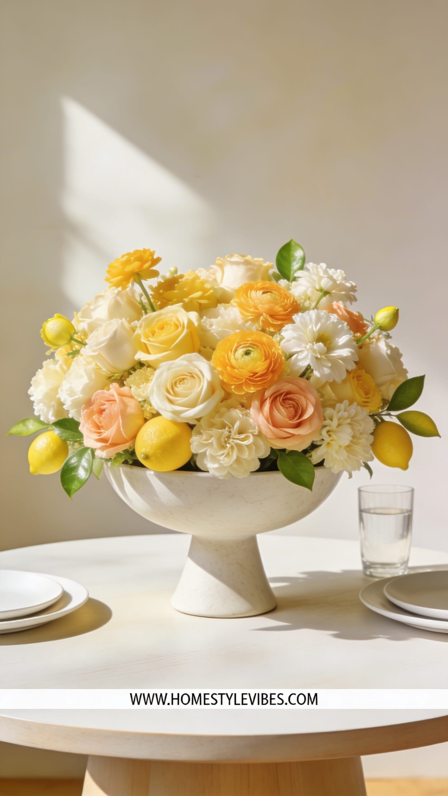
Birthdays, brunches, Mother’s Day—you want festive without going rainbow-confetti. You’ve tried mixed brights, but they clash with your tableware. This citrus-and-cream palette brings hotel-brunch polish: pale creams, butter yellow, soft apricot, and lemon leaves. The compote (a shallow bowl on a pedestal) gives you that lifted, chef’s-table look, ideal for round tables. It feels celebratory yet serene—like sunshine in good silk.
Why it works in real homes: The compote raises blooms above plates and makes small tables feel styled, not crowded. Lighting from overhead pendants gilds petals; candlelight tints creams to honey. Materials sing: ceramic compote, garden roses, ranunculus, poppies, and slices of actual citrus tucked in (or studded kumquats on skewers for whimsy). The elevated base prevents the “flat” look common with low arrangements.
Photogenic because pale tones glow against wood tables and the pedestal creates clean shadow beneath, adding depth. Variations? Budget: spray roses, carnations, and lemon leaves. Small-space: mini compote with just a handful of blooms. Darker version: add amber orchids or toffee roses. Renter-friendly: place a charger beneath to guard wood finishes from drips.
Key Design Elements:
- Main materials: Footed compote, kenzan/frog or tape grid, roses/ranunculus/poppies, citrus accents
- Color palette: Cream, butter, apricot, soft green
- Lighting strategy: Warm pendant light and candlelight for golden tones
- Furniture silhouettes: Round pedestal table, marble cafe table
- Texture layers: Smooth ceramic + velvet petals + glossy citrus
- Accent details: Linen tablecloth, ribbed glassware, brushed brass flatware
How To Recreate This Look:
- Start by securing a frog or tape grid inside the compote.
- Add a ring of greens to define the diameter and hide mechanics.
- Layer focal blooms, angling outward to build a gentle dome with dips.
- Install poppies and ranunculus last for movement; add skewered citrus tucked near the base.
- Style with a pale linen cloth and two taper candles for height rhythm.
Why This Looks Expensive: Tonal palette, lifted form, and real citrus accents read bespoke and editorial, not store-bought.
Common Mistakes To Avoid: Too many citrus pieces (it turns kitsch fast); overly tight dome; skipping negative space between heads.
Pro Styling Tip: Photograph at 45 degrees to capture pedestal shadow; place a lemon half just out of focus in the foreground for depth.
Now let’s go dramatic-minimal again—with orchids that look poured from a sculpture.
6. Minimalist Orchid Arc In A Matte Black Vessel
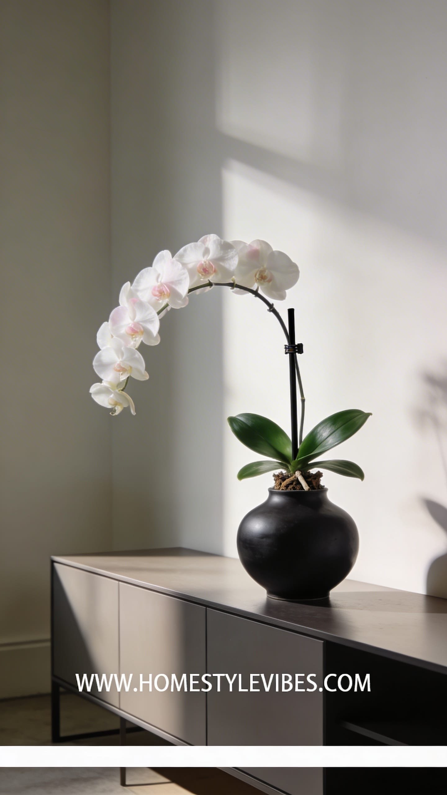
You’ve owned a supermarket orchid that looked “meh” on your shelf. You’ve tried centering it, but it felt timid. The fix? Re-pot or stage a phalaenopsis with intention in a matte black or charcoal vessel and train an elegant arc. The vibe is gallery-meets-lounge: serene, architectural, quietly opulent. Works in real homes because orchids last weeks with minimal fuss and love indirect light—perfect for sideboards and desks.
Why it looks expensive: Contrast. White or blush blooms against matte black looks editorial instantly. The arc of the stalk adds motion; moss at the base adds softness and hides plastic nursery pots. Lighting matters—a soft spotlight or nearby window highlights the orchid’s gloss without glare. Materials: matte ceramic, preserved moss, thin black stake or clear line to shape the arc.
Photogenic because the high-contrast palette pops and the arc reads as a clean line. Variations? Budget: one-stem orchid in a smaller pot with extra moss for fullness. Small-space: a single mini orchid on a stack of coffee table books. Darker version: deep plum orchid in soot-black vessel for moody drama. Renter-friendly: zero mess aside from the occasional petal.
Key Design Elements:
- Main materials: Phalaenopsis orchid, matte black vessel, preserved moss, thin stake
- Color palette: White, blush, or plum blooms with black/charcoal vessel and emerald foliage
- Lighting strategy: Bright indirect light or soft accent lamp to rim-light petals
- Furniture silhouettes: Low credenza, nightstand, built-ins
- Texture layers: Matte ceramic + glossy leaves + plush moss
- Accent details: Minimal brass object, hardcover books, small tray
How To Recreate This Look:
- Start by nestling the nursery pot inside the decorative vessel; fill gaps with moss.
- Add a slender stake behind the stem and gently guide an arc with clips or fishing line.
- Layer moss generously to hide mechanics and soften edges.
- Install near bright indirect light; avoid direct afternoon sun.
- Style with a single metal object for contrast and leave negative space around it.
Why This Looks Expensive: Restraint, negative space, and that perfect black–white contrast. It’s a design power move with one plant.
Common Mistakes To Avoid: Overwatering (yellow leaves), busy surroundings, shiny pots that reflect distractions.
Pro Styling Tip: Shoot from slightly below bloom height so the arc sweeps across the frame like calligraphy.
7. Bold Color-Block Tulips In Clear Cubes
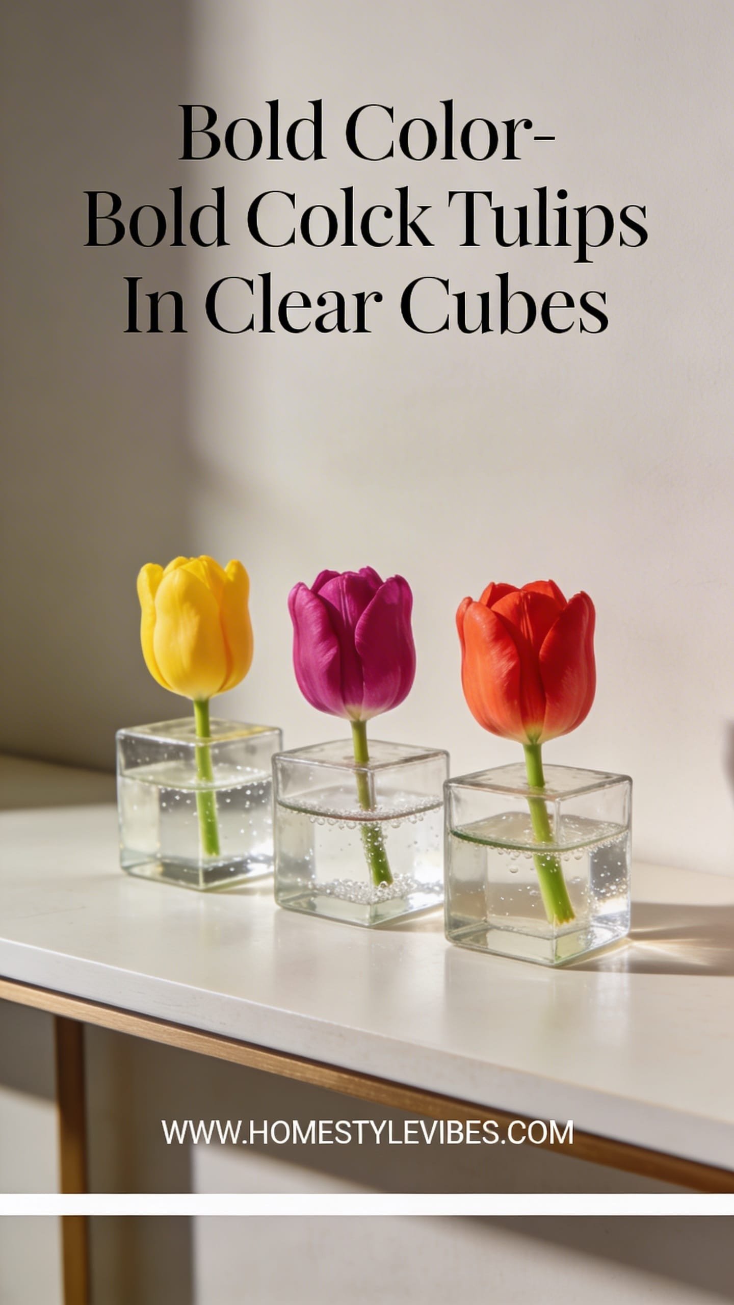
You love color but your mixed bouquets always go loud-then-louder. You’ve tried “a little of everything,” and it turns visual soup. Color-blocking solves it: one shade per vessel, lined up like art. The mood is modern, playful, and editorial—perfect for birthdays, showers, or a “we needed something fun” moment. Real-home perk: modular styling. Move cubes across a mantel, dining table, or island, and they always look intentional.
Why it looks expensive: Monochrome stems read curated. Clear cubes feel gallery-clean and show off tidy stem grids (use tape). Materials are simple: tulips in separate color families—magenta, orange, butter yellow, white. Lighting? Natural light keeps tulip petals crisp; evening lights warm them to a soft glow. Because cubes are low, you can talk across them at dinner without playing peekaboo.
Photogenic because repetition equals rhythm, and tidy stems in water add graphic interest. Variations? Budget: supermarket tulips, done. Small-space: one or two cubes flanking a candle. Darker version: berry and aubergine tulips in smoked cubes. Renter-friendly: 100%—no mechanics beyond tape.
Key Design Elements:
- Main materials: Clear glass cubes, tape grid, single-color tulips per cube
- Color palette: Bold, saturated singles—magenta, orange, yellow, white
- Lighting strategy: Diffused daylight or dimmable pendants; avoid direct hot sun
- Furniture silhouettes: Long dining table, fireplace mantel, kitchen island
- Texture layers: Clear glass + smooth stems + glossy petals
- Accent details: Modern candlesticks, lacquered trays, geometric napkins
How To Recreate This Look:
- Start by creating a tight tape grid over each cube’s rim.
- Add water and tuck tulips with a slight outward lean for volume.
- Layer cubes in a row, alternating heights if you have different sizes.
- Install candles or small objects between cubes to break up the line.
- Style with a neutral runner so the color does the talking.
Why This Looks Expensive: Editing. One color per vessel reads like an art installation rather than a mixed bouquet.
Common Mistakes To Avoid: Mixing colors in the same cube; letting tulips grow too tall without re-trimming (they’ll flop messily).
Pro Styling Tip: Photograph straight-on with even spacing; capture stem geometry through the glass for a graphic, magazine feel.
Craving drama with real movement? Let’s sculpt with anthurium and tropical leaves—hello, resort energy.
8. Tropical Sculptural Mix With Anthurium And Monstera
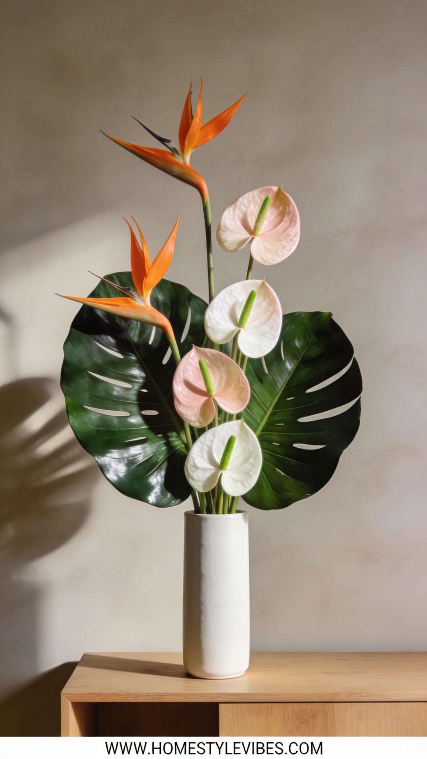
Your celebrations always skew soft and romantic—but sometimes you want bold, runway vibes. You’ve tried palms in a tall vase, but it felt hotel lobby. The fix is sculptural: anthurium, monstera, birds of paradise—curated, not crowded. The mood: modern tropical, crisp and confident. Great for milestone birthdays, warm-weather parties, or when your space needs a jolt of vacation energy. It thrives in real homes because tropicals last, shrug off heat, and make a room feel styled with fewer stems.
Why it looks expensive: Big shapes, minimal palette, and deliberate asymmetry. Use a heavy, wide-mouthed vessel—ceramic or stone—to counterbalance tall leaves. Lighting from above and behind creates cinematic highlights on anthurium’s glossy spathes; shadows carve out the negative spaces between leaves. Materials dominate: lacquer-slick petals, leathery greens, and a stone base for weight.
Photographs beautifully because the interplay of matte (monstera) and high gloss (anthurium) creates juicy contrast. Variations? Budget: mix a few hero tropicals with regular greenery (aspidistra, sword fern) for fullness. Small-space: one monstera leaf + 2 white anthurium in a narrow vase. Darker version: burgundy anthurium with deep green leaves in a charcoal vessel. Renter-friendly: protective coaster under heavy vessels.
Key Design Elements:
- Main materials: Wide vessel, anthurium, monstera leaves, bird of paradise or ginger
- Color palette: White or blush with emerald; or burgundy with inky greens
- Lighting strategy: Overhead and slight backlight for gloss highlights and dramatic shadows
- Furniture silhouettes: Kitchen island, entry pedestal, modern credenza
- Texture layers: Stone or ceramic + glossy spathes + matte leaves
- Accent details: Woven tray, rattan or cane elements, minimal sculpture
How To Recreate This Look:
- Start with a weighty vessel and a sturdy grid or chicken wire insert.
- Add your largest leaves first to outline height and negative space.
- Layer anthurium at different angles so light skims their surface.
- Install a single tall bird of paradise or ginger as a vertical exclamation point.
- Style with natural fiber accents and keep the surrounding surface clean.
Why This Looks Expensive: Monumental forms with fewer stems feel curated—and the high-gloss vs. matte duel looks designer-level.
Common Mistakes To Avoid: Overcrowding with too many varieties; short leaves that chop the silhouette; harsh direct sun that scorches petals.
Pro Styling Tip: Angle lights to catch gloss on anthurium and shadow the cutouts of monstera—instant editorial drama.
9. Soft Neutrals In A Textured Stone Vase With Dried Accents
You want something that lasts longer than a weekend but still feels alive. You’ve tried full-dry, but it felt dusty and sad. This hybrid marries fresh neutrals with dried textures—pampas, bunny tails, bleached ruscus—layered with white roses or lisianthus. The mood is cozy, curated, and softly organic, like a boutique spa lobby. It works beautifully in living rooms and bedrooms because neutrals calm the eye and dried elements extend the arrangement’s life gracefully.
Why it looks expensive: The stone vase’s texture sets a quiet, luxurious base and the tonal palette whispers rather than shouts. Lighting enhances the soft fray of pampas and the velvet of petals—think warm, indirect light or a reading lamp grazing the surface. Materials include limewash-like stone, buttercream blooms, and bleached botanicals that hold structure as the fresh stems age.
Photographs beautifully thanks to layered neutrals that capture shadow gradations and tactile appeal. Variations? Budget: carnations + baby’s breath with a few dried bits. Small-space: a mini stone vase on a nightstand. Darker version: taupe and toffee dried stems with toffee roses. Renter-friendly: dried elements shed—trim ends over a sink and give them a gentle shake before styling.
Key Design Elements:
- Main materials: Textured stone vase, pampas/bunny tails/bleached ruscus, white or cream roses, lisianthus
- Color palette: Ivory, oatmeal, warm taupe, soft gray
- Lighting strategy: Side lamp or diffused daylight to emphasize texture
- Furniture silhouettes: Upholstered sofas, fluted consoles, nightstands
- Texture layers: Limewash stone + frayed pampas + soft petals
- Accent details: Linen throw, travertine tray, ceramic candle
How To Recreate This Look:
- Start with dried elements to set height and silhouette.
- Add fresh neutrals in clusters, keeping them slightly lower than the dried stems.
- Layer smaller fillers (waxflower, baby’s breath) to soften transitions.
- Install a few longer dried wisps for movement and asymmetry.
- Style with tonal textiles nearby to extend the palette across the room.
Why This Looks Expensive: Textural layering in a tonal scheme feels bespoke, and the stone vessel reads artisan-made.
Common Mistakes To Avoid: Overly fluffy pampas that swallows the arrangement; mixing clashing undertones (cool gray with yellow-cream).
Pro Styling Tip: Backlight lightly so pampas halos glow—gives an ethereal, editorial softness.
We’re almost done—time to create a happy riot that still looks curated (yes, it’s possible).
10. Garden Party Riot—Layered Pastels With Vintage Pitchers
Special occasions beg for joy, but rainbow mixes can go chaotic fast. You’ve tried “a little of everything” and it screamed chaotic farmer’s market. The fix is a curated riot: layered pastels split across multiple vintage pitchers and jars, each with its own micro palette. The mood is English garden meets Paris flea—whimsy, nostalgia, and big-hearted charm. Perfect for birthdays, Mother’s Day brunch, or a baby shower.
Why it works in real homes: Multiple small vessels fit anywhere and make maintenance easy—replace one as it fades. Lighting bounces off different surfaces—milk glass, clear jars, chipped ceramic—for a collected glow. Materials: dahlias, garden roses, sweet peas, hellebore, mint, and fragrant herbs for sensory lift. It photographs beautifully because repetition plus variation creates rhythm—your eye dances from vessel to vessel.
Variations? Budget: supermarket roses split between jars with herbs from your yard. Small-space: three petite vessels clustered on a tray. Darker version: dusky mauve and plum pastels. Renter-friendly: felt pads under vintage pieces to protect wood.
Key Design Elements:
- Main materials: Assorted vintage pitchers/jars, mixed pastels, fragrant herbs
- Color palette: Blush, peach, lilac, butter, mint
- Lighting strategy: Scatter near windows for sparkle and life; add a few tea lights at dusk
- Furniture silhouettes: Long table, mantel, kitchen shelf
- Texture layers: Chippy ceramic + ruffled petals + feathery greens
- Accent details: Lace runner, scalloped plates, ribbon snippets
How To Recreate This Look:
- Start by selecting 3–7 vessels in varying heights and finishes.
- Add a distinct color story to each vessel (e.g., blush + cream; lilac + white).
- Layer fragrant herbs among blooms for movement and scent.
- Install vessels in a loose line or cluster, staggering heights.
- Style with vintage books and tea lights to tie the vignette together.
Why This Looks Expensive: Intentional micro-palettes read curated, not random—and vintage vessels add soul you can’t fake.
Common Mistakes To Avoid: One giant color jumble; too many tall pieces blocking sightlines; ignoring vessel proportion to bloom size.
Pro Styling Tip: Shoot diagonally across the line of vessels so the perspective compresses into a lush, layered look.
11. Monochrome Drama—All-Red Ranunculus In Brass
You want impact that reads mature, not Valentine’s cliché. You’ve tried mixed reds and it went “holiday.” The fix: a strict monochrome of red ranunculus in a brushed brass vase. The mood is evening-cocktail-lounge and velvet-banquette chic. It works in living rooms and dining spaces where you want atmosphere, not noise. Brass warms the red, while ranunculus layers add dimensional petals that avoid flatness.
Why it looks expensive: Metal + monochrome. Designers lean into one saturated note and support it with luxe materiality. Side lighting makes each petal curl glow like lacquer. Materials: brushed brass vessel, deep red ranunculus, maybe a touch of chocolate cosmos for depth—but keep it 95% red.
Photographs beautifully because the brass reflects soft highlights while the red saturates the frame. Variations? Budget: carnations in a tight, abundant dome. Small-space: a compact cylinder with 10–12 stems. Darker version: mix in black scabiosa heads. Renter-friendly: felt coaster under brass to prevent marks.
Key Design Elements:
- Main materials: Brushed brass vase, red ranunculus, minimal filler
- Color palette: Red on red with warm metallic
- Lighting strategy: Soft side light or candlelight to avoid harsh specular shine
- Furniture silhouettes: Round side table, mantle corner, bar cart
- Texture layers: Brushed metal + layered petals
- Accent details: Cut crystal glasses, dark wood tray
How To Recreate This Look:
- Start with a medium-height brass vase and fill two-thirds with water.
- Add stems in a tight spiral, trimming gradually to create a dome with natural dips.
- Layer a few taller stems for skyline variation.
- Install near moody lighting; polish the brass before styling.
- Style with crystal and a dark napkin for a cinematic vignette.
Why This Looks Expensive: Saturation, restraint, and the glow of warm metal evoke high-end hospitality design.
Common Mistakes To Avoid: Mixing pinks in; using shiny, fingerprinted brass; letting heads sit at one flat height.
Pro Styling Tip: Slightly underexpose the photo to keep reds rich and preserve highlight detail on the brass.
Last but not least, the forever crowd-pleaser that suits literally any room: hydrangeas done right.
12. Effortless Luxe—Hydrangea Mounds In Oversized Ceramic
You buy hydrangeas because they’re easy volume, but you end up with floppy heads and awkward gaps. You’ve tried stuffing more in; it only makes a lumpy snowball. The solution: go oversized on the vessel and build a true mound with support. The mood is Hamptons-meets-boutique-hotel: crisp sheets, sunlit floors, iced latte on the counter. Real-home friendly because hydrangeas, when conditioned properly, last and fill space cost-effectively.
Why it looks expensive: Scale and uniformity. One or two colors—white and green is a favorite—stacked into a cohesive, plush dome. A big ceramic or stoneware vase grounds the fluff. Lighting likes hydrangeas: they catch broad, soft highlights, making rooms look fresher and bigger. Materials include oversized ceramic, 12–20 stems of hydrangea, and a frog or grid for structure.
Photographs beautifully because the tight mound creates graphic volume and clean curves. Variations? Budget: mix in a few larger leaves or a touch of baby’s breath for fill. Small-space: half-mound in a medium cylinder. Darker version: deep blue hydrangeas in a charcoal vase for dramatic coastal vibes. Renter-friendly: protect surfaces; hydrangeas can drip when you refresh water.
Key Design Elements:
- Main materials: Oversized ceramic vase, hydrangea (white and/or green), support grid
- Color palette: White, green, or blue; keep it simple
- Lighting strategy: Bright but diffused light; avoid direct blasting sun
- Furniture silhouettes: Kitchen island, entry console, coffee table
- Texture layers: Smooth ceramic + pillowy blooms
- Accent details: Woven basket nearby, linen runner, coffee table books
How To Recreate This Look:
- Start by conditioning hydrangeas: cut stems under water, hydrate for an hour, and mist heads.
- Add a tape grid to the vase for structure.
- Layer stems in a spiral, alternating heights slightly to form a true mound.
- Install filler greens deep in the base only if needed—don’t interrupt the dome.
- Style with a simple candle and one hardcover stack for a clean, classic vignette.
Why This Looks Expensive: Big, cohesive volume with minimal palette looks tailored and calm—never fussy.
Common Mistakes To Avoid: Mixing too many colors; under-hydrating (causes flop); using a vase that’s too small and top-heavy.
Pro Styling Tip: For photos, fluff and rotate heads so petals face the camera; shoot in soft daylight for that fresh, crisp “hotel lobby” feel.
Here’s the real talk: arranging flowers isn’t about being “crafty.” It’s about mood-setting. When you nail silhouette, texture mix, and lighting, your florals do the heavy lifting—softening corners, brightening mornings, and turning a simple table into a celebration. Pick one idea from this guide and try it this week. Start with the vessel and vibe, then edit like a designer: fewer colors, more intention, one strong silhouette.
Luxury lives in texture + lighting + restraint. Let stone meet silk petals, let glass catch the waterline, and let shadows do their quiet theater on your walls. Whether you’re styling a birthday brunch, surprising Mom on Mother’s Day, or just elevating Tuesday, these flower arrangement ideas bring soul and sophistication to your space—no florist required. Slow down, place that stem with care, and watch your home exhale. Seriously—when the petals catch golden hour just right, it feels like a little miracle you made yourself.