7 Creative Flower Arrangements That Look Like They Cost a Fortune—Steal the Look
You want the lush, editorial flowers—the kind that make your entry glow at golden hour and your dining table look like it’s expecting an art critic. But the pain point? Store-bought bouquets read skimpy and flat at home, and those fancy arrangements cost more than your weekly groceries. Consider this your secret menu: seven creative flower arrangements that look like they cost a fortune, minus the markup.
We’ll layer textures like frilled petals against matte ceramic, play with light so blooms actually glow, and build sculptural silhouettes that feel couture. Think smoky mauves, creamy vanillas, inky greens; raw linen runners, fluted vessels, unlacquered brass frogs. These designs fix the “why doesn’t this ever look good in my house?” frustration with styling strategies that deliver high-impact, Pinterest-collectable results. Perfect if you love a quiet-luxury vibe, host minimalist dinner parties, or just want your coffee table to flirt with the morning sun.
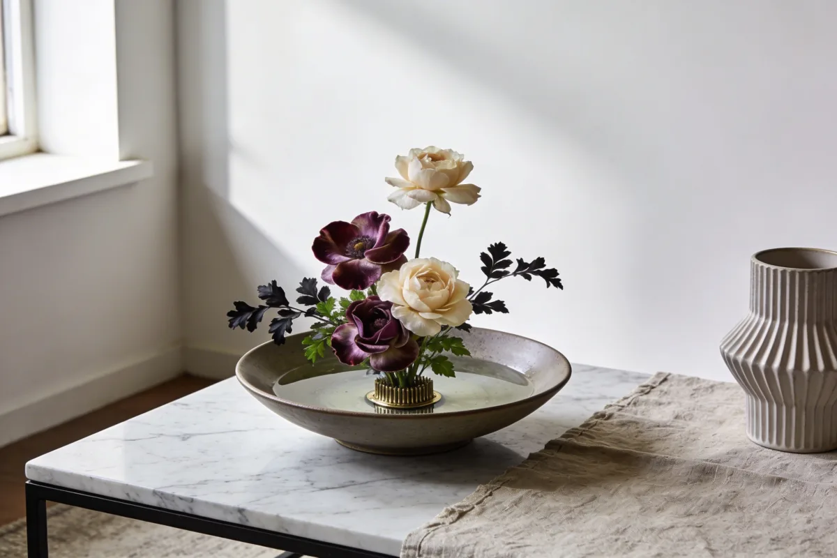
1. Low, Luxe Ikebana Bowl With Velvet Petals And Airy Negative Space
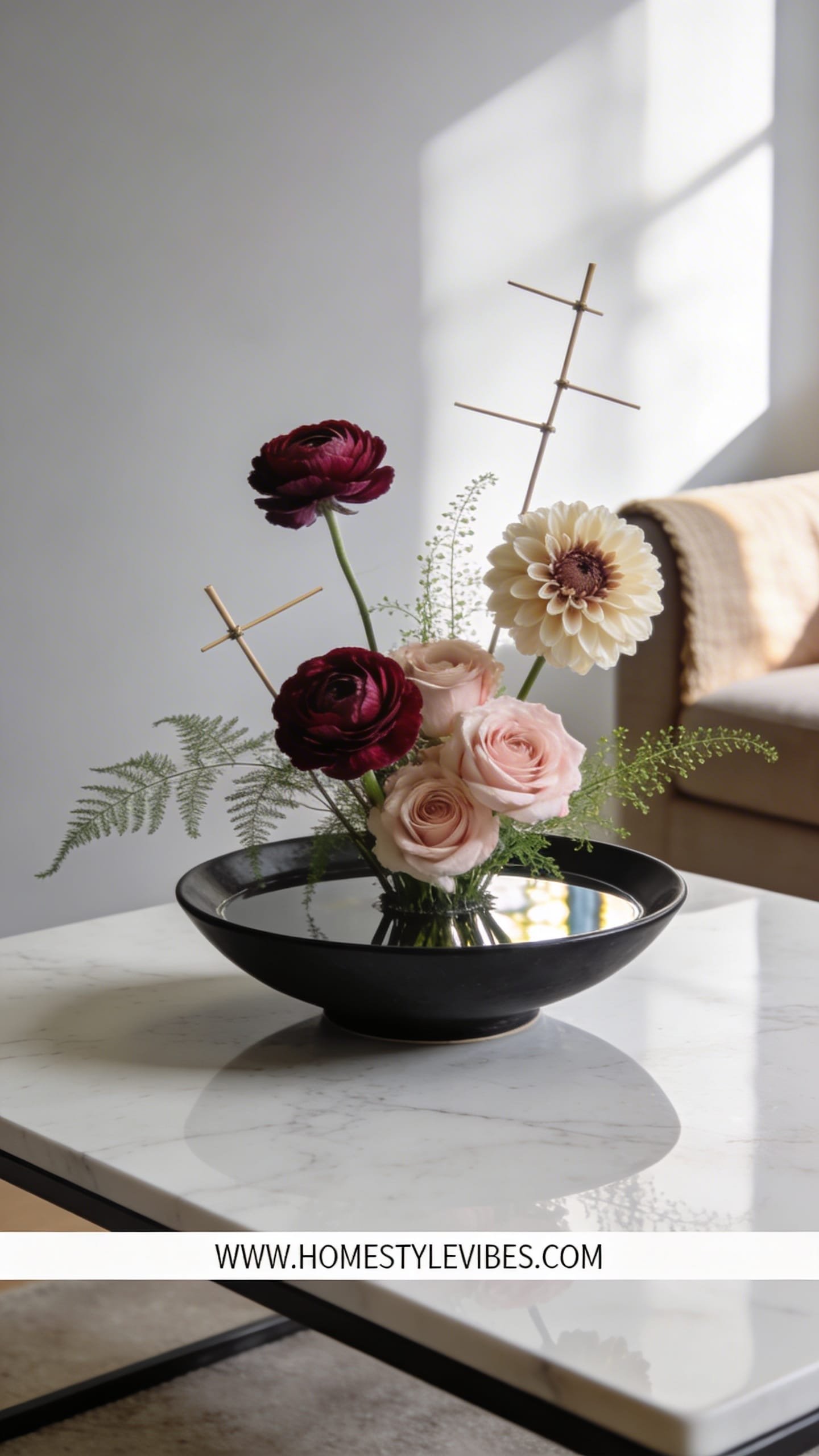
We’ve all been there: you plop a grocery bouquet in a tall vase and it looks… wobbly and top-heavy. This low, sculptural arrangement flips that dynamic. Inspired by ikebana but softened for a modern home, it creates a calm, gallery-like mood—perfect for a marble coffee table, a console, or a nightstand where you want serenity rather than height. It works in real homes because the footprint stays compact, the water surface reflects natural light beautifully, and the composition holds its shape for days with fewer stems.
By keeping blooms low and intentional, the light skims across petals and water, throwing poetic shadows at dusk. The palette leans refined: taupe roses, butter ranunculus, mauve sweet peas, and dark ruscus for depth. A matte ceramic or stone bowl feels quiet-luxury and hides mechanics. It’s easy to maintain—simply top up water and snip ends—plus it makes even budget flowers feel considered.
Why It Looks Expensive: Negative space is the magic. High-end designers pay attention to the “air” around each bloom, not just the quantity. Using a kenzan (flower frog) or a grid with waterproof tape creates angles and discipline that bridge DIY with pro-grade structure.
Materials skew tactile: matte stoneware bowl, pin frog, silky-petaled flowers like ranunculus, tulips, or anemones, and one inky foliage to anchor contrast. This setup photographs beautifully because of horizontal lines, surface reflections, and layered heights that create micro-shadows and painterly depth.
Variations:
– Budget-friendly: Use one hero flower (carnation in a single shade—trust me) en masse with two stems of foliage for structure.
– Small space: A cereal-bowl-sized dish with three tulips and two sprigs of seeded eucalyptus can read editorial.
– Renter-friendly swap: If a frog feels intimidating, tape a 1-inch grid across the bowl top; it’s invisible in photos.
Key Design Elements:
- Main materials: Stoneware bowl, pin frog or tape grid, silkier-petal blooms
- Color palette: Taupe, butter, mauve, inky green or near-black
- Lighting strategy: Low side light to skim the water and petals; avoid overhead glare
- Furniture silhouettes: Low coffee tables, console shelves, nightstands with clean lines
- Texture layers: Matte bowl, glossy water, velvet petals, subtle foliage sheen
- Accent details (hardware, decor pieces, plants): Burnished brass tray, linen coaster, single ceramic incense holder nearby
How To Recreate This Look:
- Start with a low, wide bowl and anchor a pin frog in the center with floral clay or museum putty.
- Add water until it just covers the frog; you want a reflective surface.
- Layer your focal blooms first at varying angles—one upright, one slanted, one almost horizontal.
- Install textural fillers sparingly (one or two stems) to connect forms without crowding.
- Style with one deep-toned foliage stem that arcs, creating a shadow line and a sense of movement.
Why This Looks Expensive: The discipline of fewer stems plus strong angles creates a sculptural silhouette. You can see every choice, which reads curated, not chaotic.
Common Mistakes To Avoid: Don’t fill the bowl edge-to-edge or drown short stems. Keep the waterline clean; floating debris kills the luxe vibe fast.
Pro Styling Tip: Shoot from a low angle so the bowl horizon and the arc of stems create layered negative space with reflected light.
Curious how to make color feel couture, not chaotic? Keep scrolling—next comes tonal magic with drama.
2. Monochrome Cloud: One-Color Bouquet With Tone-On-Tone Depth
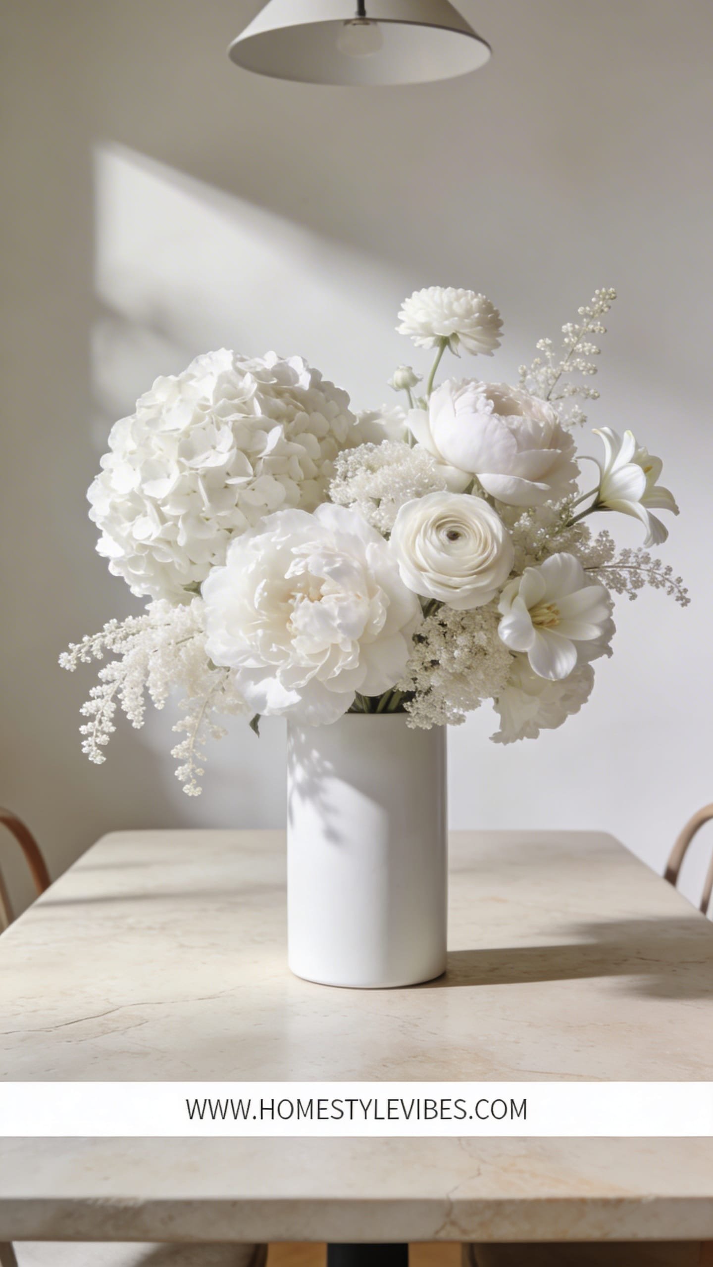
It’s that one corner that always feels busy—too many colors, too many shapes—and any bouquet you place there screams “noise.” A monochrome arrangement calms the entire zone while still packing drama. Choose one color family (think all whites, all blush, all plum) and stack textures inside that spectrum. The vibe? Quiet luxury meets editorial minimalism. This works for dining tables, entry consoles, or kitchen islands where you want cohesion and a strong silhouette.
Lighting matters: a single-tone bouquet lets light carve contours instead of competing hues. Whites glow under warm lamps; blush reads romantic in morning light; dark plum turns moody at twilight. In real homes, monochrome plays well with existing decor—no clashing with rugs or art—so the flowers look integrated and thought-through.
Why It Looks Expensive: Designers love restraint. When you limit color, you highlight form and petal quality. Mixing varieties—like roses, ranunculus, stock—within one palette shouts couture without shouting color.
Materials: Smooth glass or glossy ceramic vase for a polished finish; cluster petals with ruffles against smoother blooms; add a feathery filler like astilbe for dimension. It photographs beautifully because the camera picks up tonal shifts and micro-textures instead of being overwhelmed by hue.
Variations:
– Budget-friendly: Supermarket roses + baby’s breath (dyed or natural) all in white reads bridal-chic at home.
– Small-space: A squat, rounded vase with five peony heads in the same shade feels abundant.
– Darker version: All aubergine and burgundy with near-black scabiosa for moody depth.
Key Design Elements:
- Main materials: Glossy vase, color-coordinated blooms in multiple textures
- Color palette: Single hue in 3–5 tones (e.g., ivory, cream, chalk white)
- Lighting strategy: Warm table lamps or window side-light to emphasize texture
- Furniture silhouettes: Simple, clean-lined tables that let the form stand out
- Texture layers: Ruffles (ranunculus), smooth (roses), feathery (astilbe)
- Accent details: Linen runner in a slightly darker tone; unpolished stone coasters
How To Recreate This Look:
- Start with one color family and source 2–3 flower varieties in that hue.
- Add foliage only if it matches the chroma (dusty eucalyptus for blush, olive for cream).
- Layer by height: tallest stems in the center, softly cascading edges.
- Install a spiral technique: angle stems clockwise so the bouquet locks and spreads evenly.
- Style with a coordinating ribbon or a narrow ceramic frog ring to keep structure tight.
Why This Looks Expensive: Unity reads intentional. The tonal gradient creates natural highlights and shadows that feel editorial.
Common Mistakes To Avoid: Mixing whites with stark, blue-white faux florals can look cheap. Stick to cohesive undertones—warm with warm, cool with cool.
Pro Styling Tip: Photograph against a backdrop one shade darker than your bouquet to let edges glow without blowing out highlights.
Love drama without the clutter? Let’s dial in architectural lines with unexpected ingredients.
3. Branch & Bloom Sculpture In A Tall Cylinder (Architectural But Soft)
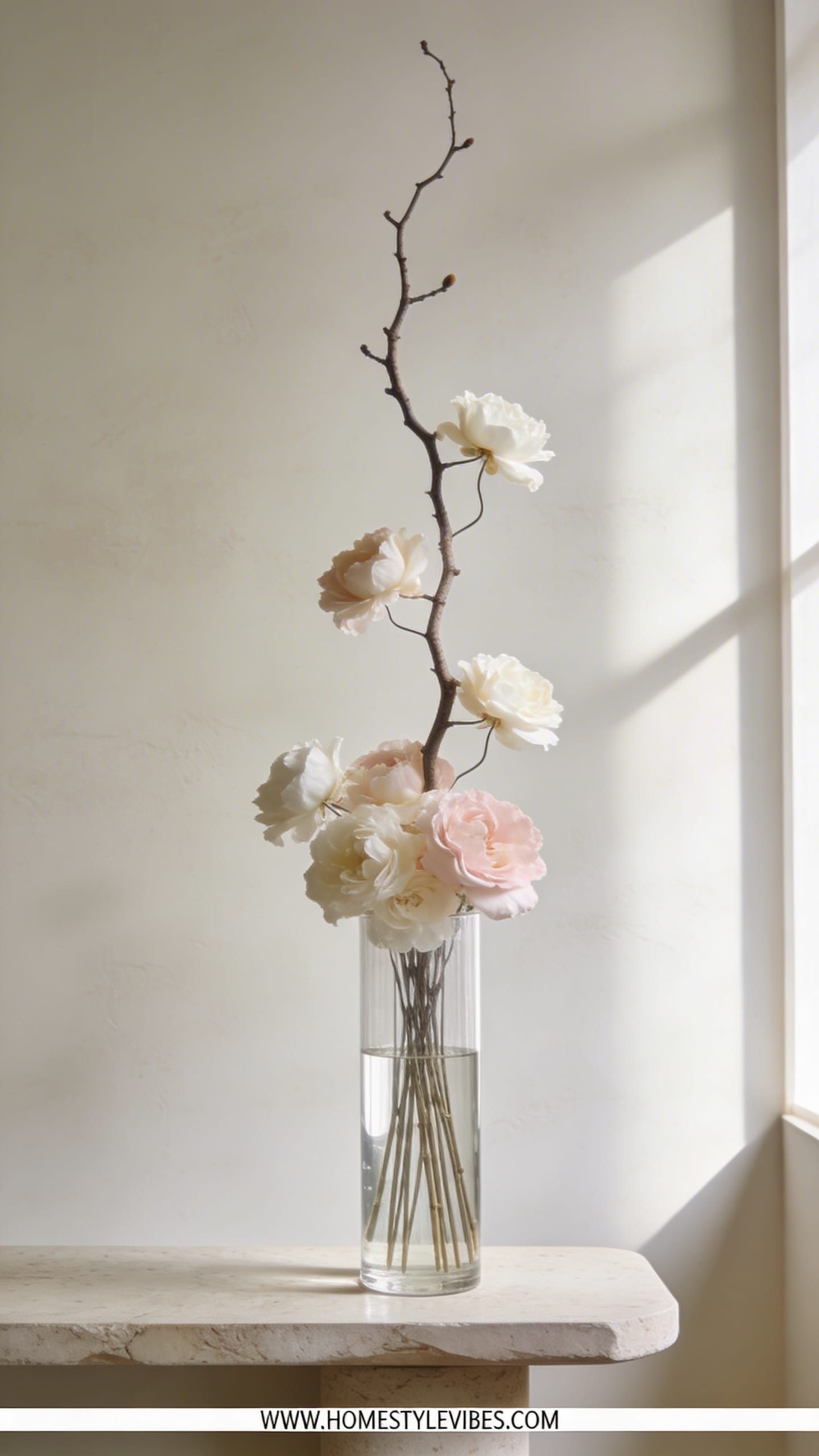
You’ve tried stuffing a tall vase full, but it still looks like a floral chimney. The fix? Give your flowers a framework—branching. This design pairs one dramatic, sculptural branch (think quince, forsythia, magnolia, or curly willow) with a handful of luxe blooms riding along the lines. The mood feels modern Japanese meets gallery loft, ideal for entryways, double-height spaces, or anywhere you crave vertical poetry.
It works because branches create height and negative space without bulk. Light grazes along the limbs and opens sightlines so the arrangement breathes. Use 5–7 hero flowers—ranunculus, peonies, anthurium—clipped at different heights, hugging the branch structure. Your cylinder should be heavy-bottomed or weighted with pebbles for stability.
Why It Looks Expensive: Scale + restraint. Using one oversized natural element with curated blooms mimics editorial styling you see in boutique hotels. It whispers, it doesn’t shout.
Materials: Tall glass cylinder, river stones, sculptural branch, luxe flowers with clean forms. Photography perks include dramatic silhouettes and crisp linear shadows at sunrise or golden hour.
Variations:
– Budget-friendly: A found branch (bake or scrub clean) with three stems of supermarket lilies—remove pollen for a sharp look.
– Small-space: A narrower, 12–14-inch vase with a single orchid stem and a slim branch for a slim profile.
– Renter-friendly: Use clear floral tape to grid the top of the cylinder for easy stem control.
Key Design Elements:
- Main materials: Tall cylinder vase, sculptural branch, 5–7 hero blooms
- Color palette: Neutrals + one accent (e.g., soft white blooms with a blush or persimmon pop)
- Lighting strategy: Backlight or side light to cast elongated shadows
- Furniture silhouettes: Console or pedestal to showcase height
- Texture layers: Smooth petals, woody branch, glossy water, stone base
- Accent details: Minimal tray, ceramic catchall, single art book for scale
How To Recreate This Look:
- Start with a cleaned, stable branch. Weight the vase with stones and fill with water.
- Add the branch first, angling it to create asymmetry and movement.
- Layer in blooms at varying heights along the branch’s path—some high, some low.
- Install a single foliage stem near the base to soften the transition.
- Style with negative space on one side; don’t center everything. Let one line “escape.”
Why This Looks Expensive: The branch gives you architectural lines; fewer flowers look intentional, not sparse. It’s the difference between volume and presence.
Common Mistakes To Avoid: Don’t overstuff around the branch; you’ll lose the air. Avoid flimsy vases—top-heavy arrangements tip easily.
Pro Styling Tip: Shoot against a light wall and tilt the camera slightly so the branch line leads the eye diagonally across the frame.
Ready for something grand and romantic without the cost of a flower field? Let’s go cascading.
4. Asymmetrical Cascade With Trailing Vines In A Footed Urn
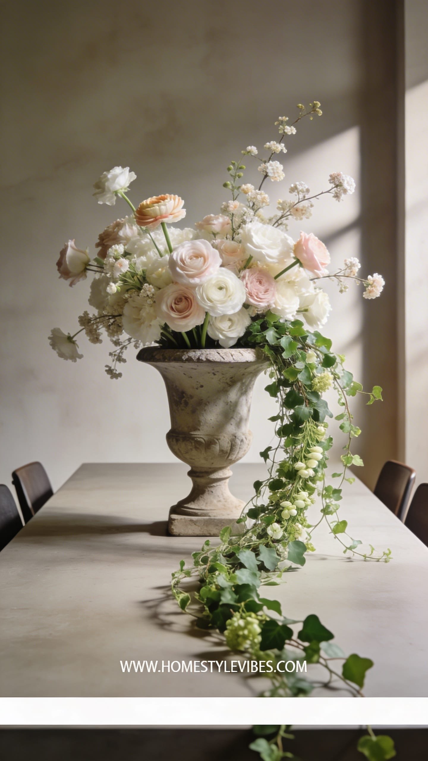
It’s that dining table centerpiece that either blocks faces or flattens out like a salad. An asymmetrical cascade solves it by sending drama to one side and keeping sightlines open. The vibe leans modern-romantic: think old-world urn meets editorial looseness. Perfect on long tables, mantels, or buffets where you want lush movement without a wall of stems.
This works because the footed urn gives you height without tall stems, and trailing greens—Italian ruscus, jasmine, ivy—create a waterfall effect. Place heavier blooms low and inward; let lighter, delicate flowers float on the long side. Light and shadow play along the curve, making the arrangement glow from every angle.
Why It Looks Expensive: The asymmetry is styled, not messy. You’re sculpting weight on one side and air on the other, which looks like a florist touched it (because that’s exactly what florists do).
Materials include: a footed urn (cement, resin, or matte ceramic), floral foam or a reusable chicken-wire mechanic, lush blooms (garden roses, peonies), and textural accents (sweet peas, butterfly ranunculus). It photographs beautifully from the front and three-quarters because the cascade reads as a gentle S-curve.
Variations:
– Budget-friendly: Carnations (dyed or natural) with lots of trailing greens—carnations ruffle like couture when grouped.
– Darker version: Wine dahlias, black scabiosa, chocolate cosmos with ivy.
– Renter-friendly: Skip foam and use chicken wire; it’s eco-friendlier and easy to reset.
Key Design Elements:
- Main materials: Footed urn, chicken wire or foam, trailing greens, lush focal blooms
- Color palette: Soft romance (blush, cream, dusty rose) or moody jewel tones
- Lighting strategy: Candlelight for warmth; side windows for softness
- Furniture silhouettes: Long tables, buffets, mantels with breathing room
- Texture layers: Ruffled petals, fine vines, matte urn versus glossy blooms
- Accent details: Brass candlesticks, linen runner, low votives to echo the cascade
How To Recreate This Look:
- Start by securing chicken wire inside the urn and filling with water.
- Add your trailing greenery first, defining the long side and soft drape.
- Layer heavy blooms low and toward the center; let some peek over the rim.
- Install lighter, airy blooms along the cascade line, tapering toward the ends.
- Style with a few buds at the highest point to balance the visual weight.
Why This Looks Expensive: Intentional imbalance reads custom. The footed base adds shadow and height, making the whole piece feel like an heirloom.
Common Mistakes To Avoid: Don’t weigh down the tip of the cascade; keep it light and tapering. Avoid stiff greens; you want flow, not wires.
Pro Styling Tip: Place a votive just below the longest vine—its flame catches the leaves and adds a guiding sparkle in photos.
Want something ultra-lush but shockingly affordable? We’re going to hack abundance next.
5. Market Bunch Remix: Luxe Layering With Supermarket Stems

You’ve grabbed three mixed bouquets and somehow it still looks like “grocery store in a vase.” The remix trick elevates basics by editing, batching, and layering. The mood: relaxed-luxe, effortless but intentional—like you passed a flower market on a Paris side street (we can dream). It’s wildly practical and family-friendly; you can refresh a few stems midweek and keep the look going.
This works because you separate by species and color, then build sections of mass. Grouping creates impact and clarity, while a strong filler greenery creates a base cushion. Lighting-wise, set it near a window where petals pick up translucency; avoid harsh overheads that flatten cheap blooms.
Why It Looks Expensive: Editing. High-end arrangements don’t mix five colors evenly. They cluster and layer to create rhythm—your eye moves from mass to mass, not ping-pong between random bits.
Materials: One substantial vase (fluted glass, stoneware), three supermarket bunches (pick a dominant color and one supporting), one structural green (eucalyptus, olive, pittosporum). Photographs shine thanks to density differences—tight clusters next to airy sprigs create depth.
Variations:
– Budget-friendly: Two bunches of the same flower + greens. Simplicity wins.
– Small-space: Split the stems into two mini arrangements for a bedside and bath moment.
– Renter-friendly: Use a wide-mouthed pitcher; it props stems naturally without wire or frogs.
Key Design Elements:
- Main materials: Supermarket stems, one hero vase, strong greenery base
- Color palette: Dominant hue + supporting accent; avoid rainbow mixes
- Lighting strategy: Indirect daylight; a table lamp at night for soft glow
- Furniture silhouettes: Kitchen island, round dining table, coffee table tray
- Texture layers: Smooth rose petals, feathery fillers, waxy greens
- Accent details: Linen napkins tucked nearby, fruit bowl in a complementary tone
How To Recreate This Look:
- Start by stripping leaves and trimming stems at an angle.
- Add greenery first to create a loose dome that hides mechanics.
- Layer your main flower in clusters of 3–5 stems together for impact.
- Install the secondary flower between clusters, not evenly around.
- Style with one or two airy accents (like snapdragon tips) to break the dome slightly.
Why This Looks Expensive: Clustering and hierarchy turn “grab bag” into “composed.” The vase choice—substantial and textural—does a lot of heavy lifting.
Common Mistakes To Avoid: Don’t cut all stems the same length; you’ll end up with a perfect (boring) ball. And toss mixed plastic sleeve fillers that look fake or neon.
Pro Styling Tip: Shoot from slightly above to capture the clustered rhythm and peek of the vase lip for context.
Craving old-world charm without the museum vibe? Let’s thrift our way to chic.
6. Vintage Vessel, Wild Meadow: Thrifted Jug With Loosely Gathered Stems
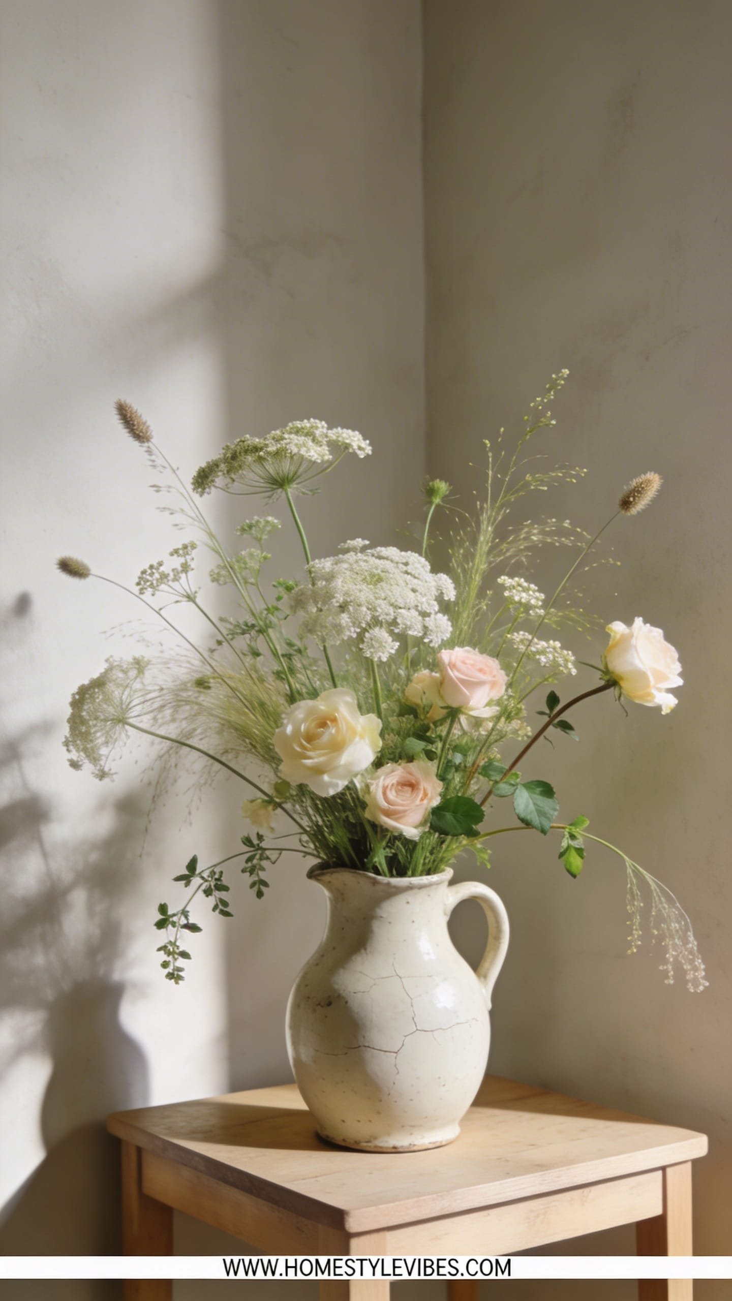
You’ve got a charming corner that never commits—too staged with a perfect bouquet, too messy with a random jar. Enter the vintage-meets-meadow moment. A thrifted jug or pitcher, a few wild-feeling stems, and a loose gather that looks like you just returned from a weekend in the countryside. The mood reads English cottage meets Scandinavian ease. It’s easy to maintain and incredibly forgiving—stems can be imperfect, and that’s the point.
It works in real homes because the vessel tells a story—chips and patina add character—and the informal shape loves small spaces. Place it on a bookshelf, an entry bench, or a kitchen counter next to stoneware crocks. Light catches on varied heights and lacy textures, creating a romantic vignette that never tries too hard.
Why It Looks Expensive: Authenticity and restraint in color. You’ll choose a tight palette (soft greens, whites, blush) and rely on shape and movement to carry the drama, not twenty different species.
Materials: Thrifted jug, meadowy stems (queen Anne’s lace, chamomile, cosmos), and a supporting “waist” flower (spray roses or small dahlias). It photographs like a lifestyle editorial: layered objects, soft shadows, linen textures nearby.
Variations:
– Budget-friendly: Daisies + baby’s breath + herbs from your fridge (mint! rosemary!) look and smell divine.
– Darker version: Chocolate cosmos, burgundy sweet peas, bronze fennel for moody meadow vibes.
– Renter-friendly: Pop a watertight glass cup inside a porous vintage jug to protect surfaces.
Key Design Elements:
- Main materials: Aged ceramic or enamel jug, airy wild stems, soft fillers
- Color palette: Soft greens, whites, blush—or earthy moody tones
- Lighting strategy: Morning window light for a dewy vibe; avoid harsh spotlighting
- Furniture silhouettes: Rustic shelves, butcher block, woven bench
- Texture layers: Patina on vessel, feathery blooms, linen or jute nearby
- Accent details: Vintage books, wooden cutting board, striped tea towel
How To Recreate This Look:
- Start by placing a watertight insert if your jug is porous; fill with cool water.
- Add your airiest stems first, letting them splay naturally to set the outline.
- Layer mid-size blooms just above the rim to create a soft waistline.
- Install a few taller accents slightly off-center for movement.
- Style with a tea towel draped nearby and one fallen petal for lived-in charm.
Why This Looks Expensive: It feels collected, not purchased. The vessel’s patina plus purposeful looseness says “designer nonchalance.”
Common Mistakes To Avoid: Don’t overfill with heavy heads; you’ll lose the meadow effect. Avoid super-bright plastic-y greens.
Pro Styling Tip: Back up a few feet and include surrounding textures in your shot—book spines, wood grain, linen—so the arrangement sits in a lifestyle story.
Want the five-star hotel moment on your vanity or bedside? Let’s go minimal—like, dangerously chic minimal.
7. Single-Variety Statement: Sculptural Stems In A Skinny Neck Vase
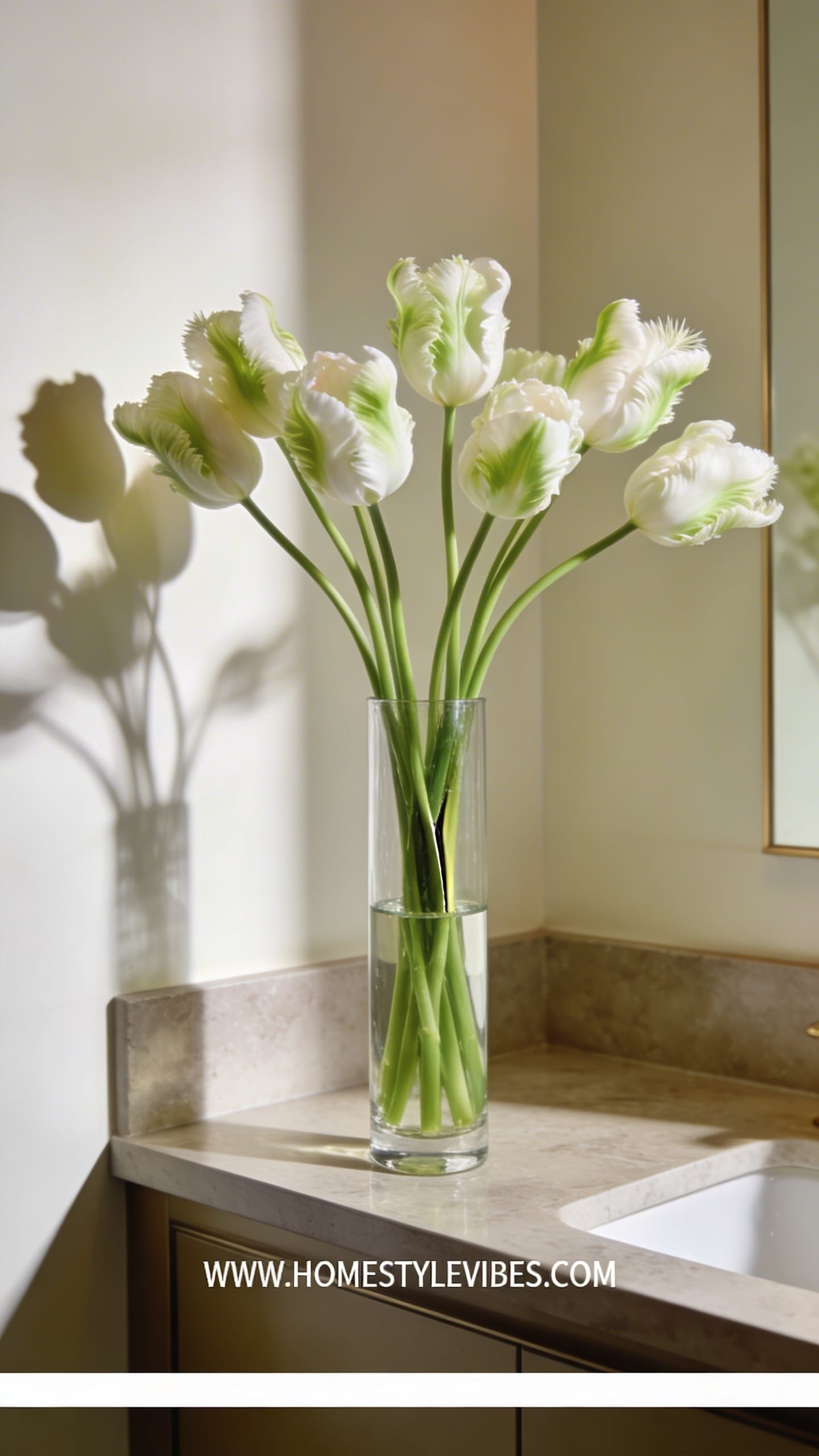
You’ve tried mixing, matching, fluffing—still chaotic. Here’s the antidote: one flower, many stems, arranged with surgical precision. The mood is contemporary gallery meets hotel-suite calm. Great for narrow consoles, vanities, or a bathroom counter where you need vertical lift without a jungle of leaves.
It works because a skinny-neck vase forces clean lines and automatic spacing. Lighting from the side creates dramatic petal shadows and a sculptural look. Choose a flower with personality—parrot tulips, anthurium, calla lilies, delphinium—and commit. Your home gets instant polish, and maintenance stays easy: swap water, trim ends, done.
Why It Looks Expensive: Repetition amplifies form. A dozen identical stems look intentional and luxe, especially when you edit leaves and align angles like a stylist.
Materials: Tall narrow vase (glass, smoked glass, or matte ceramic), single flower variety, optional floral food. This photographs beautifully because repetition creates rhythm, and the vase neck frames the stems like columns.
Variations:
– Budget-friendly: All chrysanthemums or carnations (trust the process) trimmed tight with leaves stripped read editorial.
– Small-space: Five stems of anthurium in a 2-inch neck vase for a bold, sculptural hit.
– Darker version: Deep purple callas or nearly black scabiosa in smoked glass.
Key Design Elements:
- Main materials: Skinny-neck vase, single stem variety
- Color palette: One strong hue or pure white
- Lighting strategy: Side light for petal dimension; avoid backlight that flattens
- Furniture silhouettes: Narrow console, vanity, bathroom ledge
- Texture layers: Smooth vase finish, glossy petals, clean stems
- Accent details: Minimal tray, perfume bottles, framed mini art
How To Recreate This Look:
- Start by stripping all leaves below the neck and trimming stems to a uniform long length.
- Add cool water and floral food to the vase; keep the waterline elegant and clear.
- Layer stems one by one, crossing slightly to lock them in place.
- Install a gentle angle across the group so heads tilt in the same direction.
- Style with negative space around the vase; let it breathe against a simple backdrop.
Why This Looks Expensive: The power of edit + repetition. A precise line-up reads couture and lets petals steal the scene.
Common Mistakes To Avoid: Don’t choose flimsy stems for very tall vases; they’ll droop sadly. Avoid mixing flower types—commit to the single-variety rule here.
Pro Styling Tip: Photograph straight-on with a touch of side shadow so the repeated stems create graphic stripes against the vase.
Now that you’ve got seven creative flower arrangements that look like they cost a fortune, here’s your pep talk. Pick one idea that fits your vibe and your room’s needs—calm tonal cloud for a busy corner, a sculptural branch for your entry, or a low ikebana bowl for that moody, reflective coffee table moment. Don’t overbuy; buy smarter. The luxury comes from texture, silhouette, and light—not quantity.
Set your scene thoughtfully: matte next to gloss, ruffles against smooth, a touch of shadow for drama. Edit leaves, watch your waterline, and let negative space work its quiet magic. When in doubt, restrain your color palette and elevate your vessel. You’ll be stunned how fast a humble grocery haul becomes an “Is that a florist?” conversation starter.
Flowers change a room’s mood in minutes. They soften hard edges, warm cool palettes, and make everyday rituals—coffee, emails, late-night journaling—feel intentional. So go ahead: choose your favorite design, queue your playlist, trim your stems, and let your home exhale. These arrangements won’t just look expensive; they’ll make your life feel a little richer, one petal at a time.