6 Diy Kitchen Cabinet Painting Ideas That Transform Your Kitchen on a Budget
You want a kitchen that feels bright, fresh, and a little bit “I actually have my life together.” You’re tired of the dated orange oak, dingy off-white, or that one peeling corner that catches your eye every morning while the coffee brews. Imagine clean color, a soft satin glow, and hardware that gleams just enough to look intentional—without a contractor invoice that makes you dizzy. These 6 DIY kitchen cabinet painting ideas will make your cabinets look custom, photogenic, and genuinely you—on a budget under $600, in as little as a weekend for smaller kitchens. Each idea solves a slightly different pain point: low light, heavy wood, bland rental vibes, or just a craving for a bold, Pinterest-worthy color moment. Choose your vibe, your finish, and your shortcuts. Then enjoy the compliments that start arriving the second you post the “after.”
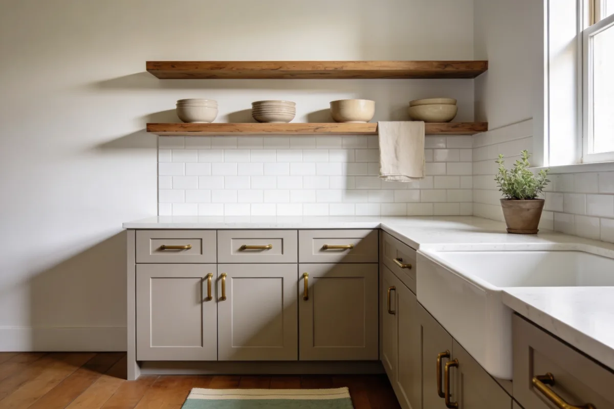
1. Cloud-Soft Greige with Brass: Calm, Collected, and Light-Loving
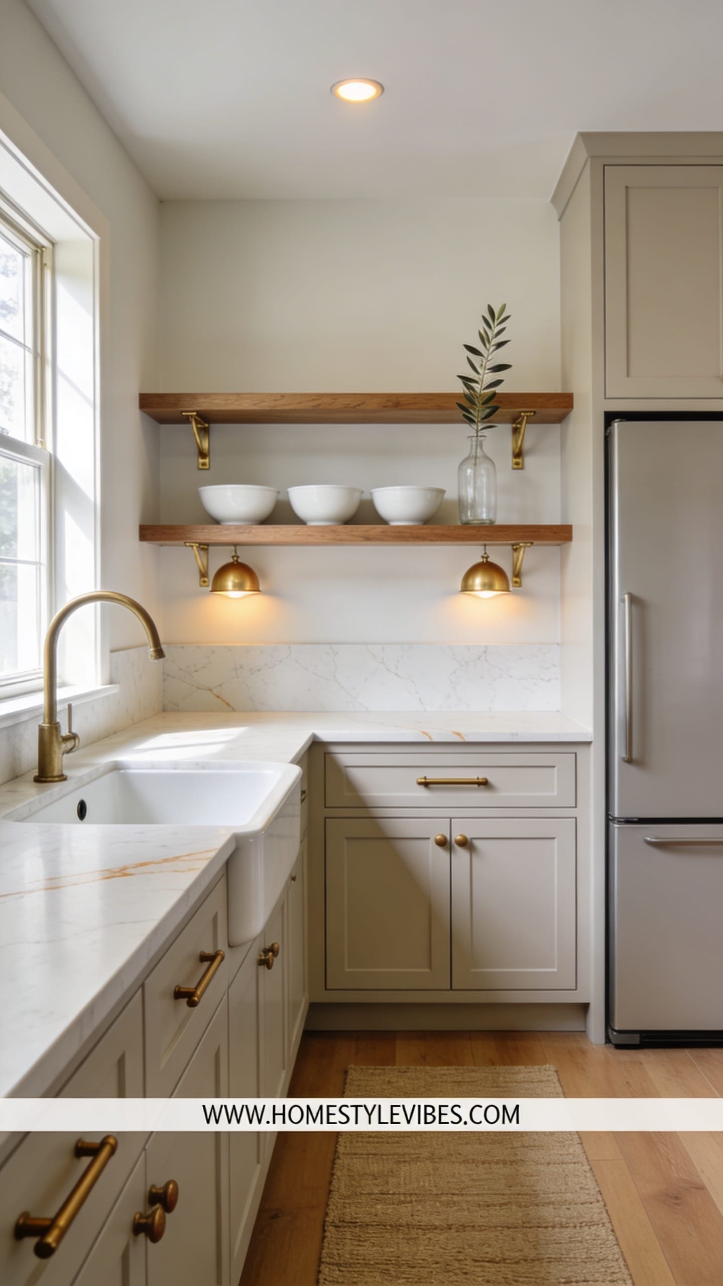
We’ve all been there: your kitchen has good bones but looks permanently tired—yellowed white doors, mismatched knobs, shadows that make everything feel dingy. You want soothing and sophisticated, not stark or cold. This cloud-soft greige kitchen balances warmth and clarity, creating that “hotel-breakfast-bar-meets-real-life” feel that works beautifully in both small condos and family homes.
The mood lands somewhere between cozy modern farmhouse and tailored minimal. Warm brass hardware adds an heirloom glint while greige (a gray-beige blend with a touch of taupe) keeps the room grounded. In low-light spaces, greige dodges the pitfall of stark white, which can go flat and chalky. Under-mount puck lights or a simple LED strip along the underside of upper cabinets make the paint read fresh and dimensional.
Materials lean soft and tactile: satin paint, brushed brass pulls, a light quartz-look laminate, and subtle woven textures—like a ribbed runner or a seagrass tray. Photographs love the subtle contrast here: pale cabinetry against warmer wood floors, a little shine from brass, a shadow line under the countertop that gives depth. It’s forgiving for busy lives and has broad resale appeal, too.
Variations you’ll love: For a rental or tighter budget, swap brass for brushed gold spray-painted knobs. Tiny galley kitchen? Go 80% greige, 20% white on the uppers to lift the ceiling visually. If you’re craving a moodier look, use a deeper mushroom tone on the lowers and keep uppers cloud-greige.
Budget Breakdown:
- Cabinet paint (satin/alkyd-hybrid, 1–2 gallons): $60–$140
- Deglosser and cleaner: $10–$20
- Bonding primer: $25–$45
- Brushed brass pulls/knobs (12–20 pieces): $80–$180
- LED under-cabinet light strip: $30–$70
- High-density foam rollers and angled brush: $12–$25
- Painter’s tape, sandpaper, tack cloths: $15–$30
Total Estimated Cost: $232 – $510
Best For: Smaller kitchens craving warmth without darkness; homes with moderate natural light; anyone wanting a subtle, refined update that photographs cleanly.
Key Design Elements:
- Main materials: Satin cabinet paint, brushed brass hardware, soft linen textiles
- Color palette: Soft greige, warm white trim, hint of muted taupe
- Lighting strategy: Warm 2700–3000K under-cabinet LED strips; soft-glow bulbs in pendants
- Furniture silhouettes: Simple counter stools with curved backs in wood or rattan
- Texture layers: Woven runner, ceramic vase, matte stoneware mug stack
- Accent details: Brass cabinet pulls, vintage-look glass jar, small olive tree or pothos
How To Recreate This Look:
- Start with a thorough clean and degloss, then sand lightly to smooth rough patches.
- Prime with a bonding primer, especially on older lacquer or factory finishes.
- Roll on two coats of soft greige in satin, sanding lightly between coats for a glassy feel.
- Swap old knobs for brushed brass handles; align them consistently using a hardware template.
- Style with a woven runner, a large cutting board leaning as art, and a warm brass tray.
Why This Looks Expensive: The gentle undertone of greige prevents the cheap, chalky “builder white” effect. Paired with consistent brass hardware and soft lighting, it reads like a curated palette, not a one-off paint job.
Watch Out: Don’t skip cleaning or you’ll trap kitchen grease under your paint. Also, avoid too-cool light bulbs; they’ll make greige skew dingy.
Pro Styling Tip: For photos, place a single glossy item—a teapot or glass carafe—near a soft lamp glow to capture a delicate highlight against the matte cabinets.
Keep scrolling—next up is a bolder move that still looks edited and grown-up.
2. Two-Tone Coastal Contrast: Deep Navy Lowers + Warm White Uppers
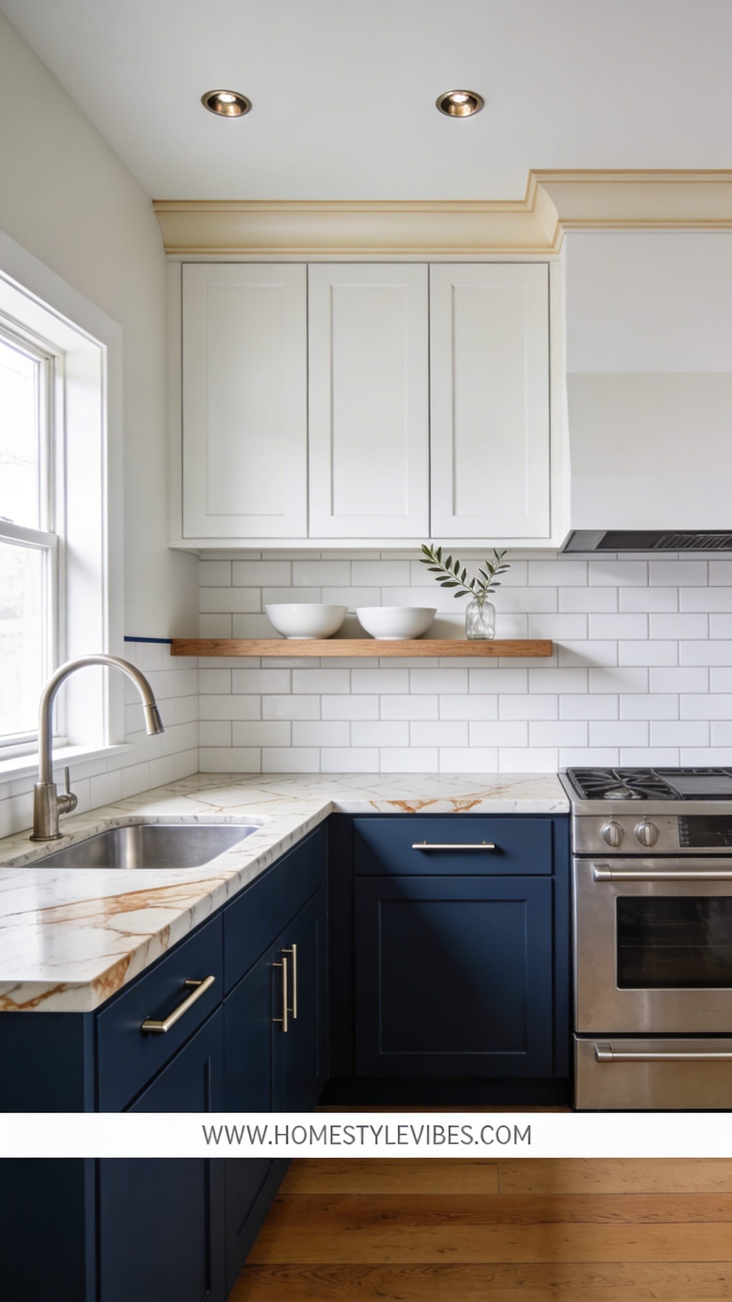
It’s that one corner that always feels top-heavy and bland, right? You’ve tried painting everything white, but it somehow feels flatter and more cluttered. Here’s the antidote: deep navy lowers paired with warm white uppers for a balanced, coastal-modern mood that draws the eye across the room and makes your countertops pop.
This design works in real homes because it plays with visual weight. Darker lowers ground the space and hide scuffs (kid-proof, pet-proof), while the light uppers lift the eye and bounce light around. Underpendant or sconce lighting creates that gentle arc of shadow under the uppers and across the drawers, adding dimension in photographs. Think nautical but refined: navy against warm brass or even polished nickel; gentle wood accents; maybe a striped hand towel if you’re feeling classic.
Photographically, the contrast is dreamy: camera lenses love the line where white meets navy, especially against light countertops. If your kitchen has a peninsula, the two-tone split adds shape and clarity. Resale-wise, navy reads timeless and stylish if you keep the undertone sophisticated—not too bright, not too teal.
Variations: Small space? Choose a slightly softened navy-gray (like “deep slate”) to avoid closing in the room. On a budget, spray-paint existing hardware in satin brass or matte black for just enough edge. For a softer take, try deep forest green lowers instead of navy (still very coastal, just leafier).
Key Design Elements:
- Main materials: Alkyd-hybrid enamel in satin, polished or brushed hardware, butcher block or light quartz-look
- Color palette: Deep navy, warm white, brass or nickel, light wood tones
- Lighting strategy: Warm pendants or a library sconce over a shelf; avoid cool LED strips
- Furniture silhouettes: Backless wood stools, rounded edges to soften the strong color blocks
- Texture layers: Linen tea towels, ribbed ceramic, a seagrass bowl
- Accent details: Striped towel, eucalyptus stems, artisan cutting board
Budget Breakdown:
- Two paint colors (1 gallon each): $120–$220
- Primer: $25–$45
- Rollers/brushes/sandpaper/tape: $25–$40
- Hardware update (spray paint or new knobs): $8–$180
- New hinge screws and filler (if moving hardware): $10–$20
Total Estimated Cost: $188 – $505
Best For: Medium to small kitchens that need clarity and polish; anyone tired of all-white but still wants brightness.
How To Recreate This Look:
- Remove doors and label everything. Clean, degloss, sand lightly.
- Prime and paint uppers in a warm white first; let them cure while you tackle the lowers.
- Paint lowers in a luxurious navy; check coverage at cabinet edges to avoid halo lines.
- Switch hardware to a single finish and length across the room for cohesion.
- Style with light woods and a single leafy branch for a crisp, editorial final shot.
Why This Feels Designer: The grounded/delicate split and consistent hardware finish signal intention. It’s the color-blocking that tells your brain, “this was planned.”
One Thing To Avoid: Don’t pick a white that’s too cool next to navy—it will look sterile. Stick to creams with a tiny drop of warmth.
Pro Styling Tip: For photos, place a pale linen towel over the navy drawers; that soft fabric-on-color contrast is a subtle hero.
Curious about texture and depth without dark colors? The next idea adds movement you can literally feel under your fingertips.
Remember, this isn’t about recreating a showroom. It’s about building a space that actually feels like yours—habits, coffee rings, Sunday pancakes and all. If one idea resonates louder than the others, that’s your starting line, not a checklist.
3. Limewashed Linen Finish: Subtle Texture for the “I Can’t Do Gloss” Crowd
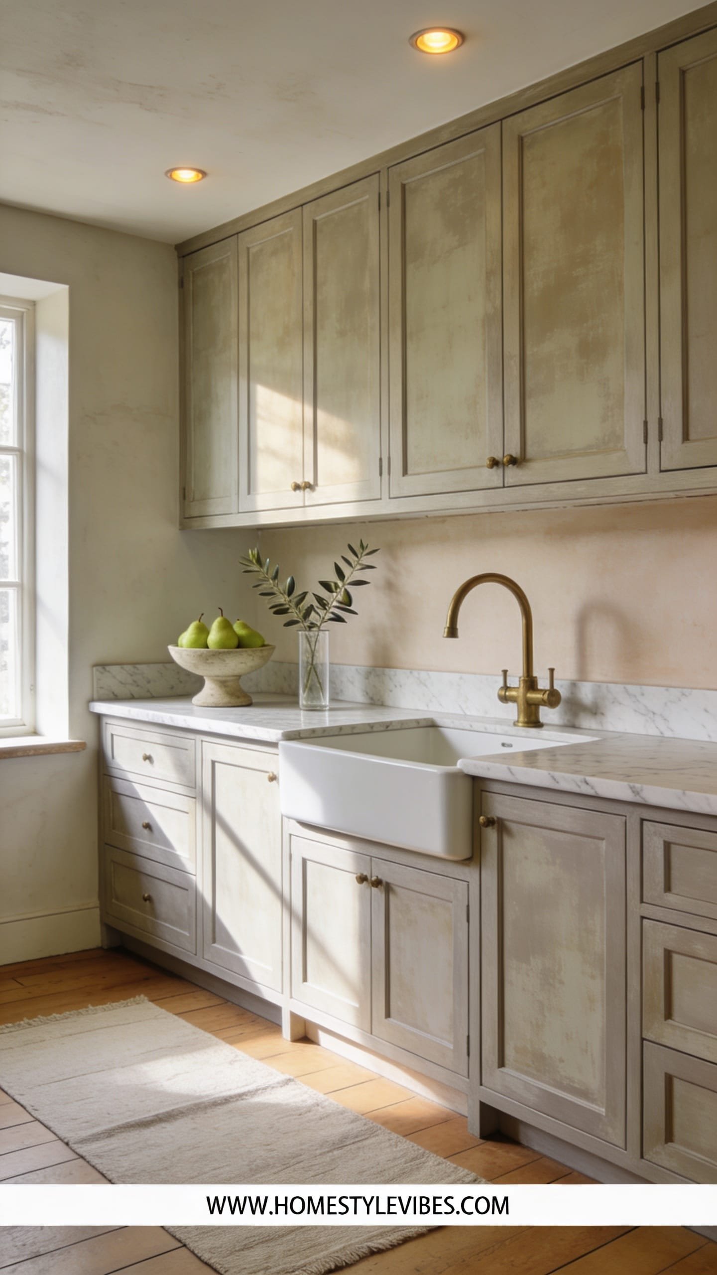
You love the idea of painted cabinets, but the plasticky, too-perfect finish makes you cringe. You want softness, movement, a bit of European cottage without going full rustic. Enter a limewashed linen finish—achieved with mineral paint or a diluted paint-and-glaze combo—that gives cabinets a breathable, velvety look.
The mood is modern Mediterranean meets gentle farmhouse. It’s low-shine but far from dull; highlights and shadows dance across fronts like woven fabric. This finish works especially well if your doors have shaker frames or slight bevels—the texture catches just enough at the edges to look intentional. It photographs beautifully because subtle variations create depth; no flat white slabs here. Real-life friendly? Yes. Tiny smudges blur into the texture, which is perfect if you’re not into constant touch-ups.
Lighting matters. Warm daylight bulbs and indirect light pull out the movement in the finish. Avoid harsh, cool task lighting that flattens everything and shows brush marks. If you have open shelves or glass uppers, the limewashed finish pairs beautifully with pottery, unfinished wood, and fluted glass.
Variations: On a budget, you can simulate limewash using diluted matte paint layered with a soft glaze; just test swatches first. In small spaces, go light sand-beige for airiness. For drama, try a moody stone-grey wash on a kitchen island only, leaving surrounding cabinets crisp and light.
Budget Breakdown:
- Mineral or limewash-style paint: $35–$90
- Base coat paint (matte): $40–$80
- Clear matte sealer or wax: $20–$40
- Brush kit (natural bristle for texture): $12–$25
- Prep supplies (cleaner, sandpaper, tape): $20–$35
Total Estimated Cost: $127 – $270
Best For: Cozy kitchens with shaker cabinets; anyone craving an artisanal, non-shiny finish that hides micro-imperfections.
Key Design Elements:
- Main materials: Mineral paint, matte sealer, unfinished wood accents
- Color palette: Sand, stone, warm white, soft gray-green
- Lighting strategy: Indirect, warm task lighting; skip overly bright cool LEDs
- Furniture silhouettes: Simple, chunky wood stools; handcrafted ceramics
- Texture layers: Linen napkins, raw-edge cutting boards, limewash walls if you’re extra
- Accent details: Oil-rubbed bronze or antique brass knobs, olive branches, terracotta pot
How To Recreate This Look:
- Prep like usual: clean, degloss, and sand. Prime if your cabinets are slick.
- Apply a flat base coat in a warm neutral; let it fully dry.
- Layer on diluted mineral paint with a crosshatch brush motion; work in sections.
- Feather edges with a barely damp brush to avoid harsh lines; let subtle variation show.
- Seal with a matte topcoat or furniture wax for durability without shine.
Why This Reads High-End: Subtle movement mimics expensive hand-finished cabinetry. The matte texture absorbs light like linen, which feels quiet and tailored rather than mass-produced.
The Most Common Mistake: Overworking the glaze or wash until it muddies. Step back often; let the base peek through in places for that breathable look.
Pro Styling Tip: Photograph in late afternoon light; the angled sun creates gentle shadows that celebrate the texture without glare.
Ready for something bold and editorial? The next look is unapologetically glam, but still practical and weekend-doable.
4. Moody Charcoal Monochrome with Matte Black Hardware
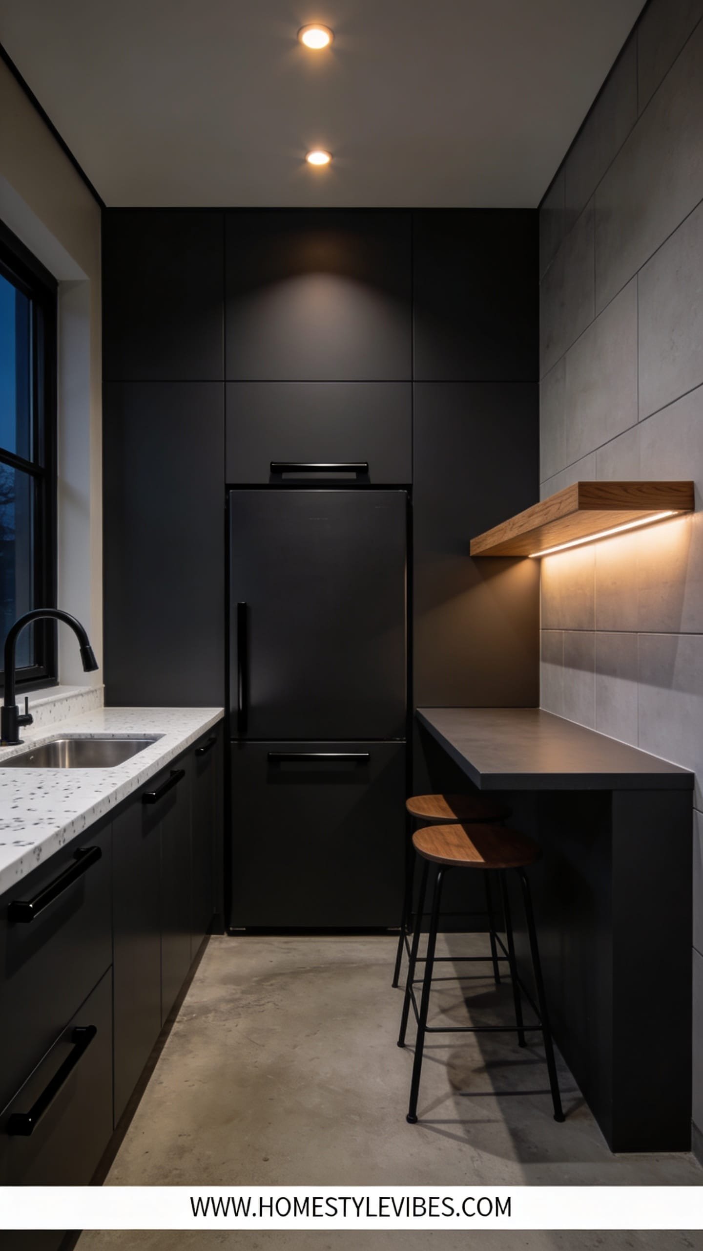
You’ve gone safe too many times and you’re still bored. Beige fatigue is real. Here’s a moody charcoal monochrome that feels like a boutique wine bar, minus the pretension. Think saturated charcoal cabinets, matte black hardware, and a whisper of walnut or warm oak in stools or shelves to keep it from feeling severe.
This setup works because monochrome quiets visual noise. It’s incredibly forgiving of appliance styles and offers amazing contrast against lighter countertops. Under-cabinet lighting makes the matte surface glow like soft charcoal velvet, and the shadow lines in drawer fronts photograph with depth. IMO, this layout wins every time in open-plan spaces with bright floors—you get drama without heaviness.
For maintenance, a scrubbable satin-matte finish hides fingerprints better than true matte while still looking sophisticated. Add a warm bulb temp and you’re set. I did a version of this in a client’s loft last fall, and we both laughed at how every plant looked twice as green and healthy against the charcoal—bonus photo perk.
Variations: Small space? Do just the island or lowers in charcoal, keep uppers pale. Want extra glam? Use a smoky mirrored backsplash or honed stone-look peel-and-stick behind the range. Renter-friendly? Paint only the doors and keep the frames as-is for easy reversal.
Key Design Elements:
- Main materials: Satin charcoal paint, matte black pulls, warm wood accents
- Color palette: Charcoal, black, walnut, cream countertop
- Lighting strategy: Dimmable warm LEDs; under-cabinet lights to carve silhouette
- Furniture silhouettes: Sleek bar stools with thin legs; a single wood shelf for relief
- Texture layers: Honed stone, ribbed vases, matte ceramics
- Accent details: Black faucet, smoked glass canisters, a single oversized art print
Budget Breakdown:
- Charcoal paint (1–2 gallons): $60–$160
- Bonding primer: $25–$45
- Matte black hardware set: $70–$200
- Under-cabinet lights: $30–$70
- Supplies (rollers, brush, tape, sandpaper): $25–$40
Total Estimated Cost: $210 – $515
Best For: Open-plan spaces, high-contrast homes, anyone who craves an evening-cocktail vibe year-round.
Why This Looks Intentional: Monochrome eliminates fussy color changes and lets lines and shapes lead. Streamlined hardware ties it up like a bow.
How To Recreate This Look:
- Prep and prime; dark colors need a flawless base.
- Roll on two coats of charcoal in satin-matte; sand lightly between coats.
- Install matte black pulls—same length throughout for discipline and polish.
- Set dimmable warm under-cabinet lighting to reduce hot spots and glare.
- Style with one wood element and one soft element (plant or linen) to keep it human.
Don’t Do This: Avoid cool 5000K bulbs; they make charcoal look flat and bluish. Also, don’t mix too many metal finishes—commit to black and one warm tone.
Pro Styling Tip: For photos, pull a stool slightly out of line and angle it toward the camera—imperfection adds life against the strict palette.
Feeling the confidence build? Next up is pure sunshine—without the glare.
If you’re feeling overwhelmed, breathe. You don’t need to repaint your entire kitchen to feel change. Tackle one bank of cabinets or the island first, live with it a week, then commit to the rest.
5. Soft Sage Serenity with Mixed Metals and Honed Stone Vibes
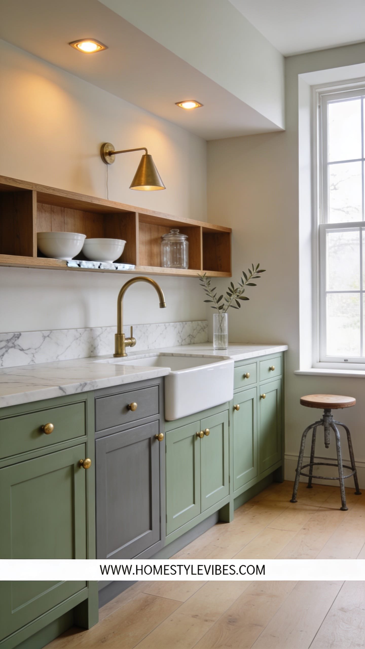
You’ve tried white, you’ve tried gray, and everything still feels like a rental. Soft sage is the color that quietly fixes the “blah” without screaming for attention. Picture tender green with gray undertones—calm enough for morning coffee, fresh enough to wake up tired tile.
The mood leans Scandinavian-meets-English-cottage—breezy, grounded, and camera-friendly. Why it works: sage behaves like a neutral in daylight and adds personality when skies are overcast. Mixed metals (brushed brass + aged nickel) look collected over time, not matchy-matchy from a big-box aisle. Honed stone or even peel-and-stick stone-look backsplash gives you gentle texture that plays beautifully with soft green.
Light loves sage. It shifts tone subtly across the day without going sickly or minty (as long as you pick a muted, gray-based sage). Photographs capture the delicate shifts in hue—especially next to natural woods, woven baskets, and creamy ceramics. It’s family-friendly, too; small fingerprints vanish in the color’s softness.
Variations: In a tiny kitchen, use sage on lowers only and keep uppers warm white. On a strict budget, repaint hardware in champagne gold spray and add one mixed-metal piece (like a nickel faucet). Feeling cottagecore? Add a peg rail and two open shelves in light oak.
Budget Breakdown:
- Sage cabinet paint (1–2 gallons): $60–$160
- Primer: $25–$45
- Hardware mix (brass knobs + nickel bin pulls): $90–$200
- Peel-and-stick honed-stone-look backsplash (optional): $60–$150
- Supplies (rollers, brush, sandpaper, tape): $25–$40
Total Estimated Cost: $260 – $595
Best For: Homes with medium natural light; anyone who wants color but needs it to behave like a neutral. Spring-to-fall lovers.
Key Design Elements:
- Main materials: Satin sage paint, mixed metals, honed or faux-honed stone
- Color palette: Soft sage, warm white, light oak, brushed brass, aged nickel
- Lighting strategy: Warm bulbs and lots of bounce on walls; say no to cool overheads
- Furniture silhouettes: Rounded wood stools, slim-profile bar chair
- Texture layers: Waffle dishcloths, ribbed glass, unglazed clay
- Accent details: Herb pots, fluted utensil jar, linen runner
Why This Looks Expensive: The layered neutrality of sage plus mixed metals suggests curation. It looks like you inherited great taste, not like you shopped one aisle.
How To Recreate This Look:
- Swatch at least three sages; pick the one with gray undertones, not yellow.
- Prep, prime, and paint doors in satin. Keep strokes long and consistent.
- Install brass knobs on uppers and nickel bin pulls on lowers for subtle contrast.
- Add a honed stone-look backsplash or a matte, textured tile for depth.
- Style with herbs and a light oak cutting board to pull the palette together.
Watch Out: Don’t pair sage with stark blue-white trim; it can make the green look dull. Choose a warm white trim with a drop of cream.
Pro Styling Tip: Place a bowl of green pears or limes on the counter; tone-on-tone styling makes the sage look intentional in photos.
Ready to go bold in a way that still reads editorial and grown-up? This last idea is for the color lovers who also like a clean line.
6. Color-Dipped Island + Crisp Perimeter: The Statement That Still Plays Nice
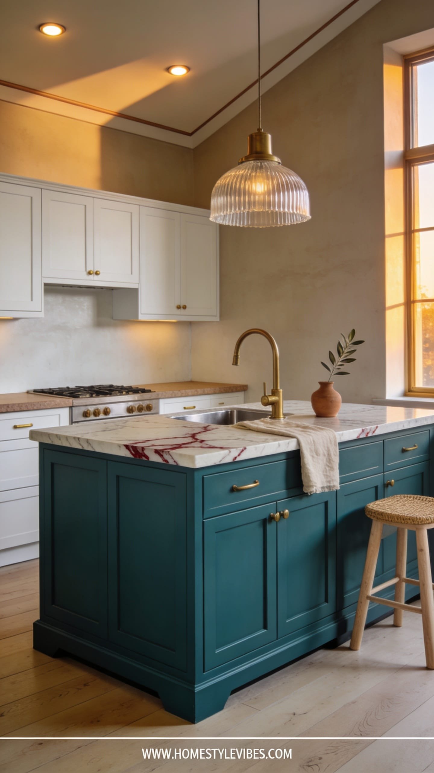
You want a dramatic moment, but the idea of repainting every single cabinet makes you want to lie down. Enter the color-dipped island: a saturated hue on the island with crisp, neutral perimeter cabinets. You get impact, control, and a shorter project timeline. And yes, it’s wildly photogenic.
Think spicy paprika, inky teal, or a terracotta clay on the island; keep surrounding cabinets soft white, warm greige, or pale taupe. The mood is modern-meets-artful. Why it works in real homes: the island takes the scuffs, not the uppers, and you can refresh it easily later if you crave a new color. Strong hues look balanced when paired with quiet perimeters; lighting catches the edges just enough to showcase the color without overwhelming the room.
Photographs adore a focal point. An island in a deep hue frames the rest of the kitchen; you get depth in the foreground and lightness in the background. Style a single vase or a stack of cookbooks on the corner to emphasize the “dipped” vibe. For durability, use enamel or alkyd-hybrid on the island—it’s the workhorse in a family kitchen.
Variations: Small space? Choose a medium, not ultra-dark hue—deep teal instead of black—for friendly contrast. On a tight budget, only paint the island base and add a runner that references the color. Renter-friendly? If your island is freestanding, paint just that piece and keep your deposit intact.
Budget Breakdown:
- Island paint (1 quart to 1 gallon based on size): $25–$80
- Perimeter touch-up paint (optional): $20–$50
- Primer: $20–$40
- Hardware for island (bold knobs/pulls): $30–$90
- Supplies (rollers, brush, tape, sandpaper): $20–$35
Total Estimated Cost: $115 – $295
Best For: Anyone craving a focal point; open-plan spaces where the island faces living areas; weekend projects.
Key Design Elements:
- Main materials: Satin or semi-gloss enamel on island, neutral satin on perimeters
- Color palette: Bold island hue + warm neutral cabinets + consistent metal finish
- Lighting strategy: Pendant trio or single oversized pendant to spotlight the island
- Furniture silhouettes: Upholstered or wood stools with a slim profile
- Texture layers: Stone or butcher block top, woven seat stools, ceramic bowl
- Accent details: Matching dish towel or art print that echoes island color
Why This Feels Designer: Restraint. One saturated moment against a calm field says “confidence.” It’s the curated pop instead of color everywhere.
How To Recreate This Look:
- Pick a saturated, complex color—look for shades with mixed undertones, not crayon brights.
- Prep and prime the island thoroughly; tape off edges for crisp lines.
- Apply two coats of enamel; finish with a light sand and a final feathered coat on visible sides.
- Upgrade island hardware to a statement finish or elongated pulls.
- Anchor with a pendant above that flatters the hue—warm bulb temps only.
One Thing To Avoid: Don’t choose an island color that clashes with nearby upholstery or rugs in open-plan rooms. Pull a tone from something you already love.
Pro Styling Tip: For photos, style the island with one tall item and one low, wide item to create height variation and avoid a “line of smalls.”
Reality check: perfection is not the goal. I once spent three hours touching up a tiny chip behind the toaster—no one noticed but me. Your eye catches flaws up close; guests see the overall glow, the mood, the confidence of color.
Quick Checklist
- Clean and degloss cabinets thoroughly before any primer
- Use a bonding primer designed for slick surfaces
- Choose satin or satin-matte finishes for cabinets
- Test paint colors next to your countertops and backsplash
- Commit to one hardware finish for cohesion
- Use warm 2700–3000K bulbs to flatter paint colors
- Sand lightly between coats for a smoother finish
- Label doors and keep hinges/screws organized
- Install under-cabinet lighting for depth and shadow play
- Style with one wood, one metal, and one soft texture
Frequently Asked Questions
How much should I budget to paint my kitchen cabinets myself?
For most small to medium kitchens, plan on $250–$600 including paint, primer, hardware updates, and supplies. If you already have tools or keep your existing hardware, you can land closer to $200–$350.
Do I need to sand down to bare wood before painting?
No. You just need a clean, dull surface. Degloss, clean thoroughly, and sand lightly to scuff the finish. Use a bonding primer to ensure the paint grips well, especially on factory-finished cabinets.
My kitchen is tiny. Which of these ideas works best without making it feel smaller?
Go for the Cloud-Soft Greige or Sage Serenity, or try two-tone with light uppers and mid-tone lowers. Keep hardware slim and consistent, and add under-cabinet lights to prevent shadows that visually shrink the space.
I’m worried about durability. Will DIY cabinet paint hold up?
Yes—if you prep properly and use the right product. Alkyd-hybrid or enamel cabinet paints cure harder and resist scratches. Give doors a few days to cure before heavy use, and install soft-close bumpers to reduce chipping.
I rent—can I still try these cabinet painting ideas?
If you can’t paint permanently, try the color-dipped island on a freestanding piece, swap hardware and save the originals, or paint only removable doors and store them safely. Always get written permission from your landlord first.
Closing Thoughts
Pick one idea that made your shoulders drop and your heart say “that.” Start there. Maybe it’s the quiet greige that tames visual chaos, or the brave charcoal that finally gives your kitchen a point of view. You don’t need a contractor or a trust fund to make your kitchen feel intentional—you need a clear color plan, solid prep, and the patience to let coats dry.
The truth is, luxury comes from texture, lighting, and restraint. Keep your palette disciplined, layer a few soft materials, choose warm bulbs, and let the cabinets do the visual heavy lifting. That’s how DIY reads custom.
So put on a playlist, tape those hinges, and roll the first coat. You’ve got this. And when the sunlight hits your newly painted cabinets next week, you’ll wonder why you waited so long.

About the Author

Krisztina P.Rendes, Founder of Home Style Vibes
Founder of Home Style Vibes
Krisztina Puskásné Rendes created Home Style Vibes as a cozy-modern lifestyle space where homemaking meets inspiration. Her goal is to help women create beautiful, organized, and peaceful homes they truly love — without overwhelm. You’ll find here heart-driven content on home decor, cleaning tips, easy family recipes, organization and decluttering, DIY home projects, plants, and seasonal ideas — all designed to bring more calm, comfort, and style into everyday life.