6 Best Bathroom Colors That Are Trending in 2026 (From Sage to Teal) You’Ll Love
You want a bathroom that makes you exhale the second you flick on the light. You hate that yours currently looks flat, cold, or just “fine.” Think sun-softened towels, a whisper of stone underfoot, and paint shades that make morning routines feel gentler. These 6 fresh bathroom color ideas will fix that exact frustration with specific, doable design moves you can pull off in a weekend or two and a budget that stays sane.
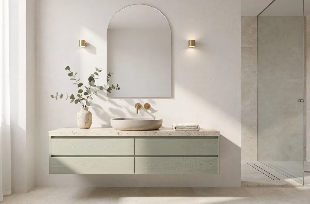
Each concept spotlights one of the best bathroom colors trending in 2026—from sage to teal—translated into a layered, real-life room. Expect texture you can feel, lighting that flatters, and layouts that actually work. They’re photogenic (hello, Pinterest saves), renter-friendly in spots, and honest about the tricky parts too. If you love a spa vibe, a warm studio feel, or something with a little wink of drama, you’ll find your match here.
1. Sunlit Sage Spa With Brushed Brass Calm
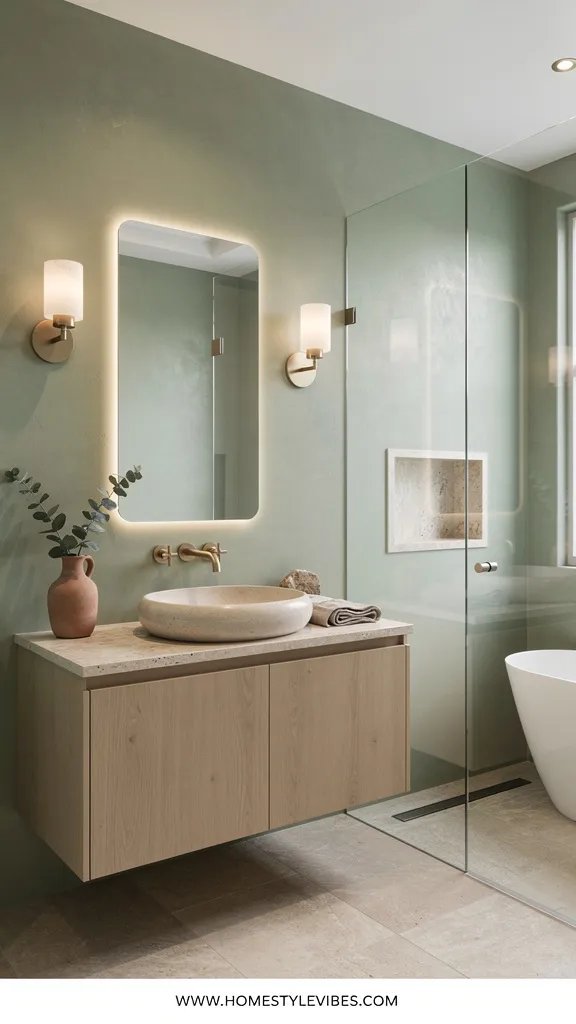
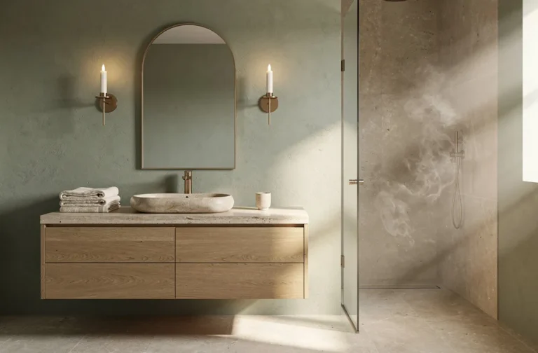
We’ve all been there: you want a serene, airy bathroom, but the second you paint it white, it turns clinical. Sage solves that. This green sits in the soft zone between gray and eucalyptus leaf, which means it flatters both warm and cool finishes and makes skin tones look healthy in the mirror. The mood is hotel-spa meets countryside greenhouse—soft, fresh, and quietly confident.
It works because sage loves natural light and also behaves beautifully under warm LEDs. In smaller bathrooms, sage reads as a gentle backdrop that makes tile and textiles feel intentional instead of random. I used a sage microcement in a client’s small ensuite last spring and honestly, the shower steam against that soft green felt like a foggy morning in the Cotswolds. For materials, think brushed brass, light oak, zellige-style tiles, honed stone, and linen textures. It photographs like a dream: depth from the green, shimmer from brass, and that satiny zellige glaze catching light in micro-highlights.
Try variations that match your budget and footprint. Budget-friendly: paint walls sage and add a single brass sconce upgrade—just that pairing reads finished. Small-space version: keep the ceiling white to avoid compression and choose a compact fluted vanity in oak. Darker version: pair deep sage wainscoting with creamy upper walls for old-world warmth. Renter move: removable sage wallpaper in a watercolor wash with brass peel-and-stick hooks.
Budget Breakdown:
- Sage paint (premium, washable): $55 – $85 per gallon
- Brushed brass faucet + drain kit: $180 – $450
- Oak vanity (30–36 inch): $450 – $1,200
- Zellige-look ceramic backsplash (8–12 sq ft): $120 – $320
- Linen shower curtain + brass rings: $60 – $120
- Warm LED wall sconces (pair): $160 – $420
Total Estimated Cost: $1,025 – $2,595
Best For: Small to mid-size baths that feel stark or cold. Perfect if you like spa calm with a natural, garden-adjacent vibe and you want paint to do heavy lifting.
Key Design Elements:
- Main materials: Limewash or matte finish paint, oak, brushed brass, ceramic tile with a hand-pressed look
- Color palette: Soft sage, warm white, light oak, brushed brass, oatmeal linen
- Lighting strategy: Warm 2700–3000K LEDs, front-facing sconces at eye level for flattering light
- Furniture silhouettes: Slab-front or softly fluted vanity, thin-edge mirror with rounded corners
- Texture layers: Linen, honed stone, ridged ceramic tile
- Accent details (hardware, decor pieces, plants): Brass hooks, eucalyptus sprig, ribbed glass canister
How To Recreate This Look:
- Start with a sage paint swatch tested in morning and evening light; choose a shade with a soft gray undertone.
- Add a brushed brass faucet and swap existing knobs for simple brass pulls to unify the metal story.
- Layer a zellige-look backsplash behind the vanity—only two rows can be enough for sparkle.
- Install warm LED sconces at cheekbone height for the most flattering glow.
- Style with a linen curtain, a single ceramic tray, and a clipped herb in a small vase—not a whole jungle.
Why This Looks Expensive: The palette is restrained and tonally cohesive. One hero hue (sage) plus one hero metal (brass) creates an intentional, edited look that reads custom, not cobbled together.
Watch Out: Don’t choose a sage with a yellow undertone if you have warm tile—it can go murky. Pick one sample with gray in it, and test next to your floor.
Pro Styling Tip: For photos, angle the sconce light to graze the zellige—those tiny highlights make the whole wall look artisan.
Feeling the calm already? Keep scrolling—next up brings cozy warmth without tipping into orange.
2. Clay Rose Sanctuary With Plaster-Soft Walls
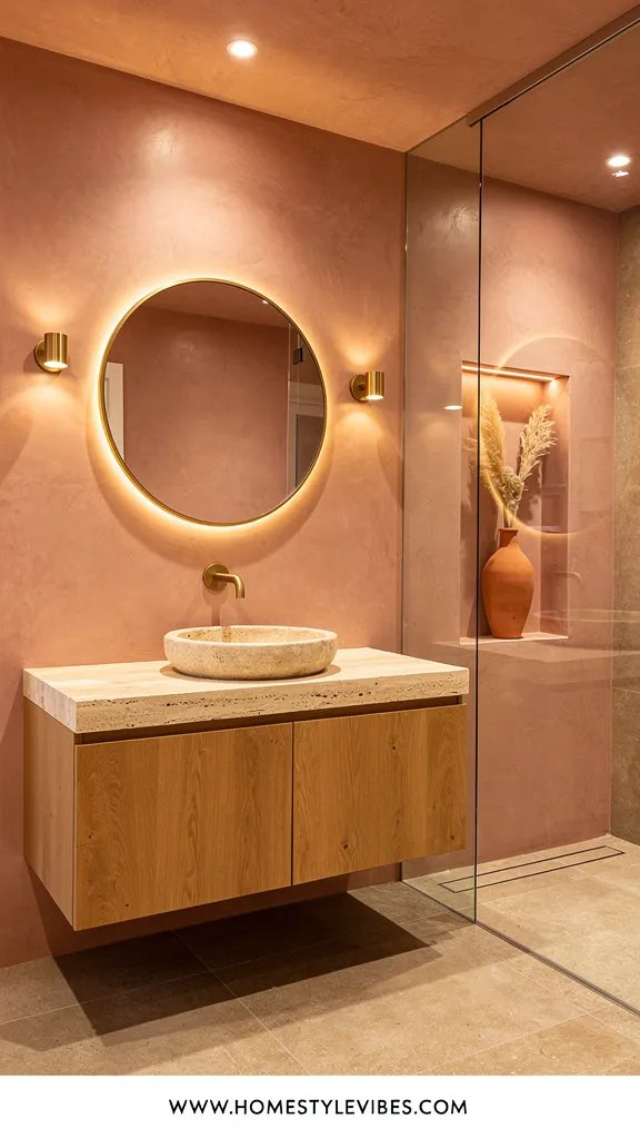
It’s that one corner that always feels off—too pink, too beige, or weirdly flat. Clay rose rights the ship. Think terracotta softened with a breath of blush and grounded by earthy undertones. The mood leans Mediterranean spa: warm, cocooning, and quietly romantic without reading nursery. It works especially well in windowless baths because the color feels like candlelight even under cool LEDs.
Here’s why this works in real homes: the undertone balance. A rose with cinnamon depth won’t read bubblegum. Limewash or plaster-soft paint adds movement, which means any wall dings or texture sins turn into “intentional” depth. Lighting matters—opt for frosted globes and indirect light bouncing off the ceiling to maintain the glow. Materials lean warm: tumbled stone, rattan, aged brass, and walnut bring out clay’s earthy side. And it photographs beautifully because the plastery sheen gives natural vignetting—there’s a soft shadow gradient in every corner.
Variations make it flexible. Budget: stick to paint and swap in walnut-look knobs. Renter: removable terracotta-look floor stickers over tired tile. Small-space: keep the rose below chair-rail height with cream above to avoid over-saturation. Darker mood: go full clay rose in a powder room with a single smoky glass pendant.
Key Design Elements:
- Main materials: Limewash/plaster-effect paint, tumbled stone, walnut, rattan
- Color palette: Clay rose, walnut brown, aged brass, cream, putty
- Lighting strategy: Frosted globes, wall grazing, dimmers
- Furniture silhouettes: Rounded vanity corners, pill-shaped mirror
- Texture layers: Plaster, woven baskets, boucle bath mat
- Accent details: Terracotta bud vase, vintage rug runner, smoked glass canister
Budget Breakdown:
- Plaster-effect paint kit or limewash: $90 – $180
- Aged brass hardware set: $60 – $140
- Frosted globe sconce (pair): $120 – $300
- Rattan or cane hamper: $40 – $120
- Vintage-style runner (2×6): $90 – $260
- Walnut-look vanity (30–36 inch): $380 – $980
Total Estimated Cost: $780 – $1,980
Best For: Windowless or north-facing bathrooms craving warmth. Great for anyone who loves earthy tones but still wants a soft, spa-like atmosphere.
How To Recreate This Look:
- Start with a clay rose swatch that leans earthy—test under your bathroom’s current bulbs to ensure no Pepto vibes.
- Add a plaster-effect finish to the main wall; leave trim warm white for structure.
- Layer walnut elements: a framed mirror or vanity with rounded edges.
- Install frosted globe sconces on dimmers and add a small lamp on a shelf for a nighttime candle-glow effect.
- Style with one terracotta vase, a vintage-look runner, and a rattan basket to catch towels.
Why This Feels Designer: The wall treatment adds visual movement, which looks custom. The curved silhouettes and muted metals avoid the “builder basic” straight lines that read cheap in photos.
One Thing To Avoid: Don’t pair clay rose with bright chrome. It cools the warmth and makes the paint look dirty. Choose aged brass, bronze, or blackened steel.
Pro Styling Tip: For that editorial shot, place a single deep green leaf in the terracotta vase—one strong shape against the rose creates striking contrast.
Before we dip into cooler tones, a quick mindset reset.
Remember, this isn’t about recreating a showroom. It’s about building a space that actually feels like yours. If one idea tugs at you more than the others, that’s your starting point—follow the pull.
3. Misty Greige Retreat With Fluted Oak and Stone
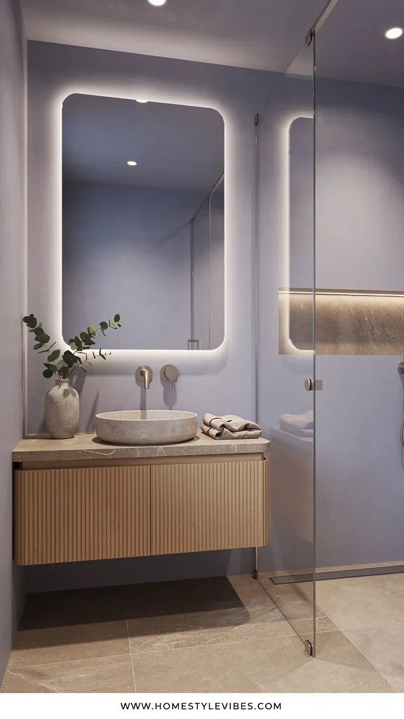
You’ve tried greige three times, but it still looks beige and blah. Here’s the fix: choose a misty greige with a whisper of blue-violet undertone. The vibe is Japandi spa—minimal but warm, soothing but not sleepy. This greige sits firmly in the high-end zone because it reads like light filtering through linen.
Why it works in real homes: flexibility. This color hugs both warm travertine and cool porcelain. In tiny bathrooms, it creates a continuous envelope that blurs corners and calms visual noise. Lighting needs a plan: aim for even, front-facing light at the mirror and a low-glare overhead. Materials do heavy lifting—fluted oak vanity, honed limestone, soft black hardware, and matte plaster ceilings. It photographs perfectly because of the delicate mid-tone balance—enough contrast for shadows, soft enough for highlights to kiss the fluting.
Variations are easy. Budget: paint + black hardware, done. Small bath: choose a floating vanity to show more floor and increase the sense of volume. Darker room: boost reflectivity with a larger mirror and low-sheen paint (not flat) to avoid dead zones. Renter-friendly: removable greige peel-and-stick behind the vanity to create a faux headboard effect for your sink area.
Budget Breakdown:
- Misty greige paint (low-sheen, scrubbable): $55 – $85 per gallon
- Fluted oak vanity or fluted wrap panels: $520 – $1,400
- Soft black hardware set: $60 – $150
- Honed limestone or porcelain-look slab for counter: $260 – $780
- Wide-format mirror (36–48 inch): $120 – $380
- LED backlit mirror strip or vanity sconce: $140 – $420
Total Estimated Cost: $1,155 – $3,215
Best For: Minimalists who still want warmth, households with mixed finishes, and anyone worried about resale. This is the Switzerland of bathrooms: neutral but not boring.
Key Design Elements:
- Main materials: Fluted oak, honed stone, matte paint, soft black metals
- Color palette: Misty greige, oat, soft black, pale stone
- Lighting strategy: Backlit mirror or horizontal sconce with diffusers to avoid harsh shadows
- Furniture silhouettes: Clean lines, floating vanity, thin-edge counters
- Texture layers: Fluting, honed finishes, cotton-linen blend towels
- Accent details: Single black-framed artwork, a ceramic tray, and a quiet plant like a ZZ
Why This Reads High-End: The combination of fluted wood with honed stone hints at custom millwork. A single dominant texture (fluting) repeated in one place feels intentional.
How To Recreate This Look:
- Start with a greige sample that shifts cooler under bright light—stand in your bathroom at noon and at night to confirm it doesn’t go yellow.
- Add a fluted oak vanity or apply fluted panels to the sides of an existing one for a custom hack.
- Layer a wide mirror and either backlighting or a diffuser sconce for even light.
- Install soft black hardware and keep metals consistent across towel bars and paper holders.
- Style with two neutral towel colors only—oat and white—to keep the field calm.
The Most Common Mistake: Mixing too many mid-tone woods. If the vanity is oak, keep shelves either black or the same oak to avoid a patchwork effect.
Pro Styling Tip: Angle a single towel with a subtle ripple over the vanity edge—creases catch shadows that add depth in photos.
Need color with a little swagger? Coming up next: the sea-glass shade that refuses to be boring.
4. Sea-Glass Teal Nook With Matte Black Lines
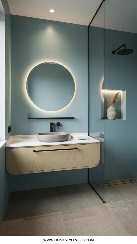
You love color, but every teal sample looks like a kid’s playroom once it’s on four walls. The trick is to choose a sea-glass teal with 50 percent gray in it. The mood? Fresh coastal boutique hotel—crisp, lively, and still grown-up. It brings energy to sleepy morning showers without amping your heart rate like neon teal.
This works in real bathrooms because teal naturally complements porcelain whites and black fixtures. Lighting turns into your secret sauce—cool daylight bulbs bring out the blue, while warm bulbs show more green. Choose one and stick with it to avoid a color swing. Materials: matte black metal, terrazzo or speckled porcelain, ribbed glass, and white oak. It photographs fabulously because teal offers instant contrast against white tile; shadows look clean, not muddy.
Variations make it versatile. Budget: teal paint + black faucet, done. Small room: paint only half the walls in teal and keep the rest white to expand visual height. Darker, moodier version: teal on walls and ceiling with a high-contrast white vanity. Renter idea: peel-and-stick teal wainscot panels with crisp black picture ledges.
Budget Breakdown:
- Sea-glass teal paint: $55 – $85 per gallon
- Matte black faucet + drain: $150 – $380
- Ribbed glass sconce (pair): $160 – $420
- Terrazzo-look floor tile (40–60 sq ft): $260 – $780
- White oak shelf + black brackets: $50 – $160
- Round black-framed mirror: $90 – $220
Total Estimated Cost: $765 – $2,045
Best For: Busy households that want a cheerful yet sophisticated bath. Works beautifully with white subway or penny tile already in place.
Key Design Elements:
- Main materials: Matte paint, black metal, terrazzo, ribbed glass
- Color palette: Sea-glass teal, crisp white, black, pale oak
- Lighting strategy: Choose color temperature intentionally; use ribbed glass for sparkle without glare
- Furniture silhouettes: Round mirror, straight-line vanity, slim shelf
- Texture layers: Terrazzo speckle, ribbed glass, tight-weave cotton towels
- Accent details: Black hook rail, striped hand towels, sprig of rosemary in a bud vase
How To Recreate This Look:
- Start with teal on one feature wall; confirm the undertone works with your tile grout color (yes, grout matters).
- Add a matte black faucet and match all visible hardware for consistency.
- Layer ribbed glass sconces on either side of the mirror to avoid nose shadows.
- Install a pale oak shelf for a warm note; keep styling light and graphic.
- Style with high-contrast accessories: striped towel, black soap pump, a single herb cutting.
Why This Looks Intentional: High-contrast color blocking (teal against white and black) feels graphic and confident. When every line matches—mirror, faucet, hardware—the room reads edited, not accidental.
Don’t Do This: Avoid pairing teal with shiny chrome and yellowy vanity lights. The mix goes carnival fast. Stick to black and neutral bulbs.
Pro Styling Tip: For photos, crack the shower curtain open 8 inches—the line draws the eye to the teal feature while showing off tile texture.
Quick breather. If you’re torn between warm and cool, you’re not alone.
If one idea resonates more than the others, that’s your starting point. You don’t need all six. Pick your mood first—calm, cozy, crisp—then choose the bathroom color that gives you that feeling in your real light.
5. Inky Blue Cocoon With Burnished Bronze Glow
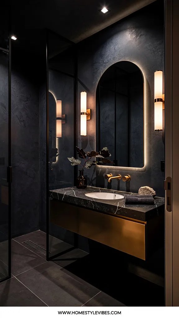
You crave drama, but every time you go dark, it looks like a dungeon. The fix is deep inky blue—not pure navy, but a blackened indigo that soaks up light without swallowing the room. The mood is boutique-hotel powder room: sultry, quiet, a little mysterious. Once you introduce burnished bronze and moody art, it turns cinematic.
Why it works at home: balance and sheen. Use matte or eggshell on walls to soften reflections, then add gloss only to trim or the vanity to bounce light. Lighting matters even more here—use warm bulbs and multiple sources: wall lights plus a dimmable ceiling fixture. Materials: bronze or antique brass, dark walnut, marble with heavy veining, and smoked glass. It photographs beautifully because dark walls make everything else pop—white towels, metallic fixtures, and art feel sculptural.
Variations help you adapt. Budget: paint walls and add a single bronze sconce. Small space: paint only the door and one wall in inky blue; keep tile light. Renter: inky removable wallpaper on a single plane. For a family bath, use scrubbable paint and a durable quartz that mimics marble.
Budget Breakdown:
- Inky blue paint: $55 – $85 per gallon
- Burnished bronze faucet: $220 – $520
- Marble-look quartz countertop: $320 – $980
- Smoked glass pendant or sconce (pair): $140 – $360
- Walnut framed art (print + frame): $90 – $220
- Thick white towels (hotel weight): $60 – $140
Total Estimated Cost: $885 – $2,305
Best For: Powder rooms and primary baths with decent lighting. Ideal for anyone who wants a moody, grown-up vibe with strong contrast.
Key Design Elements:
- Main materials: Matte paint, bronze, walnut, marble or marble-look quartz
- Color palette: Inky blue, warm white, bronze, walnut, charcoal
- Lighting strategy: Layered—sconces plus dimmable overhead, 2700K bulbs
- Furniture silhouettes: Chunkier vanity, classic framed mirror with rounded edges
- Texture layers: Matte walls, glossy trim, veined stone, plush cotton
- Accent details: Dark floral art, bronze hook rail, black soapstone dish
How To Recreate This Look:
- Start by painting a foam board with your blue and moving it around the room; confirm it looks inky, not royal, in all lights.
- Add bronze fixtures and, if budget allows, swap the drain and overflow cap to match.
- Layer a marble-look counter or a small marble tray if a full swap isn’t possible.
- Install warm sconces at face level and a dimmable ceiling fixture for mood control.
- Style with thick white towels, a single moody print, and a small smoked-glass vase.
Why This Looks Expensive: Depth. The matte inky blue pairs with gleam from bronze and stone veining, creating a high-low mix of finishes that mimic custom work.
Watch Out: Don’t skip ceiling and trim decisions. Crisp white trim against dark walls sometimes screams “unfinished.” Either paint trim to match the walls or a warm off-white with a slight gloss to look deliberate.
Pro Styling Tip: Photograph with one light source slightly dimmed—shadows pool around bronze and make it glow on camera.
Story time: a friend of mine spent weeks agonizing over navy paint chips. After a late-night call, we realized the actual problem was her cool, bluish bulbs. We swapped them for 2700K and every “wrong” swatch suddenly looked right. Sometimes the color isn’t the enemy—your lighting is.
6. Warm Putty & Stone Cream with Aged Nickel Ease
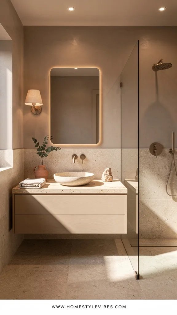
You want a neutral bathroom that feels rich, not rental. Warm putty—somewhere between greige and taupe—paired with stone cream does exactly that. The mood lands in modern Parisian-meets-California casual: understated, sunlit, never stuffy. It’s the bathroom color that makes busy mornings feel a little less chaotic because everything looks cohesive.
This works because putty softens harsh tile while cream lifts the room. Pairing with aged nickel or pewter keeps things calm; it won’t glare like chrome but still reads crisp. Lighting should stay warm-neutral at 3000K, ideally with a thin-profile vanity light that spreads illumination without harsh shadows. Materials: travertine or travertine-look porcelain, putty limewash or satin paint, reed glass, and natural cotton. In photos, this palette stacks beautifully—gentle tonal shifts create layers without wild contrast, which reads expensive in a quiet way.
Variations to try. Budget: paint and hardware swap. Small bath: vertical beadboard on the lower third in putty, cream above. Renter: removable reed-glass film on cabinet doors and stick-on marble thresholds for a finished edge. Darker version: choose a deeper putty for the vanity only; keep walls cream to keep breath in the room.
Budget Breakdown:
- Putty and cream paint (two gallons total): $110 – $170
- Aged nickel faucet and hardware: $200 – $520
- Travertine-look porcelain (floor 40–60 sq ft): $240 – $700
- Reed glass film for cabinet doors: $20 – $60
- Linear vanity light (30–36 inch): $140 – $360
- Waffle cotton towel set: $50 – $120
Total Estimated Cost: $760 – $1,930
Best For: Family bathrooms, rentals that need polish, and anyone planning to sell within a few years. This palette pleases almost everyone while still feeling specific.
Key Design Elements:
- Main materials: Travertine or lookalike porcelain, limewash/satin paint, reed glass, aged nickel
- Color palette: Warm putty, stone cream, soft white, pewter
- Lighting strategy: Even, diffused wash from a linear light and a discreet downlight in the shower
- Furniture silhouettes: Classic shaker or slab-front vanity with slim stiles
- Texture layers: Waffle towels, reed glass, limestone-look floor, woven wastebasket
- Accent details: Pewter hook rail, cream ceramic jars, olive branch cutting
How To Recreate This Look:
- Start by painting a large sample board half putty, half cream; tape it to the wall to see how your tile interacts throughout the day.
- Add aged nickel hardware and match the finish across faucet, shower trim, and pulls if possible.
- Layer travertine-look porcelain on the floor; pick a grout just one shade darker than the tile for a continuous look.
- Install a thin linear vanity light at or slightly above eye level for even, shadow-free mirror time.
- Style with reed-glass film on cabinet doors, a woven bin for extra rolls, and one olive sprig in a cream vase.
Why This Feels Designer: Tonal restraint. Two close neutrals (putty + cream) with a single accent metal creates a quiet rhythm that feels curated, not chaotic.
The Most Common Mistake: Using bright white trim with putty walls. It turns the putty dull. Choose a warm off-white trim or paint trim the same cream as the walls for flow.
Pro Styling Tip: Shoot at a slight angle to catch the reed-glass texture—micro-shadows make neutrals look layered and magazine-ready.
Real talk: I once tried to force a cool gray into a bath with tan tile. It fought back every day until I repainted in warm putty. Ten out of ten—should’ve listened to the tile first.
Quick Checklist
- Pick a bathroom color that matches your light temperature (2700–3000K for warmth)
- Test paint on large boards in multiple spots and times of day
- Commit to one metal finish for hardware and fixtures
- Choose one dominant texture (fluting, zellige, reed glass) to repeat once
- Upgrade lighting to frosted or ribbed glass with dimmers
- Select towels in 1–2 hues max for a cohesive field
- Use a single, sculptural plant or stem for contrast
- Keep countertops clear—one tray and one vertical item
- Match grout wisely; go one shade darker for seamless tile floors
- Hang shower curtain high to visually raise the ceiling
Frequently Asked Questions
How do I choose the right bathroom color if I have no natural light?
Pick colors that carry their own warmth, like clay rose, warm putty, or sage with a gray undertone. Then install 2700–3000K bulbs and frosted shades to mimic daylight softness. Always test samples under your exact bulbs before committing.
My budget is under $500—what’s the highest-impact combo from these ideas?
Paint plus lighting. Choose sea-glass teal or sage, swap in a pair of warm sconces, and update hardware to match your fixture color. Those three moves make the room feel finished and photogenic for relatively little money.
Will bold colors like teal or inky blue hurt resale?
Not if you keep the rest restrained. Limit the bold to walls and choose timeless finishes—white tile, stone-look counters, and consistent hardware. Buyers see personality without fearing an expensive overhaul.
What’s the best finish for bathroom paint so it doesn’t streak or show water spots?
Use matte or eggshell formulated for baths, or a washable matte. Avoid high gloss on large walls; it shows every roller mark and can feel harsh under bright lights. Reserve semi-gloss for trim only.
I rent—how do I get these looks without permanent changes?
Lean on removable elements: peel-and-stick paint finishes or wallpaper, reed-glass film for cabinet doors, upgraded shower curtain and rings, new hardware that fits existing holes, and plug-in sconces or swagged pendants. Focus on textiles and accessories to set the palette.
The Wrap-Up
The truth is, the best bathroom colors trending in 2026—sage, clay rose, misty greige, sea-glass teal, inky blue, and warm putty—aren’t just colors. They’re moods you can live in. Pick one that answers your daily frustration, whether that’s too cold, too flat, or too chaotic, and let it guide the materials, lighting, and textures around it.
Start small: one weekend, one wall, one new light. Luxury doesn’t come from more stuff; it comes from rich texture, thoughtful lighting, and restraint. Commit to a color story, repeat your metal finish, and edit what lands on your counters. You’ll create a bathroom that feels intentional every single day.
You’ve got this. Choose the palette that makes you exhale, gather your swatches and bulbs, and make the room actually feel finished—seriously, that first morning shower in your new color will change your whole mood.

About the Author

Krisztina P.Rendes, Founder of Home Style Vibes
Founder of Home Style Vibes
Krisztina Puskásné Rendes created Home Style Vibes as a cozy-modern lifestyle space where homemaking meets inspiration. Her goal is to help women create beautiful, organized, and peaceful homes they truly love — without overwhelm. You’ll find here heart-driven content on home decor, cleaning tips, easy family recipes, organization and decluttering, DIY home projects, plants, and seasonal ideas — all designed to bring more calm, comfort, and style into everyday life.