The Secret to How to Combine Throw Pillows Like a Designer — Cute, Funky & Cozy Ideas
You want a sofa that looks layered, lush, and magazine-level gorgeous. You hate that every throw pillow combo you try looks random, flat, or weirdly stiff. Give me 20 minutes and I’ll show you exactly how to combine throw pillows like a designer — including a foolproof formula, budget swaps under $100, and funky ideas that still feel cozy and intentional. Get ready for pin-worthy corners and a living room that finally looks “finished.”
What’s Inside
The Three-Two-One Pillow Formula Designers Swear By
If your sofa still looks like a jumble sale, this is the anchor that pulls everything together.
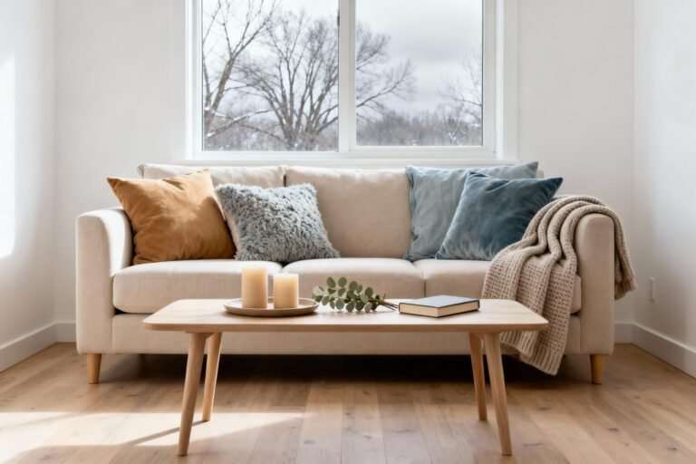
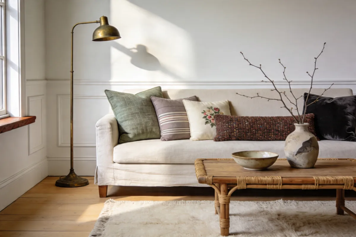
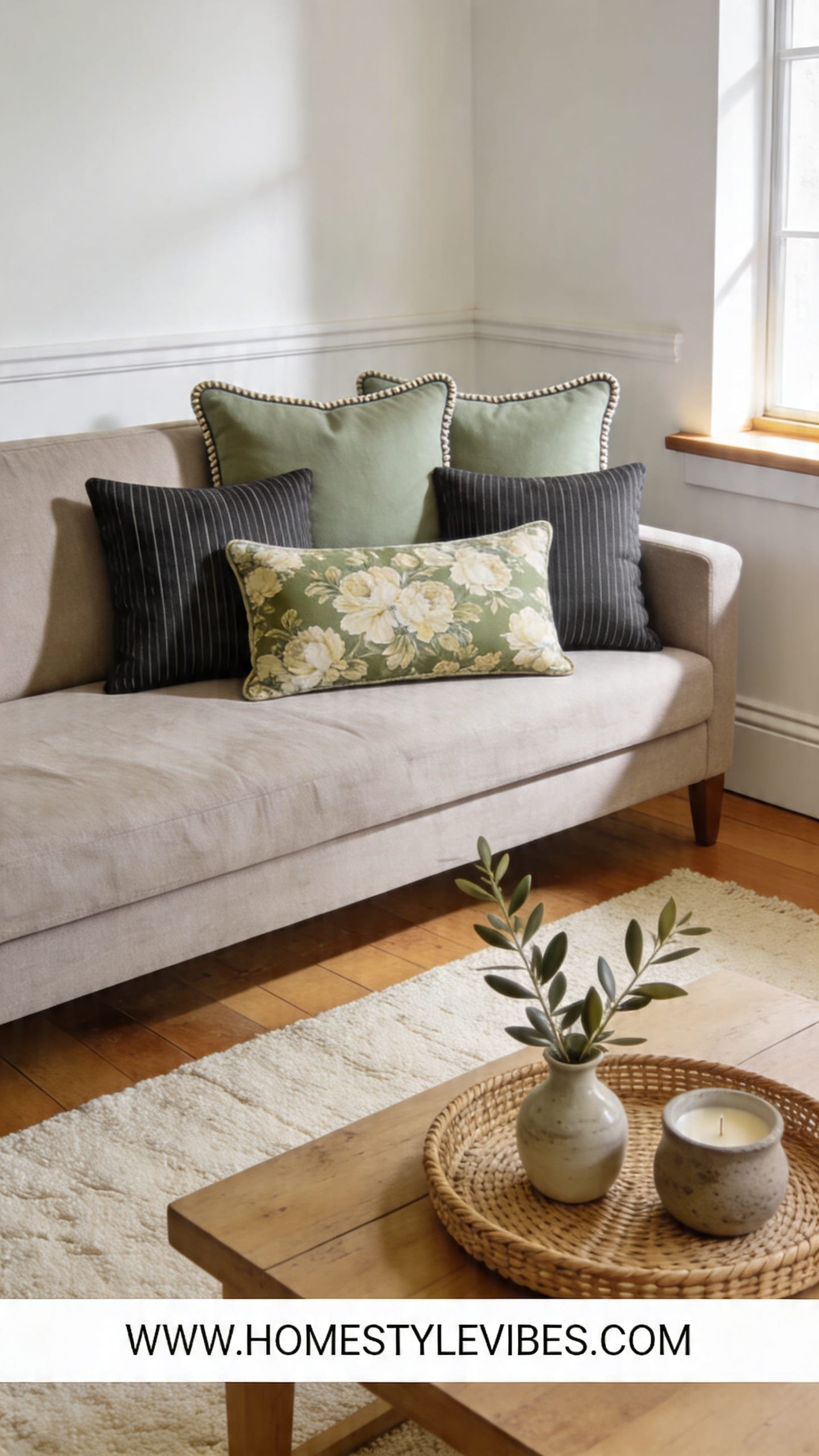
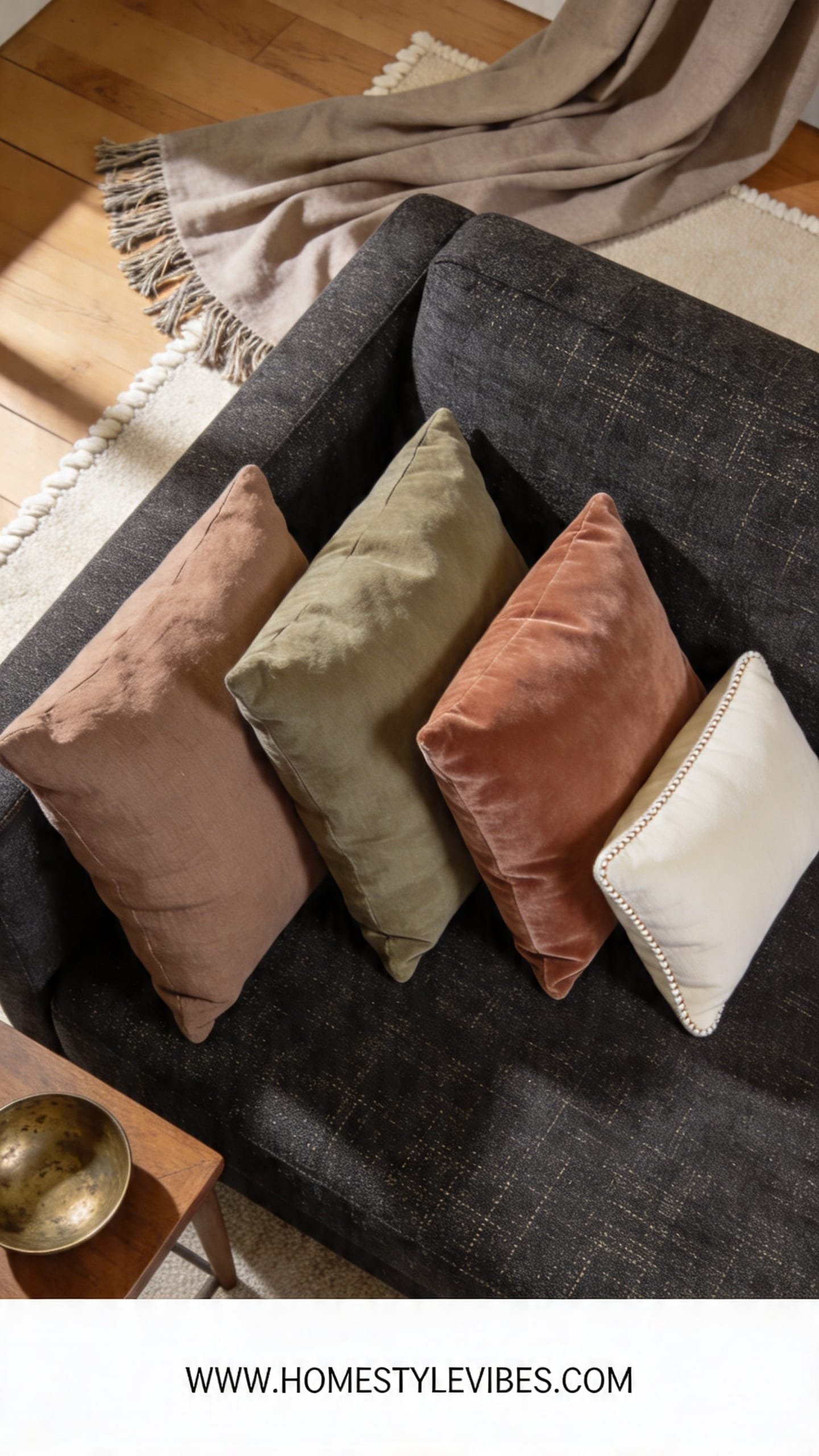
We’ve all been there: you buy a cute pillow here, a funky one there, and suddenly your sofa looks confused. The secret isn’t more pillows — it’s a formula. Start with 3 foundational solids (the calm), add 2 coordinating patterns (the personality), then finish with 1 statement pillow (the exclamation point). This creates rhythm, like a good song: steady beat, interesting layers, then a chorus that sticks.
Here’s why it works: the solids create visual breath, the two patterns echo each other in color but contrast in scale, and the single hero — usually a bold texture, unusual shape, or hand-embroidered moment — gives the vignette soul. Imagine running your hand over a nubby boucle, catching the soft sheen of velvet as evening light hits, and grounding it all with a crisp canvas or linen. That sensory mix is what reads designer.
On a tight budget or in a rental? Swap entire pillows for zippered covers and down-alternative inserts. Rinse and repeat with seasonal covers and store them flat. My ranking: Best overall — 90/10 down-feel inserts from Amazon; Budget pick — IKEA FJÄDRAR inserts; Worth the splurge — Serena & Lily or Pottery Barn feather insert for that plush “hotel” smoosh.
- Budget-friendly alternative: Pair two $12 Target Studio McGee solid covers with one patterned set from Amazon ($18–$24) and a single textured lumbar from HomeGoods
- Renter-friendly swap: Stick to removable covers and washable fabrics like polyester-linen blends for easy cleanup
Build a Color Story: From Sofa Shade to Accent Hues
This is where cute meets intentional — without repainting the whole room.
It sounds obvious, but here’s where it usually falls apart: people pick pillow colors in isolation. Instead, take your cues from the room’s “big rocks” — sofa fabric, rug, art, wood tone. Choose one anchor color already present (say, the midnight thread in your rug), a support color that’s 2–3 shades lighter or warmer (steel blue to dusty denim), and a spice color for the funky pop (cinnamon, chartreuse, fuchsia). The spice should appear only 10–20% of the time so it feels like lipstick — not face paint.
Here’s why this actually works: palettes tied to existing elements feel cohesive from every angle, even at night under warm lamps. When lamplight pools across a velvet navy and picks up the soft blush in a patterned linen, you get that candlelit glow that feels collected, not contrived. If you’re nervous about color, keep your solids tonal (ecru, oatmeal, camel), then bring in a single print that blends all three shades quietly.
Working within a budget? Grab paint swatches from Home Depot, match them to your rug and art, and shop with those in hand. Best for beginners — two-tone palette (neutrals + one accent). Skip this — four or more bold hues unless you’re building around a maximalist print you truly love.
- Budget-friendly alternative: Walmart Better Homes & Gardens pillow covers in staple colors (cream, olive, rust) under $15
- Renter-friendly swap: Bring in your accent color through a single lumbar or throw blanket draped near the pillows for continuity
This isn’t about achieving a magazine-perfect home — it’s about telling a color story that makes you exhale when you walk in. If you skip one step, nothing breaks. You’ll refine as you live with it.
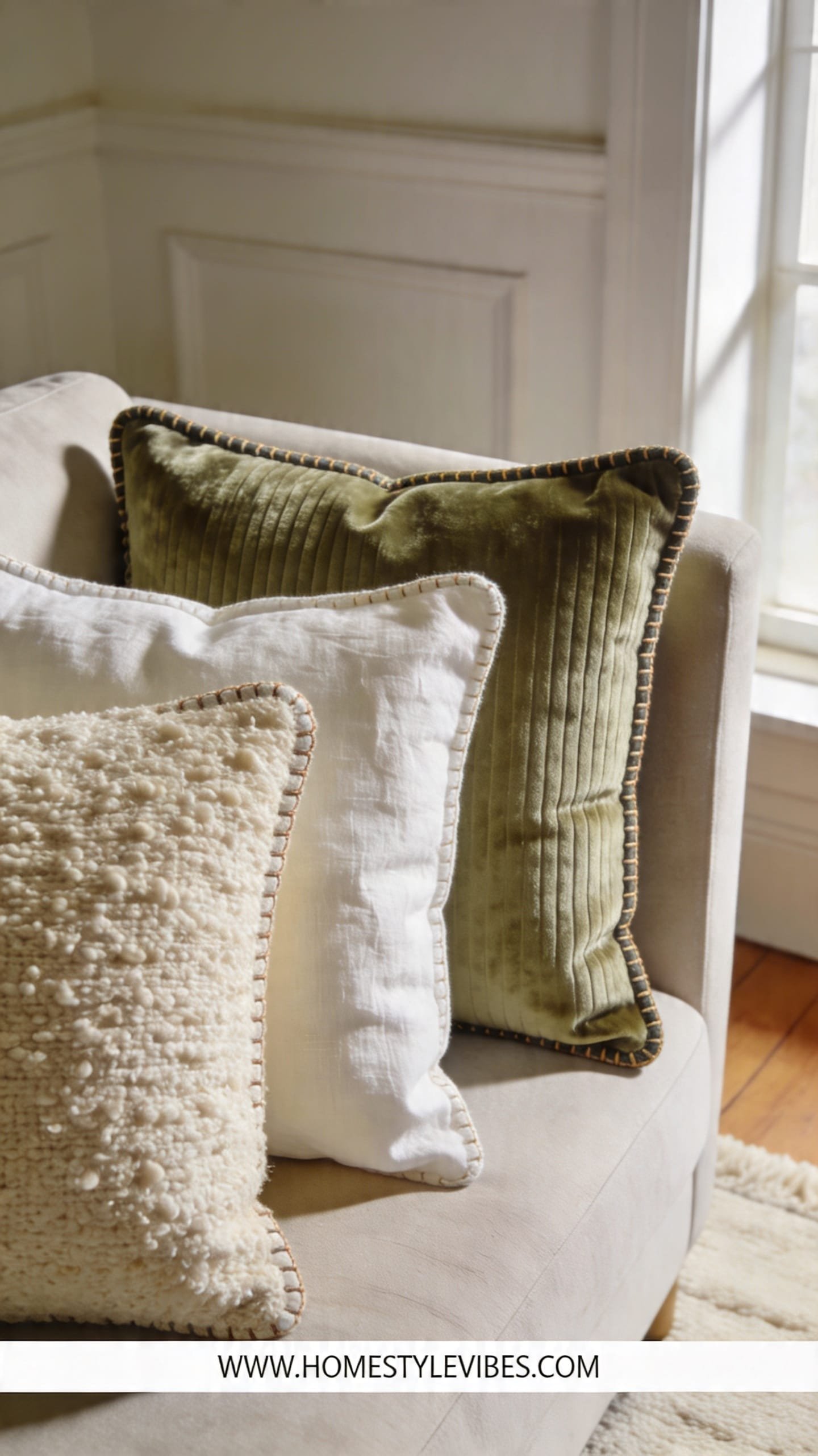
Textures That Do the Heavy Lifting (Even With Neutrals)
When you want cozy without chaos, texture is your quiet hero.
You’ve tried adding more color and it still feels busy. The secret isn’t louder — it’s richer. Combine three textures: one smooth (cotton, linen), one plush (velvet, chenille), and one tactile (boucle, fringe, slub weave). Under warm light, a velvet catches a soft sheen, boucle adds shadowy hills and valleys, and linen breathes. That interplay gives depth you can feel with your fingertips.
Prioritize touch-friendly fabrics where you actually sit. Put the nubby or tasseled favorite in the corner where it can be admired, and the soft, nap-friendly cushions dead center. For allergy or pet homes, choose tight-weave performance fabrics for the base and reserve the fuzz for the accent — IMO, this always wins on maintenance.
- Budget-friendly alternative: Amazon velvet covers ($12–$18) paired with Target boucle ($20–$25) and an IKEA linen-look basic ($6–$10)
- Renter-friendly swap: Use removable, machine-washable textures; avoid heavy wool if you can’t dry-clean easily
Mixing Patterns Like a Pro — Stripes, Florals, Abstracts
If patterns intimidate you, use scale — not guesswork — to make them play nice.
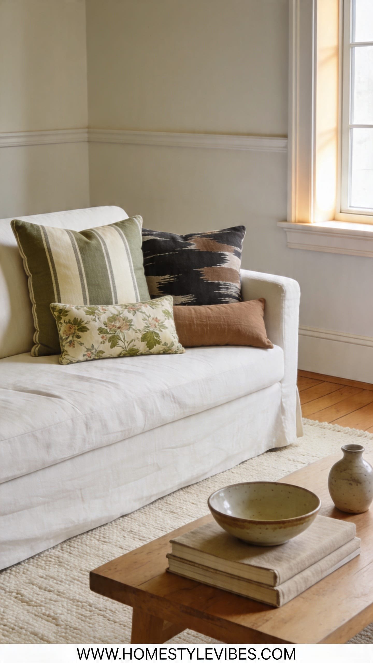
This is the part most people get wrong: they mix patterns of the same scale. Think tiny floral with small polka dots — it turns to visual noise. The fix is simple: choose one large-scale pattern (oversized floral, bold abstract), one medium (stripe, geometric), and one small (micro-dot, petite check). Limit yourself to 2–3 shared colors across them. Suddenly, even the funky mix looks like a curated gallery.
For a foolproof combo: wide stripe + painterly floral + small block print. Or, go graphic: herringbone + painterly brushstroke + micro-check. The secret sauce is breathing room — keep your solids flanking the patterns so the eye can rest, like the quiet pauses in a song. Picture the crisp line of a navy stripe beside a swishy watercolor petal; the contrast is spicy but balanced.
- Budget-friendly alternative: HomeGoods is king for patterned one-offs; aim for under $30 each and let those be your “medium” and “small” prints
- Renter-friendly swap: If you’re stuck with a patterned rug, echo one color in two pillow patterns so they feel connected
Quick micro-moment: You fling yourself onto the sofa after a long day, and your cheek lands on that silky stripe while your arm sinks into a plush floral. Feels like a hug, not a showroom.
Shape and Scale Matter: Squares, Lumbars, and Euro Sizes
Your pillow shapes are your architecture — get these right and everything else clicks.
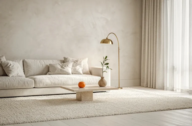
You’ve nailed the colors, yet something still feels off. Nine times out of ten, it’s the sizes. For a standard 84–90 inch sofa, aim for 24-inch squares at the back (Euro size vibes), 22-inch in front, and finish with a long lumbar (12×24 or 14×36) as the hero. That step-down cascade creates a skyline of soft peaks and valleys that looks tailored, not crowded.
On petite sofas (70–78 inches), go 22-inch back, 20-inch front, and a smaller lumbar. Deep sectionals can handle 26-inch backs. And please, use larger inserts than covers (a 24-inch insert in a 22-inch cover) for that crisp, full edge. It changes everything — visually and when you lean back with a book and feel the supportive, springy “oomph.”
- Budget-friendly alternative: IKEA Euro 26-inch inserts with Amazon 24-inch covers for a plush, custom look under $50 per pair
- Renter-friendly swap: If storage is tight, stick to two sizes (22 and lumbar) and double up the inserts for extra loft
If this feels like a lot, take a breath. Great styling happens in layers. Start with size, then add color, then texture — one pass at a time. Progress beats perfection.
Seasonal Switch-Ups Without Storing a Million Pillows
Keep it cute and cozy year-round with minimal storage and maximum mood shifts.
We all want that “fresh season” feeling without dedicating a closet to pillows. The answer? Own fewer inserts and rotate covers. Keep a core neutral trio you use year-round, then swap two accents and a hero with the seasons. For fall, think rust velvet, camel boucle, and a plaid lumbar. For spring, trade for lemon stripe, oat linen, and a floral block print. You’ll feel the temperature change — visually and literally — without spending every paycheck.
Focus on materials: linen and cotton for breezy months; velvet, knit, and sherpa when the air turns crisp. Under cool morning light, linen looks airy and matte. Under golden evening light, velvet glows. That’s the seasonal magic — not pumpkins on every surface. And if you’re in a small apartment, fold covers and store them in a single labeled bin under the bed. Done.
- Budget-friendly alternative: Two accent covers per season from Target ($15–$25 each) plus one splurge hero from Etsy or a boutique maker ($45–$85)
- Renter-friendly swap: Add a coordinating throw blanket to echo the accent color instead of buying extra pillows
Styling a Sofa vs. a Bed vs. an Accent Chair
Different perches, different rules — here’s how to nail each one without repeating yourself.
You’ve mastered the sofa, but the bed and chairs still feel awkward. Let’s map it. On a sofa, run the 3-2-1 formula with size variation. On a bed, think symmetry with a twist: two Euros against the headboard, two standards or queens, one or two decorative squares, then a long lumbar as the finale. For an accent chair, skip the clutter: choose one square or one slim lumbar that ties into your room’s palette so the seat stays functional.
Hierarchy matters. The bed wants plush layers that invite slow mornings with coffee and sun slanting across cotton percale; the chair needs one supportive pillow so you can actually sit and read. On the sofa, don’t cover every inch — leave 12–18 inches of breathable space in the center. That negative space feels calm and looks chic in photos.
- Budget-friendly alternative: Walmart or Amazon Euro shams for the bed under $20 each; pair with a single Etsy lumbar as your hero
- Renter-friendly swap: If your headboard is low, swap Euros for 24-inch squares to keep proportions right
Quick Checklist
- Pick a 3-2-1 mix: three solids, two patterns, one hero
- Anchor to your rug, art, or sofa color for cohesion
- Limit your palette to one anchor, one support, one spice
- Mix three textures: smooth, plush, tactile
- Vary pattern scale: one large, one medium, one small
- Use larger inserts than covers for fullness
- Layer sizes: 24-inch back, 22-inch front, long lumbar
- Keep seasonal covers, not extra pillows
- Leave breathing room at the center of the sofa
- Style the chair with one purposeful pillow
Frequently Asked Questions
How many throw pillows should I put on a standard sofa?
For an 84–90 inch sofa, five to six pillows look balanced: two larger at the back on each side, one or two mediums in front, and a single lumbar as the hero. Leave some center space so it doesn’t feel overstuffed.
I’m on a tight budget. What’s the smartest way to start?
Buy good inserts once and rotate inexpensive covers. Start with two quality 24-inch inserts, two 22-inch inserts, and one lumbar insert. Grab affordable covers from Target, Amazon, or IKEA, and upgrade one “hero” cover when you can.
My living room is small. How do I avoid crowding the sofa?
Use fewer, larger pillows instead of many small ones — they read cleaner and make the room feel calmer. Aim for four total and a single slim lumbar to keep the seat usable.
What fabrics are easiest to maintain with pets and kids?
Choose tight-weave performance fabrics, microfiber, or durable poly-linen blends for your base pillows. Save the velvet or boucle for one accent that you can spot-clean or replace easily.
How do I keep pillows from looking flat over time?
Size up your inserts, fluff regularly by grabbing corners and giving a quick shake, and rotate pillow positions weekly. If inserts deflate, add a bit of extra filling or upgrade to a down-alternative with higher loft.
Conclusion
The truth is, combining throw pillows like a designer isn’t about collecting dozens of trendy options — it’s about a simple structure that makes your style sing. Start with the 3-2-1 mix, build a color story from what you already own, and let texture whisper “cozy” without shouting. Then size it right, step back, and give your room that final wink with one standout hero.
You don’t need a massive budget or a stylist on speed dial. Start today with two solids you love and one patterned cover that nods to your rug or art. Swap the inserts you have into the right sizes, add a lumbar, and watch the whole room breathe easier. You’ve got this — and your sofa is about to become everyone’s favorite seat in the house.