7 Best Wall Colors for Bedroom That Feel Calm Cozy and Totally Pinterest-Worthy Secrets Revealed
You want a calm, cozy bedroom with soft light skimming textured walls, crisp bedding that actually looks intentional, and a color that flatters the room all day. You hate waking up to walls that look dull, cold, or weirdly green at 3 p.m., and you’re over scrolling Pinterest wondering why your beige doesn’t look like theirs. Imagine a space where the paint does the heavy lifting—diffusing light, grounding your furniture, and making the whole room read as serene on camera and in real life. These seven ideas fix the exact frustration: picking a bedroom wall color that finally makes the room feel quiet, cohesive, and yes—Pinterest-pretty—on a real-world budget in one weekend or less.
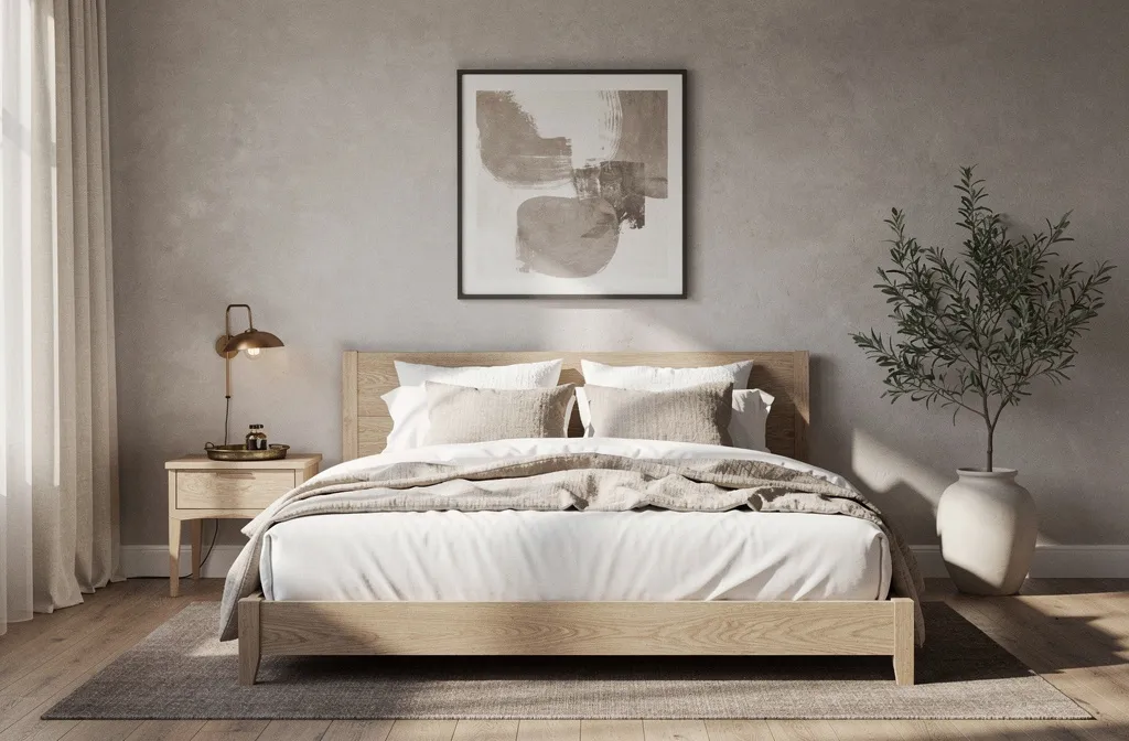
We’ll talk specific colors, undertones, finishes, textiles, and styling layers that give your space a finished look. If you’ve ever painted a swatch, loved it at noon, then hated it at sunset, this is for you. Choose one design and work it start to finish, or mix ideas as your budget and time allow. The vibe? Unfussy luxury with soul—perfect for anyone who wants a bedroom that’s calm on weekdays, moody and romantic on weekends, and photogenic any time you fluff the duvet.
1. Cloud-Soft Greige With Linen Layers and Bronze Glow
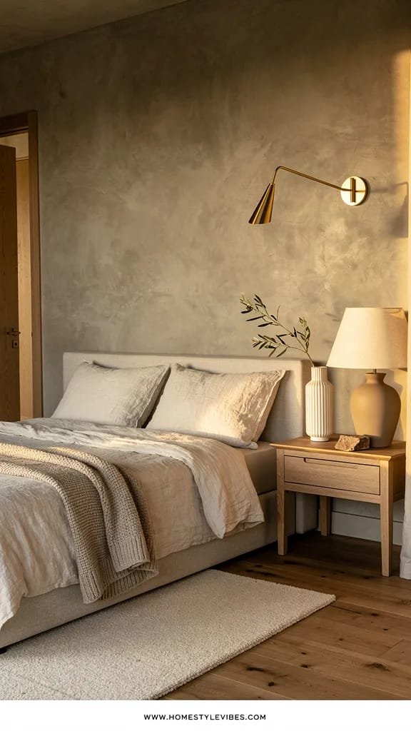
We’ve all been there: you chose a safe “greige” and somehow it reads like sad oatmeal. The secret here is a cloud-soft greige with a drop of warmth, paired with linen textures and warm metal accents that bounce light back into the room. The mood leans hotel-soft and quietly elegant—think spa robe, warm tea, and a floor lamp that makes every corner feel hugged.
This works beautifully in real homes because greige is forgiving. It hides scuffs better than pure white, plays nicely with both warm and cool furniture, and flatters skin tone, so the whole room looks gentler in the morning. Lighting matters: north-facing rooms need a greige that leans warm (beige > gray), while south-facing rooms can handle a cooler undertone. With natural light, the walls read as airy and calm; at night, bronze accents and soft lamps add a mellow glow that shifts the room into cozy mode. On camera, this palette photographs like a dream—layered neutrals plus a hint of metallic looks expensive, not busy.
Variations? Budget-friendly: paint only the wall behind the bed and use removable linen-look curtains to echo the tone. Small space: choose a lighter greige and keep the trim a crisp white to create contrast. Darker version: push two shades deeper on the same strip and swap sheer drapes for heavier flax curtains. Renter-friendly: removable fabric panels or peel-and-stick linen wallpaper behind the bed gives texture without commitment.
Budget Breakdown:
- Greige paint (1–2 gallons): $45–$120
- Linen curtains (pair): $60–$200
- Oil-rubbed bronze curtain rod: $35–$80
- Warm LED bedside lamps (dim-to-warm): $50–$180 per pair
- Textured throw + two linen pillow covers: $40–$120
Total Estimated Cost: $230 – $700
Best For: Apartments and homes where you want one palette that works with mixed furniture and gets you that soft, light-diffusing look. Great for year-round coziness without visual clutter.
Key Design Elements:
- Main materials: matte paint, linen, bronze hardware
- Color palette: warm greige, crisp white, soft taupe, muted bronze
- Lighting strategy: two warm LED lamps plus one floor lamp with fabric shade
- Furniture silhouettes: rounded headboard, wood nightstands with simple hardware
- Texture layers: linen curtains, nubby throw, wool rug
- Accent details: bronze pull handles, a single leafy plant, framed black-and-white art
How To Recreate This Look:
- Start with a warm greige on all walls; sample two undertones across your sunniest and darkest spots for a full day.
- Add linen curtains mounted high and wide to make the window feel taller and softer.
- Layer crisp white bedding with two linen shams and one textured throw in a slightly darker tone.
- Install warm LED bulbs (2700K–3000K) in bedside lamps; pick fabric shades for gentle diffusion.
- Style with a bronze tray, a leafy plant, and one piece of simple black-and-white art above the headboard.
Why This Looks Expensive: The tonal palette plus linen texture gives depth without visual noise. Bronze accents catch the lamplight and add a “soft sparkle” moment that reads lux on camera.
Watch Out: Don’t pick a greige with green undertones in north-facing rooms—it can go sallow. Always test next to your flooring; red-toned wood floors can make a cool greige look purple.
Pro Styling Tip: Angle the floor lamp so light rakes across the wall—those shallow shadows make linen textures and nubby throws look editorial in photos.
Curious how a color can feel like a hug but still look crisp in daylight? Keep scrolling—you’ll spot one that fits your exact lighting.
2. Misty Blue-Gray with Coastal Linen and Weathered Wood
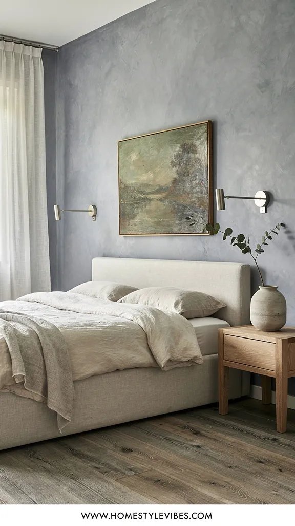
It’s that one corner that always feels a little stale—like the air doesn’t move. You’ve tried bright white, but it glares at noon and goes icy at night. A misty blue-gray solves the “stale corner” problem by bringing in a whisper of color that reads like sea air. The mood is modern coastal without the clichés: calm, breezy, grounded by weathered wood and brushed nickel or pewter details.
In real homes, blue-gray works because it cools visual heat from red or orange-toned floors, and it pairs easily with white bedding and woven textures. It’s a color that creates perceived space, especially in small rooms where you want the walls to fall back. Lighting transforms it: in bright rooms it feels airy; in low light it feels cocooned. Photographs beautifully because blue-gray adds gentle contrast against warm woods and creams, and it avoids that “flat white box” look.
Variations? Budget-friendly: paint the wall and add a single weathered-wood mirror. Small-space: keep trims white and add a pale, striped rug. Darker version: choose a deeper slate blue on an accent wall behind the bed. Renter-friendly: removable wallpaper in a faint ticking stripe over blue-gray paint adds depth without permanence.
Budget Breakdown:
- Misty blue-gray paint (1–2 gallons): $45–$120
- Weathered wood mirror: $60–$180
- Linen duvet cover: $70–$180
- Striped cotton rug 5×7: $80–$220
- Pewter or brushed nickel lamp pair: $60–$180
Total Estimated Cost: $315 – $880
Best For: Rooms with warm floors or afternoon sun; anyone craving a calm, coastal whisper without themed decor.
Key Design Elements:
- Main materials: matte paint, weathered wood, linen, brushed nickel
- Color palette: misty blue-gray, cream, warm oak, pewter
- Lighting strategy: diffused pendant, sconce pair, dimmers at 30% in the evening
- Furniture silhouettes: simple box frame bed, slim metal lamps, woven baskets
- Texture layers: linen duvet, cotton stripe rug, rattan tray
- Accent details: ceramic lamp bases, coastal abstract art, olive tree or eucalyptus stems
Why This Feels Designer:
The restrained palette and deliberate material mix—cool paint with warm wood—create tension and depth. It’s quiet but not blank, and that’s what reads high-style.
How To Recreate This Look:
- Start with a sample of two blue-grays: one slightly greener, one slightly smokier; pick the one that refuses to go baby blue in daylight.
- Add linen bedding in off-white to avoid stark contrast; fold a striped throw at the foot.
- Layer in a weathered-wood mirror opposite a window to bounce soft light.
- Install brushed nickel bedside lamps or sconces with warm bulbs to keep evenings cozy.
- Style with a rattan tray, a ceramic vase with eucalyptus, and a small stack of pale-spined books.
One Thing To Avoid: Don’t pair icy blue-gray with cold white lighting (4000K+). It will turn your room into a doctor’s office. Warm the bulbs and it all melts together.
Pro Styling Tip: Tuck the rug 2/3 under the bed and pull it out on one side only—this asymmetry adds dimension in photos and helps small rooms feel broader.
Quick Tip: Draw a small square of your chosen paint color on white paper and carry it around the room at different times of day. This isolates undertones so you don’t get tricked by your flooring or existing wall colors.
3. Milk Tea Beige with Creamy Trim and Quiet Plaid
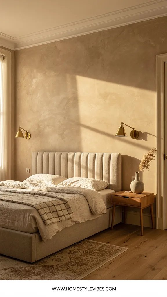
You’ve tried beige before and it ended up, well… blah. The fix is a milk tea beige with creamy trim that nods to Parisian apartments without feeling fussy. Think soft latte, a touch of caramel, and crisp bedding that looks intentional, not model-home. The mood is cozy heritage-meets-modern: graceful, warm, and deeply restful.
This works in real homes because it warms spaces that feel chilly and flatters a wide range of wood tones—from honey oak to walnut. It can handle everyday life: it hides dust, scuffs, and the “we put a suitcase there” mark for a week. Lighting: morning light turns it peachy; evening lamps make it glow. Photographs incredibly well because creamy trim adds architectural definition, and a small-scale plaid or gingham brings friendly pattern without shouting.
Variations? Budget-friendly: paint trim and a single milk tea feature wall behind the bed. Small space: lighter milk tea on walls, slightly darker on doors for depth. Darker version: go one step richer and pair with smoked bronze hardware. Renter-friendly: peel-and-stick plaid headboard decal or fabric-covered pin boards in plaid to fake the look.
Key Design Elements:
- Main materials: eggshell paint on walls, satin on trim, wool or cotton plaid
- Color palette: milk tea beige, creamy off-white, warm oak, smoked bronze
- Lighting strategy: layered table lamps with fabric shades, candlelight for evenings
- Furniture silhouettes: upholstered headboard, turned-wood lamp bases, classic nightstands
- Texture layers: quilted coverlet, wool plaid throw, velvet accent pillow
- Accent details: pleated lampshades, framed botanical prints, dried florals
Budget Breakdown:
- Milk tea beige paint (1–2 gallons): $45–$120
- Cream trim paint (1 gallon): $40–$80
- Plaid throw or blanket: $40–$150
- Pleated lampshades: $30–$90
- Smoked bronze knobs (set of 6–8): $25–$80
Total Estimated Cost: $180 – $520
Best For: Traditional or transitional homes, or anyone craving warmth without going brown. Works year-round and enhances resale value with its broad appeal.
How To Recreate This Look:
- Start with milk tea beige on walls and a creamy, slightly yellowed off-white on trim and doors.
- Add white bedding and a quilted coverlet for subtle texture; layer a wool plaid throw at the end.
- Swap hardware to smoked bronze on nightstands for quiet richness.
- Install two table lamps with pleated shades for that classic, soft light pattern on the walls.
- Style with botanical prints in simple black frames and a dried floral arrangement on a tray.
Why This Reads High-End: Contrast between wall and trim feels custom. The classic fabrics and hardware give the room a “collected over time” vibe that feels edited, not themed.
The Most Common Mistake: Painting trim the same as walls to “simplify.” Here, you want the creamy trim contrast; it’s the part that makes the biggest visual difference.
Pro Styling Tip: Place one lamp slightly closer to the wall than the other—those offset light pools make your photo look editorial, not staged.
Mindset shift: Remember, this isn’t about recreating a showroom. It’s about building a bedroom that actually fits your mornings, your laundry piles, and your Sunday naps. If one idea resonates more than the others, that’s your starting point—you don’t need all seven.
4. Deep Olive Velvet Walls with Brass and Charcoal Quiet
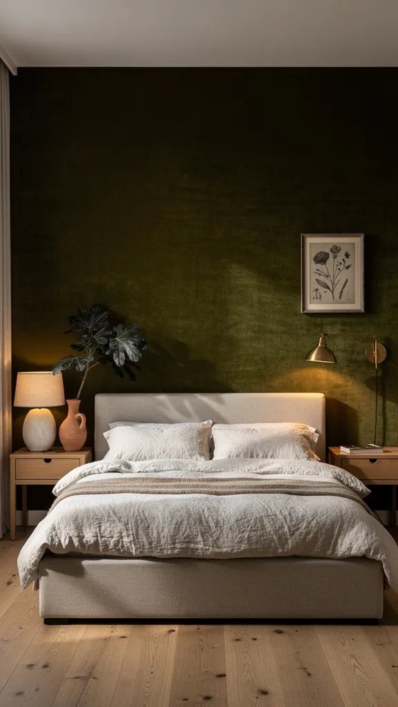
You want drama but fear your room will feel like a cave. You’ve dabbled with dark paint samples and panicked halfway. Deep olive solves the “too moody” fear by adding warmth and softness that feels more forest than bunker. The mood is modern Mediterranean-meets-library: grounded, sensual, and incredibly cozy at night—like a velvet robe for your walls.
This works in real homes because olive changes with light. Sunlight makes it earthy and organic; lamplight turns it luxe and enveloping. It pairs well with existing wood furniture and makes brass hardware and white linens pop. On camera, olive creates delicious contrast and brings out the grain in wood, the gleam in brass, and the depth in charcoal or black accents.
Variations? Budget-friendly: paint just the headboard wall olive, keep others warm white. Small space: use olive on the lower two-thirds of the wall (painted “wainscot”), creamy white above. Darker version: go full room olive with matte finish and double the lamps. Renter-friendly: olive fabric headboard or oversized art piece with olive background anchors the palette.
Budget Breakdown:
- Olive paint (1–2 gallons): $45–$120
- Brass pulls/knobs (set): $35–$120
- Charcoal linen duvet: $80–$200
- Textured ivory throw pillows: $40–$120
- Dimmer switches + warm bulbs: $30–$80
Total Estimated Cost: $230 – $640
Best For: Rooms that need coziness or where you mostly use the space in the evening. Great for creating a boutique-hotel feel.
Key Design Elements:
- Main materials: matte paint, linen, brass, natural wood
- Color palette: deep olive, charcoal, ivory, antique brass
- Lighting strategy: layered warm light—two lamps plus a dimmed overhead, 2700K bulbs
- Furniture silhouettes: low platform bed or curved headboard, clean-lined nightstands
- Texture layers: heavy linen duvet, bouclé or looped pillows, wool rug
- Accent details: brass picture light, black frames, smoky glass vase
Why This Looks Intentional:
Dark walls need a plan. Here, brass repetition and charcoal textiles tie the palette together so it reads curated, not accidental drama.
How To Recreate This Look:
- Start by painting walls in a flat/matte olive; this knocks back reflections and creates that “velvet” quality.
- Add a charcoal duvet and crisp ivory sheets to punch contrast and keep the bed fresh-looking.
- Layer antique brass hardware and one brass picture light over art to echo the metal notes.
- Install warm bulbs and dimmers; aim for pools of light instead of a bright, even wash.
- Style with a smoky glass vase and one black-framed art piece to ground the palette.
Don’t Do This: Don’t pair cool daylight bulbs with olive—they flatten the green and make it muddy. Keep it warm and let shadows add mood.
Pro Styling Tip: Leave 6–8 inches between the top of your headboard and the bottom of your art; that sliver of olive showing frames the bed beautifully in photos.
Did You Know? Dark colors actually recede visually in low light. That’s why a deep olive room can feel larger at night—it blurs the edges so your eye reads the space as infinite, not cramped.
5. Blush Beige Glow with Fluted Nightstands and Soft Brass
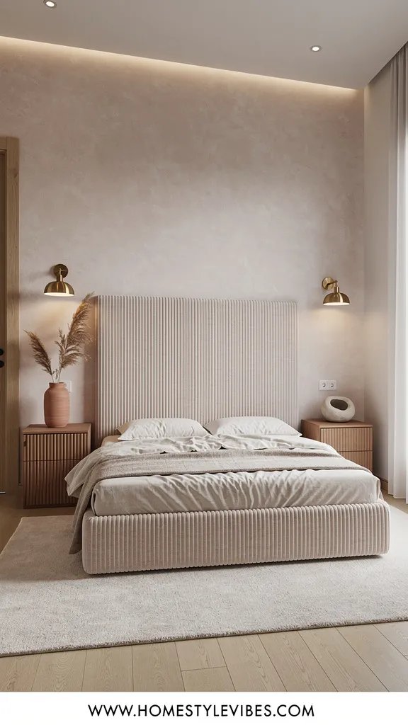
You love the idea of pink but worry it’ll look childish or Instagram-trendy in a year. You want warmth for your skin and a glow that makes mornings feel gentle. Blush beige—more beige than blush—does exactly that. The mood is soft and sophisticated, like candlelight bottled for daytime. Fluted wood details and soft brass finish the story without tipping into glam.
Why this works at home: blush beige adds a subtle rosiness that flatters every skin tone and softens shadows around the room. It’s wildly photogenic because it reflects a warm tone on everything without making beige look flat. In low-light rooms, it keeps walls from going gray and sallow. With fluted details on nightstands or a DIY fluted headboard, you get gentle shadows that add depth in every photo angle.
Variations? Budget-friendly: paint only two walls facing each other to bounce that rosy light. Small space: keep trim white and floors light; limit dark accents. Darker version: select a rose-tan two shades deeper and anchor with a walnut bed. Renter-friendly: blush-toned wall hangings and a fluted peel-and-stick headboard panel.
Budget Breakdown:
- Blush beige paint (1–2 gallons): $45–$120
- Fluted nightstands or DIY fluted panel kit: $120–$400
- Soft brass knobs/pulls (set): $30–$100
- Ivory blackout curtains: $60–$180
- Sheepskin or faux sheepskin throw: $30–$120
Total Estimated Cost: $285 – $920
Best For: Morning people, makeup-on-vanity folks, and anyone who wants a warm glow without obvious pink. Works especially well in cold climates.
Key Design Elements:
- Main materials: eggshell paint, fluted wood, soft brass, wool or faux shearling
- Color palette: blush beige, ivory, walnut, soft brass
- Lighting strategy: frosted bulbs and fabric shades to keep the glow even
- Furniture silhouettes: rounded corners, fluted textures, low-profile bed
- Texture layers: velvet cushion, shearling throw, cotton sateen sheets
- Accent details: brass picture frames, blush-toned art prints, a simple ceramic bowl
How To Recreate This Look:
- Start by painting all walls in a blush beige with a velvety eggshell finish to reflect light softly.
- Add fluted nightstands or DIY a fluted front onto existing ones with paintable half-round molding.
- Layer ivory blackout curtains hung 2–4 inches from the ceiling to close that awkward rod-to-ceiling gap.
- Install soft brass hardware on nightstands and closet doors for a cohesive thread.
- Style with a sheepskin throw draped over a chair and a small brass-framed photo on the nightstand.
Why This Looks Expensive: Micro-shadows from fluting plus soft metal accents create depth. It’s the small, repeated details that whisper “custom.”
Watch Out: Avoid cool, stark white trim with blush beige; it can make the pink read cheap. Choose a warm white or creamy off-white for harmony.
Pro Styling Tip: Photograph during golden hour with only lamps on—blush beige captures that honeyed light and makes even a simple bedscape look editorial.
Small note before we continue: you don’t need to nail undertones on the first try. Paint two poster boards, live with them for two days, and move them around. That tiny patience up front saves a redo later—trust me, I’ve been there with a “why is my beige purple?” situation at 7 p.m.
6. Soft Sage Whisper with Woven Cane and Stoneware Calm
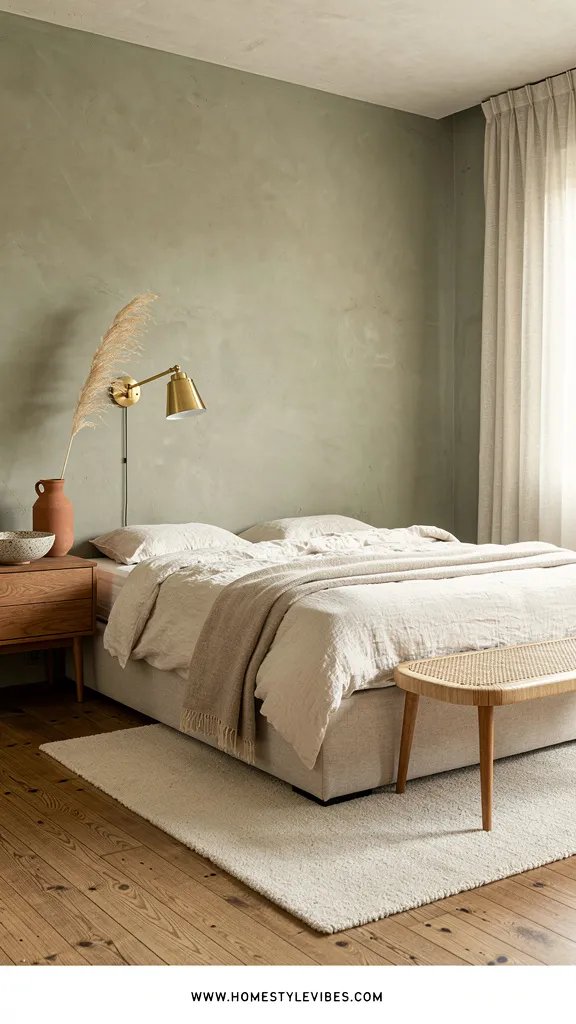
There’s always that restless energy at night—your brain won’t quiet and the room feels too “on.” Soft sage turns the volume down without darkening the space. It’s a barely-there green that reads almost neutral, especially when paired with woven cane and stoneware. The mood is Japandi-meets-California casual: airy, grounded, and quietly restorative.
Why it works at home: sage has a natural balancing effect, especially in rooms with lots of screens or harsh overhead light. It counteracts the clinical feel of bright LEDs and plays well with pale woods, caning, and stoneware lamps. Lighting shifts it from silvery green in the morning to warm herbal in the evening. On camera, the cane and sage combo creates a tactile softness, while stoneware adds subtle matte highlights that keep things looking real, not plastic-perfect.
Variations? Budget-friendly: paint the wall and add a single cane detail—like a DIY cane-front frame. Small-space version: pale sage everywhere with white bedding and a light jute rug. Darker version: drift into muted laurel green and ground it with black accents. Renter-friendly: sage linen curtains and a cane headboard that leans against the wall.
Budget Breakdown:
- Sage paint (1–2 gallons): $45–$120
- Cane headboard or DIY caning kit: $90–$350
- Stoneware lamp pair: $80–$240
- Jute or sisal rug 5×7: $70–$220
- Neutral linen bedding: $80–$220
Total Estimated Cost: $365 – $1,150
Best For: Anyone craving serenity with a little character; works beautifully in rental apartments and small rooms with limited natural light.
Why This Feels Designer:
Sage, cane, and stoneware speak the same language: tactile, matte, and natural. Repeating that material story makes the space feel deliberate and soothing.
Key Design Elements:
- Main materials: matte paint, woven cane, linen, stoneware, jute
- Color palette: soft sage, natural oak, ivory, black accents
- Lighting strategy: warm task lighting with diffused overheads on a dimmer
- Furniture silhouettes: lightweight, airy frames; rounded corners; slender legs
- Texture layers: jute rug, lightweight linen duvet, textured stoneware
- Accent details: black picture frames, a trailing plant, small stack of neutral books
How To Recreate This Look:
- Start by painting the walls a soft sage with a subtle gray undertone to avoid mintiness.
- Add a cane headboard or DIY cane panels framed in thin oak to lean against the wall.
- Layer a jute rug under the bed for texture and a relaxed, sun-baked vibe.
- Install stoneware lamps with warm bulbs to echo the matte texture story.
- Style with one trailing plant and a cluster of stoneware vessels on a tray.
One Thing To Avoid: Don’t overdo green. Keep plants simple and accents neutral, or you’ll veer into themed “garden room” instead of serene bedroom.
Pro Styling Tip: In photos, add a single black accent—like a slim frame or a small stool—to anchor the light, airy palette and sharpen the contrast.
Quick Tip: Check your paint finish. In bedrooms, eggshell or matte looks softer on camera and hides wall texture. Semi-gloss on trim only—anything shinier on walls will show every roller mark at sunset.
7. Warm Taupe Mushroom with Limewash Texture and Aged Bronze
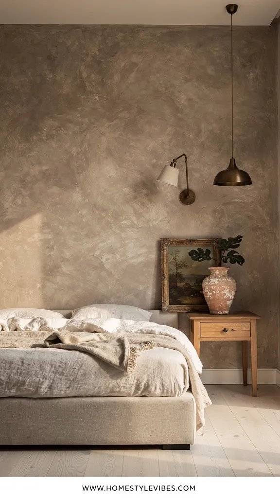
You’ve tried to add “character,” but your walls still feel flat. Here’s the fix: a warm taupe-mushroom tone paired with limewash. It’s a tactile, old-world finish that throws soft shadows and instantly makes the room feel storied. The mood leans European farmhouse-meets-contemporary: lived-in, cocooning, and visually rich without being dark.
Why it works: limewash texture scatters light and makes every photo read dimensional. Warm taupe avoids gray’s chill while staying sophisticated—no yellow, no greige muddiness. It thrives in both bright and dim rooms, shifting gently with the day. It’s practical too: minor scuffs disappear into the movement of the finish. With aged bronze and natural stone, the palette feels cohesive and timeless.
Variations? Budget-friendly: faux-limewash using a brushy technique with regular paint mixed with glaze. Small space: keep the limewash to one wall and paint the others in the same taupe color flat. Darker version: go mushroom two shades deeper and lean hard into bronze and walnut. Renter-friendly: textured canvas panels painted in limewash style, then hung as oversized art behind the bed.
Budget Breakdown:
- Warm taupe paint (1–2 gallons): $45–$120
- Limewash or mineral paint: $60–$180
- Wide natural-bristle brush + sponges: $20–$40
- Aged bronze curtain rod + rings: $45–$120
- Stone side table or travertine pedestal: $120–$400
Total Estimated Cost: $290 – $860
Best For: Anyone who wants personality with a neutral palette. Especially good for rooms with plain drywall that need movement and depth.
Key Design Elements:
- Main materials: limewash, warm taupe, aged bronze, travertine, natural linen
- Color palette: mushroom taupe, ivory, walnut, deep bronze
- Lighting strategy: wall washers or plug-in picture lights to graze the texture
- Furniture silhouettes: sculptural side table, simple upholstered bed, clean-lined dresser
- Texture layers: heavy linen curtains, wool rug, raw-edge throw
- Accent details: vintage-look frames, ceramic table lamp, one raw branch in a vase
How To Recreate This Look:
- Start by painting a base coat in warm taupe, matte finish.
- Add limewash in overlapping X strokes with a wide natural-bristle brush—work in sections for organic movement.
- Layer heavy linen curtains on an aged bronze rod with rings for a soft drape.
- Install a plug-in picture light over the bed or art to graze the wall and highlight the texture.
- Style with a small travertine side table and a raw branch in a ceramic vase for sculptural calm.
Why This Reads High-End: Textured walls plus stone accents feel bespoke. Grazing light over the surface fakes architectural bones you might not have—seriously effective.
Watch Out: Don’t rush the limewash. Uneven drying can leave harsh edges. Feather each section while still damp and keep a damp sponge handy to soften transitions.
Pro Styling Tip: Shoot with a single side lamp on and overheads off—the raking light across the limewash and stone adds depth your phone camera loves.
Mindset refresher: Perfection is not the goal. Aim for a palette and texture story that calms your nervous system when you walk in. If one corner makes you smile—even before the rest is done—you’re on the right track.
Quick Checklist
- Test paint swatches on poster boards and move them around for 24–48 hours
- Choose warm LEDs (2700K–3000K) to flatter cozy wall colors
- Commit to one finish: matte/eggshell on walls, satin/semi-gloss on trim
- Repeat a metal finish at least twice for cohesion
- Balance cool and warm tones in each palette
- Layer at least three textures: one smooth, one nubby, one soft
- Hang curtains high and wide to fix the rod-to-ceiling gap
- Rug under bed: extend at least 18–24 inches beyond sides for scale
- Use dimmers to shift from daytime bright to evening cozy
- Add one black or dark accent to sharpen lighter palettes
- Photograph with raking light across textured elements
- Edit nightstands: keep surfaces 60% clear for a finished look
Frequently Asked Questions
How do I pick the right undertone for my bedroom’s light?
Watch your room for a full day. North light is cool—choose warmer colors (greige, milk tea, blush beige). South light is warm—balanced cools like misty blue-gray or soft sage work well. Always sample in at least two spots and check morning, noon, and evening.
I’m on a tight budget—what’s the single upgrade that makes the biggest visual difference?
Paint the wall behind your bed and swap bulbs to warm LEDs on dimmers. That pairing controls color and mood for under $100–$150 and instantly makes the room feel finished.
My room is small. Will dark colors make it feel tiny?
Not if you control sheen and lighting. Matte deep olive or mushroom taupe with pools of warm light can actually blur edges at night, making the space feel larger. Keep bedding light for contrast and avoid glossy finishes.
How do I keep neutral walls from looking boring in photos?
Layer texture: linen curtains, a nubby throw, a wool rug, plus one subtle metal. Use side lighting to create shadows. Keep one dark accent to anchor the shot and avoid everything blending into beige soup.
I rent—what are renter-friendly ways to get these looks?
Lean a fabric or cane headboard, use removable wallpaper or fabric panels, swap in warm bulbs, and add curtains with tension rods. Hardware swaps on dressers also bring in your metal finish without touching the walls.
The Wrap-Up
Choose one wall color that makes your bedroom feel calm and cozy even on a Wednesday night when your laundry basket is giving you side-eye. Start small: paint a single wall, switch your bulbs, and add one textured layer. You’ll feel the shift quickly—less visual noise, more exhale.
The truth is, luxury in a bedroom comes from texture, lighting, and restraint. A color that flatters your light, a fabric that breaks up the flatness, a metal that repeats twice—these are the moves that make a room actually feel finished. I tried the blush beige in my own guest room last fall and honestly couldn’t believe the difference; the whole space photographed like a boutique hotel, and my friend refused to leave after brunch.
Pick the palette that makes your shoulders drop. Test, commit, layer. You’ve got this—and your now Pinterest-worthy bedroom is about to be your favorite place to be.

About the Author

Krisztina P.Rendes, Founder of Home Style Vibes
Founder of Home Style Vibes
Krisztina Puskásné Rendes created Home Style Vibes as a cozy-modern lifestyle space where homemaking meets inspiration. Her goal is to help women create beautiful, organized, and peaceful homes they truly love — without overwhelm. You’ll find here heart-driven content on home decor, cleaning tips, easy family recipes, organization and decluttering, DIY home projects, plants, and seasonal ideas — all designed to bring more calm, comfort, and style into everyday life.