5 Ways to Paint Oak Kitchen Cabinets So They Look Modern and Beautiful
You want a kitchen that looks crisp, sunlit, and expensive. You hate that your oak cabinets make everything feel yellowed, busy, and dated—like your room always has a sepia filter you didn’t ask for. Picture this instead: softened grain that feels artisanal, a satin sheen that catches morning light, and hardware that clicks into your hand with quiet confidence. These five paint ideas will fix the exact oak-cabinet frustration you feel right now and give you Pinterest-worthy results—on a real-life budget you can actually say yes to in the next two weekends.
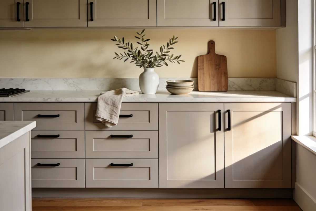
Each concept is its own world: different colors, different finishes, and super specific tips for lighting, hardware, and styling so your kitchen photographs beautifully and lives even better. If you love a clean, modern mood without losing warmth, this is for you. If you want family-friendly surfaces that stand up to splatters and sippy cups, that’s in here too. Let’s make the room actually feel finished—no demo required.
1. Soft Greige Shaker Refresh With Honed Stone Calm
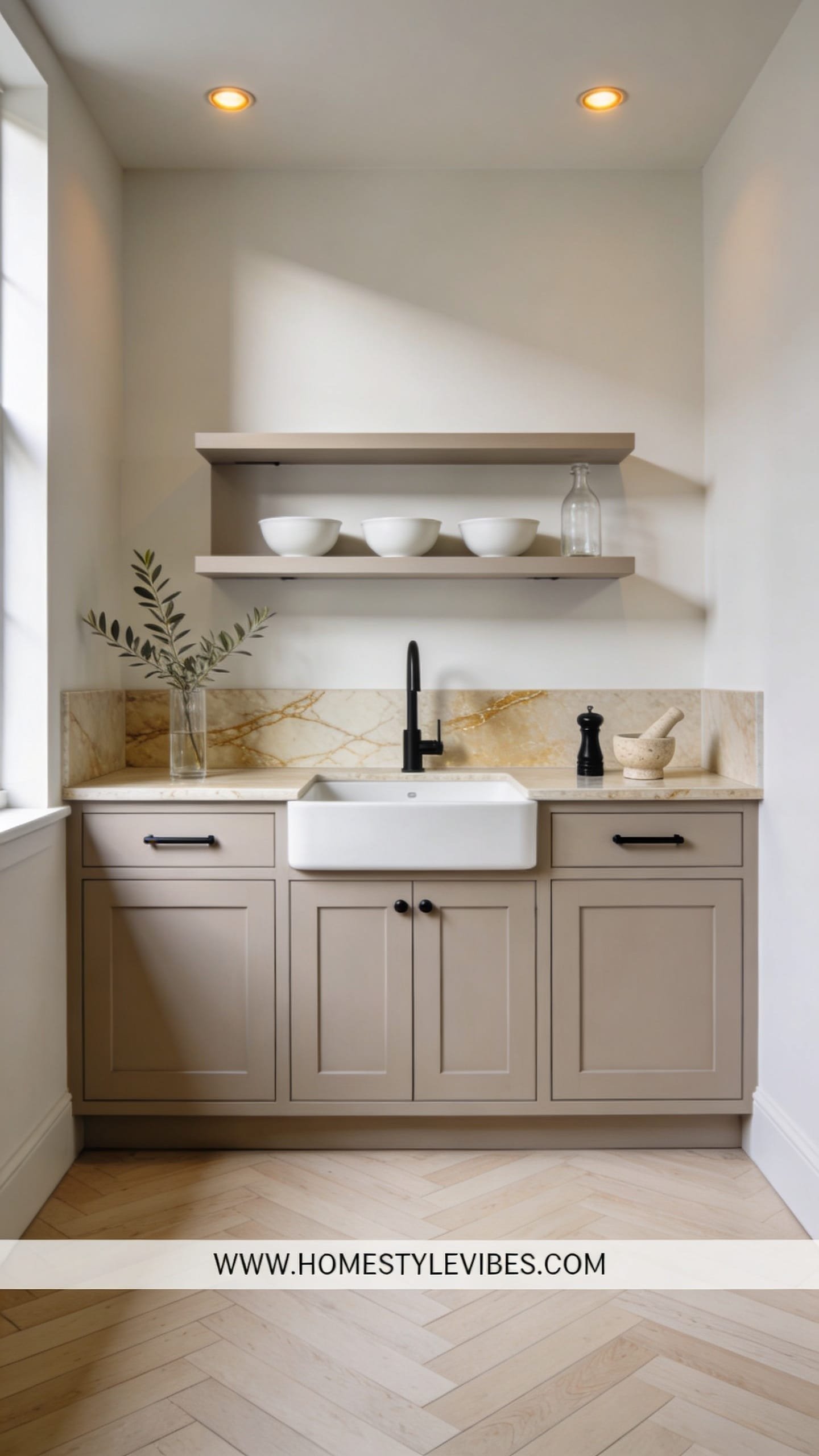
We’ve all been there: you tried a stark white on your oak cabinets hoping for “light and airy,” but the heavy grain still shouted through like corduroy pants at a silk party. This design leans into softness instead of fighting it. Think warm greige paint with a velvety satin sheen, honed marble or quartz that reads matte under morning light, and slim black or antique brass hardware that sketches just enough line work to feel current. The mood: quiet, curated, restful—like a boutique hotel pantry you’d happily linger in with a cappuccino.
What makes it work in real homes is the way greige warms oak’s natural undertones without turning yellow. It’s especially good for small spaces or kitchens with north-facing windows where stark white can fall flat. Lighting matters here. Choose warm 2700K LED bulbs that kiss the stone and keep shadows gentle; greige sings when it gets that soft glow. Materials dominate in a subtle stack: satin cabinetry, honed counters, brushed brass or black pulls, and a micro-thin ridge of backsplash detail like a short marble saddle ledge instead of traditional tile for a clean break.
Why does this photograph beautifully? The low-gloss paint paired with honed stone gives everything a low-contrast, editorial finish. The cabinet faces pick up diffused light and throw gentle shadows around the shaker rails, which reads luxe on camera. Two variations make it flexible: for a budget-friendly version, swap honed marble for a honed quartz remnant or a laminate with a chalky texture; for a small-space twist, paint lowers in greige and keep uppers in a warm white to lift the eye line. Renter-friendly angle? Paint just the pantry or a freestanding hutch for cohesion without committing to the whole room.
Budget Breakdown:
- Cabinet paint (pro-grade enamel or alkyd waterborne): $120 – $220
- Primer with tannin block (shellac-based): $40 – $70
- Honed quartz countertop (remnant install): $600 – $1,200
- Hardware (slim bar pulls or small knobs): $80 – $220
- LED bulbs at 2700K: $20 – $60
- Mini backsplash ledge in stone: $150 – $400
Total Estimated Cost: $1,010 – $2,170
Best For: Smaller kitchens, north-facing rooms, and anyone who wants calm warmth over clinical white. Works great in transitional or modern farmhouse homes.
Key Design Elements:
- Main materials: Satin greige paint, honed stone, brushed metal hardware
- Color palette: Mushroom greige, soft white walls, muted black or brass accents
- Lighting strategy: Warm 2700K LEDs, under-cabinet lighting with diffusers
- Furniture silhouettes: Slim cafe stools, round-edge table for softness
- Texture layers: Linen runner, ceramic canisters, matte flatware
- Accent details (hardware, decor pieces, plants): Herb pot in terracotta, shallow fruit bowl, narrow framed art
How To Recreate This Look:
- Start with a tannin-blocking primer to tame oak grain bleed; don’t skip this or your greige shifts orange.
- Add two thin coats of high-quality satin enamel in a warm greige; sand lightly between coats for a buttery finish.
- Layer in honed counters or a matte laminate with subtle veining; avoid shiny speckled granite which dates the look.
- Install slim pulls—either thin black bars for contrast or small antique brass knobs for warmth.
- Style with restrained bits: one ceramic pitcher, a linen towel, and a terracotta herb pot for a soft, lived-in feel.
Why This Looks Expensive: The low-sheen combo of satin paint and honed stone swallows glare and lets forms show, which feels custom. Minimal hardware lines and a short stone ledge create crisp edges without visual noise.
Watch Out: Don’t choose a greige that leans purple or green next to your floor. Test large swatches against your flooring at different times of day to avoid surprise undertones.
Pro Styling Tip: Leave 30 percent of your counters totally clear—one styled cluster under a downlight reads like a magazine shot and keeps the rest peaceful.
Keep scrolling—next we go richer, moodier, and unbelievably photogenic without losing the friendliness you need at 7 a.m.
2. Inky Navy Lowers With Cloud-White Uppers and Brass Ribbon
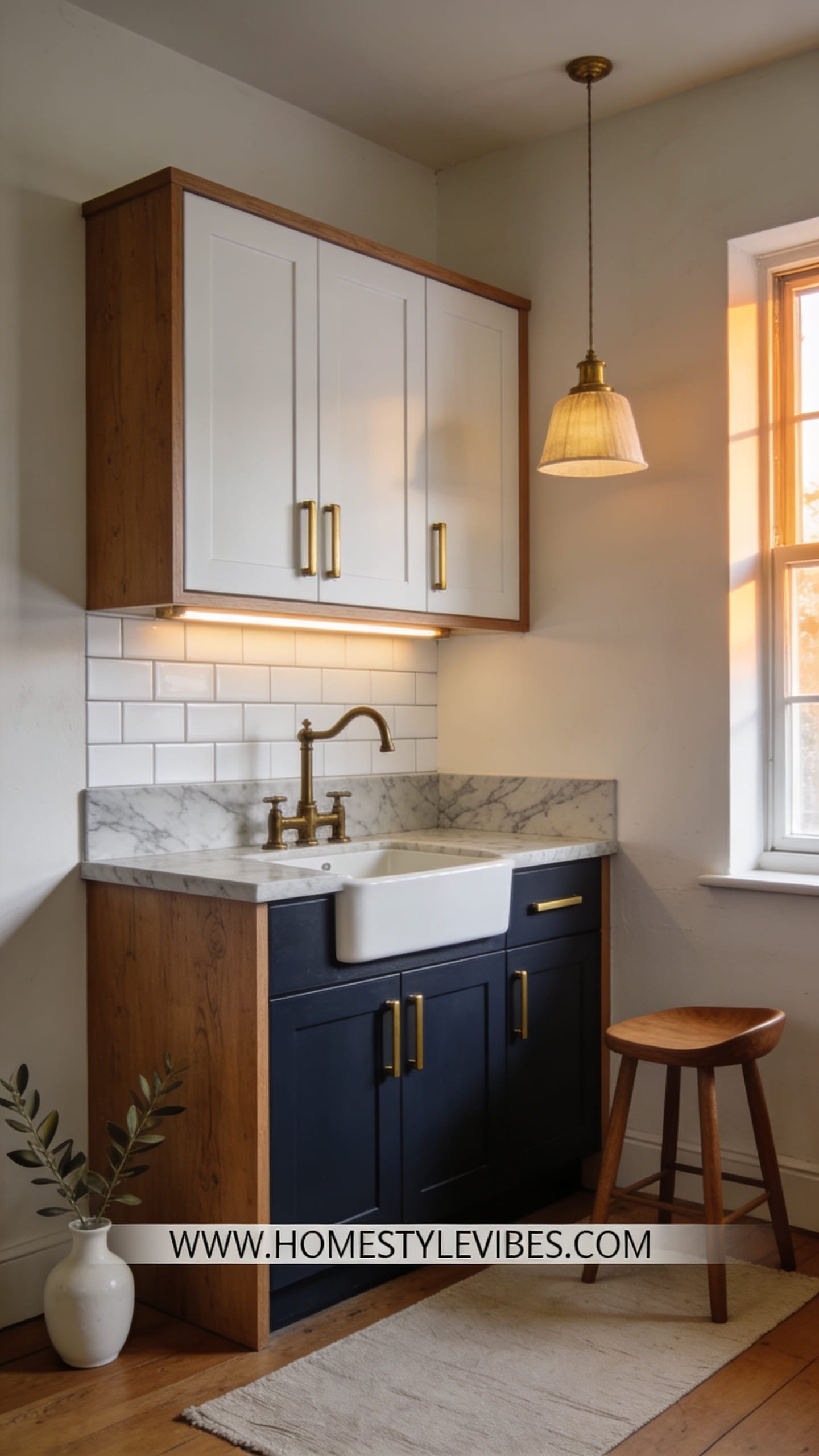
It’s that one corner that always feels off: your lower cabinets are heavy and orange, your uppers feel dusty no matter how much you clean, and the whole kitchen reads “1998 rental.” You’ve tried white on everything, but it looked flat and you missed depth. This approach solves that by giving your oak kitchen cabinets a two-tone paint story that looks intentional: inky navy on lowers for weight and presence, cloud-white uppers to bounce light, and a thin ribbon of aged brass hardware to tie it together. The vibe? Coastal modern meets city townhouse—polished but friendly.
Why it works in real life: navy hides kid scuffs, white uppers keep small rooms tall, and mixing metals is easy when one is dominant (brass) and the other is quiet (matte black or stainless appliances). For lighting, this palette loves clear globes or linen drum pendants at 3000K for a slightly clearer, gallery-like glow that keeps navy sharp. Materials: semi-gloss or satin enamel on cabinets (semi-gloss on lowers for wipeability), glossy ceramic subway tile in a stacked pattern (vertical if you’re brave), and unlacquered brass pulls that patina with touch.
Photographs? Like a dream. The dark-lower/white-upper contrast creates depth and a clean horizon in images. Shiny tile next to satin paint adds specular highlights that look “expensive” even in phone pics. Variations include a budget version using existing counters with a polished finish (balance with a matte runner to cut glare), a renter-friendly swap using navy contact paper on a freestanding island, or a darker version with charcoal instead of navy for more urban drama.
Key Design Elements:
- Main materials: Satin navy paint on lowers, cloud-white satin on uppers, glossy ceramic tile
- Color palette: Deep navy, crisp white, aged brass, light gray grout
- Lighting strategy: 3000K LEDs, clear glass pendants, under-cabinet lights for navy drama
- Furniture silhouettes: Backless stools in leather or cane, slim black-framed chairs
- Texture layers: Ribbed cotton runner, patina brass, glossy tile reflection
- Accent details: Large bowl of lemons, vertical art print, linen shade sconce if you have a plug-in opportunity
Budget Breakdown:
- Cabinet paints (navy + white): $140 – $260
- Primer (stain-blocking): $40 – $70
- Brass hardware set: $120 – $300
- Subway tile + grout: $180 – $450
- Clear globe pendants: $120 – $280
Total Estimated Cost: $600 – $1,360
Best For: Busy households, small galley kitchens, anyone who wants personality without losing brightness. Great in coastal, transitional, or modern classic homes.
How To Recreate This Look:
- Start with prep: clean, degloss, fill heavy oak grain if desired with wood filler for a smoother read, and prime thoroughly.
- Add navy to lowers in semi-gloss for durability; keep uppers in satin white to soften the glow.
- Layer in glossy stacked tile with light gray grout for crisp lines that don’t scream “builder basic.”
- Install unlacquered brass pulls; if your run is long, use a mix of knobs and bars to vary rhythm.
- Style with one high-contrast element per counter run: a citrus bowl, a dark cutting board, or a small vase of white blooms.
Why This Feels Designer: The deliberate split between lowers and uppers sets strong visual hierarchy. Brass reads as jewelry, not clutter, and stacked tile telegraphs modernity without shouting.
One Thing To Avoid: Pure cool white on uppers with warm floors can read bluish and harsh. Choose a neutral white with the faintest warmth so your navy doesn’t feel nautical in a costume-y way.
Pro Styling Tip: Place a single sconce or pendant so it creates a soft triangle of light on the tile—those gentle reflections make navy feel deep, not flat.
Pause for a second. If one idea resonates more than the others, that’s your starting point. You don’t need all five—one done well beats five half-finished projects every time.
3. Scandinavian Lime-Oak Wash With Black Framed Lines
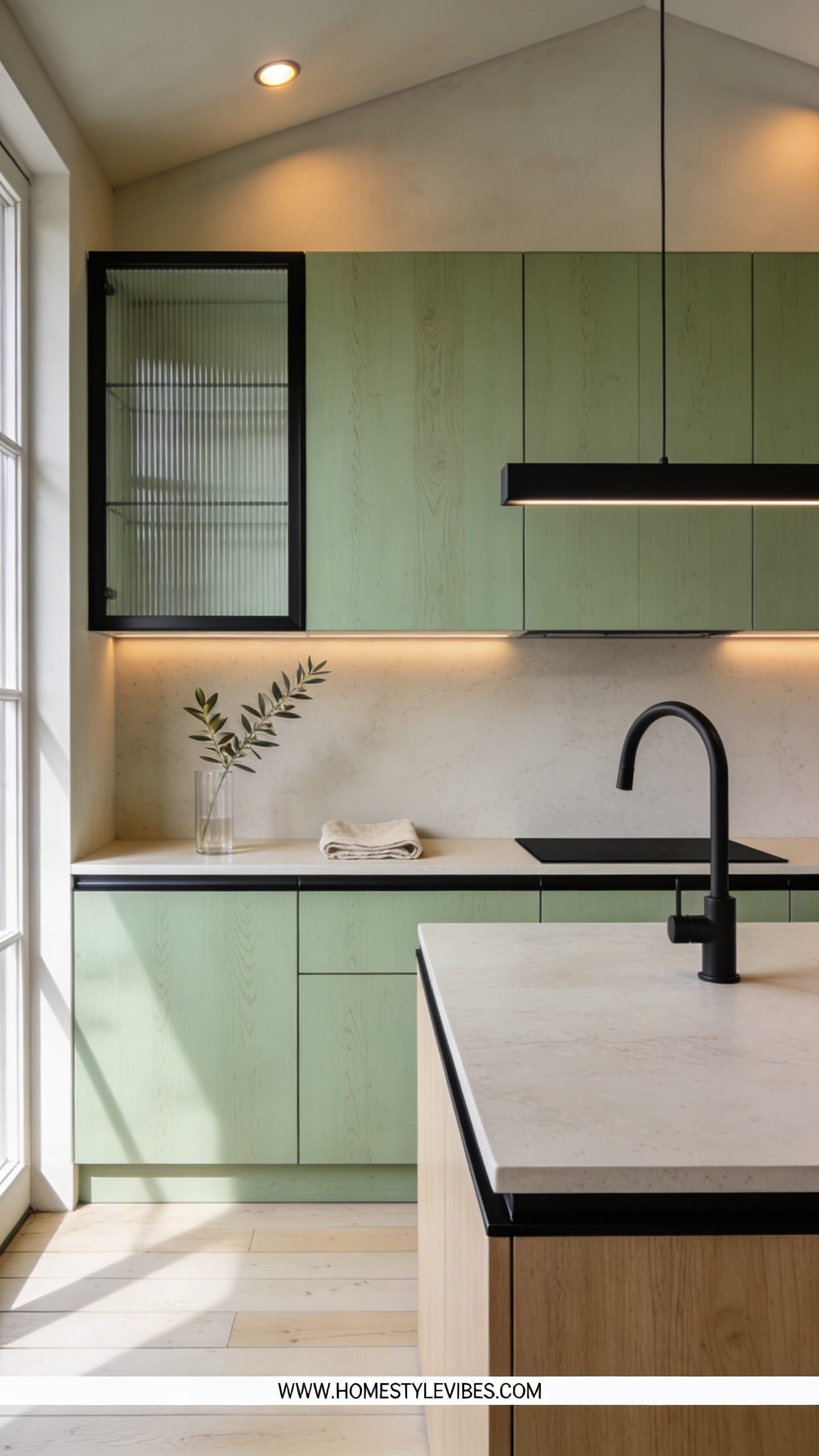
You’ve tried darkening, you’ve tried whitening, and nothing feels like you. The grain still looks aggressive, or the color skews too yellow when the sun hits at 4 p.m. This design doesn’t hide oak—it tames it. We use a lime-wash or white-wash finish that cools the warmth without erasing texture, then paint the rails or edge strips in a soft black to frame the doors. Add micro-fluted glass panels on a couple of uppers if you’re feeling bold. The energy is airy Scandinavian cabin meets modern loft: texture-forward, not precious.
Real-home logic: a lime-wash keeps fingerprints nearly invisible, and black framing hides the inevitable dings at door edges. It’s brilliant in spaces with lots of natural light that you want to soften rather than brighten harshly. Lighting plays a big role—aim for 3000K-3500K LEDs to keep the wood honest and avoid the mustard cast that warmer bulbs can create on limed finishes. Material stack: mineral wash on wood, matte black paint for frames, micro-fluted glass, soapstone-look counters for moody grounding, and a wool runner underfoot.
Why the photos love it: contrasting outlines around pale doors create depth and rhythm. Lime-wash eats glare and makes shadows look elegant, not dingy. Variations? Budget version: skip the glass and keep all panels solid; use a wipe-on white stain plus a matte waterborne poly. Small-space version: frame just the pantry and lower drawers; keep upper doors plain for less visual busyness. Darker version: swap the white-lime for a pale taupe stain and keep black frames—super chic with stainless appliances.
Key Design Elements:
- Main materials: Lime-wash or white stain, matte black edge paint, micro-fluted glass accents
- Color palette: Pale oat, soft black, charcoal counters, bone-white walls
- Lighting strategy: 3000K–3500K LEDs, wall washer under-cabinet strips to showcase texture
- Furniture silhouettes: Simple natural wood stools, thin black metal legs
- Texture layers: Wool runner, stoneware bowls, oak cutting boards
- Accent details: Slim black shelf brackets, a single trailing pothos plant, matte black faucet
Budget Breakdown:
- Lime-wash or white stain: $35 – $90
- Matte black enamel for frames: $25 – $60
- Micro-fluted glass inserts (2–4 doors): $180 – $420
- Matte waterborne poly topcoat: $30 – $70
- Soapstone-look laminate or quartz: $450 – $1,000
- Matte black faucet: $120 – $300
Total Estimated Cost: $840 – $1,940
Best For: Design lovers who want texture over gloss; open-plan homes where harsh white cabinets can glare; anyone craving natural, Scandinavian calm.
How To Recreate This Look:
- Start by sanding oak doors to open the grain; wipe clean thoroughly.
- Add a white-lime stain or mineral wash in thin coats; let the grain show through intentionally.
- Layer a matte waterborne poly to protect without yellowing; choose “Ultra Clear” finishes only.
- Install micro-fluted glass in two upper doors; keep frames painted matte black for graphic lines.
- Style with black picture frames, a single tall ceramic vase, and a wool runner to finish the narrative.
Why This Reads High-End: You’re not copying a showroom; you’re editing natural wood into a designer texture. The subtle black edging functions like eyeliner—suddenly the whole face looks finished.
The Most Common Mistake: Over-sanding and then flooding on white stain until the wood looks chalky. Keep coats thin, wipe back, and embrace some unevenness—it’s character, not a flaw.
Pro Styling Tip: Photograph late afternoon when side light skims across the doors; the tiny ridges in oak glow and the black frames sharpen beautifully.
Little mindset reframe: Perfection isn’t the goal; intention is. If your finish has a few brush marks, that can read artisanal—like a ceramic mug you love because it’s not factory-smooth.
4. Monochrome Clay White With Tone-on-Tone Walls and Hidden Joints
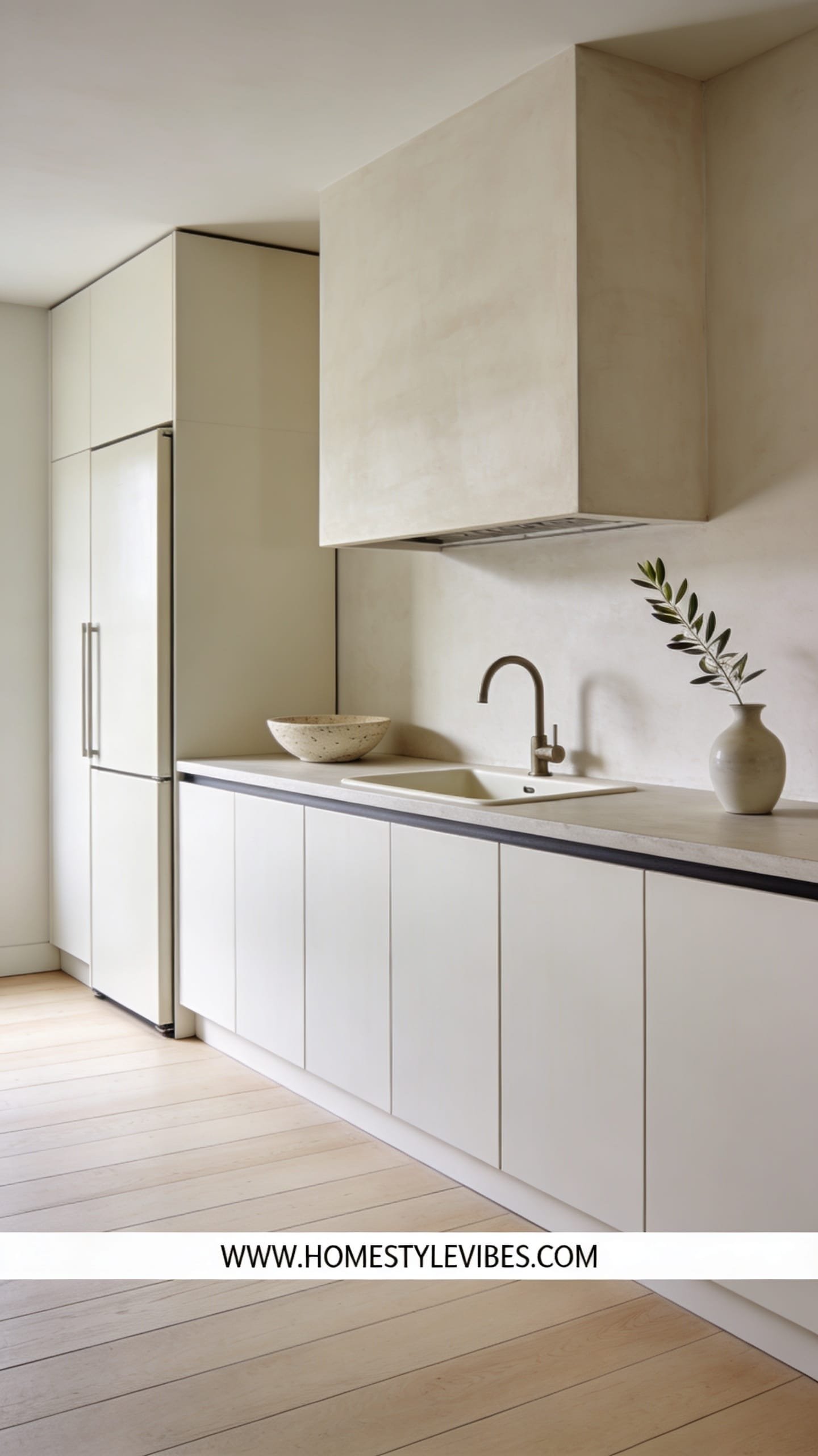
You want serenity. You crave a kitchen that disappears into the architecture so your eye can rest. But your oak cabinets push lines and shadows into every corner. This design takes a painter’s approach: one clay-white shade across cabinets and walls so the room reads as a sculptural volume. Details recede; light becomes the star. The mood is gallery-soft, Japandi-adjacent, and very grown-up.
Why it works: a single color on doors, frames, and adjacent walls smooths visual noise. Satin or matte cabinet enamel on fronts, then a flat or matte wall paint in the same color number (or one step lighter) erases seams. In small spaces it makes the room feel wider because edges don’t shout. Lighting should be layered but quiet—diffused under-cabinet lighting, fabric-shaded ceiling fixtures, and a single accent lamp on a nearby console if you have open concept. Materials hold back: clay-white paint, tone-on-tone grout on a micro-rectangle tile splash, and powder-coated white hardware or even finger pulls to keep it minimal.
Photos adore this look because the contrast is controlled. Instead of chaos, you get soft shadows that carve depth along rail lines and counter edges. Variations: a budget version that keeps your existing backsplash but paints everything else clay-white; a family-friendly version with semi-gloss on lowers for wipeability and matte on uppers/walls for softness; a darker edition with pale mushroom instead of white for homes with harsh afternoon sun.
Budget Breakdown:
- Cabinet enamel in clay white: $120 – $220
- Matching wall paint: $60 – $120
- Primer: $40 – $70
- Powder-coated white hardware or integrated pulls: $80 – $240
- Under-cabinet LED strips with diffuser: $90 – $180
- Simple linen drum flush mount: $80 – $200
Total Estimated Cost: $470 – $1,030
Best For: Apartments and townhomes, visual minimalists, open-concept spaces where you want the kitchen to feel like part of the architecture, not a separate “unit.”
Key Design Elements:
- Main materials: Clay-white enamel, matte wall paint, minimalist hardware
- Color palette: Clay white, soft taupe, pale oak, brushed stainless accents
- Lighting strategy: Diffused, layered, glare-free warmth at 2700K–3000K
- Furniture silhouettes: Waterfall-edge island or rounded table, slender-leg stools
- Texture layers: Linen shades, porcelain, lightly textured tile
- Accent details: A single branch arrangement, slim white tray, hidden outlet covers
How To Recreate This Look:
- Start by selecting one clay-white color. Order it in both cabinet enamel and wall finish; confirm they match under your specific lighting.
- Add stain-blocking primer to doors and frames; sand smooth for a near-paneless look.
- Layer two coats of enamel on cabinets and one to two coats of flat/matte on walls; caulk tiny gaps where frames meet walls to visually erase seams.
- Install minimalist hardware or edge pulls in powder-coated white or soft stainless.
- Style with restraint: a white bowl, a pale cutting board, and one leafy branch are plenty.
Why This Looks Intentional: Tonal consistency tricks the eye into seeing architecture rather than cabinets. When details stop competing, the room breathes—and that quiet reads as luxury.
Don’t Do This: Skipping under-cabinet lighting. Without it, a monochrome kitchen can look flat, like a painted set. You need that soft graze of light to shape the surfaces.
Pro Styling Tip: For photos, let the counters rest bare except one tonal vignette—texture carries the shot when color doesn’t.
Micro-moment: It’s 6:40 a.m., you’re barefoot on tile, the kettle is just starting to sing, and the walls aren’t shouting at you. That’s this kitchen’s superpower.
5. Charcoal Slab Drama With Walnut Accents and Matte Stone
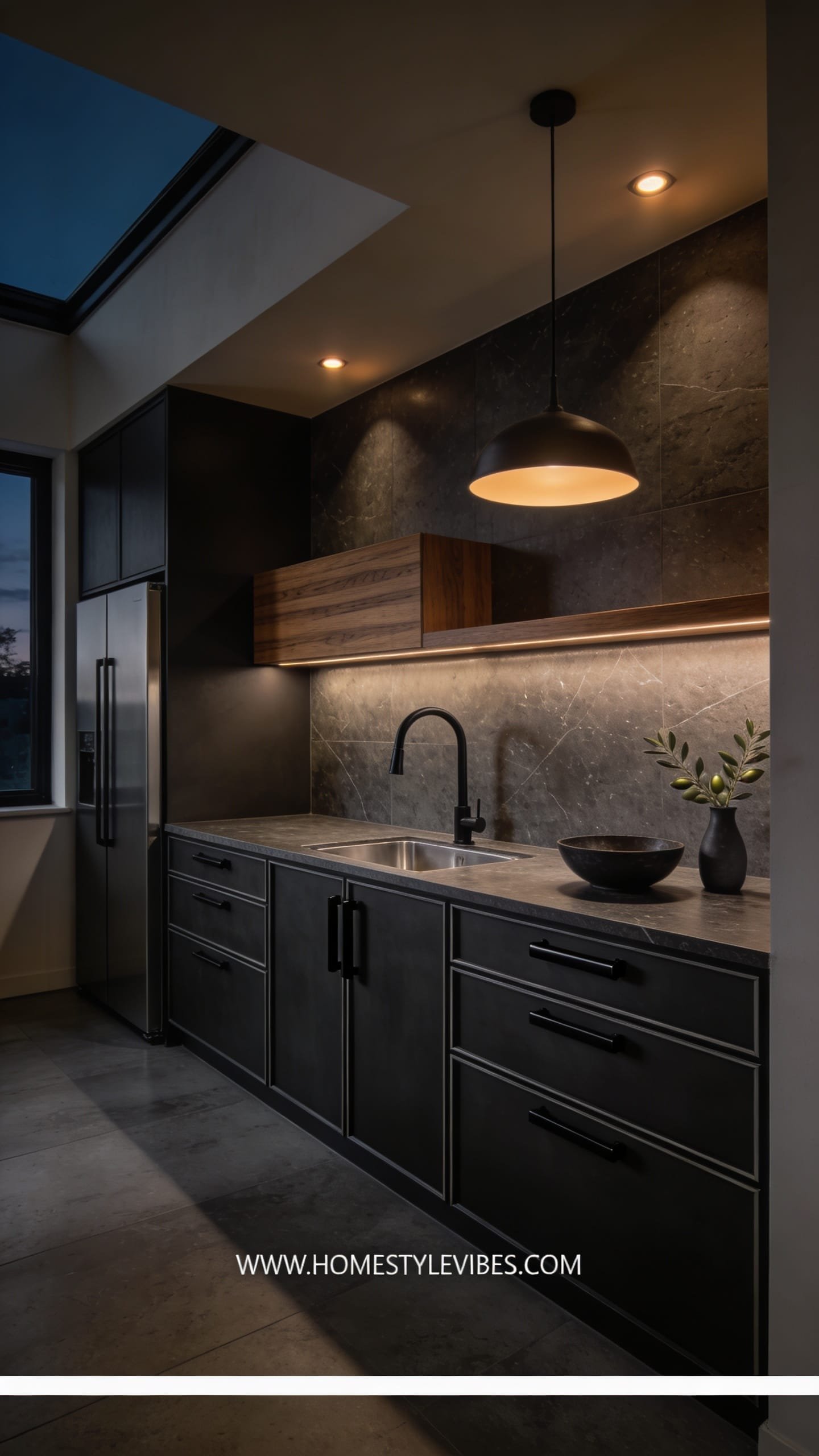
You want modern—real modern—not just “we painted it gray.” But the oak frames, the visible rails, the busy grain keep pulling your kitchen back to suburbia. Here’s the move: convert your doors to flat slabs, paint them deep charcoal, and pair with a matte stone counter that absorbs light. Add a strip of walnut on a floating shelf or two to bring warmth back in and prevent the room from feeling severe. The atmosphere is refined, moody, and deeply photogenic—like a restaurant kitchen you can actually cook in without stress.
In the day-to-day, slab doors are easy to wipe, charcoal hides micro-splatters, and walnut accents add the human touch. Lighting should be precise: spot-focused under-cabinet LEDs at 3000K, a statement linear pendant over the island, and maybe a dimmable wall sconce near a coffee corner to prevent the “black hole” effect at night. Materials take center stage: charcoal satin, matte porcelain or quartz, walnut shelves, and darkened brass or matte black hardware.
Photographically, this sings because it layers dark-on-dark with just enough wood to set contrast. Shadows look purposeful. Metal highlights along pulls or faucets glint in all the right places. Variations: budget-minded? Keep your existing shaker doors, fill the center panel with lightweight hardboard to fake a slab, then paint charcoal. Small-kitchen version: charcoal lowers only with warm off-white uppers plus a single walnut shelf to keep it buoyant. Renter-friendly? Paint a freestanding island charcoal and add a walnut butcher block top.
Key Design Elements:
- Main materials: Charcoal satin enamel, matte stone counters, walnut shelves
- Color palette: Graphite, warm walnut, soft white walls, dark brass or matte black
- Lighting strategy: Focused task lighting, dimmable linear pendant, warm under-cabinet strips
- Furniture silhouettes: Chunky island, armless stools with leather seats, squared edges
- Texture layers: Matte stone, satin paint, oiled walnut, leather, smoked glass
- Accent details: Oversized art leaning on a counter, sculptural bowl, dark linen towels
Budget Breakdown:
- Cabinet paint and primer: $160 – $280
- Slab door conversion (DIY hardboard or new fronts): $200 – $1,200
- Matte quartz or porcelain counters: $900 – $2,200
- Walnut shelves + brackets: $180 – $450
- Hardware in dark brass/black: $120 – $300
- Linear pendant: $180 – $500
Total Estimated Cost: $1,740 – $4,930
Best For: Open-plan homes needing a strong focal point, cooks who love a moody vibe, resale-minded owners in contemporary neighborhoods where modern sells.
How To Recreate This Look:
- Start by removing doors; either replace with slab fronts or fill shaker panels with hardboard and caulk edges smooth.
- Add a shellac-based primer; charcoal shows every flaw, so sand until you feel glassy smoothness.
- Layer two to three thin coats of charcoal satin, rolling large flats and tipping off with a brush for uniformity.
- Install matte stone counters or a matte-look laminate; avoid glitter flecks which kill the mood.
- Style with restraint: one big art piece or a single chunky ceramic—large scale beats clutter against charcoal.
Why This Looks Expensive: Flat slab geometry plus matte stone screams custom millwork. Walnut injects life, preventing the look from reading like a showroom kitchen after hours.
Watch Out: Cheap LED strips can cast zebra shadows on dark paint. Use diffusers and continuous runs to avoid segmented light that ruins the effect.
Pro Styling Tip: Shoot at twilight with the pendants on low; let the charcoal fade to near-black so the brass and walnut glow in the frame.
Remember, this isn’t about recreating a showroom. It’s about building a kitchen that feels like it belongs to your mornings, your playlists, your people. Pick one lane and drive it all the way to the finish—consistency beats complexity.
Quick Checklist
- Prime oak with a shellac-based, tannin-blocking primer
- Choose a finish sheen that suits your lifestyle (satin for softness, semi-gloss for wipeability)
- Sample paint over primer, not bare oak
- Use warm 2700K–3000K LEDs to flatter greiges and whites
- Consider two-tone: dark lowers, light uppers
- Try lime-wash to calm grain without hiding it
- Match walls and cabinets for a monochrome envelope
- Convert to slab doors for a modern silhouette
- Select hardware that fits scale and story (brass for warmth, black for graphic)
- Layer matte counters with low-sheen cabinet paint for editorial depth
- Install continuous under-cabinet lighting with diffusers
- Style sparingly: one high-impact vignette per counter run
Frequently Asked Questions
How do I keep oak grain from showing through the paint?
Start with a shellac-based primer to block tannins, then decide how smooth you want the look. For a nearly glassy finish, skim the doors with wood filler or grain filler, sand, prime again, and use thin paint coats with light sanding in between.
What if my kitchen is tiny—will dark colors make it feel smaller?
Dark lowers paired with light uppers won’t shrink the room; they create depth and help the white uppers fade into the walls. Keep counters clear, use glossy or reflective tile sparingly, and add under-cabinet lighting to shape the space.
I’m worried about maintenance with kids and pets. Which finish is most practical?
Semi-gloss on lowers is the most wipe-friendly, while satin on uppers keeps glare down. Navy or charcoal hides scuffs better than bright white. Add a washable matte for walls near high-touch zones.
My landlord won’t allow a full repaint. Any renter-friendly ideas?
Focus on a freestanding island or hutch. Paint those in a bold or calm color, swap hardware on doors you can keep, and use peel-and-stick backsplash. Bring in a rug, art, and lighting to change the mood without touching every cabinet.
What’s the biggest mistake people make painting oak kitchen cabinets?
Skipping proper primer and going straight to paint. That’s when you see yellowing at seams and knots. The second mistake is choosing colors in the paint aisle—test large swatches at home, over primer, and check morning, afternoon, and evening light.
Conclusion
If one of these five ideas made your shoulders drop in relief, start there. You don’t need to renovate; you need to make a few decisive moves—primer that blocks, a color that flatters, lighting that kisses surfaces instead of blasting them. The truth is, luxury in kitchens rarely comes from price tags alone. It comes from texture plus lighting plus restraint.
Pick your lane: the soft greige calm, the inky navy split, the Scandinavian lime-wash, the monochrome clay white, or the charcoal slab drama. Commit to the palette, keep styling tight, and take your time on prep. You’ve got this. Your oak kitchen cabinets can look modern and beautiful—seriously—and the next time morning light hits that satin finish, you’ll feel it.
One last personal note: a friend of mine spent weeks agonizing over paint colors before realizing the real problem was her 4000K bulbs making every finish look cold and chalky. She switched to 2700K, and overnight the “wrong” greige became perfect. Sometimes the fix is simpler than you think—start, adjust, and enjoy your kitchen again.

About the Author

Krisztina P.Rendes, Founder of Home Style Vibes
Founder of Home Style Vibes
Krisztina Puskásné Rendes created Home Style Vibes as a cozy-modern lifestyle space where homemaking meets inspiration. Her goal is to help women create beautiful, organized, and peaceful homes they truly love — without overwhelm. You’ll find here heart-driven content on home decor, cleaning tips, easy family recipes, organization and decluttering, DIY home projects, plants, and seasonal ideas — all designed to bring more calm, comfort, and style into everyday life.