5 Vertical Garden Ideas That Save Space and Look Amazing
You know that one blank wall that stares back at you like a missed opportunity? Or that narrow balcony where regular planters gobble up precious floor space? Let’s fix it. These 5 vertical garden ideas that save space and look amazing turn dead surfaces into lush, textural backdrops that calm your nervous system and make your home feel like a boutique hotel—without sacrificing a single square foot. Think matte black frames against limewashed walls, climbing thyme brushing past warm wood slats, and soft dappled light trickling through layered ferns. Photogenic? Absolutely. Practical? Even better. If you crave soothing greenery but can’t handle countertop clutter or plant chaos, this list is your new mood board.
Each design elevates your space not just with plants, but with materials and lighting that add instant polish: fluted wood, brushed brass, architectural trellises, and light-catching glass. You’ll get exact how-tos, smart swaps for renters, budget versions, and styling tricks that make every setup look editorial. The vibe: urban sanctuary meets quietly expensive. Perfect for small apartments, balcony people, hallway problem-solvers, and anyone who wants a Pinterest-worthy wall without a headache.
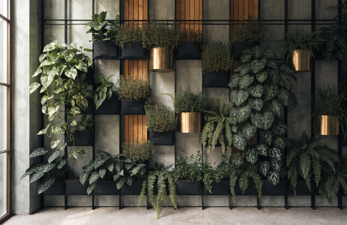
1. Sculptural Grid Wall With Modular Planter Pockets
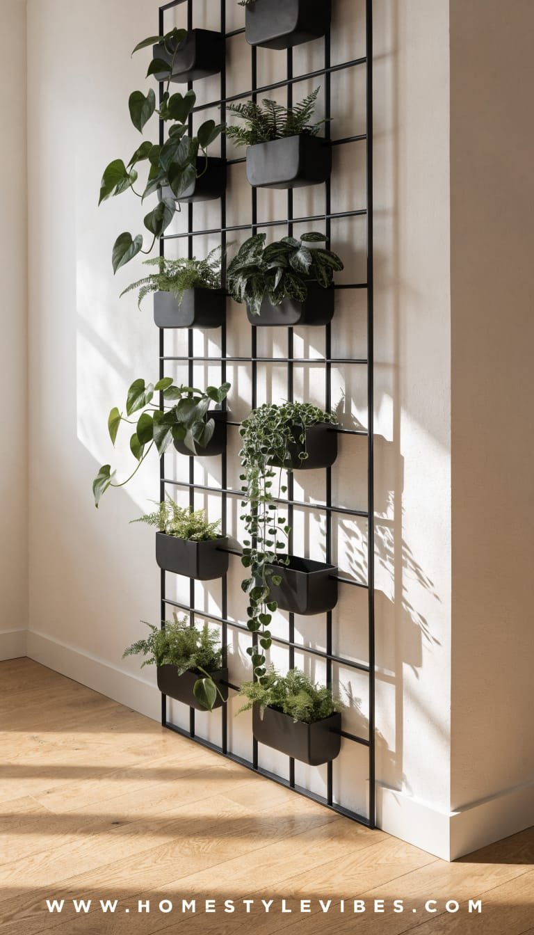
We’ve all been there: that narrow entry or living room corner that feels like empty air. You’ve tried hanging a single piece of art, but it still looks flat and, honestly, boring. Enter the sculptural grid wall—an architectural backdrop with modular planter pockets that click in like a dream and transform a dead zone into a living sculpture. The mood leans contemporary gallery meets city greenhouse: crisp lines, cast shadows, and soft greens that glide across a perfectly straight grid. It works in real homes because it’s hyper-customizable and surprisingly easy to maintain—you water by row, prune by pocket, and expand when you want more drama. Layer it near a window and the plants get that slow, cinematic side light that makes everything feel expensive.
Why it works: a strong linear framework gives your eye structure, while the organic growth softens the geometry. This balance reads “designer” in small spaces and punches up resale appeal by turning a plain wall into custom built-in energy. Choose powder-coated steel in matte black for drama, or warm white for a quiet Scandinavian moment. Bonus: the grid casts beautiful shadows throughout the day, so your wall subtly changes as the light shifts. It’s the kind of living art that guests can’t stop touching.
Why It Looks Expensive: modular pockets in a uniform colorway sit inside a consistent geometric pattern—no visual clutter, just rhythm. The grid creates a gallery vibe, and using a tight color palette (hello, olive, sage, and deep green) keeps it luxe. Add one hero plant like a trailing philodendron to break the grid line in exactly one spot for intentional imperfection.
Materials that dominate: powder-coated metal grid, slim aluminum rails, matte ceramic or recycled plastic pockets, and a textured wall finish behind (limewash or microcement) to amplify depth. Lighting turns this from “nice” to “wow”—try a linear LED wash from above or two adjustable picture lights aimed at the grid for sculptural shadows.
Photographs beautifully because contrast + repetition + depth. The negative space within each square reads as texture in photos, while the plants add soft focus moments. It’s very “architect met florist and built a wall.”
Variations:
– Budget-friendly: use painted pine battens to create a DIY grid and hook on fabric grow pockets.
– Small-space version: a half-grid above a console with 6–8 pockets and a single trailing plant.
– Darker version: charcoal grid on a dark taupe wall with moody uplighting and deep green foliage.
– Renter-friendly: 3M Command hooks to mount a lightweight aluminum frame, plus fabric pouches with wicking liners.
Key Design Elements:
- Main materials: Powder-coated steel/aluminum grid, matte ceramic or recycled plastic pockets, limewash wall
- Color palette: Black/charcoal or warm white grid; foliage in sage, emerald, deep olive
- Lighting strategy: Linear LED over-wash or dual picture lights angled for gentle shadow play
- Furniture silhouettes: Slim console or bench with clean lines in oak or walnut below
- Texture layers: Smooth metal, matte clay planters, soft foliage, gently variegated wall finish
- Accent details (hardware, decor pieces, plants): Brushed brass picture lights, small sculptural object on console, pothos, trailing philodendron, peperomia
How To Recreate This Look:
- Start with a gridded metal panel cut to your wall width; mount it centered at eye level.
- Add modular pockets across the middle third first, then grow upward to avoid a top-heavy feel.
- Layer in low-maintenance plants: start with pothos and peperomia; add one trailing hero.
- Install two adjustable picture lights above the grid; aim so each square gets a soft kiss of light.
- Style with a slim console and a single sculptural bowl; keep colors consistent for a gallery vibe.
Why This Looks Expensive: controlled repetition reads like custom millwork, and the lighting adds that gallery-level finish. Keeping the palette tightly edited makes even budget pieces feel elevated.
Common Mistakes To Avoid: overcrowding pockets, mixing planter colors randomly, or skipping drip trays (hello, wall stains). Also don’t hang the grid too high—center it around 60 inches.
Pro Styling Tip: For photos, mist the foliage lightly so leaves catch specular highlights, and shoot at an angle to exaggerate the grid’s shadow depth.
Ready for something greener, softer, and a little wild? Keep scrolling.
2. Slatted Wood Living Wall With Hidden Irrigation
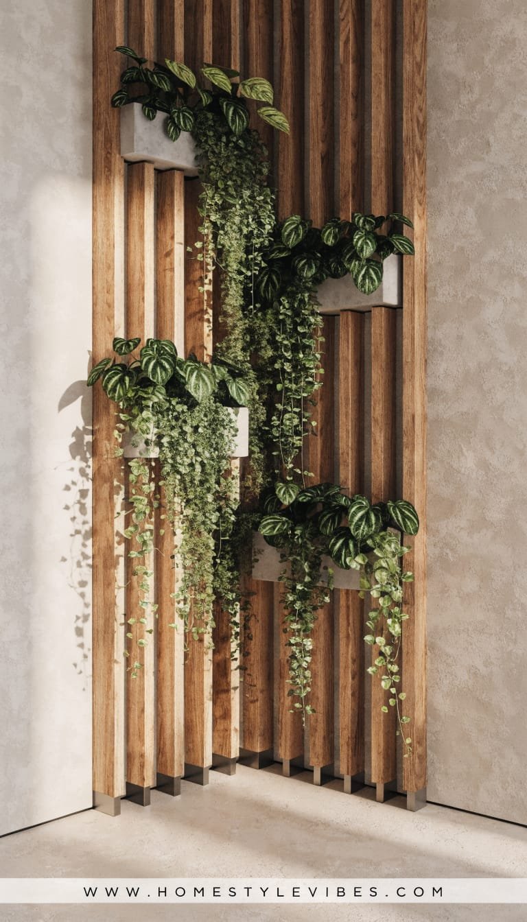
It’s that one corner that always feels off: you tried a freestanding shelf of plants, but cords, trays, and watering days turned into stress. The slatted wood living wall hides the mess and gives you spa-hotel calm. We’re talking vertical slats in warm oak or teak with slim planters nested between, plus a concealed drip line that waters everything quietly. The mood reads modern Mediterranean meets boutique wellness studio—sun-kissed wood, glossy leaves, and clean-lined hardware. In real homes, this works because it adds acoustic warmth and hides clutter. Maintenance drops dramatically with a timer-based drip system and a discreet catch basin.
Lighting here matters, but the wood already gives you depth. Aim for warm LEDs (2700–3000K) grazed across the slats; the micro-shadows do half the styling for you. Cluster plants with different sheens—matte ferns next to glossy philodendrons—and the whole wall looks alive and nuanced. Bonus: it’s easier than it looks; pre-made slat panels install like a headboard.
Why It Looks Expensive: integrated systems scream custom. The hidden irrigation and the uniform slat spacing read intentional, and the warm wood finish sets a high-end tone. Even a modest plant selection looks like a curated collection when framed by slats.
Materials to love: oiled oak or teak slats, black metal planter trays, slim copper or black irrigation tubes, and a brass shut-off valve that doubles as jewelry. The photographs? Stunning. Side light rakes across the slats and the foliage glows—seriously, it’s like having your own plant runway.
Variations:
– Budget-friendly: pine slats stained walnut; manual watering with wick planters.
– Small-space version: a 3-foot-wide panel behind a reading chair with 4–6 planters.
– Darker version: smoked oak slats, deep green wall paint behind, lush climbing ivy.
– Renter-friendly: a freestanding slatted screen with planters hooked on—not attached to walls.
Key Design Elements:
- Main materials: Oak/teak slats, matte black planter trays, discreet irrigation line
- Color palette: Honey oak, black accents, foliage in jade and emerald
- Lighting strategy: Warm LED wall grazers or downlights to highlight slat texture
- Furniture silhouettes: Low lounge chair or narrow bench with rounded edges
- Texture layers: Oiled wood grain, glossy leaves, matte black metal, soft linen cushion nearby
- Accent details: Brass shut-off valve, ceramic watering can, woven footstool
How To Recreate This Look:
- Start with pre-finished slat panels; mount with a 1/2″ spacer to let the wall breathe.
- Add planter trays between slats at staggered heights; secure with hidden brackets.
- Layer plants with different textures: ferns, philodendron, tradescantia for variegation.
- Install a drip line across the top row with emitters to each planter; connect a timer.
- Style with a lounge chair, linen throw, and a single brass sconce to warm the scene.
Why This Looks Expensive: wood slats create rhythm and acoustic luxe; hidden irrigation equals “built-in” energy. Matching metals (black and brass) keep it cohesive.
Common Mistakes To Avoid: uneven slat spacing, visible tubes, and mixing wood tones. Also, don’t overwater—drip emitters should be low-flow and timed.
Pro Styling Tip: Photograph during golden hour with lights on low; side lighting exaggerates the grain and makes leaves glow like glass.
If you crave a cleaner, minimalist take that feels like architecture first, keep going.
3. Minimalist Pocket Wall In Lime Plaster With Monochrome Greens
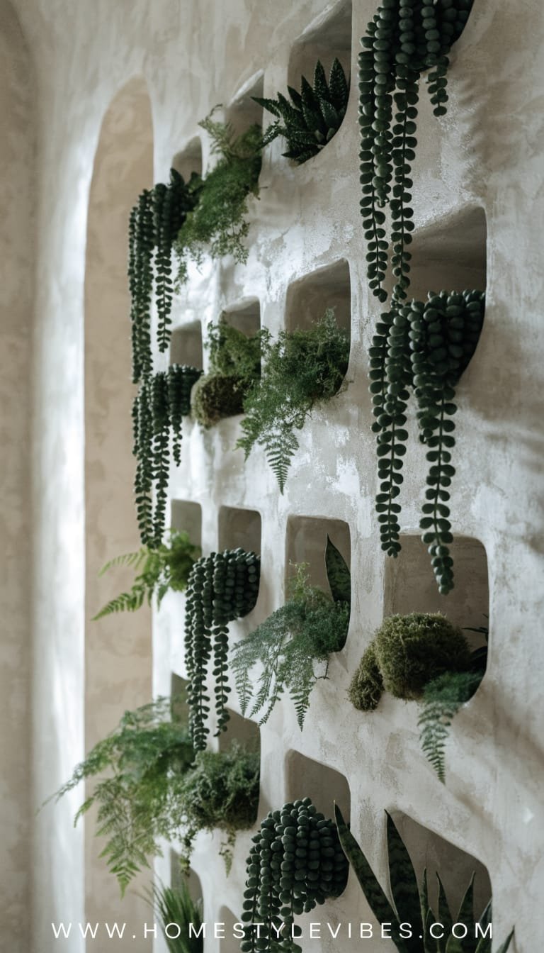
You’ve tried a wall shelf with mismatched pots, but it still looks cluttered. The minimalist pocket wall says “calm down” in the best way. Picture a lime-plaster wall in a cool oat tone, then built-in (or surface-mounted) pockets in the same color so they almost disappear. You tuck in monochrome green plants—no flowers, no loud variegation—and let the texture do all the work. The mood: Japandi meets art gallery. In real homes, this thrives where you want serenity: bedrooms, meditation corners, reading nooks. Good news for upkeep: choose slower-growing plants and you’ll prune quarterly, not weekly.
Lighting anchors the vibe: choose one linear sconce above the pockets or two tiny spots that graze the plaster. Lime plaster subtly mottles, catching the light and giving your greens a soft halo. Why it looks expensive? Tonal everything. You match planter finish to wall color. You stick to one or two plant species. It reads curated—not chaotic. And because you skip the rainbow, your eye notices shadow, form, and negative space. That’s what editors love in a vertical garden photo.
Materials that dominate: lime plaster or high-quality limewash paint, color-matched wall pockets (powder-coated metal or plaster composite), and matte ceramic accents. The restrained palette helps resale—buyers imagine their art or mirrors swapping in easily, yet the niche still feels high design.
Variations:
– Budget-friendly: use off-the-shelf wall pockets painted to match the wall; faux-limewash with two-toned rolling.
– Small-space version: three vertical rows of pockets by a bed; all peperomia or all philodendron micans.
– Darker version: deep greige wall with darker sage pockets and moody lighting.
– Renter-friendly: floating shelves with matching planters in a tight row; same tonal approach.
Key Design Elements:
- Main materials: Lime plaster/limewash, powder-coated metal pockets, matte ceramic
- Color palette: Oatmeal, putty, and layered greens in three saturation levels
- Lighting strategy: Gentle wall graze with warm-dim linear sconce or adjustable micro spots
- Furniture silhouettes: Low platform bed or a simple bench; rounded edges keep it soft
- Texture layers: Chalky walls, velvety leaves, matte ceramics, linen bedding nearby
- Accent details: Slim framed print, stone incense holder, small jute rug
How To Recreate This Look:
- Start with a limewash or plaster finish in a soft oat tone; let the texture read.
- Add color-matched wall pockets in a clean grid or an offset column; keep spacing consistent.
- Layer in one or two plant species only; choose similar leaf sizes for harmony.
- Install a slim linear sconce above; dim it to 40–60% to avoid glare.
- Style with just one tactile accent—linen throw or stone bowl—to keep the quiet vibe.
Why This Looks Expensive: restraint. A tonal scheme forces attention to form and shadow, which visually codes as “architect’s house.”
Common Mistakes To Avoid: mixing too many species, high-contrast planters, and harsh cool lighting. Skip glossy pots; matte finishes play nicer with plaster.
Pro Styling Tip: When shooting, angle the camera slightly off-center and keep negative space in frame—your eye will read it as editorial minimalism.
Feeling bolder? Let’s go lush and fragrant, outdoors or in.
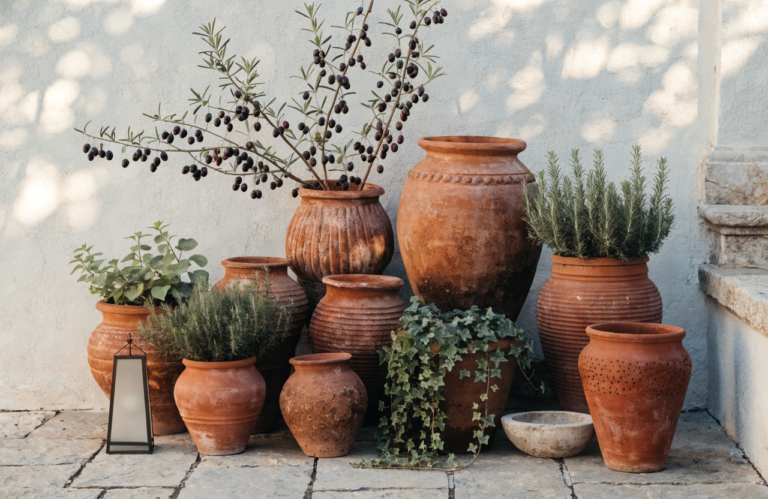
4. Mediterranean Herb Ladder For Balconies And Sun-Drenched Kitchens
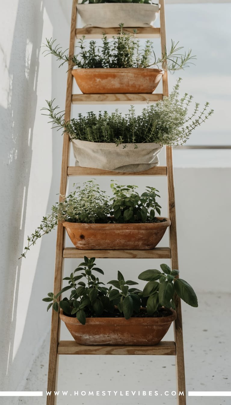
You’ve got a tiny balcony or a sunlit kitchen wall and a dream: fresh herbs at arm’s reach without tripping over pots. You tried windowsill planters, but they clutter the view or get knocked over during dishwashing acrobatics. The Mediterranean herb ladder solves this—narrow, vertical, and gorgeously aromatic. Think stacked, shallow troughs or sling-style planters climbing a ladder-like frame. The mood: breezy coastal terrace, terracotta warmth, and silver-green leaves brushing your fingertips. In real homes, it’s a champion of tiny footprints and big payoff—cooking feels luxe when you snip rosemary straight from the wall.
Lighting brings your herbs to life: bright indirect sun rules, with a supplemental grow bar if your kitchen faces the wrong way. A slim LED grow strip, set to a warm spectrum, keeps the vibe cozy rather than clinical. Why it looks expensive? Materials that feel timeworn yet tailored—terracotta, brushed brass hooks, and a ladder frame in whitewashed oak or powder-coated ivory. Add a single linen café curtain or striped cushion nearby and suddenly you’re in a magazine rack.
Materials you’ll love: terracotta troughs for breathability, a ladder frame (wood or metal), leather or canvas slings to hold smaller pots, and a soft palette of whites and warm neutrals. The camera eats this up: the repeating troughs and the trailing thyme create rhythm; sunlight skims across matte terracotta for that chalky, holiday-in-Greece glow.
Variations:
– Budget-friendly: pine ladder with sealed terracotta saucers and jute twine hangers.
– Small-space version: a single, narrow ladder with three troughs—basil, thyme, mint.
– Darker version: black metal frame with charcoal planters and deep green bay laurel for drama.
– Renter-friendly: freestanding ladder leaned securely with non-slip feet; no drilling required.
Key Design Elements:
- Main materials: Terracotta troughs, oak or powder-coated ladder frame, leather/canvas slings
- Color palette: Ivory, sand, terracotta, sage, silvery olive greens
- Lighting strategy: Natural sun + optional warm-spectrum grow strip tucked under upper rung
- Furniture silhouettes: Bistro table with slim legs, foldable chairs, striped cushion
- Texture layers: Porous terracotta, soft leather straps, nubby linen, herb foliage
- Accent details: Brass S-hooks, small olive-oil bottle for watering, striped café curtain
How To Recreate This Look:
- Start with a ladder-style frame sized to your wall or balcony width; secure at the top if needed.
- Add shallow trough planters or sling cradles spaced 10–12 inches apart for airflow.
- Layer Mediterranean herbs that like similar light/water: rosemary, thyme, oregano; keep mint isolated.
- Install a slim grow strip under the top rung if light is weak; set on a 12–14 hour timer.
- Style with a tiny bistro set and one patterned textile to nail the coastal vibe.
Why This Looks Expensive: tactile materials and symmetry. Terracotta adds artisanal soul, while a unified ladder frame keeps it crisp. Function becomes decor, which always reads high-end.
Common Mistakes To Avoid: overcrowding herbs, pairing moisture hogs with drought lovers, and forgetting drip trays (balcony neighbors will thank you). Prune often to avoid leggy chaos.
Pro Styling Tip: Before photos, brush terracotta with a dry, soft brush to blend hard water marks into a romantic patina—not messy, just lived-in.
Craving drama that doubles as wall art? The next idea turns plants into a statement piece.
5. Statement Trellis With Climbing Greens And Backlit Glow
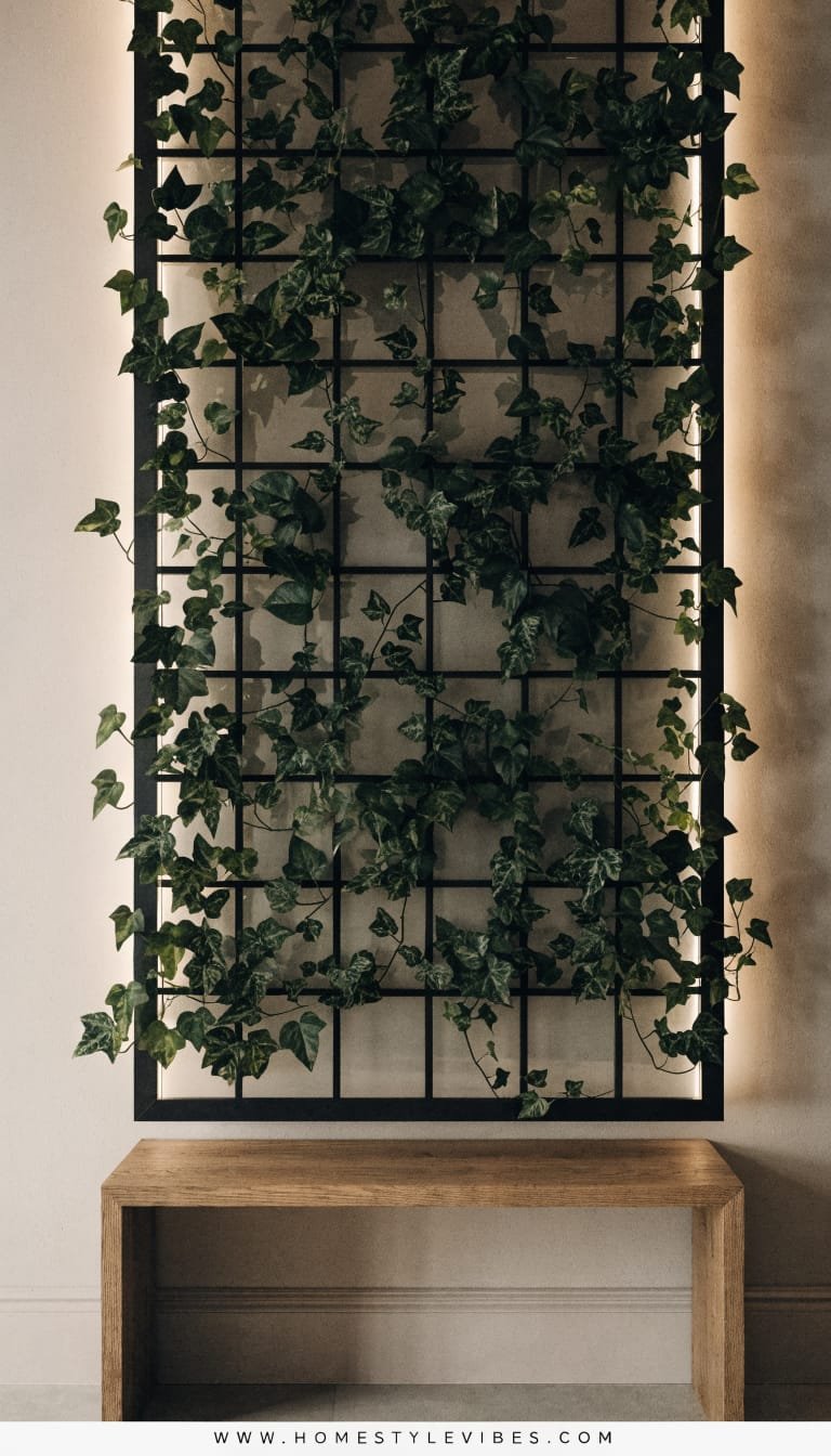
You tried a couple of hanging planters, but they looked like afterthoughts. You wanted impact—something that feels like architecture, not accessories. A full-height trellis with climbing plants and a soft backlit glow hits that sweet spot. Picture a custom metal or wood trellis anchored a few inches off the wall, a translucent panel behind it, and an LED strip washing light through the foliage. The mood: boutique restaurant meets moody lounge at home. It works in real living rooms and dining rooms because it has presence—like a fireplace, but greener. Maintenance simplifies when you choose climbers that like to be trained (philodendron, pothos, jasmine for fragrance if you have enough light).
Lighting is the star here: backlighting creates a halo that outlines every leaf and vine, so even at night, your green wall performs. That’s luxurious. The trellis geometry adds order, while vines add romance. And yes, IMO this layout wins every time on an empty, tall wall that needs a focal point. A floor-to-ceiling piece elongates the room, which is clutch in apartments with low ceilings—you’re drawing the eye up, always a designer move.
Why It Looks Expensive: layered lighting and depth. The 2–3 inch standoff from the wall creates an intentional shadow gap, just like millwork in high-end hotels. Pair it with a restrained palette—black trellis, putty wall, deep green leaves—and it screams custom installation, even if you DIY’d it on a Saturday.
Materials to lean into: powder-coated steel or stained oak trellis, frosted acrylic or fluted polycarbonate panel, and a dimmable LED strip. Photographs? Unreal. The backlighting outlines leaf edges, giving you that crisp, editorial look with glowing veins and soft gradients. It’s basically a live light sculpture.
Variations:
– Budget-friendly: wood lattice painted matte black, sheer fabric panel behind, LED rope light.
– Small-space version: a 2-foot-wide trellis between windows; instant architectural symmetry.
– Darker version: smoked oak trellis, warm amber backlight, and heartleaf philodendron for velvet leaves.
– Renter-friendly: freestanding trellis panel on a base plinth; no wall drilling, just plug-and-play.
Key Design Elements:
- Main materials: Metal or oak trellis, frosted acrylic or fluted polycarbonate, dimmable LED
- Color palette: Charcoal/black, putty walls, deep greens, warm amber light
- Lighting strategy: Backlighting for halo effect, optional small uplights at the base
- Furniture silhouettes: Low media console or credenza with clean lines to anchor the base
- Texture layers: Smooth frosted panel, graphic trellis, glossy leaves, soft wool rug nearby
- Accent details: Brass dimmer knob, black cord channel, sculptural watering can
How To Recreate This Look:
- Start with a floor-to-ceiling trellis mounted 2–3 inches off the wall using standoffs.
- Add a frosted or fluted panel behind; secure independently so it floats within the frame.
- Layer in two climbing species; train early with soft plant ties along the grid.
- Install a dimmable LED strip around the panel perimeter; hide cords with a color-matched channel.
- Style with a low credenza and one or two sculptural objects; keep the palette controlled.
Why This Looks Expensive: the shadow gap, the dimmer, the uniform geometry. It’s the same playbook high-end hospitality uses—light, depth, restraint.
Common Mistakes To Avoid: harsh, cool LEDs; visible cables; letting vines tangle into a blob. Train and trim monthly for that “designed” silhouette.
Pro Styling Tip: For photos, dim the backlight to 60%, kill overheads, and let the plant edges glow against a slightly underexposed room—instant drama.
And there you have it—five completely different ways to build vertical gardens that save space and look amazing, from sculptural grids to sun-drenched herb ladders and cinematic trellises. Each concept solves a different frustration: cluttered floors, awkward corners, hard-to-water setups, or that vague sense your space needs a focal point. The fix isn’t “more plants.” It’s better structure. When you pair thoughtful framing with smart lighting and a controlled palette, you get living installations that feel upscale and effortless.
So pick just one. Start small if you need to—three pockets over a console, a mini herb ladder by the window, or a single trellis panel with one brave vine. Let it grow with you. Luxury doesn’t come from price tags; it shows up in texture, lighting, and restraint. Matte finishes over glossy chaos. Warm grazers instead of bright overheads. Leaves chosen for shape and sheen, not a gimmicky color explosion. That’s the secret sauce the design pros use, and yes, you can steal it for your rental kitchen or your forever living room.
Imagine the first morning you pass your new living wall: the light slides across slats, leaves catch a soft glow, and the whole room exhale-hums like a spa. You made that. And you did it without crowding your floors or surrendering your style to plant clutter. That blank wall no longer stares back; it breathes. Start today, and watch your home shift from “fine” to “I never want to leave.” Seriously—your walls are ready.
About the Author

Krisztina P.Rendes, Founder of Home Style Vibes
Founder of Home Style Vibes
Krisztina Puskásné Rendes created Home Style Vibes as a cozy-modern lifestyle space where homemaking meets inspiration. Her goal is to help women create beautiful, organized, and peaceful homes they truly love — without overwhelm. You’ll find here heart-driven content on home decor, cleaning tips, easy family recipes, organization and decluttering, DIY home projects, plants, and seasonal ideas — all designed to bring more calm, comfort, and style into everyday life.