7 Low Maintenance Front Yard Landscaping Ideas That Actually Look Expensive Now
You step outside and wish your front yard felt like a calm, polished welcome instead of a high-maintenance chore. The vision? Dappled light over clean stone, sculptural greens, and a front path that whispers “high-end” without a single fussy flowerbed demanding attention. If you’re tired of patchy grass, overgrown shrubs, and hose-wrangling every weekend, these 7 low maintenance front yard landscaping ideas that actually look expensive will turn that stress into pure curb appeal. We’re talking rich textures, strong silhouettes, and color stories that photograph like a magazine cover—because the right layout doesn’t just save time, it elevates everything.
Each idea solves a specific frustration, from messy borders to awkward slopes. Expect natural stone, evergreen structure, warm lighting, and architectural plantings—timeless details that hold up in every season and under every camera filter. These looks flatter small bungalows and modern farmhouses alike, and they’re approachable even if you don’t know the difference between mulch and compost. Want a yard that looks Pinterest-famous by next month? Pick your vibe—minimal, Mediterranean, sculptural, or zen—and let’s make your entrance feel like an arrival.
1. Sculpted Gravel Courtyard With Architectural Greenery
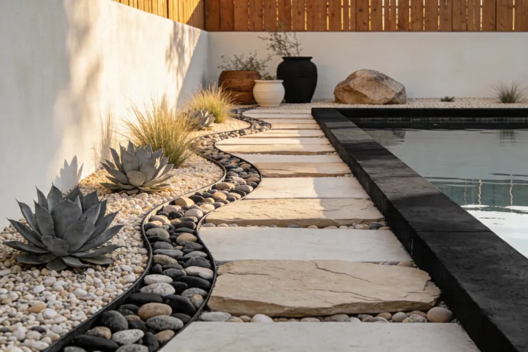
We’ve all been there: the center patch of grass turns to straw every summer, and the hose drag becomes a workout you never asked for. This design flips that struggle. Swap the thirsty lawn for a modern gravel courtyard framed by low, architectural evergreens—think olive-tone shrubs, sphere-pruned boxwood, or drought-tolerant pittosporum. The mood reads European town square meets modern minimal: clean, contemplative, and striking in every season. Pathways curve gently through crunch-underfoot gravel, and a single sculptural tree claims the spotlight—perhaps a multi-trunk olive or Japanese maple, depending on your climate.
Why it works in real homes: It trims maintenance to practically zero. Gravel suppresses weeds, and compacted pathways stay tidy with a quick rake. It’s also wildly flexible—great for narrow lots, sloped entries, or homes with strong architecture you want to highlight rather than hide. Lighting turns this into a jewel box at night: low, warm uplights graze the foliage while a soft wash along the path draws the eye to your front door. Want instant resale appeal? A structured courtyard with evergreen bones screams designer without the watering bill.
Why It Looks Expensive: Monochromatic gravel, clipped forms, and one hero tree create restraint—design’s secret luxury code. You trade visual noise for clarity. Layer different gravel sizes (3/4″ underlayment topped with 3/8″) for that satisfying, tailored finish. Add a bold, oversized stone bench or corten steel border and you’ve bridged the DIY-to-designer gap.
Materials that dominate: gravel in a deep gray or warm limestone tone, steel or stone edging, evergreen sculptural shrubs, and a single statement tree. This photographs beautifully because of crisp edges, matte textures against glossy foliage, and the way morning and evening light skims across fine gravel and casts dramatic plant shadows.
Variations:
– Budget-friendly: Skip corten steel for black composite edging; choose pea gravel and one mid-sized shrub cluster.
– Small-space version: One specimen tree in a broad gravel bed with two clipped spheres—simple and stunning.
– Renter-friendly swap: Use large planters with architectural plants over a gravel “rug” that can be removed later.
Key Design Elements:
- Main materials: Crushed gravel, steel or stone edging, evergreen shrubs, one statement tree
- Color palette: Charcoal, olive green, soft gray, touches of warm rust or bronze
- Lighting strategy: Ground uplights on the specimen tree, low path lights with shielded glare
- Furniture silhouettes: A single stone bench or minimal teak seat, boxy and substantial
- Texture layers: Fine gravel, smooth leaves, bark mulch under shrubs, matte metal edges
- Accent details (hardware, decor pieces, plants): Corten or black planters, weathered terracotta, clipped box or myrtle
How To Recreate This Look:
- Start with removing turf and leveling the area; compact a base layer of 3/4″ gravel.
- Add steel or stone edging to define curves and keep lines crisp.
- Layer a top coat of 3/8″ gravel and rake smooth, creating subtle, flowing paths.
- Install a statement tree off-center, then flank with 3–5 architectural evergreens.
- Style with a heavy, sculptural bench and warm uplighting aimed at foliage and trunk.
Why This Looks Expensive: Consistent materials + strong geometry = intentional design. Your eye reads the simplicity as luxury, especially with that single hero tree commanding attention.
Common Mistakes To Avoid: Don’t skimp on base compaction or edging—gravel bleed kills the look. Avoid too many different plant textures; keep the palette disciplined.
Pro Styling Tip: Photograph at golden hour to catch raked shadows across the gravel—angle the shot so the bench and tree align in a pleasing overlap for depth.
Curious how to add warmth without watering? The next idea leans into stone and soft grasses that dance in the wind—zero fuss, maximum movement.
2. Warm Stone Entry With Billowing Drought Grasses
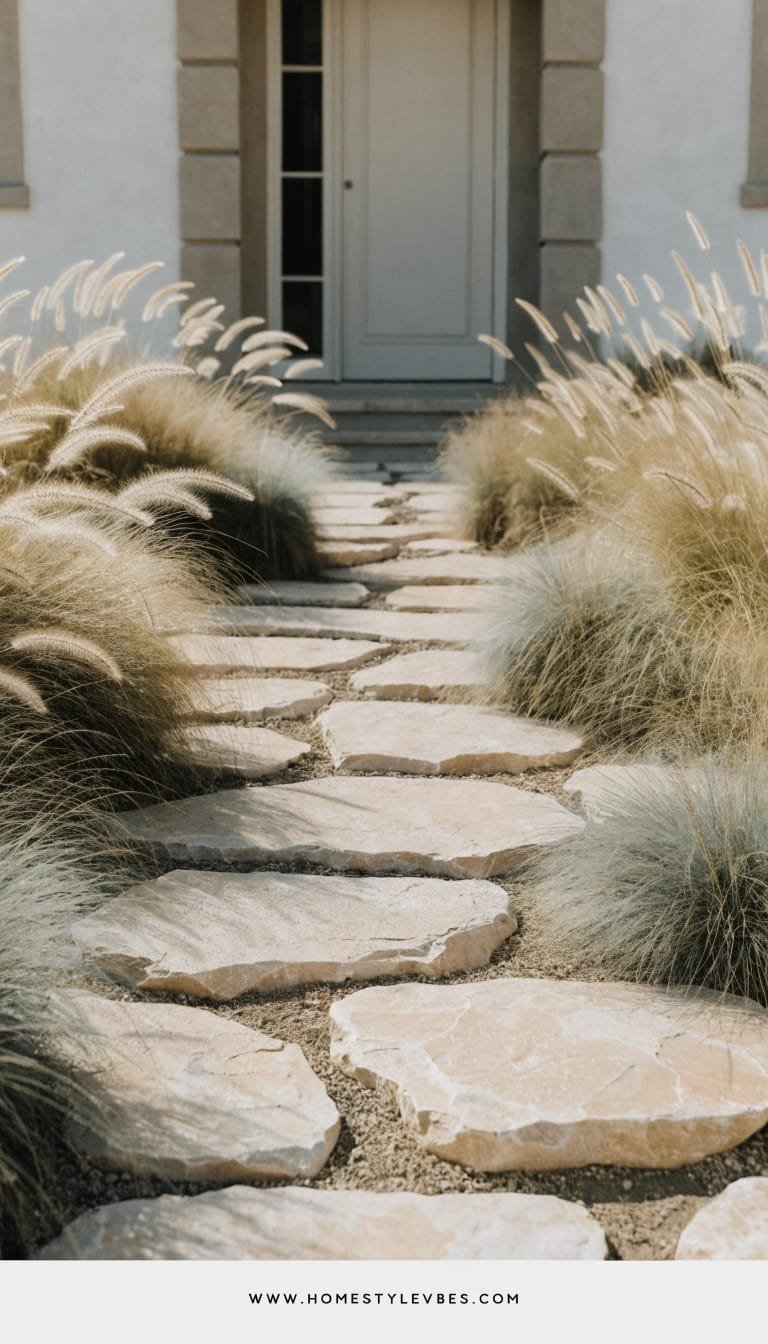
It’s that one corner that always feels off—scraggly mulch, too many little plants, no real wow. Enter the warm stone entry framed by billowing drought grasses. This creates a modern Mediterranean vibe—sun-kissed, textural, and effortlessly chic. Imagine a walkway in chunky limestone or tumbled travertine stepping-stones, set within a sea of feathery grasses like feather reed grass, blue fescue, and Mexican feather grass (or climate-safe equivalents). The stones pull you forward; the grasses add romance without maintenance.
Why it works in real homes: Grasses thrive on neglect and need just an annual trim. Their movement adds life, hiding seasonal changes and messy edges. It flatters both stucco and brick facades, and small spaces benefit from the airy texture that doesn’t feel bulky. Lighting through grasses looks magical—tiny pin-lights or stakes behind clumps create a halo at dusk.
Why It Looks Expensive: A warm stone path with irregular edges looks custom, not big-box. Pair two to three grass varieties in repeat patterns for rhythm. Add one matte black mailbox or powder-coated house numbers and the whole scene telegraphs “architect was here.”
Materials that dominate: tumbled limestone or warm-toned pavers, drought-tolerant ornamental grasses, decomposed granite infill. Photography loves the dance—sun glinting on fine blades, soft shadows, and contrast between smooth stone and fuzzy plumes.
Variations:
– Budget-friendly: Use concrete stepping stones stained in a warm tone, with native grasses from 1-gallon pots.
– Small-space: One generous stone landing with grasses in two drifts left and right—leave negative space for relief.
– Darker version: Charcoal pavers with blue oat grass and black mondo grass for moodier curb appeal.
Key Design Elements:
- Main materials: Warm stone pavers, decomposed granite, native/drought grasses
- Color palette: Sand, biscuit, wheat, olive green, soft gray-blue accents
- Lighting strategy: Low, back-aimed stakes to light grass plumes, minimal path dots
- Furniture silhouettes: None required; maybe a slim steel handrail in black
- Texture layers: Tumbled stone, soft plumes, gritty DG, matte metal accents
- Accent details: Oversized house numbers, terra-cotta bowl planter, slim post light
How To Recreate This Look:
- Start with a warm-toned stone or concrete steppers; lay them with comfortable stride spacing.
- Add decomposed granite between stones and compact for a firm, natural finish.
- Layer two to three grasses in drifts; repeat on both sides for balance.
- Install understated backlighting to skim through plumes at night.
- Style with simple, modern house numbers and one low-profile planter near the door.
Why This Looks Expensive: Tumbled stone and restrained planting feel bespoke. The asymmetry of plant drifts with a clean, regular path keeps the eye engaged.
Common Mistakes To Avoid: Don’t mix five different grasses; it reads messy. Avoid harsh white LED lights—choose warm 2700K for glow, not glare.
Pro Styling Tip: For photos, position the camera low to catch grass plumes against the sky and show off layered textures around the path.
Ready for instant polish with practically zero plants? The next concept leans hard into forms, not fuss.
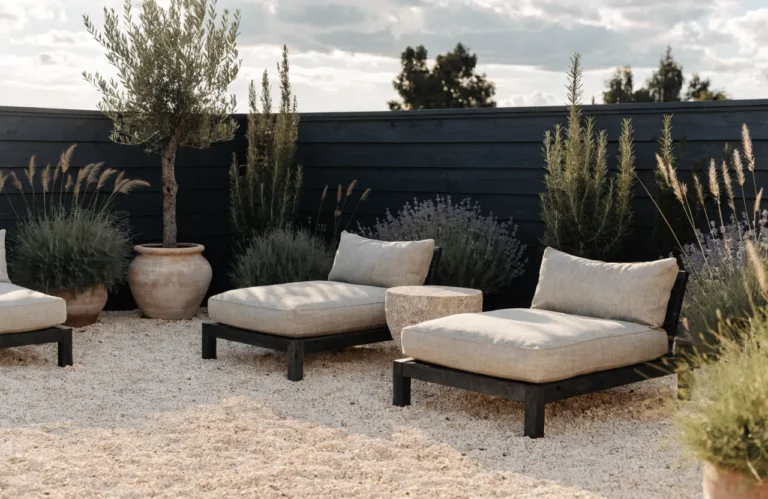
3. Oversized Planters + Symmetry-First Entry (No Lawn Required)
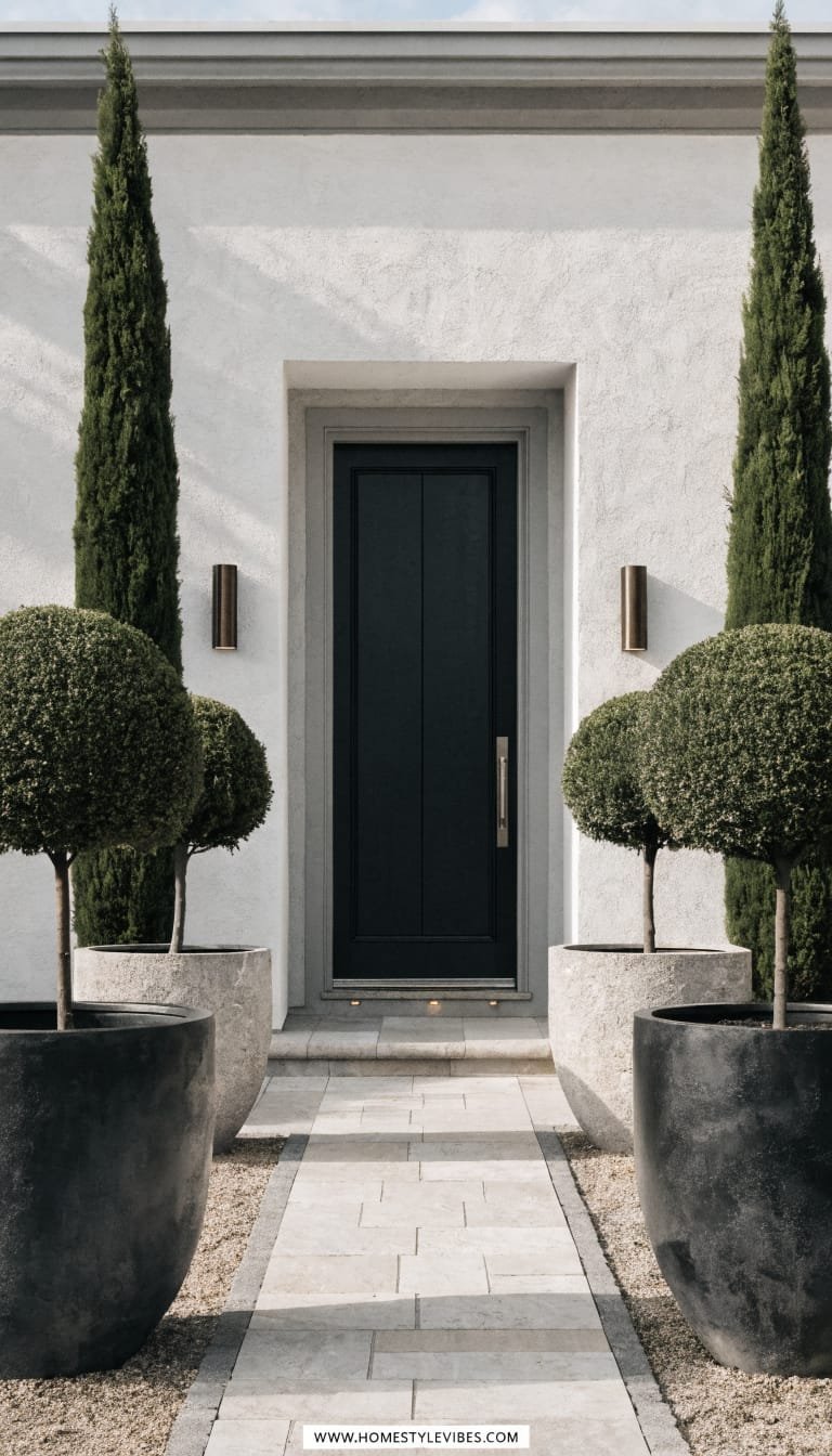
You’ve tried planting beds, but they still look chaotic or, worse, skimpy. Symmetry to the rescue. Flank your entry with two or four oversized planters in a bold finish—matte black, stone gray, or aged terracotta—and let the containers do the heavy lifting. This design feels hotel-lobby formal with a residential wink. Think clipped bay laurels, dwarf olives, or pencil cypress in matching pairs for drama with minimal upkeep.
Why it works in real homes: Containers mean containment. Fewer weeds, defined watering, and instant structure even on small porches. It’s excellent for resale because symmetry reads “finished” to the broadest audience. Lighting? Place discrete uplights behind the planters so the foliage silhouettes against your facade—think subtle, cinematic, and totally photogenic.
Why It Looks Expensive: Scale equals luxury. Oversized planters (24–30 inches) skip the dinky look and give your home presence. Match planter finish to window trim or door hardware to tighten the visual story. One color, repeated: chef’s kiss.
Materials that dominate: ceramic or fiberstone planters, evergreen topiary or columnar shrubs, crushed stone “carpet” around planters instead of mulch. Photographing this set-up loves the strong verticals and negative space around them—no busy beds distracting from the entrance.
Variations:
– Budget-friendly: Use lightweight fiberglass lookalikes and propagate cuttings to fill.
– Renter-friendly: All in containers—zero digging; add felt pads to protect porches.
– Small-space: Two planters only, plus a slim doormat in natural coir for texture pop.
Key Design Elements:
- Main materials: Large planters, evergreen structural plants, gravel or paver base
- Color palette: Matte black or stone gray, deep green foliage, warm brass accents
- Lighting strategy: Discreet uplights behind/between planters
- Furniture silhouettes: Optional slim bench in teak or metal, rectilinear
- Texture layers: Smooth planter, glossy leaves, coarse gravel, natural fiber mat
- Accent details: Coordinated mailbox/house numbers, minimal door wreath in olive branches
How To Recreate This Look:
- Start with two or four oversized planters in a finish that echoes your exterior trim.
- Add high-quality potting mix and slow-release fertilizer for low-touch health.
- Layer in evergreen specimens; underplant with trailing thyme or ivy for softness.
- Install small uplights aimed at the planters and adjacent wall for dramatic silhouettes.
- Style with a crisp doormat and matching hardware for a pulled-together entry.
Why This Looks Expensive: Consistent scale and symmetry feel custom. Even budget planters look luxe when they’re large, minimal, and color-matched to the facade.
Common Mistakes To Avoid: Don’t under-size the planters or mix too many plant species. Avoid plastic-y finishes that fade; choose UV-stable materials.
Pro Styling Tip: Shoot straight-on for a clean, editorial image; keep the doormat edge parallel to the frame for that pleasing, graphic composition.
Want something with spa-like calm and barely any watering needs? Let’s go zen.
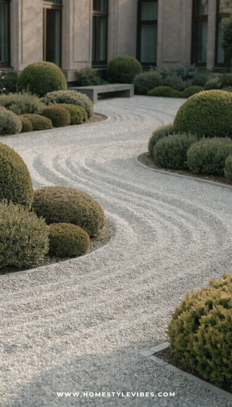
4. Japandi-Inspired Zen Bed With Raked Gravel and Boulders
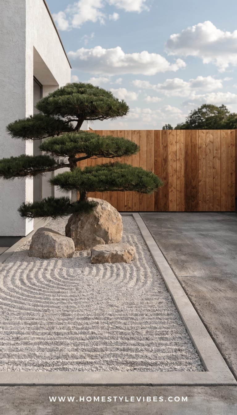
It’s the patch by the driveway that never thrives—sun-scorched or shade-starved, always a little sad. Transform it into a framed zen bed that celebrates stillness. This look blends Japanese minimalism with Scandinavian warmth: raked gravel, a few carefully placed boulders, and a sculptural pine or dwarf conifer. The mood is serene, balanced, and quietly sophisticated—the kind of front yard that invites a deep breath before you even reach the door.
Why it works in real homes: Minimal planting equals minimal upkeep. Gravel and boulders don’t complain about the weather. Small yards love this because it draws the eye to shape and shadow instead of square footage. Lighting matters: a single, low spotlight grazing a boulder face creates museum-level drama at night.
Why It Looks Expensive: Precision. When lines are clean and elements are few, everything must look intentional. Boulders with visible grain, consistent gravel color, and a floating cedar or charred-wood board edge read designer. The restraint makes neighbors wonder who your landscape architect is.
Materials that dominate: granite or basalt boulders, pale gravel, charred wood or cedar edging, one sculptural evergreen. Photographs beautifully because shadows reveal raked patterns and boulder faces catch warm light like art pieces.
Variations:
– Budget-friendly: Two boulders instead of three; pine in a large container at the back.
– Small-space: A 4×6-foot zen “panel” near the mailbox—tiny, perfect, memorable.
– Darker version: Black gravel with silver-gray boulders for moody, modern curb appeal.
Key Design Elements:
- Main materials: Uniform gravel, statement boulders, wood edging, one dwarf conifer
- Color palette: Soft white/gray gravel, charcoal boulders, deep green foliage, honey wood
- Lighting strategy: One to two pinpoint uplights for stone faces and foliage underside
- Furniture silhouettes: None; maybe a low wooden step or threshold element
- Texture layers: Fine raked gravel, rough stone, soft needles, warm wood grain
- Accent details: Discreet water bowl, minimal mailbox in black, subtle wind chimes (optional)
How To Recreate This Look:
- Start with a clean rectangle or square; set wood or metal edging flush with grade.
- Add compacted base gravel; top with a uniform layer for raking patterns.
- Layer 2–3 boulders in a triangular composition; vary height and angle for naturalism.
- Install a single sculptural evergreen; keep underplanting minimal or mossy.
- Style with a raked pattern you can refresh seasonally and one sharp uplight for drama.
Why This Looks Expensive: The curated scarcity of elements and gallery-like lighting feel bespoke. Every line speaks; nothing shouts.
Common Mistakes To Avoid: Don’t scatter pebbles randomly or use mismatched rock colors. Avoid over-planting; negative space makes it zen.
Pro Styling Tip: Photograph from an angle that lets raked lines converge toward the boulders—instant depth and calm.
Craving warmth and European charm without the water bills? The next look is cottage energy—edited.
5. Mediterranean Gravel Garden With Terracotta Accents
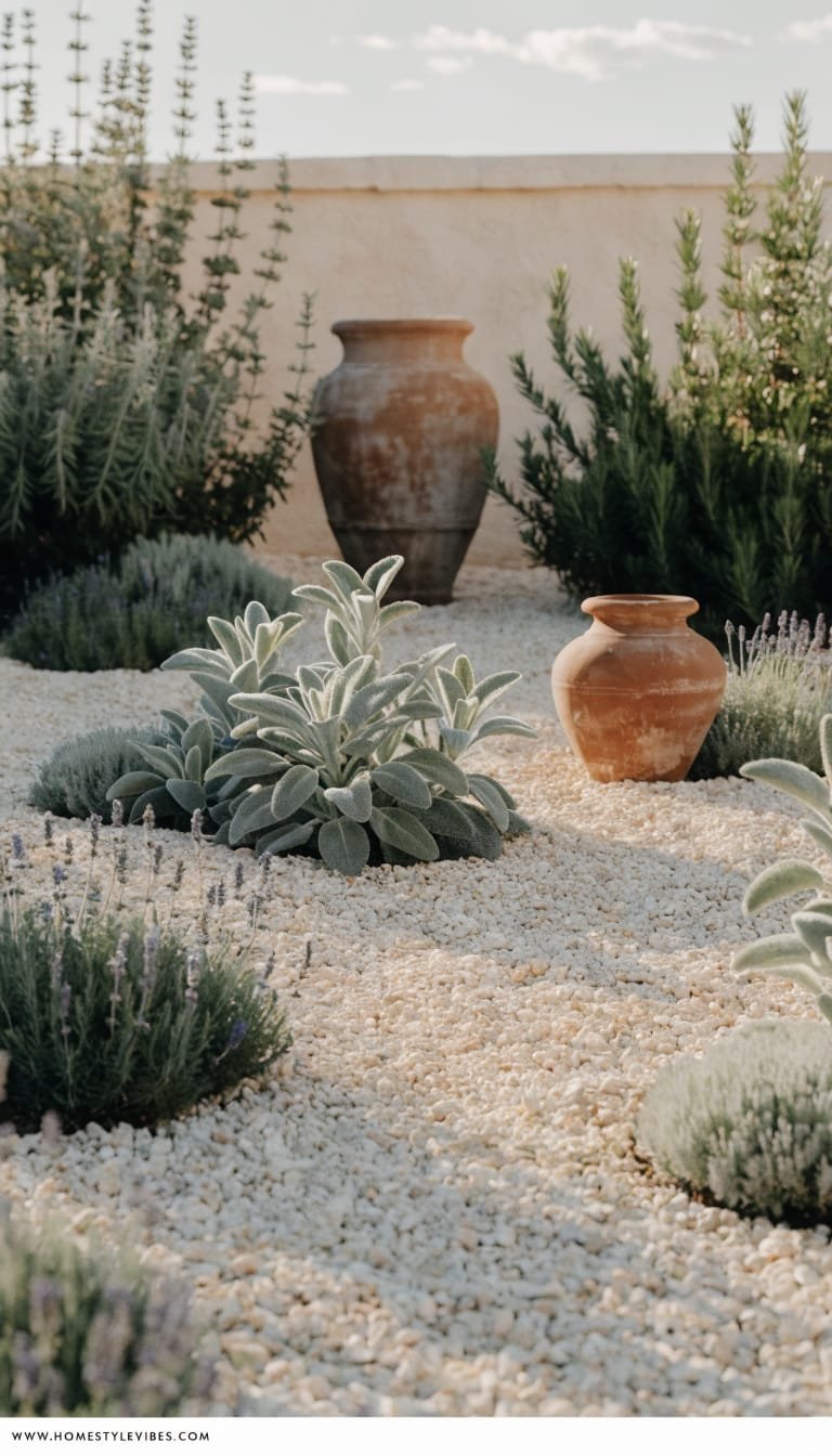
You’ve planted blooms for pops of color, but they fade fast and look tired between seasons. A Mediterranean gravel garden trades fragile flowers for year-round structure: silver-leaf perennials, aromatic herbs, and terracotta textures that age beautifully. Picture sage, rosemary, lavender, and santolina drifting around a gravel carpet, punctuated by terracotta ollas or an aged urn. It’s sun-loving, fragrant, and deliciously low maintenance.
Why it works in real homes: These plants adore heat and poor soil. They beg you not to overwater. Small yards look richer with layered foliage contrasts—silvery greens, deep olives, and the warm blush of clay. Brass or copper lighting warms the palette and creates that golden, old-world glow at dusk.
Why It Looks Expensive: Consistent materials and patina. Terracotta, warm gravel, and a trio of silvery plants feel curated and “collected on travels.” Add a small, recirculating wall fountain in limestone or painted plaster for gentle sound—suddenly your front yard feels like a boutique hotel courtyard.
Materials that dominate: terracotta pots and ollas, decomposed granite or crushed limestone, herbs and silver-leaf shrubs, a simple plaster or stone fountain. Photos love the matte texture of clay, soft plant mounds, and warm reflected light off pale gravel.
Variations:
– Budget-friendly: Use a single large terracotta pot and thrifted clay bowls; plant from cuttings.
– Small-space: Focus the look on a 6-foot radius around the entry, with gravel and three plant mounds.
– Renter-friendly: Keep everything in pots on a gravel “rug” with breathable landscape fabric underneath.
Key Design Elements:
- Main materials: Terracotta, warm-toned gravel, Mediterranean herbs, plaster or stone water feature
- Color palette: Clay, sand, olive, silver-green, soft white
- Lighting strategy: Low, warm stake lights; soft glow against the fountain wall
- Furniture silhouettes: Curved-back bistro chair (optional), low-slung stool in wood
- Texture layers: Matte clay, fine gravel, soft velvety leaves, water sheen
- Accent details: Aged urns, metal house numbers in bronze, olive-branch wreath
How To Recreate This Look:
- Start with weed barrier and a 2–3″ layer of warm gravel across the front beds.
- Add three repeating plants (lavender, rosemary, santolina) in generous drifts.
- Layer terracotta planters in graduated sizes; group in threes for balance.
- Install a compact wall fountain or clay urn with recirculating pump; keep it subtle.
- Style with warm lighting and a single rustic bench or stool near the entry.
Why This Looks Expensive: The repetition and patina imply age and intention. Visual warmth + herb fragrance = multi-sensory luxury without fuss.
Common Mistakes To Avoid: Don’t mix bright colored gravel with terracotta—it clashes. Avoid over-complicating plant varieties; stick to three or four heroes.
Pro Styling Tip: Shoot close-ups of clay against silver leaves and gravel; those micro-textures scream editorial richness.
If your front yard is a slope or an awkward corner, the next idea turns topography into a feature, not a flaw.
6. Tiered Corten Steel Beds With Native Planting
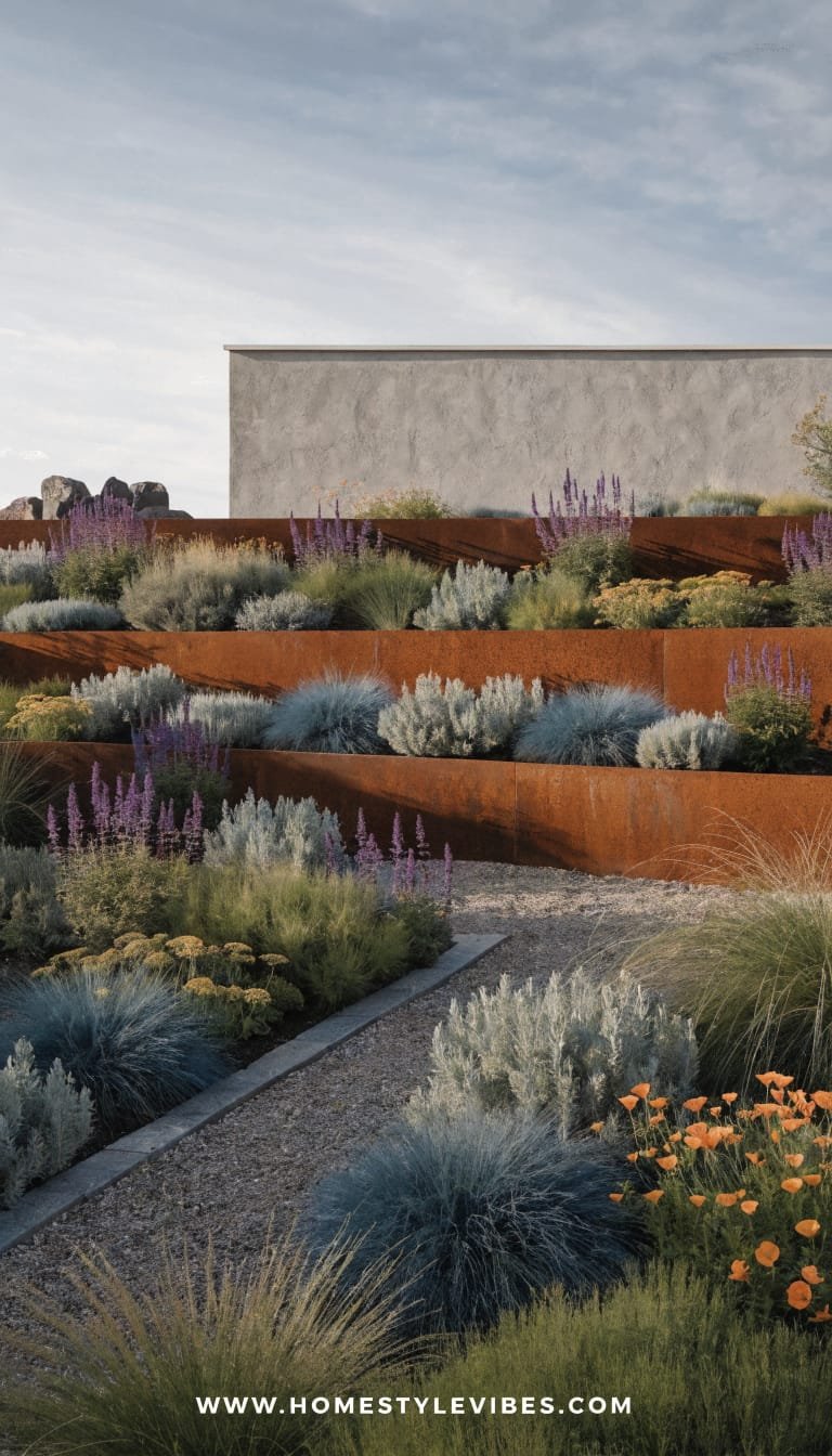
You’ve tried throwing plants at that slope, but rain washes them out and it always looks half-finished. Tier it. Corten steel retaining beds bring sculptural lines and warm, rusted tones that pair beautifully with native, low-water plants. The look is modern yet earthy—like a boutique vineyard hillside. Terracing creates flat planes that feel intentional, and the steel’s amber-brown patina adds instant depth against green foliage and gray stone.
Why it works in real homes: Structurally, tiers solve erosion while making maintenance easy—you can reach everything. Natives reduce watering, attract pollinators, and thrive with less fuss. At night, linear lights wash the steel for a soft glow and gorgeous shadow play. Resale loves it because it solves a functional issue while adding serious curb appeal.
Why It Looks Expensive: Custom-feeling metal work always reads high-end. Combine two heights of steel planters for rhythm, keep plantings simple (grasses, salvias, manzanita or arctostaphylos if climate-appropriate), and finish with crushed gravel paths. Suddenly, your incline looks like a designed landscape, not a struggle.
Materials that dominate: corten steel walls or modular planters, native shrubs and grasses, gravel paths, embedded step lights. Photography adores the color contrast—rust, green, and stone—with sharp lines and layered heights.
Variations:
– Budget-friendly: Use pre-fab steel edging and stacked stone at key spots instead of full walls.
– Small-space: One long corten planter parallel to the sidewalk with two simple native species.
– Darker version: Black powder-coated steel if you prefer less color variation; pair with deep green natives.
Key Design Elements:
- Main materials: Corten steel, native perennials and shrubs, gravel, step/deck lights
- Color palette: Rust, sage green, charcoal, pale stone
- Lighting strategy: Linear strip lights under cap edges, small spotlights for anchor plants
- Furniture silhouettes: Optional simple bench integrated into a tier
- Texture layers: Weathered metal, fine gravel, airy grasses, rough stone
- Accent details: Metal house numbers, minimalist mailbox, rain chain for sculptural function
How To Recreate This Look:
- Start with a site plan for 2–3 tiers; mark heights and set drainage paths.
- Add corten walls or modular steel planters; anchor securely and backfill with gravel and soil.
- Layer native plants in masses—groundcovers up front, medium-height grasses in the middle, shrubs as anchors.
- Install low-voltage lighting beneath edges and at key plant clusters.
- Style with a restrained palette of gravel and one bench or boulder for seating or sculptural weight.
Why This Looks Expensive: Serious materials + problem-solving design = instant “architected” feel. The patina reads artisanal rather than off-the-shelf.
Common Mistakes To Avoid: Don’t overcrowd plants early; natives expand. Avoid mixing too many materials—steel + gravel + one stone type is plenty.
Pro Styling Tip: For photos, shoot at a slight diagonal from the lowest corner to capture the step-up rhythm and rich steel color.
Longing for that clean, magazine-ready facade where every line feels crisp? Pavers and parity are your new best friends.
7. Monochrome Paver Grid With Evergreen Hedges and Soft Wash Lighting
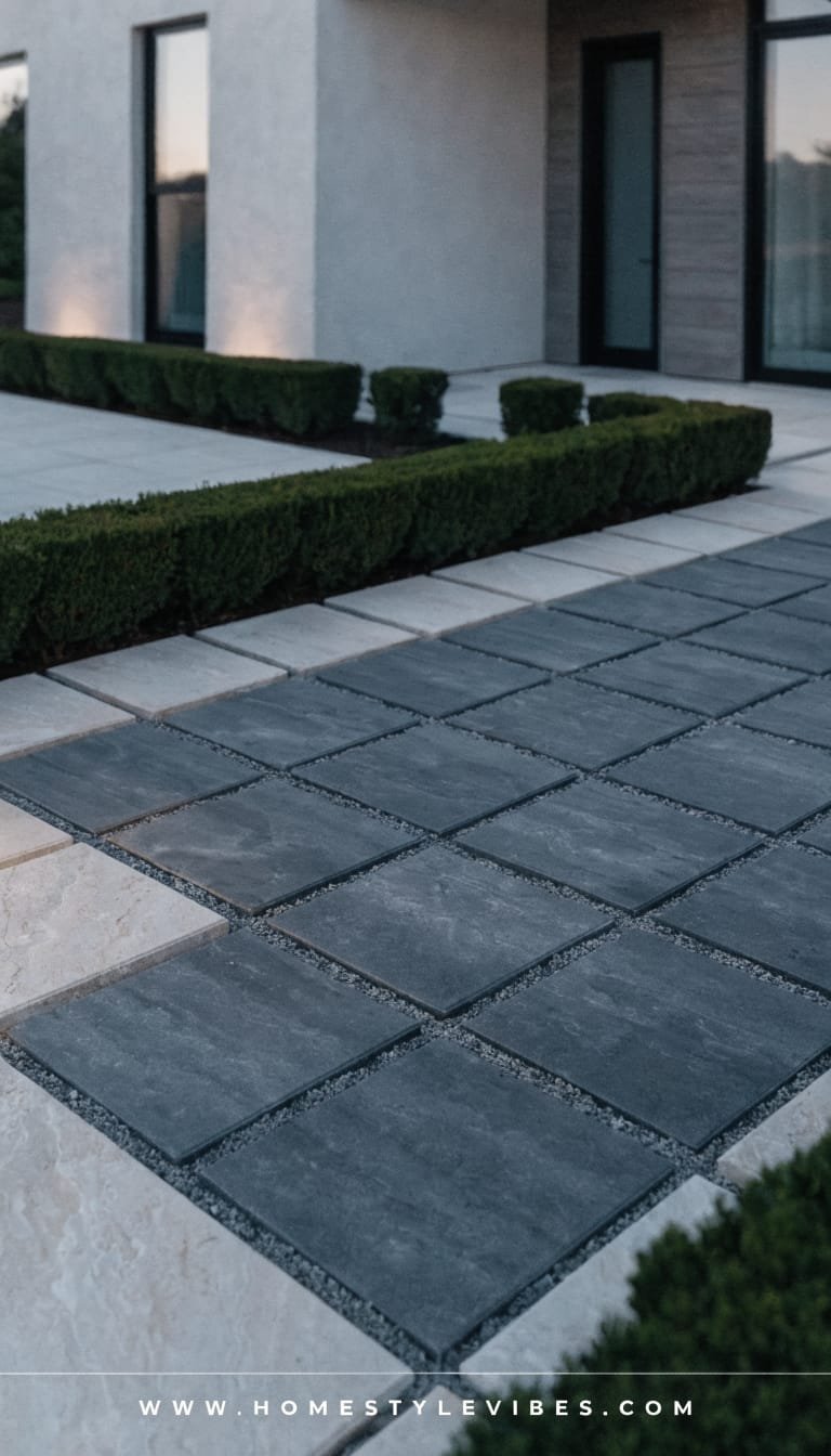
You’ve got a driveway and a strip of tired lawn that always looks, well, tired. The monochrome paver grid solution transforms the whole front into a graphic composition—large-format pavers in a single shade (charcoal or light limestone) with tight joints or gravel infill. Frame the yard with low evergreen hedges—think Japanese holly, boxwood varieties suited to your zone, or even dwarf yew. The vibe: modern manor meets boutique gallery. It’s clean, it’s calm, and it puts your architecture front and center.
Why it works in real homes: Big pavers equal fewer weeds and easier sweeping. Evergreen hedges keep structure year-round with minimal trimming. The grid pattern guides your eye—and your guests—right to the door. Lighting? A soft, even wall wash on the facade and subtle path markers make the whole home look professionally lit—no runway vibes, just quiet confidence.
Why It Looks Expensive: Monochrome amplifies perceived quality. Oversized elements feel custom, especially when lines align with the front door, windows, and steps. Keep plant palette ultra-simple—two greens max—and you’ll get that editorial polish you’ve been craving.
Materials that dominate: large-format pavers or concrete slabs, evergreen hedging, steel or stone edging, concealed lighting. It photographs beautifully because the grid adds structure while hedges deliver a plush, velvety backdrop that pops against matte pavers.
Variations:
– Budget-friendly: Use standard concrete squares dyed in a single tone, set in compacted DG.
– Small-space: A tight 3×3 grid landing with a short hedge border; instant upgrade.
– Renter-friendly: Lay large outdoor tiles on a leveled gravel base for a temporary grid patio feel.
Key Design Elements:
- Main materials: Large pavers, evergreen hedges, gravel or tight joints, warm LED wash lights
- Color palette: Single-tone paver field (charcoal or bone), deep green, black metal accents
- Lighting strategy: Soft wall wash, recessed step markers, minimal path indicators
- Furniture silhouettes: Optional sleek bench or cube stools near the entry
- Texture layers: Matte paver, plush hedge, subtle gravel infill, smooth metal
- Accent details: Linear mailbox, flush house numbers, simple black planters for height near door
How To Recreate This Look:
- Start with a simple grid plan that aligns paver seams with architectural lines.
- Add a compacted base and set large pavers level; keep joints consistent at 1/4–1/2 inch.
- Layer evergreen hedges as a low border; maintain a single species for cohesion.
- Install soft wash lights on the facade and minimal path markers at key turns.
- Style with one sleek bench and a pair of tall, matching planters at the entry.
Why This Looks Expensive: Precision and repetition. The grid repeats, the hedges repeat, and the lighting ties it all together for a seamless, curated facade.
Common Mistakes To Avoid: Don’t mix paver colors or hedge species. Avoid harsh, bright lighting—choose 2700K–3000K for a soft, architectural glow.
Pro Styling Tip: Shoot from an elevated angle (even a step stool) to show the grid symmetry and clean hedgerow line—pure design candy.
Still scrolling? Good. That means your home’s potential is officially louder than your lawn woes.
Here’s the heart of it: beautiful, low maintenance front yard landscaping ideas that actually look expensive come down to discipline—fewer species, bigger gestures, better materials, and flattering light. You don’t need a thousand flowers; you need one sculptural tree, a strong path, and textures that feel intentional to the touch and the eye. Imagine stepping out every morning to the quiet crunch of gravel, a soft wash of warm light, and plants that thrive because you aren’t over-managing them. That’s curb appeal with sanity intact.
Pick one idea. Start small if you need to: replace your struggling lawn square with a gravel courtyard and a hero tree, or flank your front door with two oversized planters and call it a day. Then layer in details—house numbers that match your planters, lights that graze rather than glare, and restrained greenery that holds shape through all four seasons. Luxury, IMO, lives at the intersection of texture, lighting, and restraint. Get those right, and everything else feels easy.
And please—don’t rush this part. Walk your front yard at golden hour. Notice where shadows fall, where you want a little sparkle, and where silence feels right. Design is just storytelling with materials. Choose a chapter from these seven, and let your front yard say what you’ve been trying to say for ages: Welcome home, without the weekend watering shift. Seriously—your hose can finally retire.
About the Author

Krisztina P.Rendes, Founder of Home Style Vibes
Founder of Home Style Vibes
Krisztina Puskásné Rendes created Home Style Vibes as a cozy-modern lifestyle space where homemaking meets inspiration. Her goal is to help women create beautiful, organized, and peaceful homes they truly love — without overwhelm. You’ll find here heart-driven content on home decor, cleaning tips, easy family recipes, organization and decluttering, DIY home projects, plants, and seasonal ideas — all designed to bring more calm, comfort, and style into everyday life.