7 Summer Home Decor Ideas for Your Living Room That Feel Light and Airy
You want a living room that breathes—sunlight that doesn’t fight heavy fabrics, a sofa that doesn’t swallow the space, colors that feel like a deep inhale. But clutter creeps in, old rugs hoard shadows, and that one weird lamp throws a yellow cast over everything. The dream? Sheer textures, soft movement, layered neutrals with a few seasonally juicy hits of color, and a layout that actually invites you to stretch out. These 7 summer home decor ideas will fix the biggest frustrations—stale lighting, bulky furniture, dingy color stories—so your living room looks light and airy within a weekend and under a realistic budget cap per idea. Think photogenic, Pinterest-friendly moments designed for real homes, not museum sets. If you crave breezy linens, sunlit corners, and easy upkeep that still reads chic, this guide was made for you.
1. Cloud-Curtain Windows with Breezy Layering and Hidden Rods
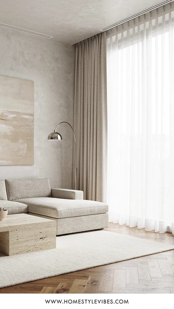
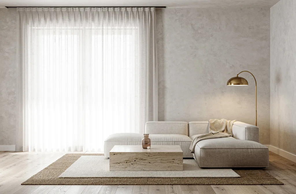
We’ve all been there: you hang “light” curtains, but they pool like damp towels and your living room still feels heavy. The secret is height, sheerness, and light diffusion—plus solving that dead space between the rod and the ceiling that makes everything look cheaper than it is. This design turns your windows into soft-focus light boxes with sheer linen layers, slimline ripple-fold tracks mounted near the ceiling, and barely-there hardware that disappears into the architecture.
The mood is hotel-spa meets coastal casual—open, easy, and quietly luxe. It’s perfect for rental apartments with standard 8–9 foot ceilings because the vertical lines trick the eye upward. It photographs beautifully: morning sun hits the sheer pleats, creating a soft gradient and depth across the room. The materials are simple: open-weave linen or voile, ceiling-mount tracks, and a slim blackout roller tucked behind for movie nights. You get the best of both: diaphanous by day, cozy by night.
Why it works in real homes? It hides crooked window casings, balances odd wall proportions, and lets you control glare without strangling daylight. Lighting feels cooler and more natural because sheers spread light across the walls, eliminating harsh hot spots.
Budget Breakdown:
- Ceiling-mount curtain tracks: $60–$200 per window
- Sheer linen curtain panels: $40–$180 each
- Slim blackout roller shade: $70–$250 per window
- Installation hardware and anchors: $15–$40
Total Estimated Cost: $350 – $1,200 (depending on window count and fabric)
Best For: Rooms with average ceiling heights, renters who need removable solutions, anyone battling yellow lighting or shadowy corners in summer.
Key Design Elements:
- Main materials: linen or voile sheers, metal tracks, hidden rollers
- Color palette: cloud white, pale oat, or soft flax
- Lighting strategy: diffuse daylight, optional blackout for control
- Furniture silhouettes: low-back sofas that don’t fight the vertical drape
- Texture layers: open-weave sheers, smooth walls, matte finishes
- Accent details: slim brass returns, alabaster lamp to echo translucency, green trailing plant by the window
How To Recreate This Look:
- Start with precise measurements from ceiling to floor and add 1–2 inches so panels kiss the floor without puddling.
- Add a ceiling-mount track 1–2 inches from the wall; ripple-fold carriers give that luxe hotel wave.
- Layer a sheer panel in front and a slim roller shade behind the track for nighttime control.
- Install a cool-temperature LED bulb in nearby lamps to maintain the daylight vibe.
- Style with a pale woven rug to bounce light back into the room and keep the window zone clean.
Why This Looks Expensive: The hidden hardware and floor-kissing hems read custom. Consistent ripples create rhythm, and the slightly warm white fabric keeps the space from feeling sterile.
Watch Out: Don’t hang the track on the window frame. Mount it as high as you can; the visual height is what makes the room feel bigger and airier. Avoid fabric that’s too stark white; it can glare in sunlight.
Pro Styling Tip: Shoot photos when sunlight is soft and indirect; let the panels billow slightly by cracking a window to capture movement and shadow play.
Keep scrolling—what comes next changes how your living room feels underfoot, not just at the window line.
2. Pale-Oat Rug Swap with Airy Pattern and Barely-There Contrast
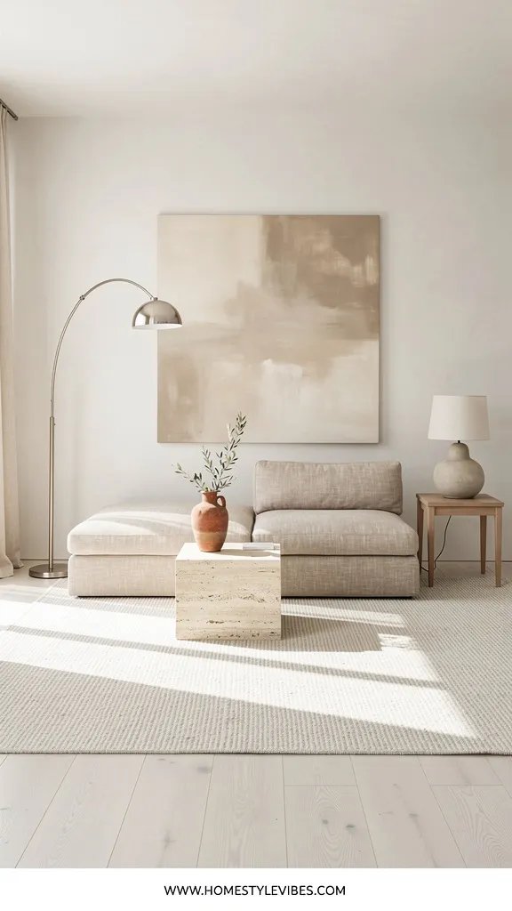
It’s that one corner that always feels off because your dark rug hoards shadows like a secret. You’ve tried cleaning it, shifting the furniture, even adding brighter lamps, but the floor still drags the mood down. A pale-oat or chalky greige rug with a whisper of pattern changes the entire light story. It turns the floor into a reflector that sends glow back up to your walls and furniture—an instant “lighter and airier” summer home decor move.
The mood here reads relaxed California minimal with a hint of Scandinavian calm. Why it works in real homes: pale rugs don’t have to be precious. Pick a low-pile, patterned weave that hides crumbs and pet fluff; stain-resistant fibers have come a long way. Your lighting will feel more even because you’ve eliminated the visual sinkhole. And on camera? The soft pattern creates texture without visual noise, so your sofa and coffee table pop.
Material-wise, aim for wool blends, recycled PET, or performance fibers. Flatter piles vacuum easily and don’t swallow furniture legs, which keeps the room feeling crisp. This approach helps resale, too—lighter floors and rugs make rooms photograph like a listing dream.
Budget Breakdown:
- 8×10 performance rug: $220–$950
- Rug pad (thin felt or natural rubber): $60–$180
- Spot cleaner or enzyme spray: $12–$24
- Optional: professional rug cleaning voucher for end-of-season refresh: $120–$220
Total Estimated Cost: $292 – $1,374
Best For: Open-plan living rooms that feel heavy, homes with pets or kids (pick performance fibers), anyone who wants a quick visual refresh.
Key Design Elements:
- Main materials: performance fiber or wool blend, thin felt pad
- Color palette: oat, cream, fog, warm ivory with a micro-pattern
- Lighting strategy: amplify daylight by reflecting it up
- Furniture silhouettes: light-legged pieces or sofas with visible legs
- Texture layers: flatweave rug, nubby linen throw, smooth ceramic
- Accent details: pale wood tray, glass vase, woven basket
How To Recreate This Look:
- Start with a rug that’s at least the front legs of your seating group; scale matters for a finished look.
- Add a thin felt pad to make the rug feel cushioned but not bulky—thick pads can create toe-stubbing lips.
- Layer smaller accent rugs (like a jute runner) if you have an odd room shape or traffic path.
- Install soft white bulbs (3000–3500K) nearby to keep the color reading warm and bright, not blue.
- Style with a pale wood coffee table or light tray to continue the airy visual rhythm.
Why This Feels Designer: Tonal patterning adds just enough interest without busying the room. The scale of the rug anchors the furniture, which always reads custom and thoughtful.
One Thing To Avoid: Don’t go pure white or super shaggy. You’ll fight every crumb and the pile crush will look messy within a week.
Pro Styling Tip: Angle your camera to catch the rug’s subtle texture; shoot from knee height to keep the pattern soft and dimensional.
Remember, this isn’t about recreating a showroom. It’s about building a space that actually feels like yours. If one idea resonates more than the others, that’s your starting point. You don’t need all of them.
3. Linen Slipcover Sofa with Air-Kissed Cushions
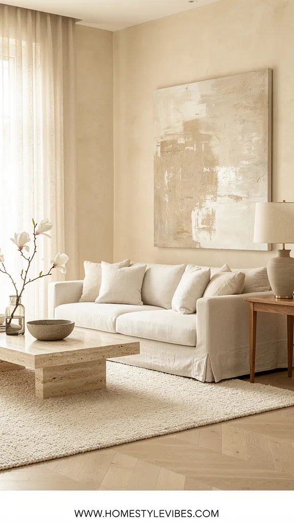
You love your sofa’s shape, but every summer it reads hot and heavy. You’ve tried tossing on lighter throws, but the whole thing still feels like winter. A linen slipcover gives instant breathability—visually and physically. It softens edges, adds natural slub texture, and lets you shift from structured to relaxed without buying a new couch.
The mood is Hamptons-meets-Paris-apartment: casual but intentional. Linen handles summer heat nicely, and a tailored slip avoids the “wrinkled sheet” look. In real homes, this wins for maintenance—a quick wash or dry-clean refresh beats spot-cleaning microfiber for days. Lighting looks gentler against linen; the fibers catch sunlight and create micro-shadows that read luxe on camera. It also keeps resale flexible: a neutral slip gives future buyers a clean canvas.
Materials: pre-washed linen (7–10 oz for durability), or performance linen if you want stain resistance. Choose a warm white, pale flax, or mist gray that suits your rug. For cushions, swap dense poly fills for a feather-down blend or high-resilience foam wrapped in batting; you want that air-kissed sit that doesn’t collapse at the back.
Budget Breakdown:
- Custom or semi-custom slipcover: $350–$1,200
- Ready-made slip for standard sofa shapes: $120–$420
- Feather-down blend cushion inserts: $35–$110 each
- Fabric protector spray: $14–$30
Total Estimated Cost: $269 – $1,760
Best For: Sofas with good bones, renters refreshing a dated piece, families wanting washable, summer-friendly seating.
Key Design Elements:
- Main materials: linen, feather-down blend, cotton piping
- Color palette: warm white, flax, pale stone, driftwood gray
- Lighting strategy: soften bright midday sun with texture-rich seating
- Furniture silhouettes: bench-seat cushion, slender arms, visible legs
- Texture layers: linen, seagrass basket, glossy ceramic side table
- Accent details: tonal piping, contrast throw pillows in sky blue or pistachio
How To Recreate This Look:
- Start with a fitted slipcover tailored to show the sofa legs; a skirt can work, but keep it crisp and slightly above the floor.
- Add new cushion inserts for a higher loft that doesn’t pancake by lunchtime.
- Layer in two throw pillows max in summer—go generous in size, restrained in number.
- Install felt glides under sofa feet so the room feels rearrangeable and light.
- Style with a pale wood or travertine side table that catches light and echoes the linen tone.
Why This Reads High-End: A fitted slip with crisp seams feels bespoke. The fabric’s slub texture plays with light so even neutrals look dimensional, not flat.
The Most Common Mistake: Oversized, droopy slips. Baggy fabric adds visual weight. Tailoring matters—pin-fit before ordering if you’re going custom.
Pro Styling Tip: For photos, steam only the visible front planes and leave a hint of natural linen rumple on the seat for that chic, lived-in summer vibe.
4. Soft-Shadow Lighting Plan with Layered Whites and a Linen Drum Pendant
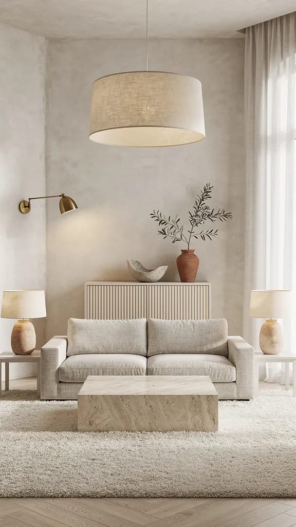
Lighting is tricky. You change bulbs, add a lamp, still end up with patchy brightness and that one weird shadow your cheap pendant casts on the wall. A summer lighting plan needs layered whites: a linen drum pendant for overhead softness, two low-glare table lamps at seat height, and one directional sconce to pull texture off your artwork or fluted cabinet front.
This mood feels modern Mediterranean meets minimal boutique hotel: creamy, diffused, and quiet. It works for both small and large living rooms because you’re not blasting light from one source—you’re feathering it across the space. Materials to look for: linen or paper shades, alabaster or plaster bases, matte brass hardware, and dimmable LED bulbs at 2700–3000K for evenings and 3500K for daytime tasks. On camera, the layered light creates depth and flattering shadows that make surfaces look expensive.
Variations: budget-friendly uses paper lantern pendants and ceramic thrifted lamps with new shades. Renter-friendly? Plug-in sconces with cord covers that match the wall paint. Darker rooms can run 3500K bulbs in the lamps to stay crisp but not blue.
Budget Breakdown:
- Linen drum pendant: $120–$450
- Table lamps (pair): $140–$520
- Plug-in sconce: $60–$220
- Dimmable LEDs and smart plugs: $40–$110
Total Estimated Cost: $360 – $1,300
Best For: Rooms with only overhead can lights, apartments with uneven daylight, anyone wanting a soft summer glow without major rewiring.
Key Design Elements:
- Main materials: linen, alabaster, matte brass
- Color palette: warm whites and sand tones
- Lighting strategy: layered, dimmable, glare-free
- Furniture silhouettes: low profile to let the pendant feel airy
- Texture layers: paper shade grain, linen weave, plaster finish
- Accent details: discrete cord management, matching bulb temps
How To Recreate This Look:
- Start with the pendant: hang it so the bottom sits 78–84 inches from the floor to avoid head bumps and keep sightlines open.
- Add two lamps at seated eye level on either side of the sofa; aim shades at 24–28 inches tall.
- Layer a plug-in sconce to graze textured art or a fluted cabinet; it builds depth.
- Install dimmers or smart plugs to dial in brightness based on time of day.
- Style with consistent bulb temperatures across all fixtures for cohesive color.
Why This Looks Intentional: Consistent color temperature equals harmony. The linen shade glows from within, and the sconce adds directional contrast—your eye reads it as curated, not random.
Don’t Do This: Mixing cool 5000K bulbs with warm 2700K lamps. Your walls will look sickly and your sofa will skew a weird color in photos.
Pro Styling Tip: For pictures, dim overheads to 30%, lamps at 70%. You’ll get creamy highlights and gentle shadows that flatter your textures.
Before we go bold with color, let’s talk layout. Because a light and airy living room isn’t just surfaces—it’s how you move through it.
5. Open-Flow Layout with Floating Furniture and Negative Space
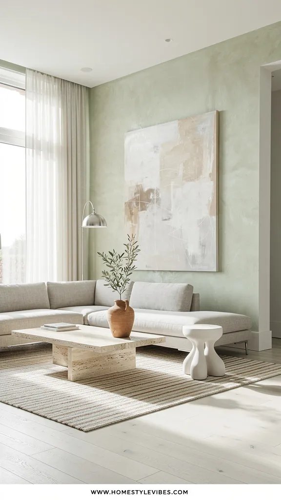
You push the sofa to the wall, swear it’ll make the room bigger, and somehow it still feels cramped. You’ve added a slender coffee table, but the energy is stuck. The fix? Float the seating to create generous negative space around pathways and windows. Think of air as a design material—you want visible floor and breathing room between pieces.
The mood reads Japandi-coastal: calm, minimal, nothing heavy or overfilled. It’s wildly practical for families because it creates clear zones for conversation and kid play without feeling cluttered. In small spaces, floating furniture on a correctly scaled rug defines the room and prevents that “furniture clinging to the perimeter” look. Light flows around the pieces instead of stopping at a wall of upholstery.
Materials and shapes matter: choose a slim-leg lounge chair instead of an oversized armchair, a rounded-edge coffee table to keep traffic moving, and a narrow console behind the sofa for function without bulk. Photographs love this setup: you get long sightlines, layered planes (sofa, coffee table, chair), and a clean focal axis.
Budget Breakdown:
- Rug upgrade to anchor floating layout (if needed): $220–$950
- Slim console table (10–14 inches deep): $120–$480
- Light-legged accent chair: $180–$850
- Furniture sliders/glides and cable management: $20–$45
Total Estimated Cost: $340 – $2,325 (varies based on what you already own)
Best For: Narrow living rooms, rental layouts with odd windows, anyone craving more breathing room without a remodel.
Key Design Elements:
- Main materials: light wood, linen, cane, matte metal
- Color palette: pale neutrals with one soft accent (sky, sea-glass, apricot)
- Lighting strategy: keep fixtures away from the center sightline to avoid visual block
- Furniture silhouettes: low, leggy, curved edges
- Texture layers: cane chair back, boucle or linen pillows, woven basket
- Accent details: small-footprint plant stands, floating shelves vs bulky bookcases
How To Recreate This Look:
- Start by pulling your sofa 8–16 inches off the wall; set the rug so 2/3 of the sofa sits on it.
- Add a narrow console behind the sofa for lamps and catch-alls; keep it lighter than the sofa color.
- Layer a single accent chair opposite the sofa with open legs; leave at least 30–36 inches for a walkway.
- Install cable clips and cord covers so negative space stays clean, not spaghetti-like.
- Style with fewer, larger objects on the coffee table—a single sculptural bowl beats a cluster of trinkets.
Why This Feels Designer: Negative space is a luxury. Restraint telegraphs confidence, and curved traffic routes make a room feel gracious even when it’s modest in size.
Watch Out: Don’t downsize the rug. A too-small rug ruins the float and makes everything look timid. Also, avoid heavy recliners—they’ll drag the room visually.
Pro Styling Tip: Shoot from a doorway corner so the furniture layers read like a V—depth sells lightness in photos.
Real talk: I reworked a client’s layout in under an hour by floating the sofa and adding a narrow console. She texted me later, “I didn’t know air could be furniture.” That’s the energy we’re chasing.
6. Citrus-and-Ceramic Accent Story with Restraint
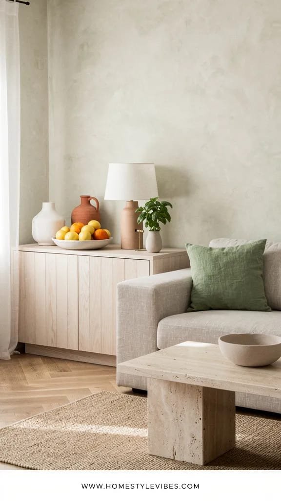
You want color for summer, but every time you buy bright pillows, it turns into a confetti explosion. The fix isn’t more color—it’s fewer, better anchors. A tight citrus-and-ceramic story gives you sunlit freshness without chaos: think pale lemons, soft tangerine, and sprigs of basil green set against chalky white ceramics and sandy neutrals.
The mood is modern Mediterranean—fresh, unfussy, and edible-adjacent. It works in family rooms because ceramics can be sturdy, and color shows up in removable items you can swap seasonally. It photographs beautifully because glossy fruit and matte ceramics create contrast, while a small dose of saturated hue against a light room reads crisp and editorial.
Variations: budget-friendly means thrift-store ceramics sprayed with a matte topcoat and a single citrus-toned throw. Small spaces can stick to one color family (just lemon) for simplicity. Darker rooms can use bolder citrus (blood orange, lime) so color doesn’t get swallowed.
Budget Breakdown:
- Matte ceramic vase or bowl: $24–$180
- Two summer-tone pillows in linen or cotton: $60–$220
- Real or faux citrus stems/fruit: $14–$48
- Small art print or framed tea towel with citrus motif: $30–$140
Total Estimated Cost: $128 – $588
Best For: Neutral rooms craving one confident seasonal hit, renters who want color without paint, hosts prepping for summer gatherings.
Key Design Elements:
- Main materials: matte ceramic, linen, cotton, pale wood
- Color palette: lemon, tangerine, basil, chalk white, sand
- Lighting strategy: place color where daylight hits for a glow effect
- Furniture silhouettes: neutral canvas for highlights—linen slip sofa, oak table
- Texture layers: matte bowl, crisp linen, glossy fruit skin
- Accent details: striped tea towel in a frame, citrus-scented candle in a ceramic jar
How To Recreate This Look:
- Start with one hero ceramic piece—bowl, pitcher, or oversized vase in matte white.
- Add two pillows in a single citrus tone; keep patterns simple or go solid with texture.
- Layer real citrus in the bowl or a single branch of faux lemon leaves for height.
- Install a small art moment with a citrus motif near a window to catch natural light.
- Style with a pale wood tray on the coffee table to ground the color pop.
Why This Looks Expensive: Limiting the palette creates intention. Matte ceramics and textured linen feel artisanal, not mass-produced.
One Thing To Avoid: Mixing five bright colors at once. Keep it to one or two citrus hues max so your room feels crisp, not chaotic.
Pro Styling Tip: For photos, mist real citrus for a soft gleam; place it where side light hits to create subtle highlights.
Pause and breathe. You don’t need to buy a truckload of accessories. One carefully chosen color story can carry an entire summer look. If it feels too bold, scale it back to a single art print and a bowl of lemons—still fresh, still light.
7. Limewashed Accent Wall with Textured Neutrals and Stone Touches
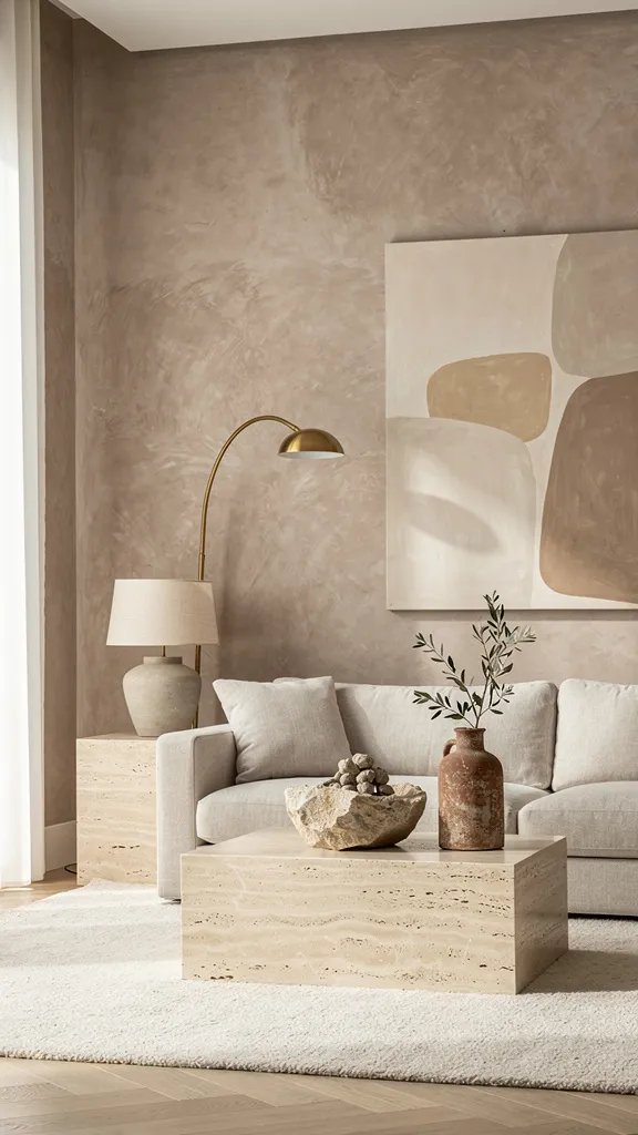
You’ve tried white paint after white paint and the wall still looks flat, almost chalky in a bad way. A friend of mine spent weeks agonizing over paint colors before realizing the real problem was her lighting and lack of surface texture. Enter limewash: a breathable, mineral-rich finish that builds soft movement and quiet depth without reading “faux finish.” It swallows harsh glare and turns your wall into a canvas of shifting tones.
The mood leans modern Mediterranean with a nod to wabi-sabi—imperfect, tactile, yet refined. It’s gorgeous in real homes because it hides minor wall imperfections and plays well with both warm and cool lighting. Materials pair beautifully: travertine, honed limestone coasters, raw oak, and linen. In photos, limewash gives you that editorial gradient—like sunlight has history on your wall.
Variations: budget-friendly uses a DIY limewash or mineral-based paint with a large brush. Renter-friendly? Use peel-and-stick textured panels in a pale plaster effect or experiment on a portable folding screen. Darker versions can go for a beige-taupe limewash to stay moody yet airy when lit correctly.
Budget Breakdown:
- Limewash or mineral paint: $90–$180 per gallon
- Large masonry brush and tray: $25–$45
- Painter’s tape, drop cloths, sandpaper: $20–$40
- Travertine side table or tray: $80–$480
Total Estimated Cost: $215 – $745
Best For: Feature walls behind a sofa or console, rooms with ample daylight that feels harsh on flat paint, anyone craving texture without clutter.
Key Design Elements:
- Main materials: limewash, travertine, oak, linen
- Color palette: warm white, pale stone, oat, mist gray
- Lighting strategy: wall washers or grazing sconces to show texture
- Furniture silhouettes: simple lines to let the wall sing
- Texture layers: stone, open-weave fabric, matte pottery
- Accent details: slim brass frame mirror, branchy greenery in a clay vase
How To Recreate This Look:
- Start with a test patch—check how the color reacts morning vs. evening; limewash shifts beautifully through the day.
- Add two to three irregular coats with a large brush in crisscross strokes; embrace variation.
- Layer a travertine table or tray to echo the stone vibe and reinforce the palette.
- Install a plug-in picture light or wall-grazing sconce to catch the texture.
- Style with minimal decor: one large vase, a stack of linen-bound books, and a small bowl for keys.
Why This Looks Expensive: Mineral finishes read timeless and handmade. Light moves across the wall in gradients, which luxury interiors rely on for depth.
The Most Common Mistake: Overworking the finish. Don’t “correct” every brush mark—those variations are the soul. Also, don’t pair with ultra-glossy trim; the glare will fight your soft wall.
Pro Styling Tip: Photograph at an angle so the wall’s micro-shadows read clearly; place a single leafy branch to cast a delicate silhouette.
Honest moment: I tried limewash in my own living room last fall and honestly couldn’t believe the difference. I thought I needed new art; turns out, I needed depth on the wall behind it. The whole room felt quieter and brighter at the same time.
8. Coastal Cane and Fluted Wood Accent Combo for Light-Bouncing Texture
Do you ever feel like your storage pieces look like black holes? You’ve tried painting them white, but they still feel blocky. Cane and fluted wood introduce linear texture that bounces light and keeps storage feeling airy. A slim cane-front console or a fluted sideboard breaks up the mass, and the tiny shadows in the texture mimic seaside boardwalk vibes—summer in furniture form.
The mood is coastal-Japandi—clean lines with beachside warmth. In real homes, it’s practical: cane doors hide clutter but don’t read heavy. Fluted details on a media cabinet elevate standard boxes into sculptural pieces. Lighting does the heavy lifting; grazing light across flutes and woven cane turns simple storage into a focal point. On camera, those vertical lines make any vignette feel taller and crisper.
Variations: small-space version uses a wall-mounted fluted shelf with concealed brackets. Budget-friendly uses fluted peel-and-stick panels applied to an existing IKEA cabinet and new cane door inserts. Renter swap? A freestanding cane console and a fluted table lamp give you the vibe with zero commitment.
Budget Breakdown:
- Cane-front console: $220–$1,100
- Fluted sideboard or stick-on fluted panels: $80–$950
- New hardware in brushed brass: $28–$120
- Under-cabinet motion lights (battery): $24–$60
Total Estimated Cost: $352 – $2,230
Best For: Living rooms that double as media zones, small apartments needing attractive storage, anyone who hates visual heaviness.
Key Design Elements:
- Main materials: natural cane, oak or ash, fluted MDF or wood
- Color palette: honey, sand, cream, pale gray oak
- Lighting strategy: side lighting to graze and reveal texture
- Furniture silhouettes: slim frames, lifted on legs
- Texture layers: woven cane, ribbed wood, linen shade
- Accent details: slim brass pulls, alabaster bowl, airy plant like asparagus fern
How To Recreate This Look:
- Start by replacing one bulky piece (like a dark TV stand) with a cane or fluted alternative lifted on legs.
- Add stick-on LED lights inside for that quiet glow when you open doors—yes, it’s a small joy.
- Layer a linen-shade lamp on top to echo the matte textures.
- Install new brass pulls for a warmer tone that complements the cane.
- Style with a single stacked book pile and a small sculptural bowl—no clutter zones.
Why This Feels Designer: Repetition of vertical lines creates rhythm and visual height. Natural materials add an artisanal note that reads boutique, not big-box.
Don’t Do This: Avoid pairing cane with too many busy patterns. Let it be the texture star; keep fabrics calm.
Pro Styling Tip: Shoot with the lamp on at dusk; the gentle glow across the flutes looks incredibly polished in photos.
Perspective reset: your living room will feel light and airy when you remove three heavy things for every one thing you add. Subtraction is a style move, not a failure to decorate.
9. Barely-Blue Walls with Crisp White Trim and Sea-Salt Accents
You crave color, but you don’t want nursery pastels or cold hospital blues. You’ve sampled swatches and somehow it always looks childish or icy. The fix is a barely-there blue with a gray undertone—think sea mist, not sky crayon—paired with crisp white trim. It cools the room visually during summer, bounces light with a delicate tint, and still plays like a neutral.
The mood is coastal classic with modern restraint. It works in real homes because it flatters natural wood, black accents, and brass without fighting them. Midday light feels serene instead of stark, and evening lamplight warms the blue into a sophisticated gray. Photographs love this: pale blue walls set off warm woods and fabrics, creating that editorial cool-warm tension.
Variations: small spaces can paint only the top half of the wall or use a color-drenched alcove for subtlety. Renter-friendly? Use removable paint or even pale blue linen panels hung as wall “art.” Darker rooms can push the blue a hair deeper to prevent it from washing out.
Budget Breakdown:
- Paint and supplies: $80–$180
- New crisp white outlet/switch covers: $12–$36
- Sea-salt-toned throw or pillow: $28–$140
- Simple white trim refresh (semi-gloss): $40–$90
Total Estimated Cost: $160 – $446
Best For: Rooms with warm light that feel too yellow, beach-adjacent styles, anyone wanting color that still behaves like a neutral.
Key Design Elements:
- Main materials: matte wall paint, semi-gloss trim
- Color palette: mist blue-gray, crisp white, sand, driftwood
- Lighting strategy: warm bulbs to balance cool walls, or daylight bulbs for fresh mornings
- Furniture silhouettes: simple lines with warm wood to counterbalance cool walls
- Texture layers: woven jute tray, cotton throws, raw-edge ceramic
- Accent details: thin black frame on art for contrast, sea-glass bottle vase
How To Recreate This Look:
- Start with a large paint swatch on two walls; view morning and evening to confirm undertones.
- Add crisp white trim or just refresh old trim to make the blue feel intentional.
- Layer in one sea-salt-toned textile to echo the wall color subtly.
- Install warm LED bulbs (2700–3000K) to keep the blue from going icy at night.
- Style with warm wood and one black accent for balance.
Why This Looks Expensive: Delicate color paired with pristine trim shows restraint. The contrast lines look architectural, even in a builder-basic room.
Watch Out: Don’t pair cool blue with blue-tinted bulbs. Your skin tones will look odd and the room will feel chilly.
Pro Styling Tip: Position a warm wood object (like an oak bowl) in the foreground of photos so the blue behind reads sophisticated, not cold.
10. Summer Mantel and Shelf Edit with Negative Space and Organic Shapes
Your shelves collect every souvenir and candle until the room feels crowded. You rearrange weekly, but it still looks busy. The summer approach: edit to 50% capacity, then rebuild with organic shapes and breathing room. Think sculptural vases, smooth stones, one ceramic bowl, a couple of linen-bound books—done.
The mood is gallery calm with coastal references. It performs beautifully in real homes because it’s easy to dust (fewer things!) and swappable as the season shifts. Lighting on shelves should be indirect; add a picture light above the mantel or a small clip-on spotlight to skim across objects and cast elegant shadows. In photos, negative space on shelves reads chic and editorial—seriously, you’ll be shocked how expensive it looks.
Variations: budget-friendly means shopping your home and spray-painting a few dated pieces with matte stone texture. Small spaces can treat one shelf like a mantel moment. Darker rooms might skip black accessories and lean into pale stone and white ceramics to keep things bright.
Budget Breakdown:
- Matte stone spray for a few objects: $10–$18
- Picture light or clip-on spotlight: $28–$160
- Linen-bound books (thrifted and recovered if needed): $10–$40
- One sculptural ceramic piece: $35–$220
Total Estimated Cost: $83 – $438
Best For: Overstuffed shelves, mantel zones needing a summer reset, renters who want impact without paint or new furniture.
Key Design Elements:
- Main materials: ceramic, stone, linen, glass
- Color palette: sand, white, soft gray, with a hint of sea-glass
- Lighting strategy: wall-mounted or clip-on light grazing objects
- Furniture silhouettes: keep nearby pieces simple to avoid competition
- Texture layers: matte ceramics, linen spines, smooth river rocks
- Accent details: thin brass picture light, framed pressed fern
How To Recreate This Look:
- Start by clearing the shelf completely and cleaning it—fresh base, fresh mind.
- Add one large object off-center, then a medium book stack opposite it.
- Layer a small bowl or rock stack in the negative space to create a gentle triangle.
- Install a picture light or aim a clip-on to skim the objects—not spotlight them.
- Style with one piece of greenery (dill fronds in water are beautiful and unexpected).
Why This Looks Expensive: Editing equals intention. Organic shapes and matte finishes absorb glare and photograph like an editorial spread.
One Thing To Avoid: A row of tiny knickknacks. Group items by scale and keep counts odd—3 or 5 usually wins.
Pro Styling Tip: Shoot shelves slightly off-center so the negative space reads as a deliberate composition, not emptiness.
If your brain feels full, good news: you only need to act on one idea this week. Small shifts—like a rug swap or a curtain lift—change the whole mood faster than you think.
11. Indoor-Outdoor Plant Pairing with Light Pots and Height Variation
Plants can feel like clutter when they’re all different shapes and dark pots. You’ve tried clustering them, but it turns into a tangled jungle. The summer approach is a calm, airy pairing: two to three sculptural species, pale or sandy pots, and deliberate height variation. You want negative space between leaves and furniture so the eye can rest.
The mood sits at modern organic with a breezy terrace feel. This works in real homes because you can pick low-maintenance species—olive tree (faux if needed), ZZ plant, or bird of paradise—that love bright light and architectural space. Lighting matters here: place plants where they’ll backlight softly at certain times of day; the translucent leaves create a summer shimmer that cameras adore.
Variations: budget-friendly uses nursery pots slipped into woven baskets with plastic saucers. Small-space version? One medium floor plant plus a trailing plant on a wall shelf. Darker rooms can use a high-quality faux olive and a pothos under a grow bulb disguised in a pretty lamp.
Budget Breakdown:
- Two to three plants or high-quality faux: $60–$360
- Pale ceramic or fiberstone pots: $40–$220 each
- Plant stand for height: $24–$90
- Watering can and saucers: $18–$40
Total Estimated Cost: $142 – $930
Best For: Corners that feel dead, rooms needing life without loud color, rental spaces with limited decor options.
Key Design Elements:
- Main materials: fiberstone, ceramic, woven seagrass
- Color palette: sand, chalk, sage, olive
- Lighting strategy: place for backlight moments and avoid harsh midday scorch
- Furniture silhouettes: low, simple pieces so plant forms stand out
- Texture layers: matte pots, glossy leaf surfaces, basket weave
- Accent details: subtle plant stakes, pebble topdress for a clean finish
How To Recreate This Look:
- Start with one tall plant to create height (olive or bird of paradise), then add one medium sculptural plant.
- Add pale pots or slip nursery pots into woven baskets with trays to protect floors.
- Layer a plant stand to stagger heights; avoid a flat row of greenery.
- Install a grow bulb if needed; pick 4000K for natural-looking plant light.
- Style with a pebble topdress to hide soil and keep things looking tidy.
Why This Looks Intentional: Limited species and consistent pot tones create cohesion. Height variation reads curated, not cluttered.
Watch Out: Random mismatched pots and too many species. Keep a tight palette—your living room will breathe better, and so will you.
Pro Styling Tip: Photograph plants when light passes through leaves; move a white card opposite the window to bounce glow into shadows.
12. Airy Coffee Table Vignette with Travertine, Glass, and a Single Statement
Your coffee table is a drop zone—remotes, coasters, a random sunscreen from last weekend. You’ve tried trays, but it still looks busy. This summer, go for an airy vignette: one low, wide travertine or sand-toned bowl, a slim glass vase with a single stem, and a hidden remote box. Big scale, low height, and negative space win here.
The mood: quiet resort lounge meets artist’s studio. It works beautifully at home because it’s practical—you actually have room for a drink and a book. Lighting plays along: glass and stone bounce light without glare, and taller items stay minimal so sightlines across the room stay open. In photos, the wide negative space draws attention to texture and light, not clutter.
Variations: budget-friendly means a ceramic bowl with a matte limestone spray finish and a thrifted glass cylinder. Small tables can drop the bowl and go with just a book stack and a small vase. Darker rooms might use a pale oval tray to spread more light across the tabletop.
Budget Breakdown:
- Travertine or ceramic bowl: $40–$260
- Glass vase: $12–$60
- Remote storage box or lidded basket: $18–$65
- Fresh branch or stem: $6–$18
Total Estimated Cost: $76 – $403
Best For: Anyone whose living room looks messy by midday, open-plan spaces where surfaces are always in view, renters needing decor that moves with them.
Key Design Elements:
- Main materials: travertine, glass, linen-bound book
- Color palette: sand, cream, soft white, subtle green
- Lighting strategy: keep centerpiece low so light flows across
- Furniture silhouettes: rounded edges for ease in tight spaces
- Texture layers: stone pores, glossy glass, woven coasters
- Accent details: discrete remote box tucked under the table lip
How To Recreate This Look:
- Start with one overscale bowl centered or off-center based on table shape.
- Add a single glass vase with a tall, airy stem—no dense bouquets.
- Layer a small book stack with neutral covers if you need height variation.
- Install a cable clip under the table for chargers so surfaces stay clean.
- Style with tonal coasters; wood or cork keeps it grounded.
Why This Feels Designer: Scale and restraint. One strong piece reads purposeful, and mixed finishes (stone + glass) play beautifully with summer light.
Don’t Do This: Don’t overcrowd. If your bowl is large, let it own the stage—no extra tchotchkes nibbling at its edges.
Pro Styling Tip: Shoot from a slightly higher angle so you catch the bowl’s interior shadow; it adds depth and subtle drama.
Quick Checklist
- Ceiling-mount curtain track placed within 2 inches of ceiling
- Sheer linen or voile panels that kiss the floor
- Pale-oat, low-pile rug sized to anchor the seating group
- Linen slipcover fitted to show sofa legs
- Layered lighting: linen pendant, two table lamps, one grazing sconce
- Float the sofa and define zones with a correctly scaled rug
- Citrus-and-ceramic vignette with a tight, limited palette
- Limewashed feature wall for soft texture and depth
- Cane or fluted storage pieces lifted on legs
- Barely-blue wall with crisp white trim refresh
- Edited shelves at 50% capacity with organic shapes
- Plant pairing: two to three species, pale pots, height variation
- Airy coffee table vignette with one strong statement bowl
- Consistent bulb color temperature across fixtures
- Cord management for clean negative space
Frequently Asked Questions
How do I make my living room feel light and airy on a small budget?
Prioritize the big visual wins: raise your curtains to the ceiling, swap in a pale rug, and change all bulbs to a warm, consistent color temperature. Then edit shelves to half-capacity. Those moves cost less than new furniture and shift the whole vibe.
I rent—what can I actually do without risking my deposit?
Use ceiling-skim curtain tracks with removable anchors, plug-in sconces with cord covers, and renter-safe stick-on fluted panels for cabinets. Focus on textiles (slipcovers, rugs) and movable color (pillows, art, bowls). You can also limewash a large canvas or folding screen if painting walls is off-limits.
My room is dark. Won’t pale colors look dingy?
Choose warm, creamy neutrals rather than stark white, and layer multiple light sources: a soft pendant, two lamps, and a grazing sconce. Add reflective surfaces like a pale rug and travertine accents. If you want color, go slightly deeper so it reads intentional in low light.
How do I keep a pale rug clean with kids or pets?
Pick performance fibers or recycled PET with a low pile and subtle pattern. Use a thin felt pad, treat spills immediately with enzyme cleaner, and book a professional wash at summer’s end. Micro-pattern hides daily life better than a solid.
What’s the most common mistake when trying to get a summer look?
Too many small, bright accents competing for attention. Keep a tight palette, scale up a few pieces, and leave negative space. Also, don’t mix bulb color temperatures—it destroys the airy effect instantly.
Conclusion
If you want your living room to feel light and airy for summer, pick one idea and start there. Maybe it’s hanging sheers from the ceiling line this weekend or rolling out a pale-oat rug that sends glow back into the room. The truth is, luxury in summer comes from texture, lighting, and restraint—linen that softens edges, layered lamps that create quiet shadows, and a color story with just enough citrus to feel alive.
You don’t need a full redo to get a room that breathes. Choose a move that solves your biggest frustration—shadows on the floor, a heavy sofa, cluttered shelves—and make that change. When you feel the air move differently in your space, you’ll know you’re on the right track. You’ve got this. Let the room exhale.

About the Author

Krisztina P.Rendes, Founder of Home Style Vibes
Founder of Home Style Vibes
Krisztina Puskásné Rendes created Home Style Vibes as a cozy-modern lifestyle space where homemaking meets inspiration. Her goal is to help women create beautiful, organized, and peaceful homes they truly love — without overwhelm. You’ll find here heart-driven content on home decor, cleaning tips, easy family recipes, organization and decluttering, DIY home projects, plants, and seasonal ideas — all designed to bring more calm, comfort, and style into everyday life.