Discover 10 Home Design Styles for 2026 That Will Make Your Home Feel Fresh, Cozy and Modern
Imagine sunlight slipping across limewash walls, softening the edges of a ribbed oak console, while a boucle chair practically begs for a Sunday curl-up. Think matte black hardware that grounds the room like eyeliner, oversize stone veining that reads like art, and layered textiles that feel like a favorite sweater.
These 10 home design styles for 2026 elevate a space fast because they combine modern lines with tactile warmth—textures, natural finishes, smart lighting, and just-right color stories. Each look brings crisp contrast and soulful details that photograph beautifully (yes, Pinterest will notice): limed woods, brushed metals, deep greens, moody plums, chalky whites, plush rugs, structural sofas. If you love spaces that feel welcoming yet editorial, these are for you—especially if you want photogenic rooms that don’t feel try-hard.
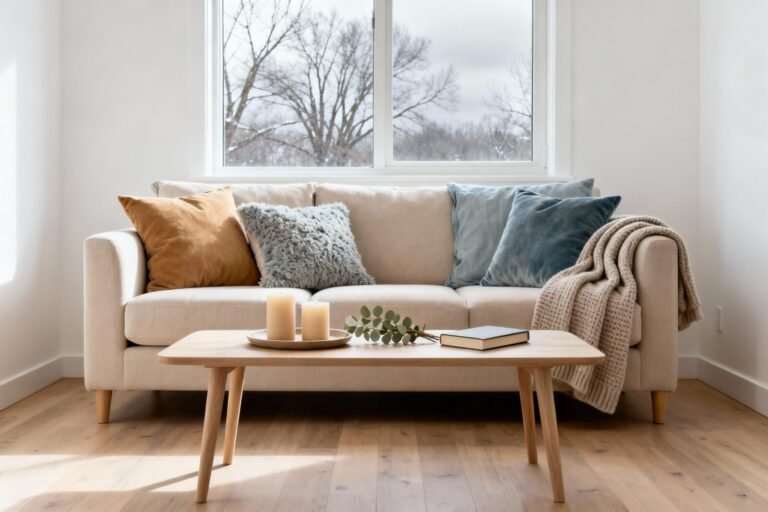
1. Sun-Washed Organic Modern With Sculptural Edges
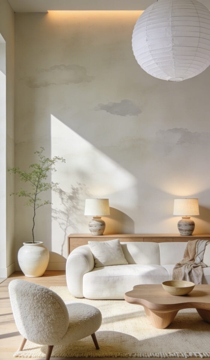
This style channels that serene, just-back-from-a-retreat vibe: creamy limewash walls, pale oak, oversized ceramic planters, and soft-edged furniture that looks sculpted but not fragile. It works beautifully in real homes because it hides daily life with layered neutrals and forgiving textures—linen slipcovers, wool rugs, stoneware lamps.
Lighting plays a huge role here: diffuse, warm pools from paper lanterns and uplights graze the walls, creating depth and shadow that make even a rental look designer-level. Materials stay natural and tactile—travertine, limewash, unsealed oak, cotton-linen blends—while a minimal palette keeps it calm and cohesive.
Why does it photograph so well? The contrast between chalky walls and matte wood creates subtle drama, and light catches the wall texture like a sunset. Go budget-friendly with faux-limewash paint techniques and engineered oak accents. Small-space version: use a low-profile sofa, a round travertine-look coffee table, and a single XL floor lamp for instant polish. Darker twist: switch the walls to mushroom taupe with espresso wood and bronze details. Renter-friendly swap: fabric wall panels attached with command strips give the limewash look without paint.
Key Design Elements:
- Main materials: limewash, pale oak, travertine, textured ceramics
- Color palette: chalky white, oat, sand, putty, soft stone gray
- Lighting strategy: diffused lanterns, wall grazers, warm 2700K bulbs, hidden uplights
- Furniture silhouettes: rounded edges, low-slung, sculptural bases
- Texture layers: linen, boucle, wool, plaster-like finishes
- Accent details (hardware, decor pieces, plants): matte black pulls, oversized greenery, hand-thrown vases
How To Recreate This Look:
- Start with a soft, limewashed wall finish or a faux plaster paint in a warm white.
- Add a pale oak media console and a rounded, low-profile sofa in oatmeal linen.
- Layer in a wool rug with a subtle, hand-knotted texture and a travertine coffee table.
- Install paper lantern pendants and a floor uplight to graze the walls.
- Style with oversized ceramics, stacked stone books, and a single large plant for scale.
Why This Looks Expensive: The natural finishes and subtle wall texture read custom and “architectural,” especially when lit from below and the sides.
Common Mistakes To Avoid: Don’t overfill the room; too many small decor bits ruin the calm. Skip glossy finishes—they fight the matte softness.
Pro Styling Tip: Angle your lamp to skim the limewashed wall—shadows add that editorial, sculptural depth on camera.
Keep scrolling—next up we lean into cozy color drama without sacrificing calm.
2. Deep Plum + Walnut Modern Lounge (Rich, Moody, But Livable)
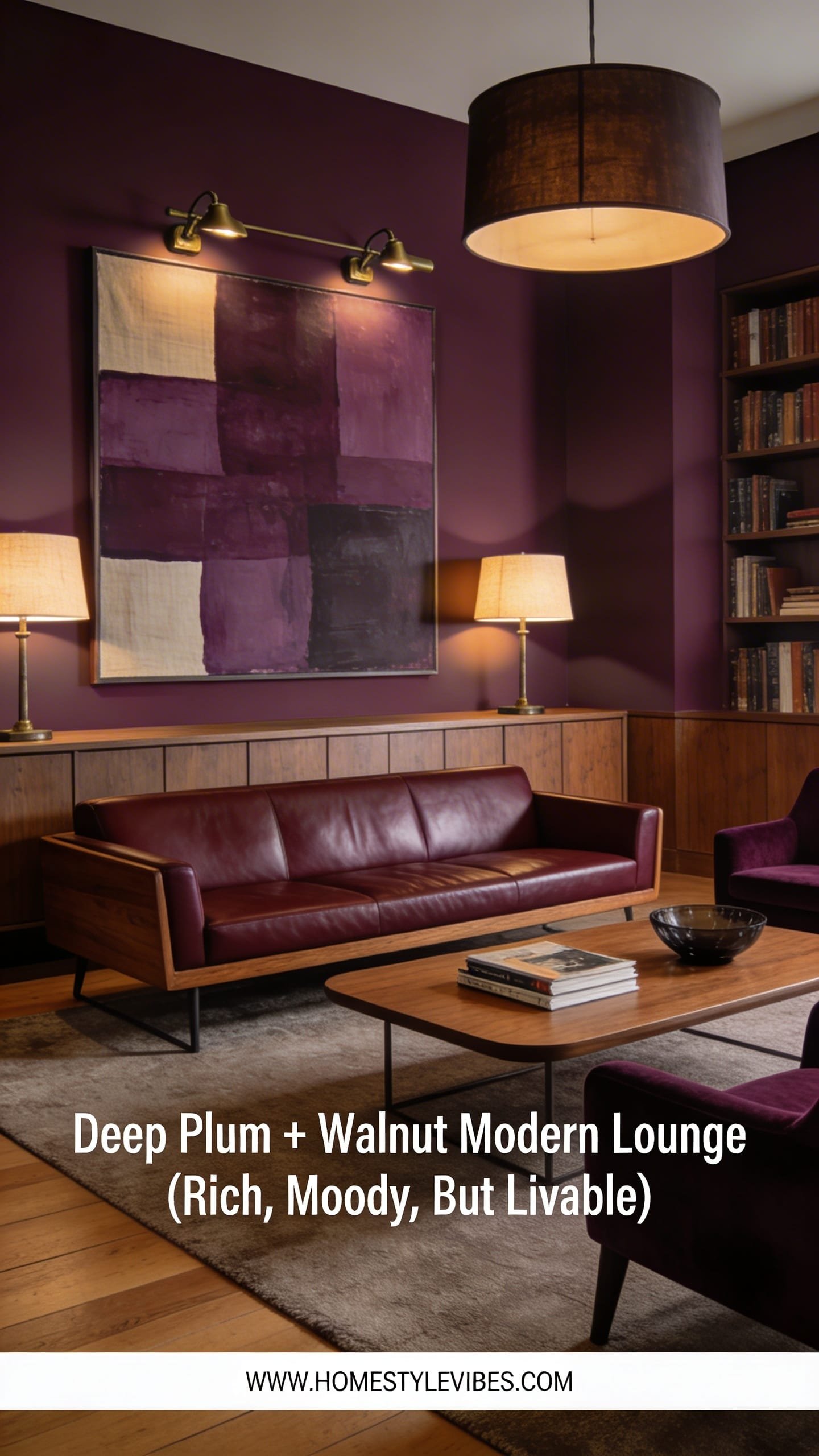
Ready for drama? This 2026 standout wraps your living room in wine-stained plums, cordovan leather, and satin walnut, giving you that speakeasy-meets-library vibe. It thrives in real homes because the saturated palette hides wear and anchors open floor plans, while walnut adds warmth that never feels cold or industrial. Lighting transforms everything: think adjustable picture lights over art, table lamps with parchment shades, and a dimmable central fixture to switch from “Tuesday night” to “cocktail hour.” Photographs love this: color saturation, grain patterns, and soft lamp glow bring richness and depth that whites can’t match.
Budget-friendly version: keep your existing sofa and add plum velvet pillows, a walnut veneer coffee table, and one deep-hued accent wall. Small-space tweak: use plum-curtain drama and a walnut frame mirror to enlarge the room visually. Renter-friendly? Peel-and-stick grasscloth in aubergine with brass accents. Want a lighter twist? Try raisin-brown walls with coppery leather and dusty lavender textiles for contrast. Resale stays strong if you keep major surfaces (floors, kitchens) neutral and layer the color with textiles and drapery.
Key Design Elements:
- Main materials: walnut, velvet, cordovan leather, satin brass
- Color palette: plum, aubergine, raisin, walnut, warm ivory
- Lighting strategy: picture lights, shaded table lamps, dimmable ceiling light
- Furniture silhouettes: squared arms, tight backs, vintage-inspired club chairs
- Texture layers: velvet, mohair throw, silk-blend curtains, nubby rug
- Accent details: brass gallery rails, smoked glass, oil-rubbed bronze hardware
How To Recreate This Look:
- Start with one enveloping plum wall or full-room plum if you love cocooning.
- Add a walnut media console and club chair; introduce brass with a picture light.
- Layer velvet pillows, a mohair throw, and a wool rug in warm ivory.
- Install dimmers and place two table lamps with parchment shades at eye level.
- Style with framed vintage posters, smoked glass vases, and a low bowl of figs or deep-toned florals.
Why This Looks Expensive: Saturated tones plus walnut read tailored and intentional—like a boutique hotel lounge done in custom millwork.
Common Mistakes To Avoid: Don’t pair cool bright whites with plum; choose warm ivory to avoid a jarring clash. Skip chrome—brass or bronze suits the palette.
Pro Styling Tip: Photograph with one lamp on and ambient lights dimmed; let shadows deepen to highlight the velvet sheen.
Love mood but want airiness? The next look blends modern lines with coastal restraint—zero seashell kitsch.
3. Refined Coastal Minimal (Salt, Stone, And Zero Nautical Flags)
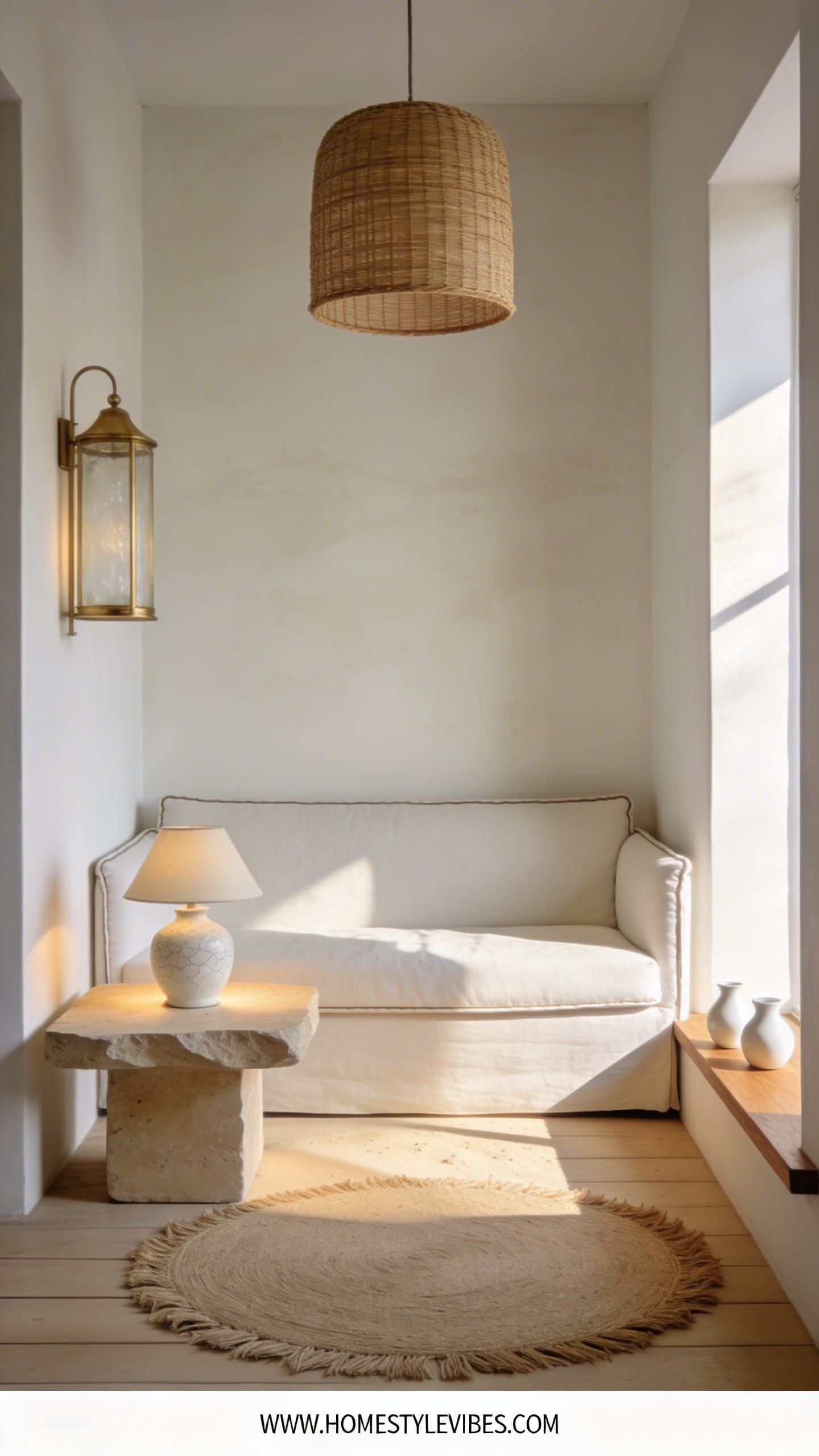
This isn’t beach-house clichés—it’s a seaside whisper: bleached woods, shell-white limewash, sea-salt linen, and raw stone accents. The mood feels crisp and restorative, like a morning walk by the water. It works because it keeps clutter down, uses hardworking textures, and brings light in with pale floors and reflective ceramics.
Lighting lives low and layered: picture lantern sconces, rattan pendants, and low table lamps for a soft glow that mirrors late afternoon sun on sand. It photographs beautifully thanks to tonal layering and the matte-vs-shimmer play (matte walls, glazed ceramics, lightly grained wood).
Budget swap: pine furniture with a whitewash and jute rugs. Small-space? Stick to monochrome sand tones and slimline slipcovered sofas. Darker variant: storm-gray walls, blackened oak accents, and porcelain table lamps with a seasalt glaze. Renter-friendly: peel-and-stick grasscloth in a pale sand tone and removable linen-look drapes to soften the room without paint.
Key Design Elements:
- Main materials: bleached oak, limewash, rattan, jute, raw stone
- Color palette: warm white, sand, chalk gray, driftwood
- Lighting strategy: rattan pendants, lantern sconces, low table lamps
- Furniture silhouettes: relaxed slipcovers, spool-leg side tables, clean-lined consoles
- Texture layers: linen, gauze curtains, jute rug, glazed ceramics
- Accent details: driftwood-toned frames, shell-inspired ceramics (abstract), soft blue-gray throws
How To Recreate This Look:
- Start with warm white or pale sand walls; add a bleached or whitewashed wood tone.
- Add a slipcovered sofa and a rattan or cane accent chair.
- Layer in a jute rug and gauzy curtains to filter light.
- Install a rattan pendant and two lantern sconces with warm bulbs.
- Style with raw stone bookends, textured pottery, and a bowl of olive branches.
Why This Looks Expensive: A controlled palette with premium natural fibers looks curated and calm—like a designer edited every piece.
Common Mistakes To Avoid: Don’t overload on themed decor (anchors, signs). Keep motifs subtle and abstract to avoid cheesy.
Pro Styling Tip: Shoot in natural morning light; the gauze curtains will diffuse brightness and give that dreamy, magazine haze.
Craving bold but modern? Let’s flip the script with high-contrast geometry and cool stone.
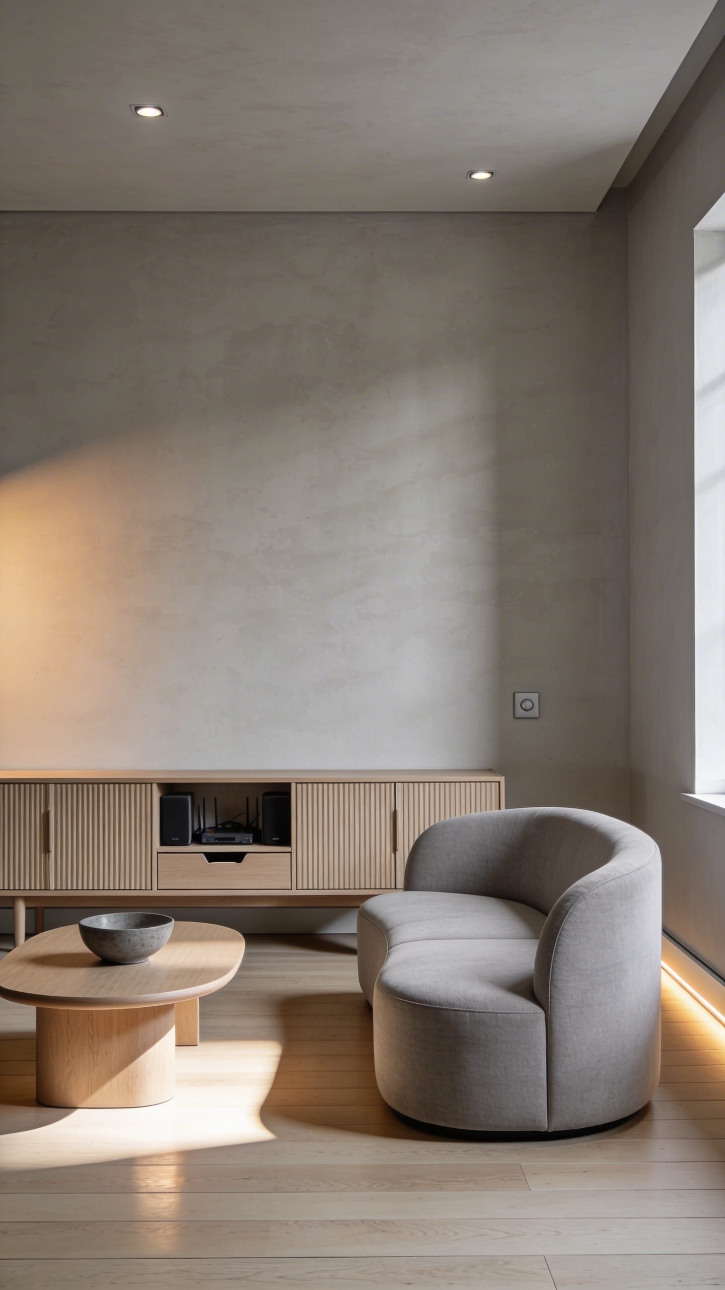
4. Graphite Monochrome With Veined Stone Statements
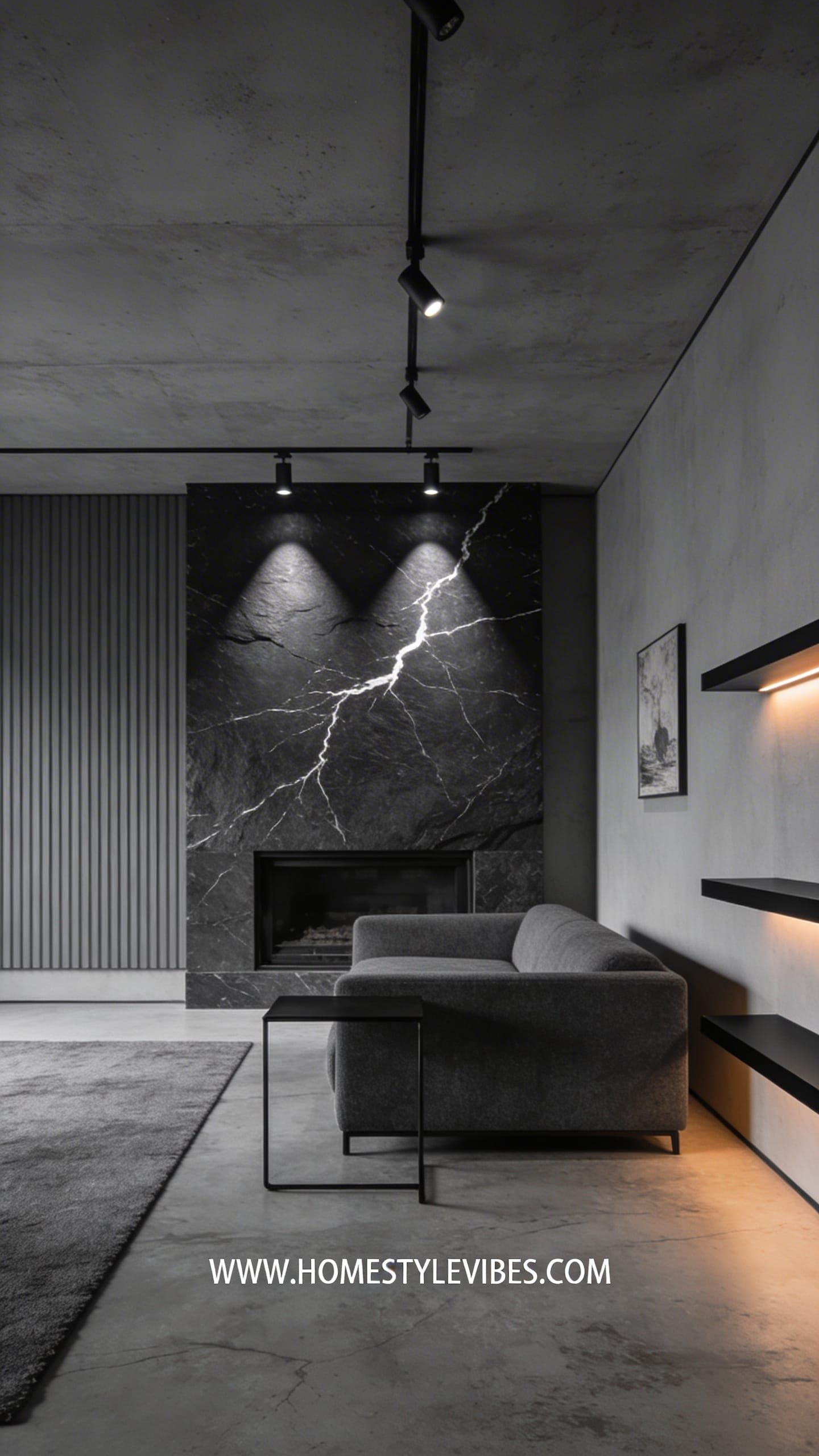
Imagine a lean, tailored interior where every line has purpose: charcoal walls, blackened hardware, and a dramatic stone slab with white lightning veining. This look gives you modern gallery vibes without feeling sterile because textures—fluted panels, microcement, wool upholstery—keep it touchable.
It’s fantastic for city apartments and compact spaces where clarity and visual height matter. Lighting strategy winners: track lighting washing stone surfaces, narrow beam spots on art, and LED strips under shelving for a futuristic edge. Photographs? Ridiculously well—high contrast and crisp edges bring cinematic depth.
Budget-friendly approach: laminate with stone-look patterns, matte-black paint on one wall, and a fluted MDF media unit. Small space: mount the TV on a dark panel to make it “disappear.” Warmer take: graphite walls with smoked oak, bronze hardware, and cream textiles. Renter swap: removable black contact paper on cabinet kickboards and adhesive LED strips for drama without drilling.
Key Design Elements:
- Main materials: veined marble or porcelain, microcement, fluted wood or MDF, matte black metal
- Color palette: graphite, jet black, charcoal, crisp white accents
- Lighting strategy: track heads, under-shelf LED, narrow-beam art spots
- Furniture silhouettes: low and linear, thin metal legs, sharp profiles
- Texture layers: wool, microcement, ribbed wood, smooth stone
- Accent details: black picture frames, smoky glass, sculptural branches
How To Recreate This Look:
- Start with a graphite feature wall or microcement finish for a soft-industrial base.
- Add a stone or stone-look coffee table and a fluted media console.
- Layer a charcoal wool rug and tight-back sofa with white piping for crisp contrast.
- Install track lighting to spotlight art and a linear LED under shelving.
- Style with smoky glass, architectural books, and a single tall branch in a black vase.
Why This Looks Expensive: Dramatic stone and precise lighting mimic high-end showrooms and architect-led interiors.
Common Mistakes To Avoid: Don’t mix too many blacks with different sheens randomly. Keep a consistent matte base and add sheen strategically.
Pro Styling Tip: Place a white object on the dark coffee table to create a focal point and balance the frame in photos.
5. Warm Modern Mediterranean With Terracotta and Lime-Plaster Curves
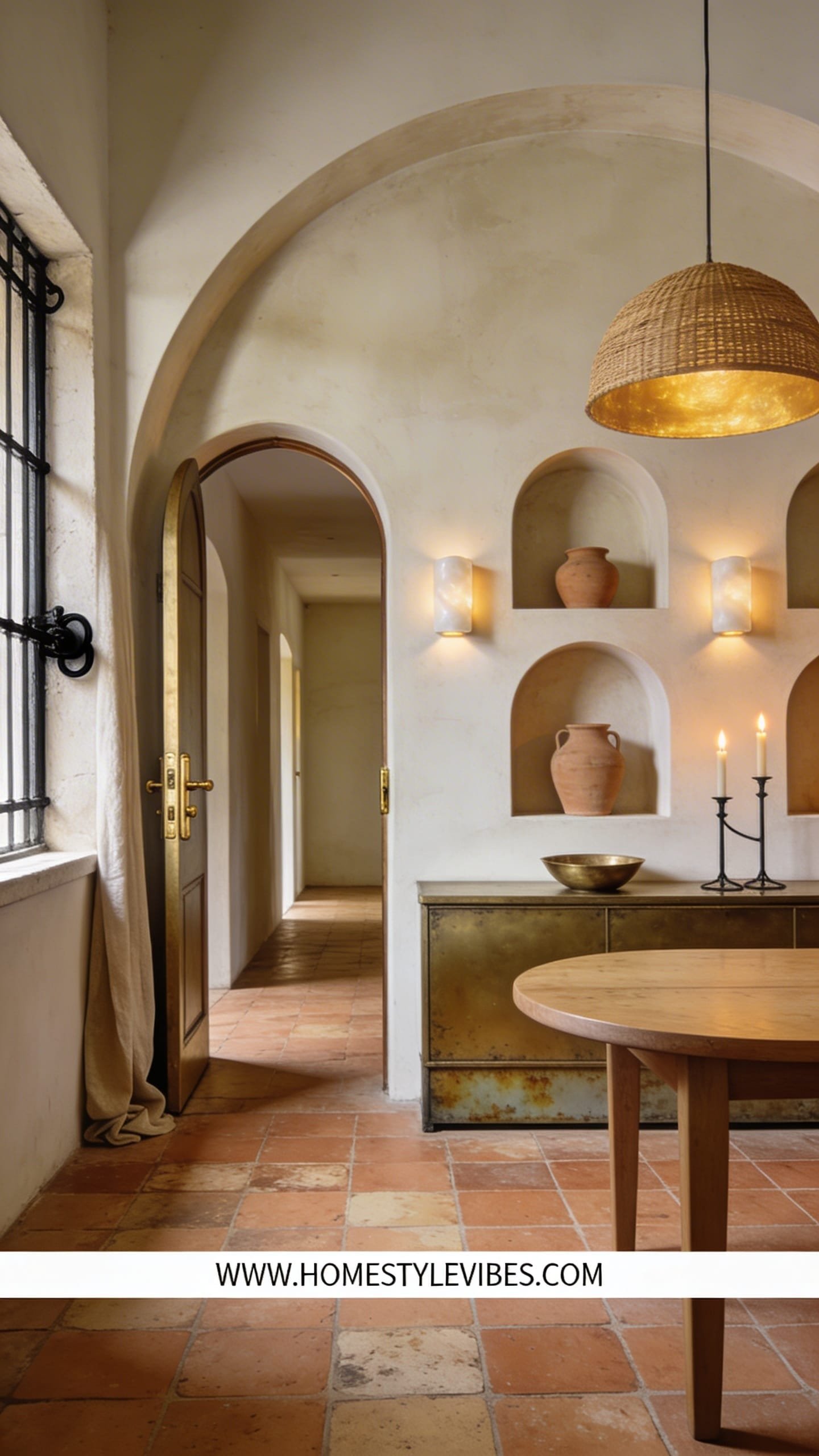
This design wraps your home in a sun-baked, villa-adjacent glow—terracotta floors, curved plaster niches, arched thresholds, and aged brass. The mood is relaxed and convivial, built for big platters of food and late-night laughter.
It works in real homes because the materials patina beautifully: terracotta hides scuffs, lime-plaster softens acoustics, and iron hardware withstands life. Lighting feels golden: alabaster sconces, open-flame look candles (LED if you must), and rattan-shaded pendants. In photos, the curves and plaster texture catch shadows gorgeously—think postcard sunsets on your walls.
On a budget, paint arches onto flat walls and use terracotta-look porcelain. Small-space hack: a curved headboard niche or rounded corner shelves deliver the vibe without demolition. Darker spin: drown a room in toasted ochre with black iron hardware and rusty clay textiles. Renter-friendly: freestanding arched shelves, swap-in vintage brass lamps, and linen drapes clipped to tension rods.
Key Design Elements:
- Main materials: terracotta, lime-plaster, aged brass, iron, rustic oak
- Color palette: warm white, sand, terracotta, toasted ochre, olive
- Lighting strategy: alabaster or glass sconces, candlelight vibes, warm bulbs
- Furniture silhouettes: chunky wood tables, slipcovered chairs, curved headboards
- Texture layers: plaster, linen, woven rattan, hand-loomed rugs
- Accent details: pottery, olive branches, forged iron pulls, vintage rugs
How To Recreate This Look:
- Start with warm white or pale sand walls; add a lime-plaster treatment on one feature wall.
- Add terracotta-look flooring or a large vintage rug in rust and cream.
- Layer rustic wood furniture and slipcovered dining or lounge chairs.
- Install alabaster-style sconces and a rattan pendant over the table.
- Style with pottery clusters, olive branches, and linen table runners.
Why This Looks Expensive: Plaster and terracotta signal craftsmanship, while aged metals read as heirloom quality.
Common Mistakes To Avoid: Don’t push bright Mediterranean blues here—stay in the warm spectrum so it feels grounded, not beachy-themed.
Pro Styling Tip: Capture corners where the plaster curves meet; those soft shadows sell the high-end Mediterranean feel instantly.
If you love calm but want more structure, the next style sharpens lines with warm wood grids and airy symmetry.
6. Japandi Grid Calm: Light Wood, Low Profiles, And Ritual Order
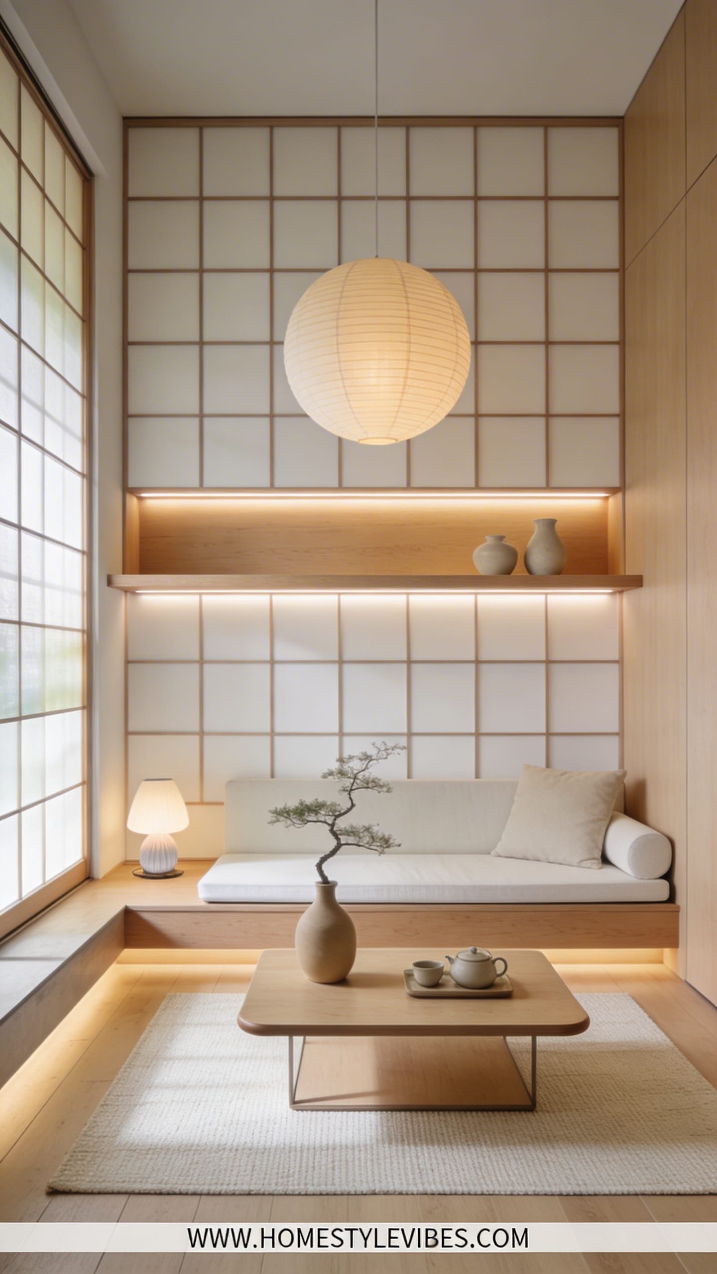
Japandi grid calm gives you the hush of a tea house with the efficiency of Scandinavian order. Picture pale ash or oak, grid-panel millwork, shoji-inspired screens, and super-low furniture that keeps sightlines open. It works wonders in smaller spaces because low silhouettes stretch vertical space and the precise layout stops clutter creep.
Lighting stays gentle: rice paper lanterns, linear LEDs under shelving, and table lamps with soft diffusers. Photographs adore the repetition of grids and the shadow play on slatted wood—clean, serene, and balanced.
Budget version: veneer panels with routed grooves, paper lanterns, and a neutral cotton rug. Darker option: smoked oak panels, graphite textiles, and bronze pulls. Renter-friendly: freestanding shoji screens, modular open shelving in light wood, and floating-look wall shelves with removable brackets. For resale, keep walls neutral and focus the style in movable pieces and paneling that you can refinish.
Key Design Elements:
- Main materials: ash/oak, rice paper or linen diffusers, slatted wood, matte ceramics
- Color palette: light oak, bone, mushroom, soft black
- Lighting strategy: lantern pendants, hidden shelf LEDs, small diffused table lamps
- Furniture silhouettes: low, rectilinear, rounded corners only where needed
- Texture layers: cotton, wool felt, matte stoneware, tatami-like rugs
- Accent details: simple branches, black stone trays, handmade cups
How To Recreate This Look:
- Start with a pale wood tone and a grid-panel feature (slatted or routed pattern).
- Add a low-profile sofa and a platform-style coffee table in matching wood.
- Layer a flatweave rug and cotton-linen cushions in bone and mushroom tones.
- Install a rice paper lantern and LED strips beneath shelves for soft, indirect light.
- Style with a single branch in a matte vase, stacked trays, and neatly arranged books.
Why This Looks Expensive: The restraint reads intentional—like custom millwork—while repetition and symmetry scream designer attention to detail.
Common Mistakes To Avoid: Don’t overcrowd shelves; negative space is non-negotiable here. Avoid glossy finishes that disrupt the calm.
Pro Styling Tip: Photograph straight-on to emphasize symmetry; let shadows between slats create gentle depth.
7. New Heritage: Patterned Stone, Wainscot Drama, And Mixed Metals
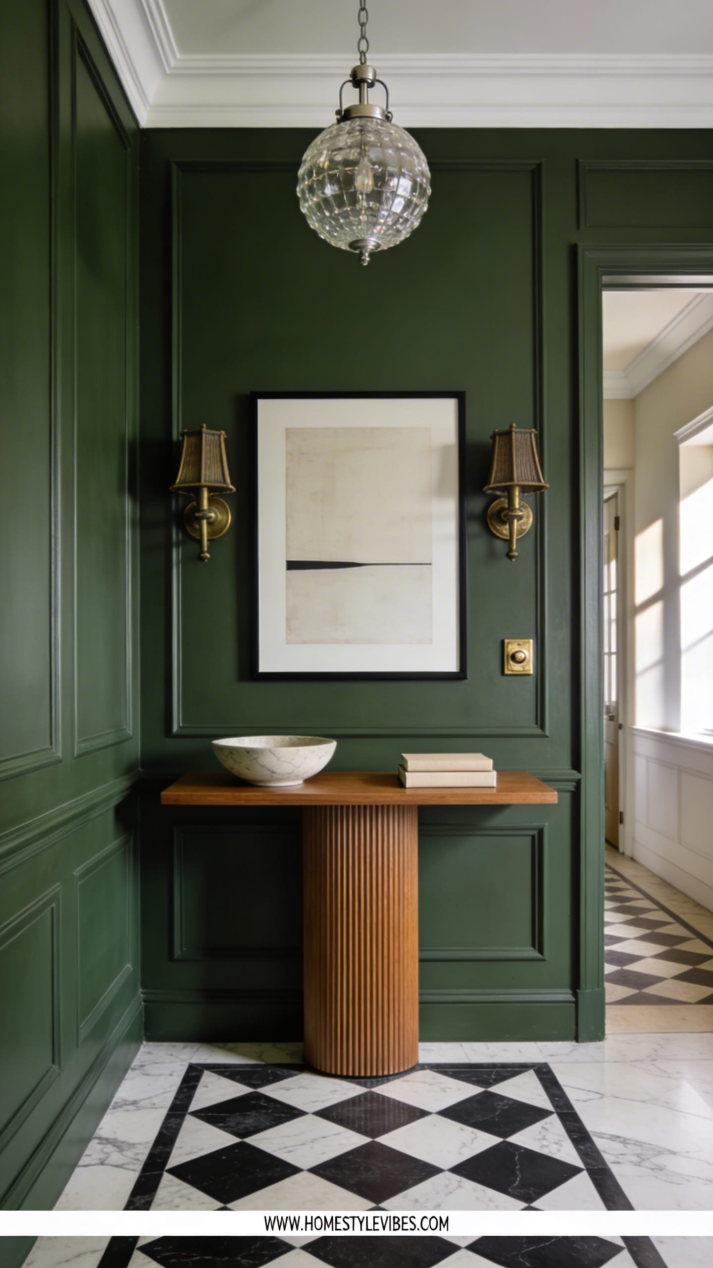
New Heritage marries old-house character with clean-lined modernity: picture a paneled entry painted in deep green, checkerboard marble floors, fluted consoles, and modern art. The mood feels grand but not fussy—think townhouse energy with fewer rules.
It wins in real homes because it layers long-term value (paneling, real stone, classic patterns) with flexible decor you can refresh. Lighting brings the vibe together: library sconces, crystal-globe pendants for sparkle, and dimmers everywhere. It photographs like a dream: crisp moldings, patterned floors, and art pops against saturated paint.
On a budget, use MDF wainscoting, painted checkerboard floors on wood, and thrifted brass. Small-space hack: half-height paneling to avoid visual heaviness. Darker version: inky navy with black-and-white art and unlacquered brass. Renter-friendly: foam millwork strips, peel-and-stick textile wallpaper, and framed panels of fabric to fake wainscot texture. Resale stays strong because classic bones appeal widely.
Key Design Elements:
- Main materials: painted millwork, marble or porcelain checkerboard, fluting, unlacquered brass
- Color palette: deep green, inky navy, ivory, walnut, black
- Lighting strategy: library sconces, crystal or milk-glass pendants, dimmers
- Furniture silhouettes: traditional shapes with modern upholstery, pedestal tables
- Texture layers: velvet, mohair, silk lampshades, grasscloth
- Accent details: picture rails, mixed metals (brass + black), vintage frames
How To Recreate This Look:
- Start with wainscoting or fluted wall panels painted in a deep tone.
- Add a checkerboard rug or tile to ground the space.
- Layer a velvet bench and a fluted console with modern art above.
- Install library sconces and a statement pendant for sparkle.
- Style with mixed metal frames, stacked books, and a brass bowl for keys.
Why This Looks Expensive: Architectural detailing and pattern-on-stone suggest custom craftsmanship and old-money taste (without the inheritance).
Common Mistakes To Avoid: Don’t mix too many patterns at once. Let the checkerboard be the hero and keep fabrics relatively solid.
Pro Styling Tip: Angle a chair into the shot to show the wainscoting depth; side-light it to make shadows outline the paneling.
Ready for color that still reads sophisticated? The next style goes forest-deep and fresh, not farmhouse.
8. Forest Modern: Deep Green, Stone, And Burnished Bronze
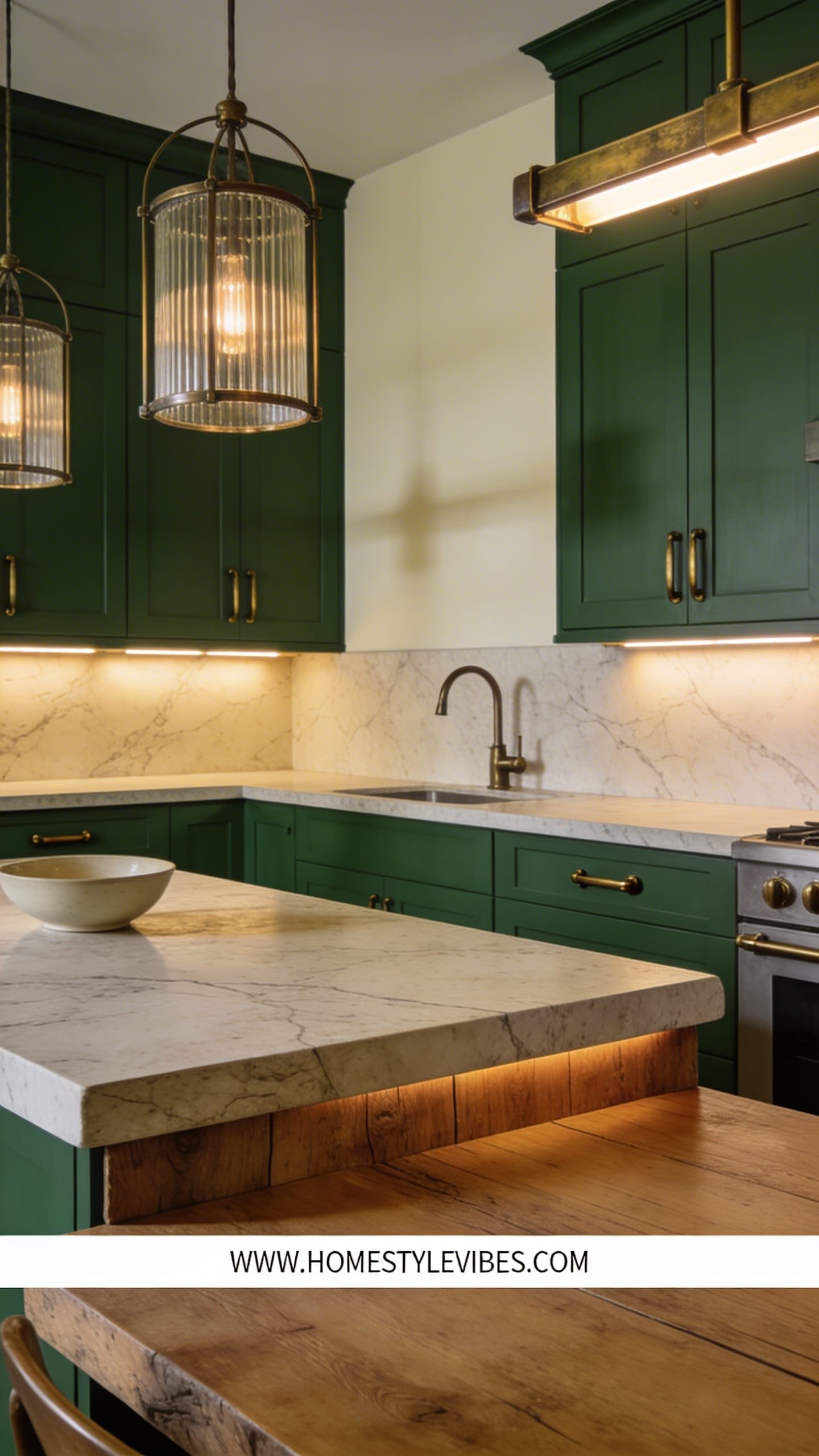
Forest Modern brings the outdoors in—dark green cabinets or walls, creamy stone, bronze hardware, and chunky wood. The space feels grounded and calm, like a refined cabin with a city IQ.
It performs well in kitchens, dining rooms, and dens because deep green balances warm wood and stone, while bronze adds soft glow that ages nicely. Lighting? Layer pendants with ribbed glass, under-cabinet LEDs, and a dimmable chandelier. On camera, the green photographs rich and plush, especially against pale stone veining and warm metals.
Budget route: paint existing cabinetry deep green and change only the hardware to bronze. Small-space option: green on lowers only with white uppers to keep things light. Darker variant: olive-charcoal walls, black soapstone, and brass mesh cabinet inserts. Renter-friendly: green freestanding storage units, bronze knobs on IKEA pieces, and a large, leafy plant for instant “forest.” Resale tip: this color story ages well when you pair it with classic counters and wood floors.
Key Design Elements:
- Main materials: painted wood, marble/soapstone, bronze, oak/walnut
- Color palette: forest green, olive, cream, warm white, bronze
- Lighting strategy: ribbed glass pendants, task LEDs, dimmable chandelier
- Furniture silhouettes: shaker-modern hybrids, rectangular with softened edges
- Texture layers: stone veining, ribbed glass, woven seat pads, wool runners
- Accent details: bronze mesh, aged pottery, oversized foliage
How To Recreate This Look:
- Start by painting key cabinetry or a feature wall in a deep, forest green.
- Add bronze or aged brass hardware and a creamy stone (or lookalike) surface.
- Layer ribbed-glass pendants and under-cabinet LEDs for glow and task light.
- Install wood open shelves to display earthy pottery and glassware.
- Style with a wool runner, large cutting boards, and a generous vase of branches.
Why This Looks Expensive: Dark, saturated paint plus real or realistic stone instantly reads custom and considered.
Common Mistakes To Avoid: Don’t pair green with cool white lights—choose warm bulbs or you’ll turn it hospital green. Avoid shiny chrome here.
Pro Styling Tip: Photograph with a creamy runner and a light cutting board to break up the green mass and pull focus.
9. Tech-Quiet Minimalism With Hidden Smarts
You want all the gadgets—just not the spaceship look. Tech-Quiet Minimalism hides speakers, routers, and hubs in fluted cabinets; uses voice-controlled dimmers; and tucks charging in drawers. The vibe is calm, not clinical: soft grays, greige walls, pale oak, and a few organic curves.
Why it works: fewer cords, fewer dust traps, and a cleaner backdrop for daily life. Lighting changes the game with circadian settings: warm evenings, bright task lighting, and gentle night paths. Photos love the unbroken lines and absence of clutter; it looks like your home always tidied itself.
Budget-friendly: use cord covers, adhesive cable raceways, and multipurpose smart bulbs. Small-space: one media wall with a floating console conceals everything. Darker read: taupe walls, espresso wood, and bronze accents. Renter-ready: smart plugs, battery-powered motion lights, and freestanding storage with cord cutouts. Resale strong because everyone loves hidden tech; keep your millwork simple and neutral for universal appeal.
Key Design Elements:
- Main materials: pale oak, lacquer-free MDF, acoustic panels, microtexture fabrics
- Color palette: soft gray, greige, pale oak, warm white, charcoal accents
- Lighting strategy: smart dimmers, circadian bulbs, under-cabinet motion lights
- Furniture silhouettes: floating consoles, slim sofas, rounded corners
- Texture layers: micro-boucle, felt, ribbed cabinetry, matte ceramics
- Accent details: hidden charging docks, flush wall plates, minimal art
How To Recreate This Look:
- Start by mapping all cords and adding hidden channels or cable raceways.
- Add a floating console with fluted doors to conceal routers and speakers.
- Layer smart bulbs and dimmers to control warmth and brightness effortlessly.
- Install a slim soundbar behind a slatted panel or fabric frame for stealth audio.
- Style with two large-scale artworks and one sculptural lamp—nothing extra.
Why This Looks Expensive: Seamless lines and concealed tech mimic high-end built-ins and custom AV planning.
Common Mistakes To Avoid: Don’t buy too many smart systems that don’t talk to each other; keep ecosystems minimal to avoid visual and digital clutter.
Pro Styling Tip: Turn off display screens when photographing; the black mirror effect keeps reflections clean and graphic.
Last but not least, a style for color lovers who still want polish—think playful, but curated.
10. Playful Soft-Color Maximalism (Curated, Not Chaotic)
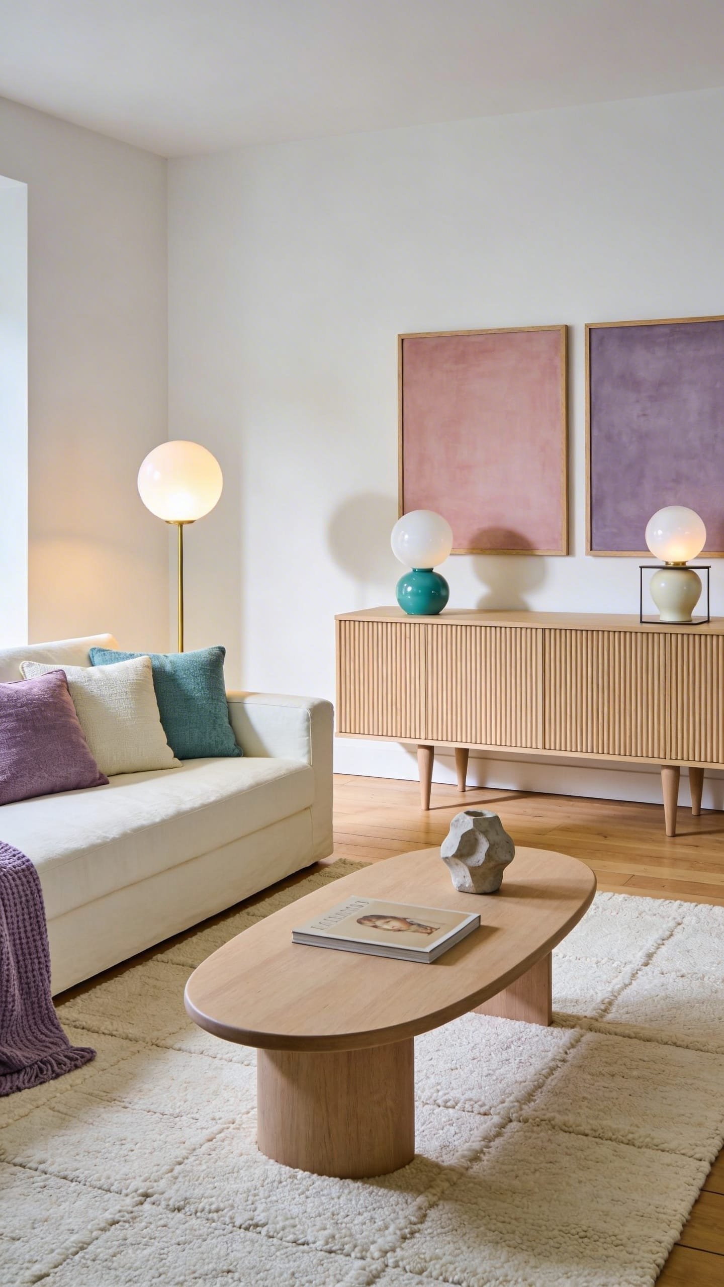
Playful Soft-Color Maximalism brings joy without the headache: rose, buttercream, muted teal, and lavender sing in harmony over textural neutrals. The space feels like a chic art collector’s home where pieces talk to each other—not a flea market brawl.
It works in real life because you layer color in movable parts (pillows, lamps, art) and ground it with quiet backdrops—wool rugs, simple sofas, and fluted wood casegoods. Lighting gets whimsical: candy-colored lamps, opal-glass globes, and dimmable track spots for art. It photographs beautifully thanks to color blocking, height variety, and soft matte finishes that avoid glare.
Budget path: thrift frames, paint them one color family, and build a gallery wall. Small-space? Keep the sofa neutral and layer three accent colors in measured doses across pillows, lamps, and art. Darker mode: deeper wine, teal, and ochre with walnut furniture. Renter-friendly: peel-and-stick murals behind shelving, bright lamp shades, and colored linen curtains on tension rods. Resale stays fine if you keep walls light and focus hue on decor.
Key Design Elements:
- Main materials: wool rugs, lacquered side tables, fluted consoles, matte ceramics
- Color palette: rose, buttercream, muted teal, lavender with oat and ivory base
- Lighting strategy: opal globes, colorful table lamps, directional art spots
- Furniture silhouettes: curved sofas, drum tables, playful pedestal bases
- Texture layers: boucle, chenille, velvet, ribbed glass
- Accent details: sculptural candles, layered art stacks, colored linen drapery
How To Recreate This Look:
- Start with neutral walls and a pale wool rug to anchor the room.
- Add a simple sofa, then introduce two curved accent chairs in different pastel hues.
- Layer color with pillows, lacquer side tables, and a soft-tone abstract art piece.
- Install opal-glass globes and add a colorful table lamp or two for glow.
- Style with sculptural candles, books by spine color, and a floral arrangement echoing your palette.
Why This Looks Expensive: Curated color stories and restrained shapes feel designer-y—like each piece had an audition.
Common Mistakes To Avoid: Don’t mix too many patterns at once; vary texture and keep prints to one or two per zone.
Pro Styling Tip: Color-block vignettes (rose stack of books + teal vase + butter lamp) to create jewel-like moments on camera.
Conclusion
You don’t need a full gut renovation to make your home feel fresh, cozy, and modern in 2026. You just need intention: a clear palette, tactile materials, and light that plays nicely with both. Pick one of these 10 home design styles and go all in on the mood—whether that’s sun-washed organic modern with sculptural edges or a deep plum lounge that feels like after-hours velvet. Start with the big moves (color, texture, and lighting), then layer in your personality with art, greenery, and those just-right accent details. Your home will thank you by looking good at 7 a.m. and 7 p.m.—and yes, it’ll be extremely Pinterest-friendly.
Here’s the real secret: luxury lives in restraint and layering. Use fewer, better pieces. Focus on stone that looks alive, wood that shows grain, fabrics that beg to be touched, and lighting that flatters everything it touches. Keep cords hidden, bulbs warm, and surfaces matte where possible. Aim for contrast and depth—light against dark, smooth against nubby, curved against linear. When you’re done, step back and ask: where does my eye rest? What catches the light? If you’ve got answers, you’ve got a space that not only reads modern and cozy but also feels like you.
So choose your adventure. Go moody with walnut and plum, coastal with salt and sand, or grid-calmed with Japandi precision. Edit ruthlessly, style thoughtfully, and add one unexpected flourish in every room. When your lighting clicks on and your textures hum, you’ll feel it: a home that’s calm, current, and completely yours. Seriously—get the dimmers, then thank me later.