7 Colorful Living Room Designs That Feel Cheerful and Modern Now
Think sun-warmed velvet, matte ceramics, a swish of limewash, and a burst of citrus on the coffee table. These colorful living room designs don’t just brighten a space—they sharpen it. We’re talking saturated walls balanced with pale oak, sculptural seating paired with terrazzo, and lighting that turns pigments into poetry. Every idea here transforms your room visually with crisp color contrasts, layered textures, and furniture that photographs like a magazine spread.
Whether you live in a bright loft or a compact rental, these looks dial up joy without sacrificing sophistication. They’re Pinterest gold, but they also make sense for real life—stain-hiding textiles, multipurpose layouts, and lighting that flatters both your art and your selfies. If you love cheerful and modern living rooms that still feel grown-up, start scrolling—you’re about to meet your color soulmate.
1. Citrus Modern With White Plaster and Sunlit Geometry
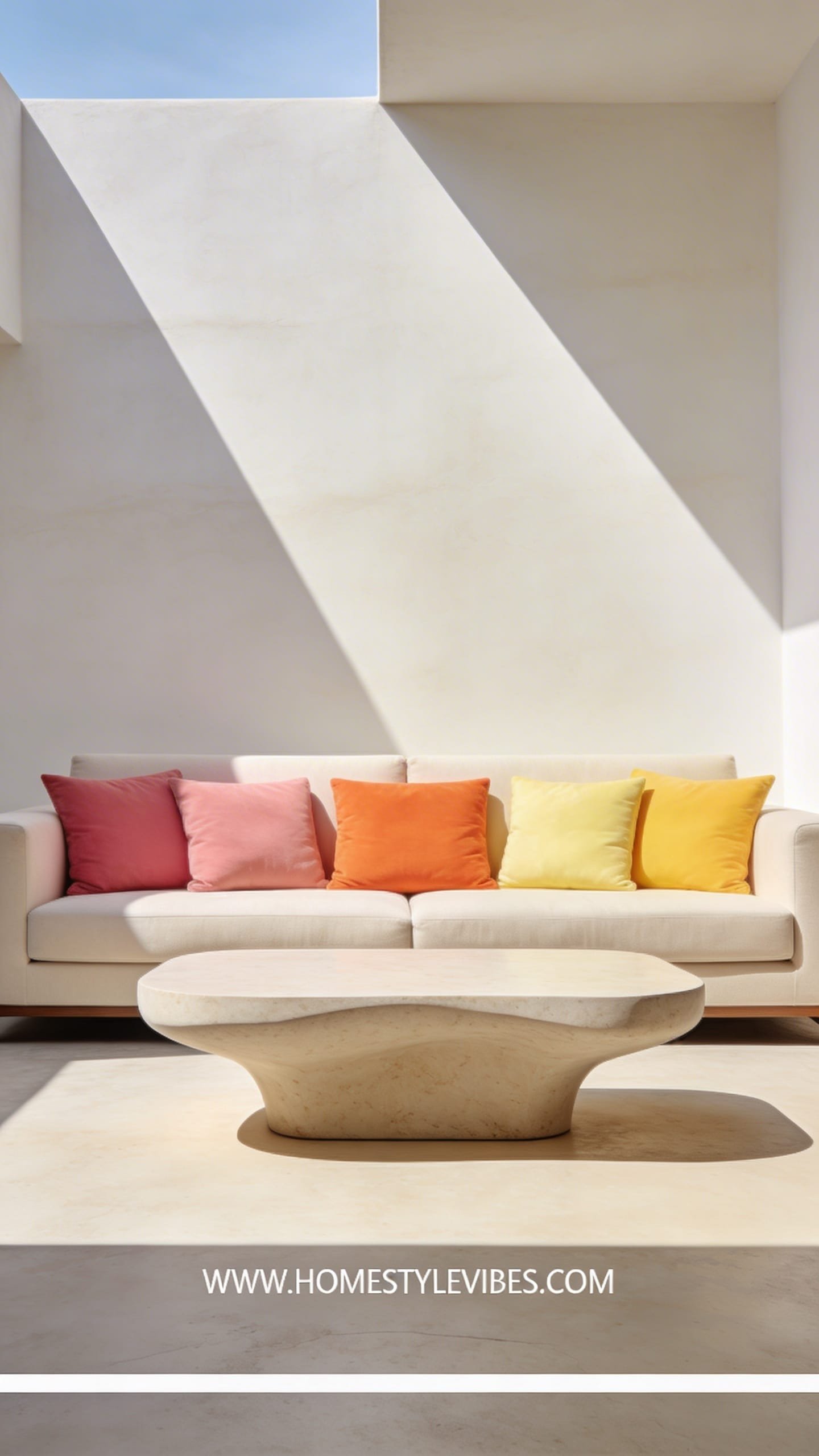
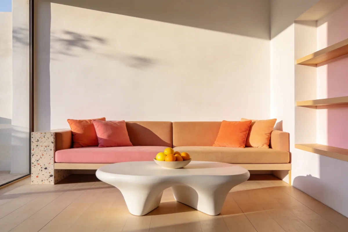
This look brings the zing. Imagine a creamy white plaster room punctuated by grapefruit pink, tangerine, and lemon sorbet cushions on a low, clean-lined sofa. Crisp sunlight dissolves across walls while a matte, sculptural coffee table sits center stage like a modernist snack. The mood feels fresh, uplifting, and slightly Mediterranean—like a house that drinks its espresso outside even when it’s cold. It works beautifully in real homes because the base stays neutral and timeless while the accents rotate seasonally. Families love it: white walls wipe down; bold pillows disguise kid chaos; and the palette energizes morning routines.
Lighting gives citrus colors a real glow-up. Daylight turns apricot and coral into a soft blush while warm evening lamps deepen them into sunset tones. Plaster walls act like a diffuser—no glare, just soft focus. Materials lean chalky and tactile: limewash, ceramic, pale oak, and softly textured cottons. Photograph-wise, the contrast of white geometry against juicy textiles adds instant depth. Shadows carve into the plaster so your room looks sculpted, not flat. Variations? Try a budget take with peel-and-stick plaster-effect wallpaper and thrifted ceramic lamps. Small-space version: swap a bulky sofa for a low armless sectional and nesting tables to keep sightlines open. Darker version: replace the white base with mushroom beige and bump the citrus to deeper marigold and rust. Renter-friendly swap: removable art ledges with bright prints—no drilling drama.
Key Design Elements:
- Main materials: Matte plaster or limewash, pale oak, ceramic, cotton-linen blends
- Color palette: White, mushroom, grapefruit pink, tangerine, lemon, leafy green accents
- Lighting strategy: Daylight-maximizing sheers + warm 2700K table lamps for sunset vibes
- Furniture silhouettes: Low-profile sofa, curved-edge coffee table, skinny-leg side tables
- Texture layers: Nubby throws, terracotta planters, woven jute or sisal rug
- Accent details (hardware, decor pieces, plants): Brushed brass pulls on a sideboard, citrus-hued art, glossy philodendron
How To Recreate This Look:
- Start with a neutral shell: paint or limewash walls in soft white or mushroom.
- Add a low, clean sofa in beige or off-white to anchor the room.
- Layer citrus pillows and a color-blocked throw in grapefruit and marigold.
- Install gauzy linen sheers and two warm-glow table lamps with ceramic bases.
- Style with a white plaster or travertine-look coffee table and a large potted plant for fresh green balance.
Why This Looks Expensive: The restrained palette with a strong accent family reads curated. Matte plaster plus sculptural ceramics telegraph custom craftsmanship even if you DIY’d it.
Common Mistakes To Avoid: Don’t scatter a rainbow of unrelated brights—stick to two or three citrus hues. Skip cold, blue-toned bulbs that make colors feel harsh.
Pro Styling Tip: Shoot at golden hour with lamps on; let soft shadows hug the plaster and place citrus accents in odd-numbered clusters for depth.
Curious how color can feel moody and chic without going dark? Keep scrolling.
2. Electric Blue Gallery Lounge With Sculptural Seating
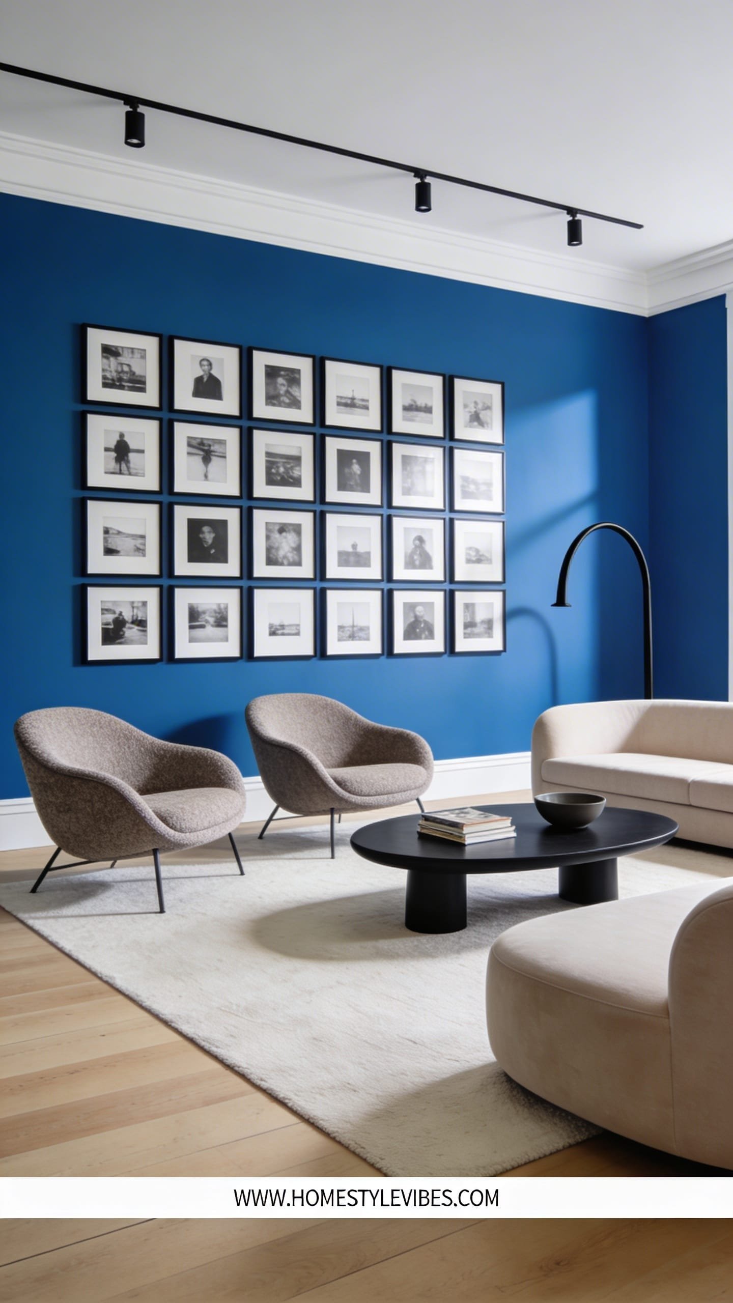
Bring museum vibes home with an electric blue statement wall that frames a rotating gallery of black-and-white photography. The mood is punchy, urban, and artsy—your streaming queue will taste better from here, trust me. This works in apartments and open-plan spaces because that confident blue acts like architecture, instantly zoning the living area and flaring against crisp trim. Plus, you can keep big furniture neutral and let the wall and art do the heavy lifting.
Lighting turns this into a show. Picture slim track lights washing the blue in a soft arc while a floor lamp with a globe shade throws a cool highlight across your chair’s curve. Materials love contrast: chrome or brushed steel against boucle, velvet against powder-coated metal, glass next to matte paint. Photographs pop thanks to the stark black frames slicing into the cobalt backdrop—clean lines, graphic edges, and controlled reflections. Budget version: use a deep royal blue in eggshell finish and IKEA frames. Small-space variation: paint a blue rectangle “art panel” behind the sofa instead of the whole wall. Darker spin: swap to midnight blue and brass for a sophisticated, loungey night feel. Renter-friendly trick: freestanding grid panel behind the sofa wrapped in blue fabric, no paint required.
Key Design Elements:
- Main materials: Satin or eggshell blue paint, chrome/brushed steel, boucle, glass
- Color palette: Electric blue, charcoal, white, chrome, hints of teal
- Lighting strategy: Directional track lights on art + globe floor lamp + LED strip on console
- Furniture silhouettes: Sculptural lounge chair, tight-back sofa, floating media console
- Texture layers: Boucle throw, ribbed glass vase, matte ceramic bowl
- Accent details: Black-and-white photography, thin black frames, slimline dimmers
How To Recreate This Look:
- Start by painting one feature wall in a saturated electric blue; keep trim bright white.
- Add a simple neutral sofa and one sculptural accent chair in boucle or velvet.
- Layer a glass coffee table to maintain sightlines and reflect the blue subtly.
- Install a basic track light kit and aim heads to graze the artwork, not blast it.
- Style with black frames, stacked art books, and a single chrome object for shine.
Why This Looks Expensive: Controlled color plus gallery lighting feels intentional. The blue reads as “custom” especially when you nail clean edges and symmetrical art spacing.
Common Mistakes To Avoid: Avoid mixing warm brassy metals with cool chrome unless you repeat both at least three times. Skip busy rugs that compete with the art wall.
Pro Styling Tip: Center your largest art piece over the sofa and leave generous breathing room; negative space makes the blue hum on camera.
Ready to soften things without losing the color rush? The next one layers pastels like a designer macaron box.
3. Sorbet Pastel Studio With Curves and Cloudy Neutrals
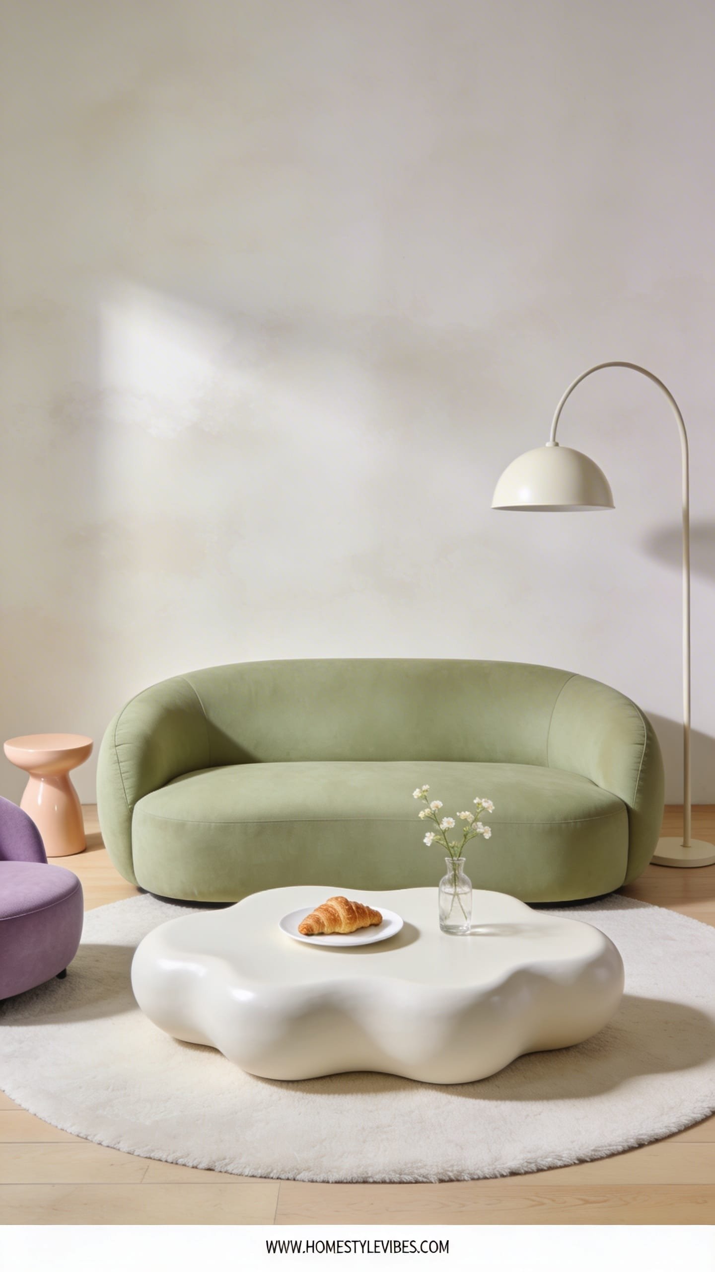
Pistachio, peach, and lavender—light, creamy, and bright without feeling juvenile. This pastel living room leans modern by keeping shapes rounded and finishes matte. The mood feels soft and dreamy, like an overcast spring day with fresh flowers and an almond croissant on the table. It’s perfect for small homes because pastels bounce light around and rounded silhouettes reduce visual clutter. Bonus: pastels play nice with blonde woods and off-whites, which helps resale if you plan to strip the color back later.
Lighting matters here: avoid icy daylight bulbs which turn pistachio sour. Warm 2700–3000K lighting keeps the room glowing like candlelit gelato. Materials stay plush but sleek—boucle, brushed cotton, wool blend rugs, and powder-coated side tables. Photography loves this look because of the layered tonalities: each pastel softly edges into the next, creating depth without heavy contrast. Budget version: paint just the lower half of the wall pistachio with a soft line and add pastel cushions; thrift a curvy coffee table and repaint it matte. Small-space twist: pick a two-seater sofa with a rounded corner chaise. Darker take: inject dusty mauve and sage with walnut accents. Renter-friendly: removable pastel decals in organic blobs—no commitment, all charm.
Key Design Elements:
- Main materials: Boucle, brushed cotton, powder-coated metal, light oak
- Color palette: Pistachio, peach, lavender, warm white, hints of walnut
- Lighting strategy: Warm LEDs, frosted globes, and bounce light off white ceilings
- Furniture silhouettes: Rounded sofa, drum side tables, curved floor lamp
- Texture layers: Cloudy wool rug, ribbed throw, matte planters
- Accent details: Pastel candlesticks, scalloped tray, soft floral stems
How To Recreate This Look:
- Start with warm white walls and one pastel accent—pistachio works universally.
- Add a rounded sofa or accent chair in boucle to nail the soft geometry.
- Layer a light-toned rug with subtle texture (think low-pile wool blend).
- Install a curved floor lamp with a frosted globe shade for diffused brightness.
- Style with pastel ceramics, stacked trays in two tones, and a single floral arrangement.
Why This Looks Expensive: Consistent curves and matte finishes feel designer. Limiting the palette to three pastels with creamy neutrals reads calm and curated.
Common Mistakes To Avoid: Avoid shiny, cheap lacquer in pastel; it looks toy-like. Skip mixing too many pastels or you’ll drift into candy store territory.
Pro Styling Tip: Arrange pastels in gradients—peach near beige, lavender near gray—to create soft transitions that photograph buttery smooth.
Love warmth but want deeper sophistication? Bring on terracotta and olive with a coastal wink.
4. Terracotta & Olive Modern Mediterranean With Fluted Wood
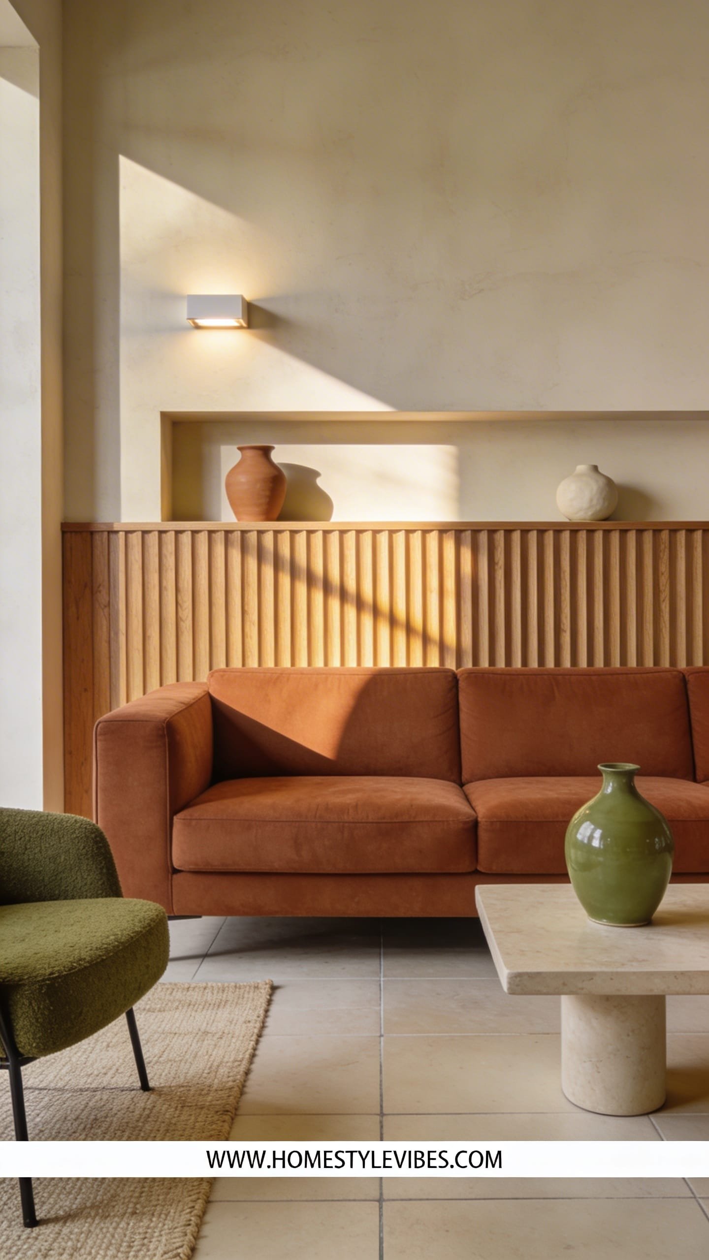
This is the color story for anyone who wants cheerful and modern but still earthy: sunbaked terracotta, olive green, and creamy limestone. The mood channels a modern Mediterranean villa—relaxed, tactile, and grounded. It thrives in family rooms because every hue hides scuffs, and natural materials age gracefully. Plus, it photographs like a travel magazine spread: think shadows sliding across fluted wood and a gentle sheen on glazed pottery.
Lighting here should mimic golden hour. Use warm bulbs and layered sources so terracotta glows like embers and olive feels rich, not muddy. Materials anchor the look: fluted wood on a media console, limewash on the focal wall, and a chunky wool rug under a stone or travertine coffee table. Contrast arrives through metal accents—brushed brass or burnished bronze. Variations include a budget version with faux-fluted MDF panels and ceramic-look porcelain tables; a small-space formula with wall-mounted shelves to keep the floor clear; a darker edit that swaps cream for tan and adds charcoal linen curtains; and a renter-friendly olive slipcover over your existing sofa with terracotta pillows.
Key Design Elements:
- Main materials: Fluted oak or ash, limewash, travertine/stone, chunky wool
- Color palette: Terracotta, olive, cream, brass, touches of charcoal
- Lighting strategy: Layered table lamps, uplights on plants, and dimmable warm LEDs
- Furniture silhouettes: Boxy sofa with tailored lines, solid stone coffee table, slim metal side tables
- Texture layers: Nubby wool rug, linen curtains, glazed terracotta pots
- Accent details: Aged brass handles, olive-toned ceramics, landscape art with warm skies
How To Recreate This Look:
- Start with a cream or pale limestone wall; limewash a single feature for movement.
- Add a neutral, tailored sofa and layer terracotta and olive cushions.
- Introduce fluted wood via a console or DIY slat panel behind the TV.
- Install warm, dimmable lighting plus a small uplight behind a plant for drama.
- Style with pottery, a stone tray, and one large landscape print in warm tones.
Why This Looks Expensive: Fluted textures and stone surfaces read custom and heavy, even with affordable dupes. The palette feels collected from nature, not trend-based.
Common Mistakes To Avoid: Don’t mix too many wood tones; stick to two max. Avoid overly orange terracotta—choose a sun-baked, slightly muted shade.
Pro Styling Tip: Place a brass object where light kisses it—just enough sparkle to punctuate the matte textures in photos.
Prefer a high-energy jolt that still reads refined? Let’s talk color blocking done the grown-up way.
5. Bold Color-Block Loft With Modular Sofas and Punchy Stripes
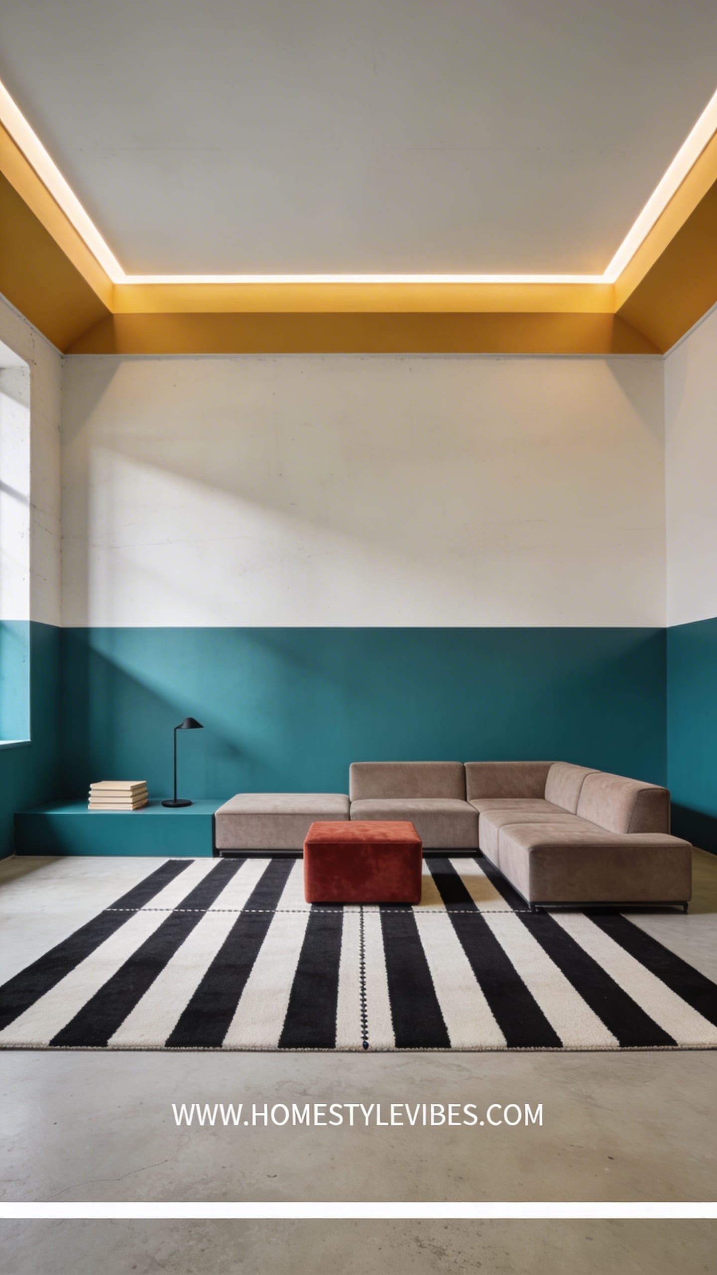
Color blocking turns your living room into a modern painting you can sit in. Picture a teal wall banding into a saffron stripe that wraps onto the ceiling edge, with a brick-red ottoman and a graphic striped rug stitching it all together. The vibe feels energetic, urban, and decisively modern. Families and roommates love this because it organizes space visually—each color zone can correspond to a function, like reading, gaming, or conversation.
Light this like a stage: wall washers to illuminate blocks evenly and a single pendant over the coffee table to anchor the center. Materials skew clean and tough—performance upholstery, powder-coated shelves, and rugs with flatweave or indoor-outdoor fibers. Photographs thrive on the sharp edges between colors; it’s all about crisp tape lines and confident geometry. Budget version: use paint and a bold rug while keeping furniture simple. Small-space hack: do half-height stripes to avoid chopping the room. Darker option: swap teal for deep forest and saffron for mustard; layer smoked glass. Renter-friendly: create temporary color panels with foam boards wrapped in fabric.
Key Design Elements:
- Main materials: Matte paint, powder-coated metal, flatweave rugs, performance fabrics
- Color palette: Teal, saffron, brick red, ecru, black accent lines
- Lighting strategy: Wall washers or picture lights to skim stripes + one focal pendant
- Furniture silhouettes: Modular, low sofas; blocky ottomans; linear shelving
- Texture layers: Flatweave rug, canvas cushions, smooth lacquer trays
- Accent details: Stripe or checkerboard pillows, graphic prints, colored glass
How To Recreate This Look:
- Start by mapping color blocks with painter’s tape; repeat one color at least three times.
- Add a modular sofa in a neutral base and one bold ottoman in a saturated hue.
- Layer a graphic rug (stripes or checkerboard) to anchor the palette.
- Install a clean, round pendant and two wall washers or picture lights.
- Style with graphic art, colored glass vases, and a couple of black accents to outline the scene.
Why This Looks Expensive: Precision equals polish. Clean tape lines and thoughtful repetition feel high-design, not DIY.
Common Mistakes To Avoid: Don’t scatter too many shapes. Keep lines consistent and avoid mixing curves with sharp angles unless you repeat both deliberately.
Pro Styling Tip: Photograph at a slight angle so the color planes overlap, creating layered depth rather than a flat, straight-on shot.
Craving more organic movement and maximalist pleasure? Enter the jewel box that glows after dark.
6. Jewel-Tone Cocoon With Velvet, Brass, and Moody Wallpaper
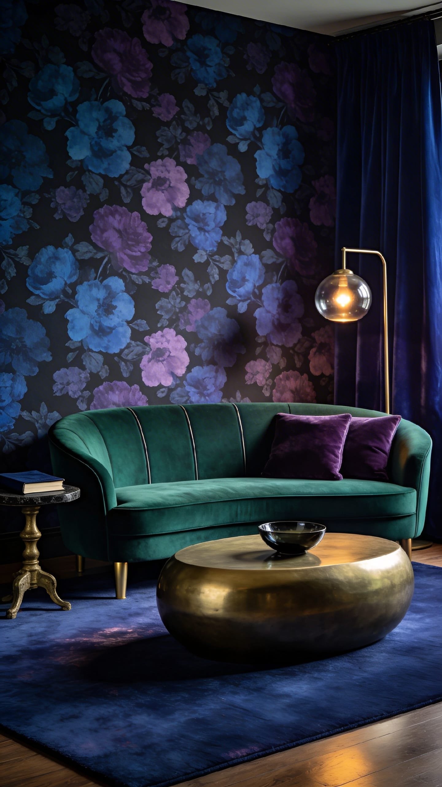
Think emerald, sapphire, and amethyst layered over inky florals and brushed brass. This is your cozy, evening-forward living room that feels like a well-made cocktail. The mood is intimate, cocooning, and decidedly grown-up. It suits older homes and rentals where you might not control the architecture because the rich palette and textiles create their own envelope. It also hides wear and tear—ideal if the space doubles as a reading room or late-night conversation pit.
Lighting is everything: go warm and dimmable. Use lamps with fabric shades, sconces that graze a wallpapered wall, and a small table lamp tucked on a bookshelf for dappled glow. Materials run plush and reflective—cotton-velvet, mohair accents, antique brass, smoked mirror, and a heavy wool rug. Photography wins because of the interplay: the velvet eats light while brass tosses it back, creating a chiaroscuro that reads luxe. Budget variation: choose a single jewel tone (emerald) with a botanical peel-and-stick wallpaper. Small-space approach: replace a heavy sofa with two petite velvet chairs and a slim bench. Darker mood: paint the ceiling the same color as the walls to sink into the hue. Renter-friendly: velvet slipcovers and a folding screen wrapped in moody fabric behind the sofa.
Key Design Elements:
- Main materials: Velvet, heavy wool, brass, smoked glass, patterned wallpaper
- Color palette: Emerald, sapphire, amethyst, black, antique brass
- Lighting strategy: Layered lamps, sconces on dimmers, candlelight moments
- Furniture silhouettes: Tight-arm sofa, barrel chairs, slender brass side tables
- Texture layers: Velvet, mohair throw, silk-trim pillows, ribbed glass
- Accent details: Fringed cushions, vintage books, jewel-toned art glass
How To Recreate This Look:
- Start with one dominant jewel tone on walls or main upholstery (emerald is the easiest).
- Add velvet seating and ground it with a dense, dark rug for shadowy depth.
- Layer in brass: a floor lamp, a side table, and a picture frame—repeat at least three times.
- Install dimmable lighting and place one lamp to graze any wallpaper or textured wall.
- Style with saturated glass, layered art, and one surprising texture like mohair or silk.
Why This Looks Expensive: High-contrast light behavior—matte vs. sheen—reads editorial. Jewel tones feel custom when repeated across materials rather than mixed indiscriminately.
Common Mistakes To Avoid: Avoid too many patterns fighting. Let wallpaper lead, and keep textiles mostly solid or tonal.
Pro Styling Tip: Angle a brass piece near a lamp so it throws a warm reflection onto velvet; it adds dimensionality on camera without extra props.
Want the opposite energy—airiness and plants—but still saturated color? The tropical modernist has entered the chat.
7. Tropical Modernist: Teal, Chartreuse, and Natural Rattan
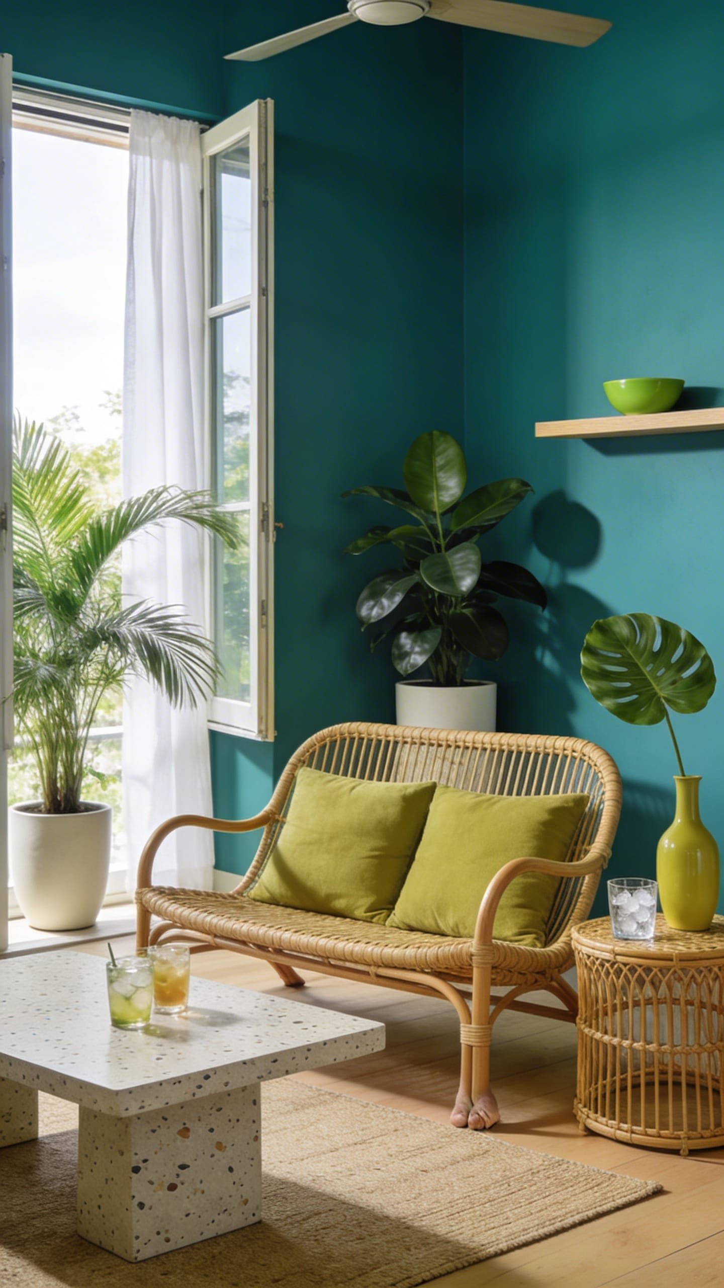
Vacation energy, delivered. This cheerful and modern living room leans on teal walls, chartreuse accents, and natural rattan for that breezy, botanical vibe. The mood feels optimistic and casual-luxe: windows open, ice clinking, fan humming softly. It works in warm climates and small spaces alike because the palette invites daylight and plants to do half the styling. Durable fibers and wipeable finishes mean you can live here—feet on rattan, drinks on terrazzo, zero stress.
Lighting leans bright and diffuse. Sheer curtains, reflective white ceilings, and a ceiling fan with a slim LED keep things light without glare. Materials are everything: rattan and cane, mango wood, terrazzo or speckled stone, tactile linen, and glossy glazed ceramics in teal or jade. The camera loves the mix of woven patterns, shadow play from caned fronts, and pops of citrusy chartreuse against cooler teal. Budget variation: opt for a single teal accent wall, a rattan chair, and chartreuse cushions. Small-space take: slim armless sofa, hanging planters instead of floor pots. Darker version: deepen teal to petrol blue and trade chartreuse for moss. Renter-friendly swap: bamboo blinds, a rattan pendant, and peel-and-stick terrazzo on a basic side table.
Key Design Elements:
- Main materials: Rattan/cane, light wood, terrazzo, linen, glazed ceramics
- Color palette: Teal, chartreuse, sandy beige, jade, leafy greens
- Lighting strategy: Daylight amplification with sheers + fan light + rattan pendant
- Furniture silhouettes: Slim sofa, airy rattan chair, rounded terrazzo table
- Texture layers: Cane panels, woven baskets, linen throws
- Accent details: Tropical prints, monstera leaves, citrus in a bowl, jade vases
How To Recreate This Look:
- Start with teal on one or two walls; keep trim and ceiling bright white.
- Add a light, slim sofa and one statement rattan chair with cane panels.
- Layer a natural fiber rug and a terrazzo or speckled coffee table for playful texture.
- Install a rattan pendant or cane-wrapped lamp; use sheers to flood the room with light.
- Style with oversized greenery, chartreuse pillows, and glossy ceramics in teal/jade.
Why This Looks Expensive: Natural textures plus high-saturation teal feel resort-level. Repeating cane across two or three pieces creates a bespoke vibe rather than a one-off accent.
Common Mistakes To Avoid: Don’t overdo kitsch—limit palm prints. Keep at least half your textiles solid to let textures speak.
Pro Styling Tip: Place rattan near a window so the cane casts patterned shadows—instant depth and a “caught-the-breeze” moment in photos.
Let’s land this colorful plane. You just met seven ways to create colorful living room designs that feel cheerful and modern—each with its own mood, materials, and lighting DNA. Here’s your permission slip to choose one direction and go all in. Start with a foundation that suits your space: if you want sunlit clarity, lean citrus and plaster; if you crave moody coziness, pick jewel tones and dimmers; if you need layout superpowers, color-block your walls and zone like a boss.
Remember the core recipe for luxe: texture plus lighting plus restraint. Texture brings touchable richness—boucle, wool, limewash, fluted wood, velvet. Lighting sculpts it—grazing sconces, warm lamps, shadow lines across stone. Restraint keeps it chic—choose a hero color family and commit. Don’t chase every trend; curate two or three bold moves and repeat them. When in doubt, edit: remove one accessory, center your art, upgrade one lamp, and suddenly your living room breathes with intention.
Most importantly, design for the life you actually live. If you need easy maintenance, pick forgiving rugs and performance fabrics. If you shoot content, think about how your favorite corner photographs at different times of day. If you host weekly movie nights, test your palette with low light so it still looks great when the popcorn comes out. Your living room should make you smile before coffee and glow after sundown. Pick the idea that made your heart jump, order those paint samples, and get started. Your future self—kicked back on a perfect sofa, admiring the sunset playing across your newly colorful walls—will say, seriously, what took us so long?