6 Pretty Garden Decor Ideas Using Pots and Plants
You want the kind of garden that makes you exhale. Dappled light, velvety greens, petals that glow at golden hour, and that quiet, collected elegance that doesn’t scream for attention but absolutely owns the moment when you step outside. But here’s the frustration: your pots feel random, your plants look like they’re waiting for instructions, and the whole thing reads “yard sale” instead of “garden sanctuary.”
These 6 pretty garden decor ideas using pots and plants will fix that. Each one is a complete, ready-to-steal concept that elevates your patio, porch, balcony, or yard purely through thoughtful combinations of texture, scale, color, and placement. We’ll layer terracotta, stone, limewashed finishes, sculptural foliage, and glow-y lighting in ways that look expensive, photograph beautifully, and feel deeply personal. Think modern Mediterranean shadows, hotel-spa serenity, romantic courtyard charm—styled to be family-friendly, renter-flexible, and totally Pinterest-worthy. If you love curated spaces that feel both soulful and sharp, this is your garden’s new era.
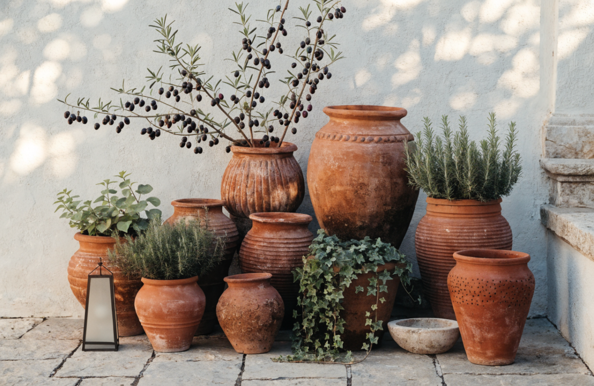
1. Sun-Washed Mediterranean Courtyard With Terracotta Stacks
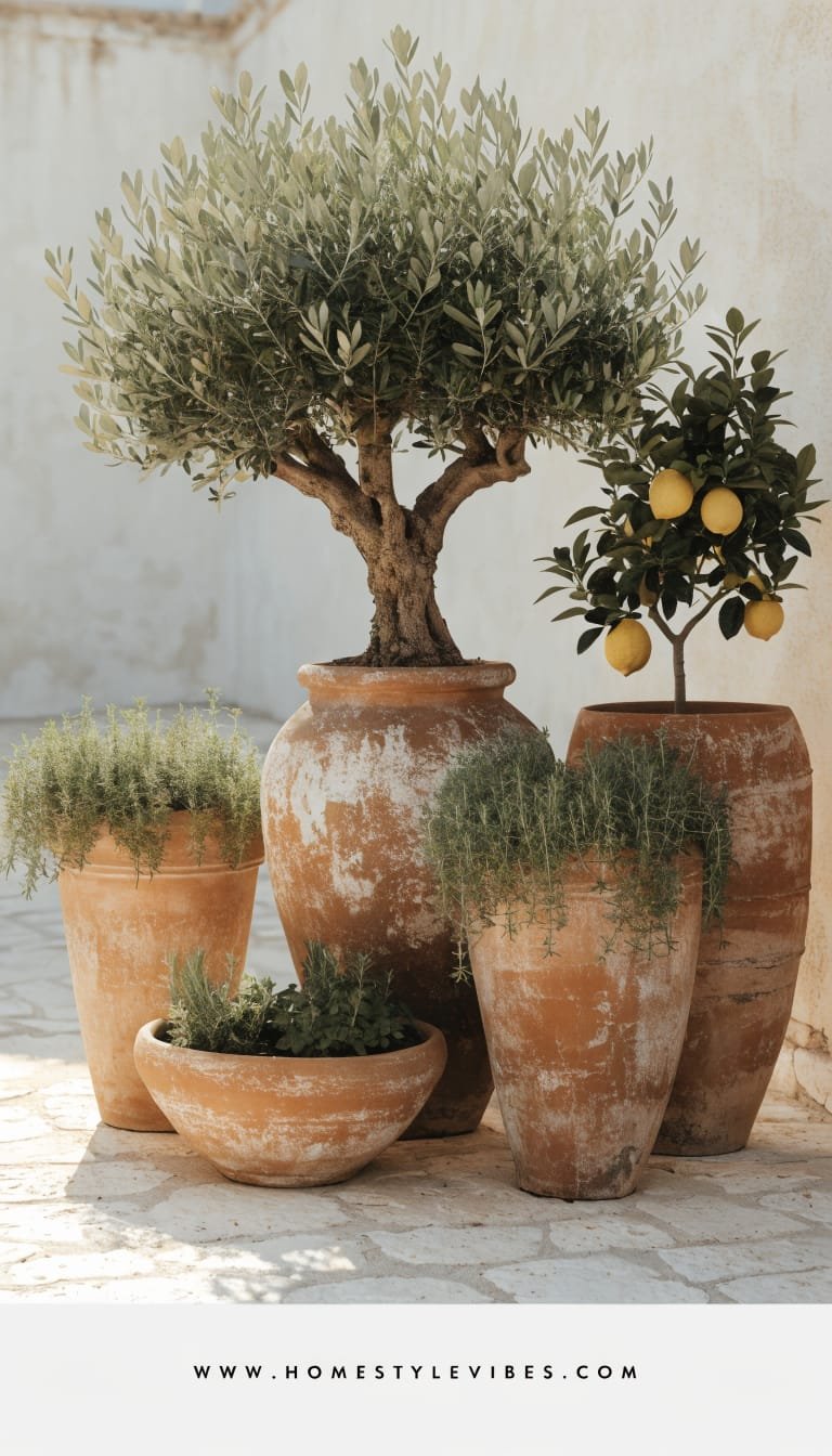
We’ve all been there: a patio that feels sun-blasted and flat, with pots scattered like afterthoughts. You’ve tried a few “colorful annuals,” but it still looks busy and not chic. This design brings that breezy, holiday-in-Puglia courtyard vibe to real life—warm, sun-washed, and grounded with terracotta in varied heights. The mood is relaxed-luxe: think olive trees in oversized pots, thyme spilling over edges, and glossy citrus fruit punctuating the scene like jewelry. It works in small spaces and large ones because it relies on verticality and repetition, not square footage.
Lighting? Late afternoon sun makes the terracotta glow like baked cookies and casts soft plant shadows across the ground. At night, a single warm uplight on the olive tree or a candle cluster by the door brings a cinematic quality. Why it looks expensive: a controlled palette (terracotta, chalky whites, silvery greens), repetition of materials, and scale-friendly groupings deliver that high-end designer coherence you see in boutique hotels.
Materials dominate: hand-thrown terracotta, limewash on walls or planters, natural stone pavers or gravel, and a touch of aged brass for watering cans or lanterns. It photographs beautifully because the color contrast (rust against soft green), layered heights, and matte surfaces create depth and texture. Variations? Budget-friendly: thrift terracotta and refresh with a limewash effect. Small-space: two stacked planter heights flanking a bistro table. Renter-friendly: use rolling plant caddies and avoid drilling. Darker version: charcoal pots mixed with unglazed terracotta for moodier contrast.
Key Design Elements:
- Main materials: Unglazed terracotta, limewash, natural gravel, aged brass
- Color palette: Terracotta orange, chalky white, silvery olive green, soft sage
- Lighting strategy: Low, warm string lights and one targeted uplight on a hero plant
- Furniture silhouettes: Slender bistro chairs, round café table, low wood bench
- Texture layers: Matte clay, soft thyme spillers, pebbled gravel, crinkled linen cushions
- Accent details (hardware, decor pieces, plants): Brass watering can, ceramic lemons, olive, rosemary, thyme, kumquat
How To Recreate This Look:
- Start with 3–5 terracotta pots in graduated sizes; keep shapes simple and classic.
- Add an anchoring tree (olive or dwarf citrus) in the largest pot for structure.
- Layer in Mediterranean herbs (rosemary, thyme) as mid-size fillers and spillers.
- Install a gravel layer or a terracotta-toned outdoor rug to define the “courtyard.”
- Style with a small café table, linen cushions, and one warm uplight aimed at the hero plant.
Why This Looks Expensive: Edited repetition and restrained color instantly read as intentional, not random. Terracotta’s natural patina plus a single sculptural tree feels like quiet luxury.
Common Mistakes To Avoid: Don’t mix too many pot styles or colors. Skip tiny pots that clutter. Avoid neon annuals that fight the palette.
Pro Styling Tip: Photograph late afternoon—angle the camera low to capture layered pot heights and long plant shadows on limewashed walls for magazine-level depth.
Craving a cleaner, spa-like moment next? Let’s pivot from sun-washed warmth to zen-calm neutrals.
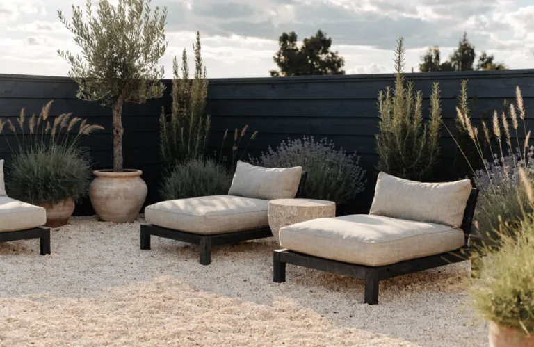
2. Japandi Serenity Deck With Sculptural Green-On-Green
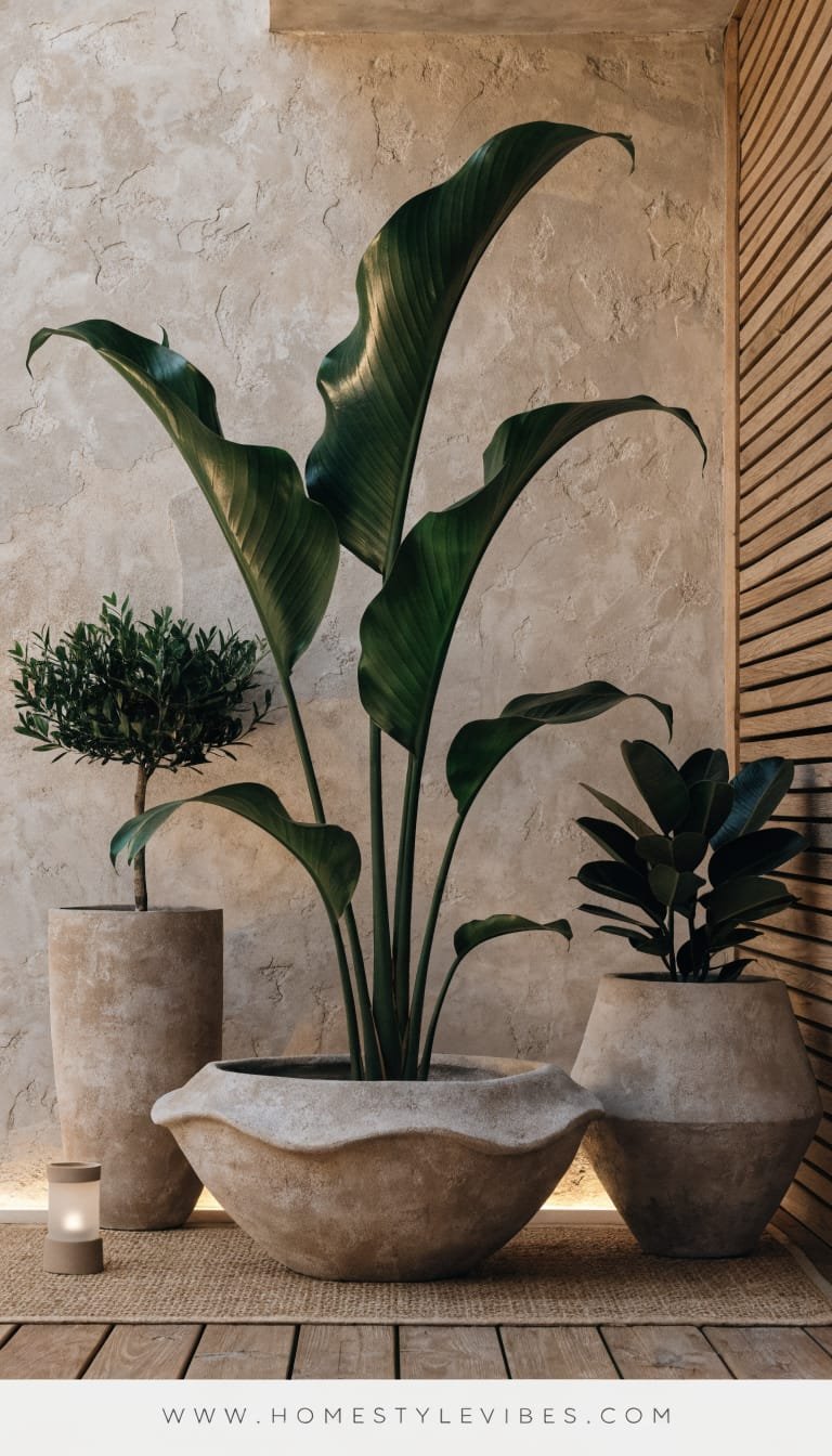
It’s that one corner that always feels off—too busy, too colorful, too “trying.” You’ve tried stacking cute planters, but it still looks like a florist exploded. This Japandi deck approach strips everything back to form and texture. The mood: spa-level calm with sculptural leaves, low bowls, and sand-toned planters. It works beautifully in small balconies and family decks because it relies on evergreen structure, low maintenance species, and a neutral palette that calms visual noise.
Lighting turns it from simple to sublime: soft, diffused lanterns and hidden step lights graze across matte planters and cast gentle halos on broad leaves. Why it works in real homes: fewer plants, bigger impact, easier watering. Why it looks expensive: elevation through negative space and intentional asymmetry—think three planters, each with a sculptural focus (a dwarf conifer, a variegated hosta, a mossy underplant). The restraint bridges DIY and design-mag elegance.
Materials dominate: sand or putty-toned fiberglass planters, slatted wood decking, river stones, and a touch of blackened steel. It photographs beautifully because green-on-green reads plush and high-end, while the clean lines and matte finishes give crisp definition. Variations? Budget-friendly: IKEA bowls and spray-painted plastic planters in taupe. Small-space: one hero bowl with concentric planting. Darker version: charcoal planters with chartreuse foliage for contrast. Renter-friendly: planters on trays to protect decking.
Key Design Elements:
- Main materials: Sand-toned planters, river stones, slatted wood, blackened metal
- Color palette: Moss, olive, charcoal, putty, soft black
- Lighting strategy: Diffused lanterns, step lights, candles inside frosted hurricanes
- Furniture silhouettes: Low-profile bench, simple cube side table, floor cushions
- Texture layers: Matte planters, smooth stones, ribbed foliage, soft linen throws
- Accent details: Bamboo tray, black steel watering can, bonsai shears
How To Recreate This Look:
- Start with three planters: one low, wide bowl; one medium cylinder; one tall rectangle.
- Add a sculptural evergreen to the tall planter; fill the bowl with moss, hosta, and ferns.
- Layer river stones on soil surfaces for a clean, zen finish.
- Install warm step lights or lanterns; keep brightness low for a spa glow.
- Style with a low bench and a black steel tray—no extra colors needed.
Why This Looks Expensive: Scale and negative space do the heavy lifting. A few large, sculptural plants feel curated and gallery-like, not cluttered.
Common Mistakes To Avoid: Don’t mix too many leaf colors or variegations. Skip glossy planters; matte keeps it calm. Avoid tiny accessories.
Pro Styling Tip: Shoot at dusk with lights on; angle from above to capture concentric planting and stone texture for that editorial, “whisper-quiet” sophistication.
Ready for drama? Let’s swing toward bold color and high-contrast geometry that begs for a photo.
3. Graphic Monochrome Patio With Black-and-White Planters
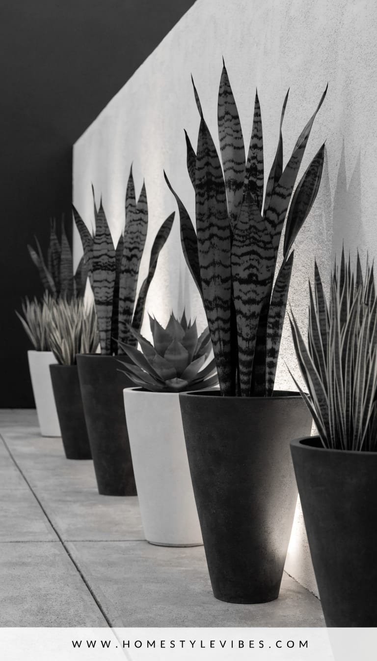
You’ve tried to make your patio exciting, but it still looks “nice” instead of jaw-dropping. Maybe you added colorful pots and it just felt chaotic. Time for graphic restraint: black-and-white planters, linear repetition, and plants that read sculptural—think snake plant, agave, zebra grass. The mood is urban-modern with a hint of art gallery, perfect for compact patios and renters craving impact without a renovation.
Lighting plays up the contrast: downlights grazing a white wall while a few focused uplights punch drama into tall plants. Why this works at home: high-contrast palettes hide dirt, photograph crisply, and create instant cohesion. Why it looks expensive: a strict color story, consistent finishes (matte black, crisp white), and geometric plant forms.
Materials dominate: powder-coated metal planters, painted concrete, porcelain pavers, and glossy leaves for contrast. It photographs beautifully—black/white lines, tall spikes against soft grasses, and that punchy shadow play. Variations? Budget-friendly: thrift mismatched planters and spray them black/white. Small-space: two tall black cylinders and one white cube flanking a door. Darker version: add charcoal gravel. Renter-friendly: rubber pads under planters to protect decks.
Key Design Elements:
- Main materials: Powder-coated metal, painted concrete, porcelain, basalt gravel
- Color palette: Black, white, charcoal, emerald green
- Lighting strategy: Wall grazing, targeted uplights, hidden strip under bench
- Furniture silhouettes: Angular bench, cube tables, sling-back chairs
- Texture layers: Matte metal, glossy foliage, fine gravel, ribbed grasses
- Accent details: Black lanterns, striped outdoor pillow, monochrome art plaque
How To Recreate This Look:
- Start with three planters in black/white; keep shapes bold (cubes, tall cylinders).
- Add structural plants: snake plant, agave, or hardy yucca; soften with zebra grass.
- Layer charcoal gravel around planter bases for a crisp, gallery plinth effect.
- Install a wall-grazing sconce or solar uplight to carve dramatic plant shadows.
- Style with a single striped cushion and black lanterns—no extra colors needed.
Why This Looks Expensive: Monochrome sharpens every line. Strong geometry plus curated plant shapes delivers a designer-level visual punch.
Common Mistakes To Avoid: Don’t sprinkle in random colors. Avoid glossy white planters that glare in sun. Keep plant choices graphic, not frilly.
Pro Styling Tip: Shoot mid-morning when sunlight creates clean-edged shadows; step slightly off-center to let diagonals lead the eye.
If your heart beats faster for romance, keep scrolling. We’re heading to a courtyard layered with blooms and weathered beauty.
4. Romantic Courtyard Layers With Weathered Stone And Soft Blooms
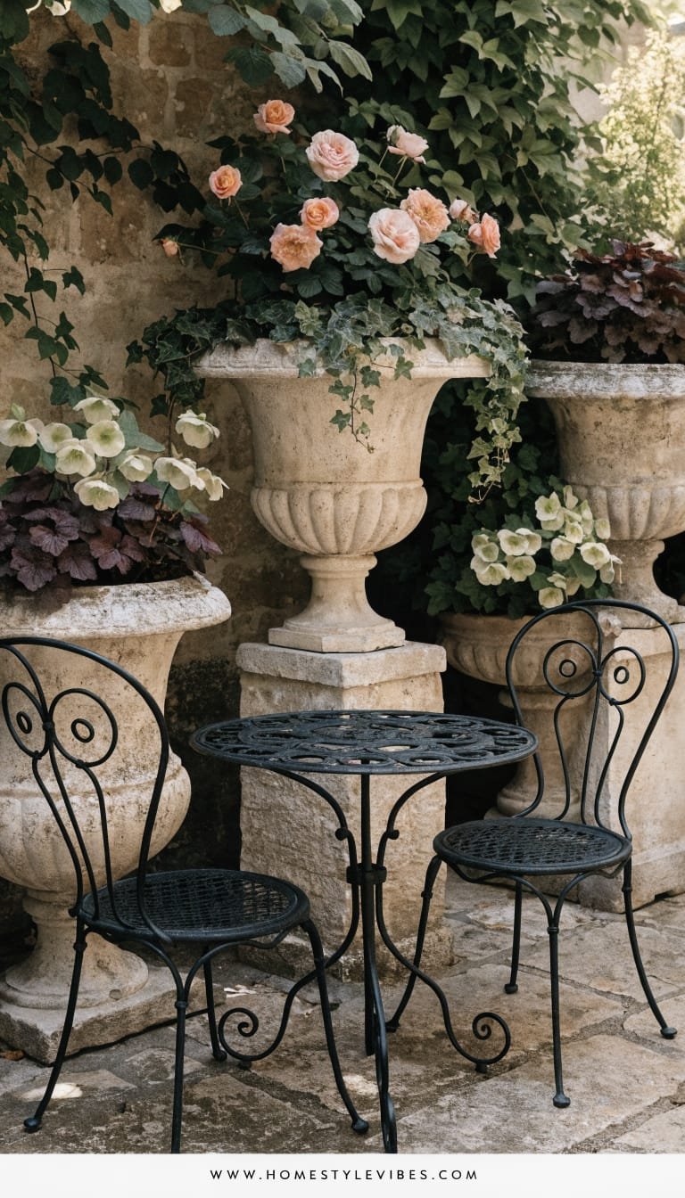
You’ve got a mishmash of flowering pots that somehow read “messy” rather than “enchanted.” You’ve tried more color, but it feels shouty. This design whispers. The mood is European romance: weathered stone planters, trailing ivy, soft blush and apricot blooms, and a vintage-style bistro set tucked into a leafy corner. It works in shaded patios or spots with partial sun, using plants that glow in low light—heuchera, hellebores, scented pelargoniums, and old-world roses if you’ve got sun.
Lighting matters: delicate fairy lights woven through a trellis, plus a lantern or two with real wax pillars for that flicker that warms stone. Why it works in real homes: stone and faux-stone planters anchor the look year-round; swap in seasonal blooms without losing the bones. It looks expensive because patina—real or faux—feels collected and historic, especially with a tight palette of dusty pinks, mauves, and cloud whites.
Materials dominate: cast stone or lightweight fiberstone, antique-style urns, moss, and iron accents. It photographs beautifully because of layered heights, soft color gradients, and matte surfaces that drink in light instead of reflecting it. Variations? Budget-friendly: thrift concrete urns and rub with garden lime for patina. Small-space: one statement urn with a trailing composition (ivy + mini roses). Darker version: plum heuchera, midnight pansies. Renter-friendly: use plant stands to achieve height without drilling.
Key Design Elements:
- Main materials: Cast stone/fiberstone, iron, moss, pea gravel
- Color palette: Blush, apricot, dusty mauve, soft cream, mossy green
- Lighting strategy: Warm fairy lights, lanterns with candles, low garden spike lights
- Furniture silhouettes: Curvy iron chairs, round bistro table, scrollwork details
- Texture layers: Porous stone, velvety petals, trailing ivy, crunchy gravel
- Accent details: Aged terracotta shards as mulch, vintage watering can, linen napkins
How To Recreate This Look:
- Start with two to three stone-look urns in varying heights to create a triangle composition.
- Add romantic plants: roses or pelargoniums for sun; hellebores and heuchera for shade.
- Layer trailing ivy and soft fillers like bacopa or lobelia for spill and movement.
- Install fairy lights on a simple trellis; add one lantern cluster at floor level.
- Style with a bistro set and a moss-lined tray; keep colors muted and harmonious.
Why This Looks Expensive: Patina plus restraint. Stone textures and muted floral tones feel antique and crafted, not store-bought.
Common Mistakes To Avoid: Don’t mix neon annuals into this palette. Avoid shiny plastic urns without adding a patina wash. Don’t skip the trailing element—it’s the romance!
Pro Styling Tip: Photograph just after watering; damp stone deepens color and makes petals look plush against the gravel.
Need something functional-meets-beautiful for cooks and entertainers? The next idea turns your planters into a working harvest bar that still looks chic.
5. Edible Edge: Herb Troughs And Citrus Pots For The Outdoor Kitchen
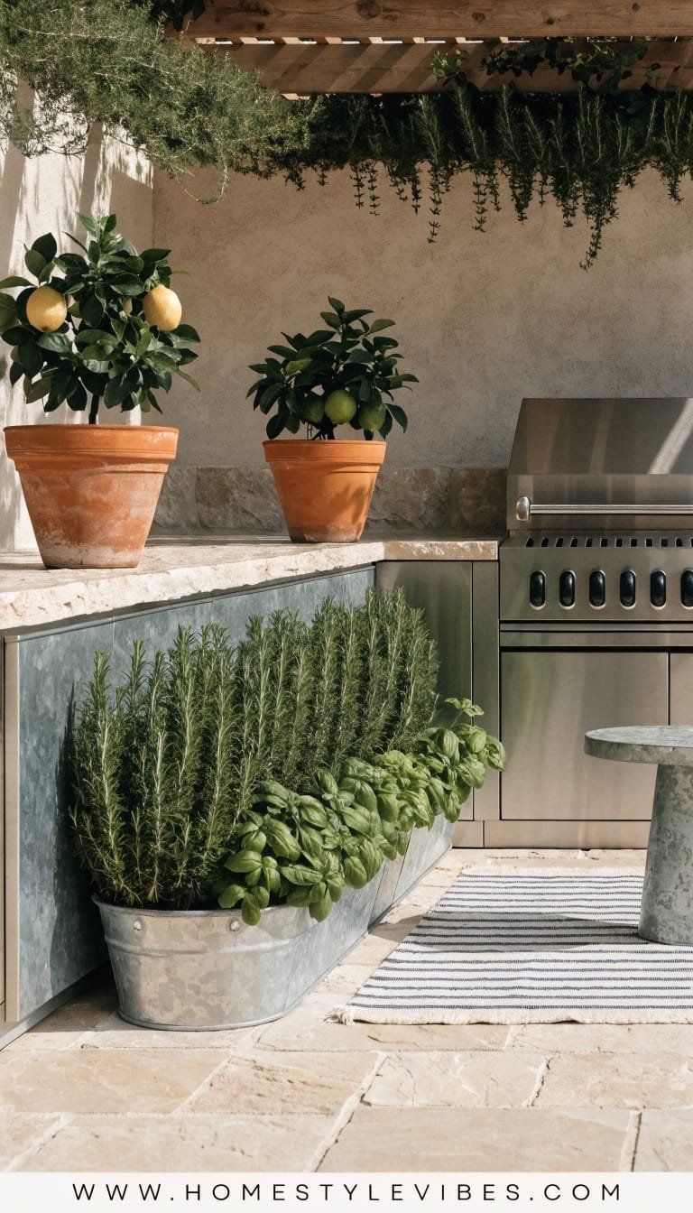
It’s the patio that works hard but never looks stylish—the grill corner, the random side table, the lone rosemary bush clinging to life. You’ve tried lining up herbs, but they look scraggly and mismatched. This design corrals everything into long troughs and matching citrus pots so your outdoor cooking area looks intentional and gourmet. The mood is fresh, functional, and a bit coastal—think terracotta and galvanized troughs, crisp striped textiles, and a fragrant green canopy near your prep zone.
Lighting does double duty: under-counter strips illuminate the workspace while a soft pendant or string light warms the dining side. Why it works in real homes: trough planters keep roots cool and organized, and citrus in large rolling pots travels with the seasons. Why it looks expensive: uniform troughs, grid-planted herbs, and sculptural citrus create a calm, chef’s-garden look that reads bespoke rather than DIY.
Materials dominate: galvanized steel or corten-look troughs, oversized terracotta or fiberclay citrus planters, butcher-block serving boards, and striped cotton. It photographs beautifully—repetition, straight lines, and layered greens with pops of citrus. Variations? Budget-friendly: cedar boxes with plastic liners. Small-space: one trough under a window and a dwarf lemon in a single large pot. Darker version: black troughs with chartreuse herbs. Renter-friendly: planter caddies and free-standing shelves with potted herbs.
Key Design Elements:
- Main materials: Galvanized or corten-look troughs, terracotta/fiberclay, wood, cotton
- Color palette: Herb green, lemon yellow, terracotta, galvanized gray, navy stripe
- Lighting strategy: Under-counter strips, warm pendant/string lights, task sconce
- Furniture silhouettes: Simple prep table, slatted shelves, director’s chairs
- Texture layers: Ribbed herb leaves, matte clay, galvanized sheen, woven textiles
- Accent details: Brass mister, ceramic salt cellar, enamel trays, citrus snips
How To Recreate This Look:
- Start with one or two long trough planters; position parallel to the grill or prep area.
- Add herb grids: basil, thyme, chives, parsley, mint in separate clusters for a tidy look.
- Layer a dwarf lemon or kumquat in a large pot on a wheeled caddy near the dining table.
- Install under-counter LED strips and a warm overhead string light for ambiance and function.
- Style with striped napkins, a wood board, and a brass mister for a chef-curated finish.
Why This Looks Expensive: Repetition equals design. Matching troughs and disciplined plant spacing mimic a professional kitchen garden with resort energy.
Common Mistakes To Avoid: Don’t mix invasive mint in the same trough with tender herbs—keep it corralled. Avoid tiny pots that dry out overnight. Skip too many decorative colors near food zones.
Pro Styling Tip: For photos, harvest a small bunch and lay it on a cutting board; the hand-touched moment plus visible citrus adds lifestyle storytelling.
Now for the balcony people and anyone with a blank fence or ugly wall. Let’s go vertical and sculptural—zero clutter, all impact.
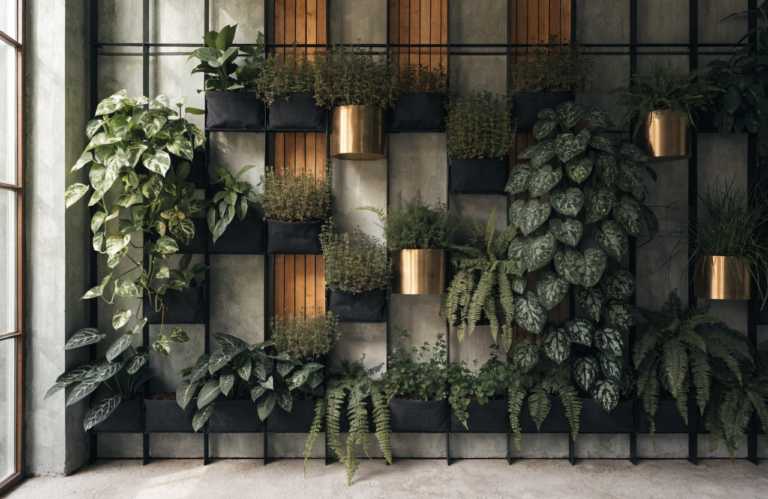
6. Vertical Green Gallery With Modular Wall Planters
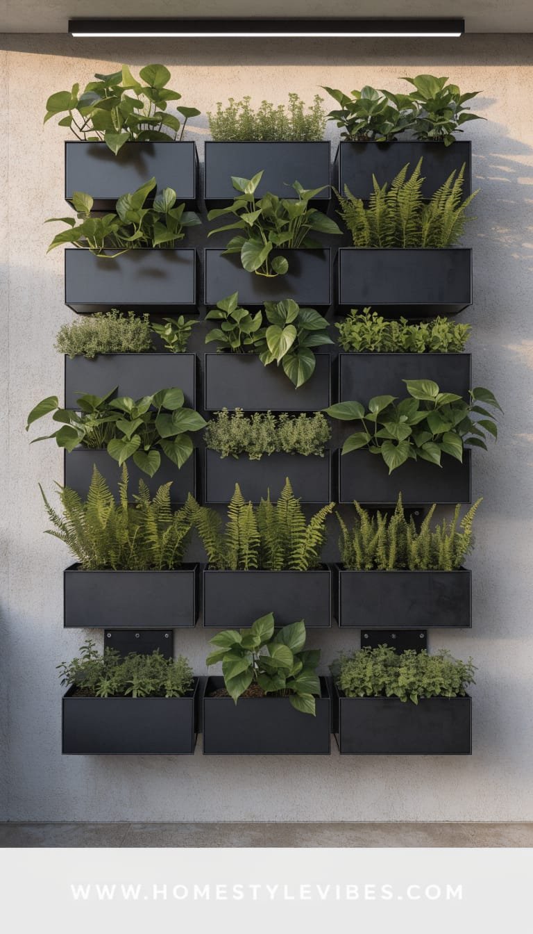
You stare at a plain fence or balcony wall and feel stuck. You’ve tried hanging a few baskets—cute, but meh. This design turns that dead zone into a living gallery using modular wall planters in a pleasing grid. The mood is modern botanical: clean lines, lush foliage, and a flexible system you can expand over time. It works for renters and small spaces because it climbs instead of sprawls, and it doubles as a privacy screen without heavy construction.
Lighting is the secret weapon: a soft wash from above creates gentle shadows beneath each planter, adding depth. Why it works in real homes: watering becomes simple with built-in reservoirs, and you can swap plants seasonally without redoing the whole wall. Why it looks expensive: the consistent module size, clear negative space, and repeated foliage types give it a curated, “gallery exhibit” polish.
Materials dominate: powder-coated metal or matte polypropylene planters, cedar trellis slats if needed, and a restrained plant palette—ferns, trailing pothos (for covered balconies), or drought-hardy succulents for sun. It photographs beautifully because the grid structure provides rhythm, while varied leaf sizes add texture and soft movement. Variations? Budget-friendly: DIY painted MDF backer with inexpensive pockets. Small-space: a 2×3 grid beside a bistro set. Darker version: black modules with pale green variegation. Renter-friendly: command hooks or tension trellis with S-hooks.
Key Design Elements:
- Main materials: Modular wall planters, cedar slats, matte hooks, irrigation tubing (optional)
- Color palette: Soft black or clay for modules; layered greens; pale wood
- Lighting strategy: Overhead wall wash, micro spotlights on the center column
- Furniture silhouettes: Slim café chairs, narrow console shelf, fold-down table
- Texture layers: Matte planters, glossy vines, feathery ferns, smooth cedar
- Accent details: Small brass plant labels, minimalist watering can, ceramic wall disc
How To Recreate This Look:
- Start with a grid plan (e.g., 3×3); map anchor points and ensure even spacing.
- Add modular planters in a single color; keep at least one empty square for breathing room.
- Layer plant types by height: upright fern in top row, trailing pothos or ivy in middle, succulents or compact herbs below.
- Install a soft wall wash light or clip-on spots for evening drama and depth.
- Style with a slim console shelf below for tools and a single sculptural object—nothing busy.
Why This Looks Expensive: Grid discipline plus plant variety equals art. The consistent modules make the wall look architectural, not crafty.
Common Mistakes To Avoid: Don’t overload with mixed planter colors or random spacing. Avoid water runoff staining—use saucers or built-in reservoirs. Watch weight limits on rental walls.
Pro Styling Tip: Shoot straight-on to emphasize the grid; let a trailing vine break the frame slightly for a dynamic, editorial touch.
Okay, exhale. You just toured six distinct ways to style pots and plants that look pretty—like, designer pretty—in real life. Whether you felt seen by the sun-washed terracotta courtyard, the hush of Japandi greens, the graphic punch of black and white, the romance of weathered stone, the chef’s kiss of herb troughs, or the sculptural rhythm of a vertical gallery, you’ve got a blueprint that solves an actual frustration: randomness, clutter, flatness, or that nagging sense of “almost.”
Here’s the truth no one tells you: luxury outdoors isn’t about exotic plants or custom hardscape. It’s texture + lighting + restraint. When you repeat materials, control color, and let one or two hero shapes lead, the whole space breathes. Warm bulbs, not harsh ones. Matte surfaces that absorb glare. A few large planters over a dozen small. And always, a touch of height—because shadows and layers make everything look rich on camera and even better in person.
Pick one idea. Just one. Maybe you begin with stacked terracotta and an olive sapling, or a trio of sand-toned bowls filled with moss and fern. Try it, live with it, tweak it at golden hour. Your garden should meet you where you are—quiet mornings with coffee, Friday-night pasta under fairy lights, kids trailing mint leaves, a book and a breeze. Start small, aim for intention, and let that first corner set the tone. The rest will follow. And when it does? Don’t be surprised if your patio becomes the most photographed “room” in your home. Seriously—wait for sunset, and thank me later.