5 Small Front Yard Landscaping Ideas with Big Curb Appeal
You know that feeling when you pull up to your home and think, “It’s fine… but it doesn’t glow”? Maybe your small front yard looks flat in photos, or the entry feels like an afterthought instead of a warm welcome. The pain point: tiny footprints that read as cluttered or barren, and a sidewalk view that doesn’t show off your home’s personality. Good news: these 5 small front yard landscaping ideas with big curb appeal will change that fast—without turning weekends into a shovel marathon.
We’re talking layered textures, sculpted greenery, strategic lighting, and colors that look luxe in sunlight and even better at dusk. Each design here balances simplicity and soul—polished enough for resale-friendly curb appeal, personal enough to feel like an extension of your style. You’ll see crisp gravel against silky grasses, matte pavers that make your entry feel custom, and plant palettes that photograph like a Pinterest board. If you love a “wow” moment that feels calm, intentional, and a little bit editorial, these are for you.
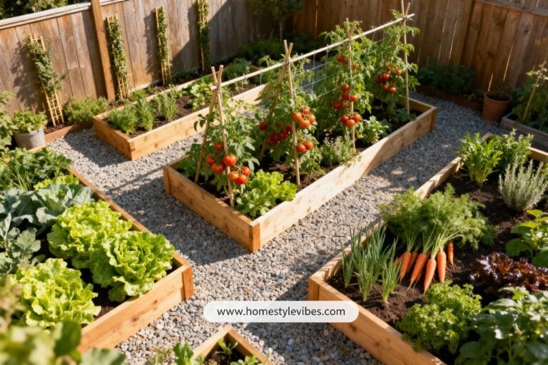
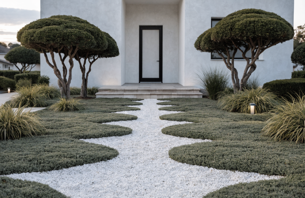
1. Gravel-and-Grass Modern Ribbon Entry With Moonlight Glow
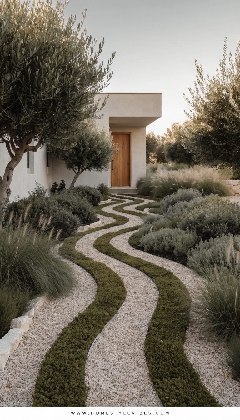
We’ve all been there: you lay a standard path, maybe toss a few shrubs along the front, and somehow the yard still looks… basic. Flat. Like it’s missing a heartbeat. This design leans into a structured minimalism: alternating “ribbons” of crisp gravel and soft groundcover that lead to your front door like a runway. The mood? Modern Mediterranean meets serene Zen—clean lines, low-water planting, and that soft, silvery shimmer you get from olive-toned greens at golden hour.
Why it works in real homes: it creates strong geometry that instantly reads “custom,” while the materials stay budget-flexible. The ribbon layout makes small yards look longer and more intentional, like you widened your entry with design instead of demo. Lighting does the heavy lifting here: stake lights and low-set sconces graze the gravel, making every texture pop while guiding visitors safely. You’ll feel the calm as you walk in—your shoulders drop, your steps slow, and that door suddenly looks like the entrance to a boutique hotel.
Why It Looks Expensive: the rhythm of repeated lines, restrained plant choices, and a limited palette. Designers swear by repetition because it quiets visual noise. Here, the cool-toned gravel, slender pavers, and a couple of sculptural plants do the heavy lifting. You’ll bridge the DIY-to-high-end gap by choosing a matte texture mix (crushed gravel, honed concrete) and one standout specimen plant—think a dwarf olive tree or multi-trunk bay laurel—that makes the whole space feel curated.
Materials to lean on: crushed granite or pale limestone gravel, large-format concrete pavers, steel or aluminum edging, and drought-tolerant groundcovers like creeping thyme, Dymondia margaretae, or woolly thyme. Add one or two vertical moments with pencil cypress or a narrow evergreen. For the finishing touch, warm white (2700K) LED path lights that cast subtle crescent shadows on the gravel. Photographs beautifully because of the balance between the light-absorbing groundcover and the light-reflecting gravel; depth and micro-shadows add instant editorial drama.
Variations you’ll love:
– Budget-friendly: Use concrete step stones spaced with pea gravel; swap specimen tree for a well-pruned rosemary topiary.
– Small-space version: Narrow the ribbons to 12–16 inches and reduce the number of rows; add a single planter as a focal anchor.
– Darker version: Use basalt or charcoal gravel, pair with dark bronze lighting and deep green mondo grass for moodier vibes.
– Renter-friendly swap: Lay stepping-stone pavers over landscape fabric with loose gravel; keep plants in oversized planters you can take with you.
Key Design Elements:
- Main materials: crushed gravel, large-format pavers, metal edging, matte planters
- Color palette: soft greys, mineral whites, sage greens, warm bronze lighting
- Lighting strategy: low, warm stake lights and door-adjacent sconces for grazing
- Furniture silhouettes: slim entry bench or small bistro set with straight lines
- Texture layers: rough gravel, velvety groundcover, smooth paver finish
- Accent details: sculptural topiary, house numbers in blackened metal, clay or fiberstone pots
How To Recreate This Look:
- Start with a simple layout sketch of 3–5 “ribbons” running from sidewalk to door, sized 12–24 inches each.
- Add metal edging to define clean lines, then fill alternates with landscape fabric + gravel and drought-tolerant groundcover.
- Layer one focal specimen (olive, bay, or cypress) near the entry; keep other plants low and repetitive.
- Install warm, low-voltage stake lighting along one side only to avoid runway vibes; add a dimmable sconce by the door.
- Style with a narrow bench and a tall, matte planter that echoes your house numbers’ finish.
Why This Looks Expensive: controlled geometry plus one heroic plant reads intentional, not improvised. The understated palette feels custom, which is what buyers and Instagram both love.
Common Mistakes To Avoid: mixing too many gravel colors, over-planting with busy flowers, or using bright white LEDs. Keep it cohesive and warm-toned.
Pro Styling Tip: Shoot at dusk with lights on; angle from the side to catch shadow play across gravel for magazine-grade depth.
Ready for a softer, greener feel without losing structure? Keep scrolling—this next one layers texture like a gorgeous cashmere throw for your front yard.
2. Layered Cottage Meadow With a Crisp Front Border
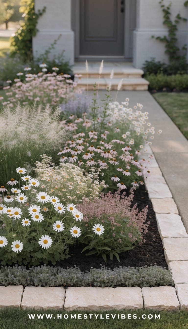
It’s that one corner that always feels off: a few pots crammed by the stoop, a line of random shrubs that never bloom at the same time, and mulch that turns patchy in a month. You’ve tried adding color, but it still reads messy. Enter the layered cottage meadow—but with a crisp front border that keeps it feeling tailored. The mood: romantic, airy, and humming with movement, like a gentle breeze lives here. But it’s also edited, which keeps small front yards from tipping into chaos.
Why it works in real homes: you get four-season interest and a pollinator-friendly garden without sacrificing structure. The secret is hierarchy—tall, feathery perennials at the back (think ornamental grasses and echinacea), mid-height bloomers in the middle (salvia, yarrow, catmint), and a tight, evergreen front border of low boxwood or dwarf myrtle as the chic “liner.” Lighting: up-lights on a small tree or tall grass create theatrical shadows at night, and a single lantern sconce sets the cottage tone at the door. Your front yard becomes a dynamic tapestry that photographs like a magazine cover—layers, contrast, and a little wild magic.
Why It Looks Expensive: it’s the deliberate combo of structured edging with painterly perennials. Designers love the tension between “wild” and “tailored.” The boxwood front edge makes everything behind it look intentional, even when blooms peak and fade. Choose a tight color story—blush, soft mauve, and creamy whites—or go cool with blues and silvers for that moody, moonlit feeling.
Materials to favor: steel or stone edging, good landscape soil plus compost, mixed perennials, and a few statement grasses like Pennisetum or Calamagrostis. Texture comes from seed heads, fuzzy lamb’s ear, and glossy evergreen edges. Photos thrive on contrast: airy plants behind a dense, dark-green border create depth and a natural vignette around your entry.
Variations to consider:
– Budget-friendly: Start with seed packets and small nursery starts; focus on a single variety in sweeps for faster impact.
– Small-space version: Keep the border and choose 3–4 plants max; repeat them for a cleaner look.
– Shade-friendly swap: Use ferns, hosta, and astilbe in the middle layer; replace boxwood with dwarf Japanese holly.
– Renter-friendly: Faux boxwood edging in planters + large trough planters with meadow mix you can bring with you.
Key Design Elements:
- Main materials: steel/stone edging, compost-rich soil, perennial meadow mix, low hedge
- Color palette: blush, soft mauve, chalky whites OR cool blues, purples, silvers
- Lighting strategy: a single lantern sconce at the door and subtle up-lights on grasses
- Furniture silhouettes: curved bistro chairs or a small spindle bench in natural wood
- Texture layers: feathery grasses, velvety lamb’s ear, glossy evergreen hedge
- Accent details: antique-style house numbers, aged terracotta pots, copper watering can
How To Recreate This Look:
- Start with a clear border: install metal or stone edging to outline your front bed in a gentle curve.
- Add soil and compost, then plant a tight, low evergreen hedge at the front, spacing evenly for a continuous line.
- Layer perennials in height order: tallest at back (grasses), mid bloomers in the middle, groundcovers and lamb’s ear at front edges.
- Install one or two up-lights behind a taller grass or small ornamental tree to cast evening shadows.
- Style with mismatched terracotta pots and a wood bench to add warmth and a place to pause.
Why This Looks Expensive: repetition and restraint. Even a meadow becomes “designer” when you repeat varieties and hold the palette tight. The tidy hedge says bespoke garden, not backyard experiment.
Common Mistakes To Avoid: planting too many one-off specimens, skipping soil prep, or choosing clashing bloom colors that fight each other. Edit, then edit again.
Pro Styling Tip: For photos, groom spent blooms and water lightly an hour before shooting—petals perk, and leaves get that glossy, alive look.
If you crave sleek drama over softness, the next idea sharpens every edge and makes your front yard feel like modern art.
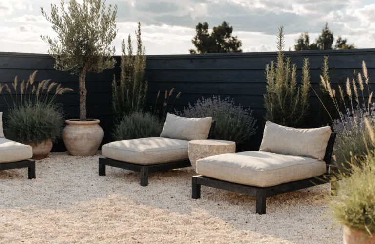
3. Monochrome Stone Courtyard With Sculptural Green Moments
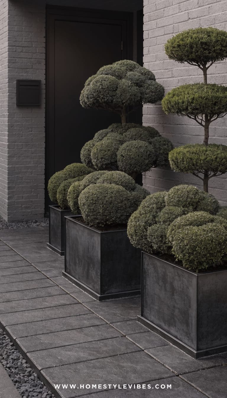
You’ve tried to “add interest,” but every new thing just makes the front look busier. It’s that visual clutter spiral. This design breaks the cycle with a monochrome stone palette and a few sculptural green moments, so every element earns its spot. The mood: gallery-quiet, confident, and tranquil. Think charcoal pavers, blackened steel planters, and clipped evergreens that look like living statues.
Why it works in real homes: it’s incredibly low maintenance and wildly space-smart. A paved courtyard with permeable joints gives you tidy structure without creating a heat island, and the monochrome scheme makes a small entry read as expansive. Lighting matters big time: in-ground well lights and narrow-beam spotlights transform a single tree or clipped sphere into nighttime sculpture. This one photographs like a dream because monochrome amplifies light and shadow—your home becomes the backdrop, not the competition.
Why It Looks Expensive: designers lean monochrome to unify mismatched facades or busy neighborhoods. Stone-on-stone reads timeless and premium, and the sculptural green nods to high-end European courtyards. The “less but better” vibe bridges DIY to luxury when you choose quality finishes: thick pavers, powder-coated planters, and a matte black mailbox or door hardware to echo the palette.
Materials to prioritize: large-format porcelain or concrete pavers in one deep tone, black steel planters, river rock in charcoal or onyx, and evergreen shapes—globe boxwood, dwarf pine, or cloud-pruned Japanese holly. Consider a single water bowl (recirculating) for a silky, reflective surface that catches light like a mirror.
Variations:
– Budget-friendly: Use concrete paver stones from the hardware store and paint galvanized planters matte black with metal-specific paint.
– Small-space: Create one dramatic planter cluster and a single seating cube; leave more negative space.
– Warmer version: Use sandy limestone tones with warm bronze accents and olive-green plantings.
– Renter-friendly: Lay down interlocking deck tiles over gravel and use lightweight fiberglass planters.
Key Design Elements:
- Main materials: charcoal pavers, black steel planters, dark river rock, powder-coated hardware
- Color palette: deep charcoal, matte black, glossy green, subtle metallic bronze
- Lighting strategy: in-ground wells and tight-beam spots aimed at one or two sculptural plants
- Furniture silhouettes: cube stools, slim bench, or low-profile concrete-look table
- Texture layers: matte pavers, smooth pebbles, glossy evergreen leaves
- Accent details: house numbers in sans-serif black, slim door knocker, shallow water bowl
How To Recreate This Look:
- Start with a single-tone paver field; choose larger sizes (24×24 or 24×36) to reduce grout lines.
- Add a slim border of dark river rock to edge planting zones and hide irrigation or lighting hardware.
- Layer two to three sculptural evergreens in staggered heights; keep all other plants minimal or ground-hugging.
- Install in-ground well lights pointed up and a narrow-beam spotlight for your main plant statement.
- Style with a matte black mailbox, minimalist bench, and one shallow water bowl or lantern cluster.
Why This Looks Expensive: unified color minimizes visual noise and highlights form. The eye reads “intentional architecture” even in small footprints.
Common Mistakes To Avoid: mixing blacks (warm vs cool) without testing, overfilling planters, or ignoring drainage under pavers. Keep forms clean, test finishes in daylight.
Pro Styling Tip: For photos, wet the pavers lightly to deepen tone and boost reflection—but avoid puddles. It’s instant drama.
Want something with movement and romance, but with modern bones? This next layout reimagines the classic front walk as a destination.
4. Curved Stepping-Stone Path With Flanking Ornamental Grasses
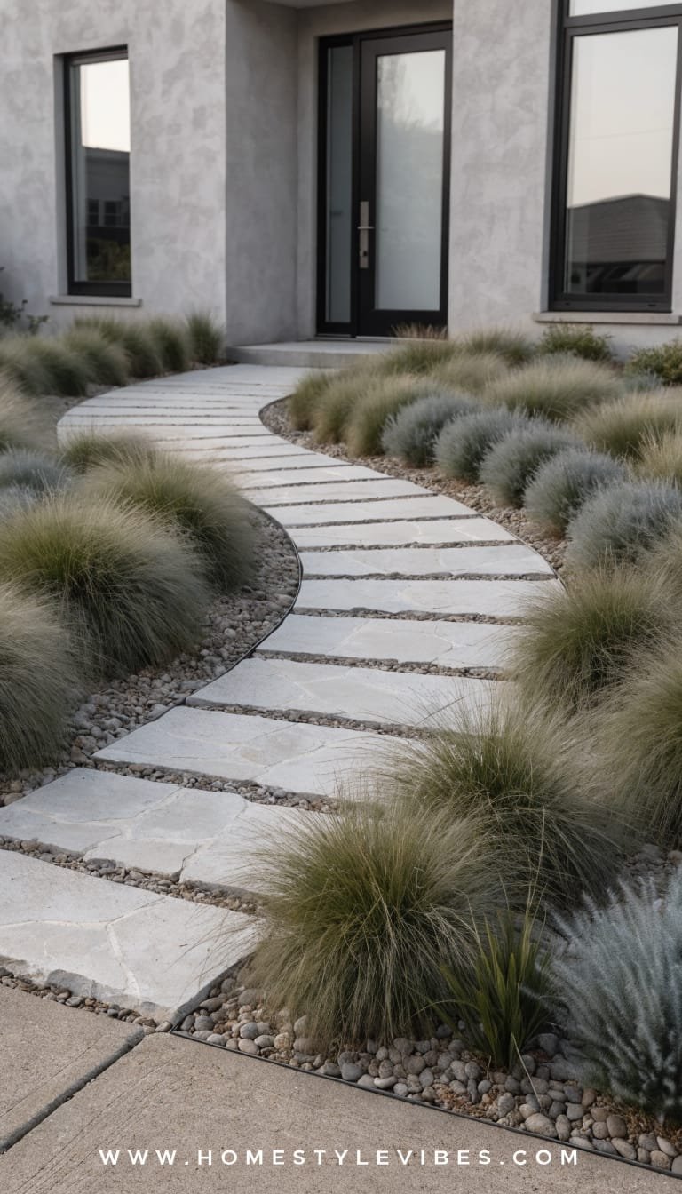
It’s the straight, skinny path problem: you have a basic concrete walk that screams builder-grade. You’ve tried planters, but they just crowd the entry. This design bends the rules with a gentle, curved stepping-stone path surrounded by swaying ornamental grasses. The mood: breezy coastal meets urban calm—each step feels like a little exhale as the blades whisper against your ankles.
Why it works in real homes: curves trick the eye into believing your yard is larger and more dynamic. The stepping-stone layout allows for better drainage and easy DIY installation. Lighting becomes storyline: low dome path lights set far apart (not every stone!) create a dotted rhythm that feels like a moonlit garden. Photographs capture incredible depth thanks to overlapping grasses and the curve’s vanishing point—your entry suddenly has a “journey” instead of a straight shot.
Why It Looks Expensive: controlled asymmetry with confident negative space. Designers love the rhythm of repeated grasses; it reads spa-like and premium. Choose larger, irregular stones (bluestone, irregular limestone) for that elevated, custom feel. Mix a couple of grass species—like feather reed grass and Japanese forest grass—to create layered movement and varied texture.
Materials to choose: irregular flagstone or chunky concrete stepping stones, steel edging, ornamental grasses (Pennisetum, Calamagrostis, Sesleria, Hakonechloa for shade), and fine gravel or mulch to fill gaps. Add one accent boulder or driftwood log for sculptural grounding. The texture mix—smooth stone, feathery grass, crunchy gravel—translates beautifully in photos.
Variations:
– Budget-friendly: Use precast stepping stones spaced wider; fill with pea gravel and drought-friendly thyme.
– Shade version: Swap to Carex, Hakonechloa, and ferns; choose cooler-toned stones to match the vibe.
– Low-water: Go all-in on native grasses and groundcovers; eliminate thirsty blooms entirely.
– Renter-friendly: Lay stepping stones over landscape fabric and pin the curve; use potted grasses for height and take them when you move.
Key Design Elements:
- Main materials: irregular stone, gravel infill, steel edging, ornamental grasses
- Color palette: cool greys and soft greens, with bronze seed heads as seasonal accents
- Lighting strategy: sparse dome or bollard lights along the outside edge of the curve
- Furniture silhouettes: light sling chairs or a petite teak bench near the entry
- Texture layers: rough stone, feathery grasses, crunchy gravel, seasonal seed heads
- Accent details: a single boulder, brushed-bronze door hardware, woven doormat
How To Recreate This Look:
- Start by marking a gentle S-curve with a hose; adjust until it feels natural and not too tight.
- Add steel edging to hold your curve; excavate shallowly and set stepping stones level but with slight pitch for drainage.
- Layer ornamental grasses in drifts along the outside of the curve; keep the inside lighter to emphasize the path.
- Install a few low dome lights on the outer edge only; avoid lighting every step to prevent a runway effect.
- Style with a small bench at the end of the path and a sculptural boulder placed off-center for balance.
Why This Looks Expensive: the sinuous path feels custom and site-specific, like a landscape architect designed it just for your lot.
Common Mistakes To Avoid: making the curve too sharp, mixing too many grass types, or setting lights too close together. Keep it calm and rhythmic.
Pro Styling Tip: Photograph from a low angle along the curve to exaggerate depth and capture that layered grass silhouette against the sky.
Feeling the pull toward high function and hospitality—somewhere to sip coffee and wave to neighbors? The next idea turns your small front yard into a legit mini-terrace.
5. Micro Front Patio Nook With Potted Citrus and Checkerboard Pavers
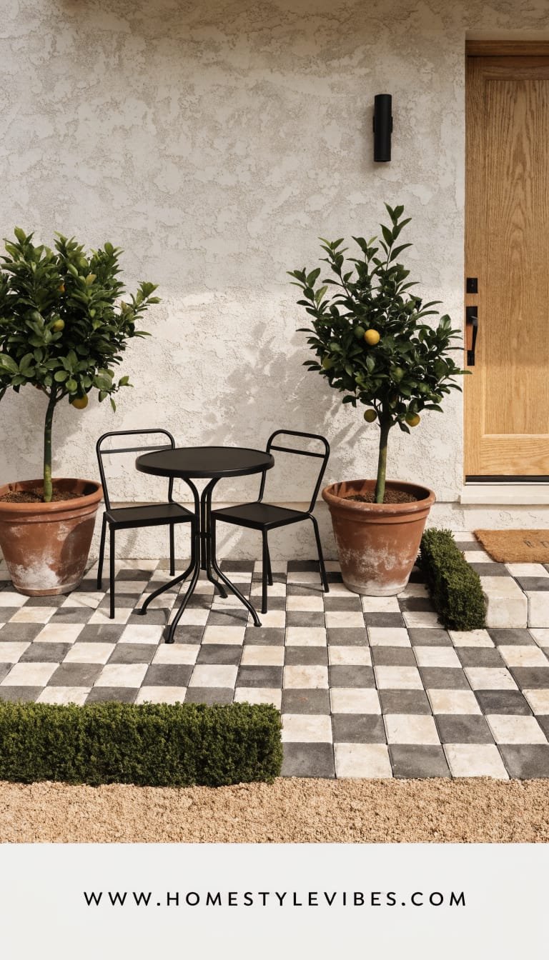
You’ve got a tiny patch of lawn you never use and a stoop that barely fits a welcome mat. You’ve tried a chair, but it looked awkward. This design claims the space with a petite front patio nook—checkerboard pavers, potted citrus, and a bistro set that says “morning espresso lives here now.” The mood: European sidewalk cafe meets California sunshine. It gives you usable square footage and major curb appeal in one move.
Why it works in real homes: small front yards often waste 40–60 square feet of prime space near the door. Pavers laid in a tight checkerboard exaggerate width and feel playful yet classic. The potted citrus (or dwarf bay, or olive if you’re chilly) adds sculptural greenery you can control and re-pot as needed. Lighting: a single overhead lantern or wall sconce paired with one small, dimmable table lantern for evening glow. It photographs like a magazine because the bold pattern compresses neatly into the frame—crisp lines, glossy leaves, and a pop of fruit color for instant charm.
Why It Looks Expensive: checkerboard is timeless, and when you scale the squares to your space (14–18 inches for small yards), it looks custom and architectural. Limit the palette to two contrasting tones—cream and charcoal or warm grey and off-white—and echo those shades in your bistro set cushions and planters for cohesion. Add one luxe material, like a brass doorbell or marble-topped side table, and you’ve bridged straight to designer territory.
Materials to use: concrete or porcelain pavers in two tones, polymeric sand or creeping thyme for joints, fiberglass or terracotta planters, slim-profile bistro chairs, and a compact round table. Add a striped outdoor cushion for that cafe vibe. Texture-wise, you get a mix of matte pavers, glossy citrus leaves, and soft textiles—perfect for close-up shots and scroll-stopping thumbnails.
Variations:
– Budget-friendly: Use concrete stepping stones in alternating colors; paint the stoop railings to match the palette.
– Small-space: Scale down the checkerboard to a 4×4 grid; tuck a foldable bistro set that stores flat.
– Cold-climate: Swap citrus for dwarf conifers or hardy topiaries; add a cozy throw and lanterns for a Nordic vibe.
– Renter-friendly: Lay interlocking patio tiles over the existing surface; use lightweight planters and a solar lantern.
Key Design Elements:
- Main materials: two-tone pavers, polymeric sand or thyme, fiberglass planters, bistro set
- Color palette: cream and charcoal or warm grey with muted green foliage and citrus pops
- Lighting strategy: one architectural sconce plus a portable, dimmable lantern for mood
- Furniture silhouettes: cafe-style chairs, round pedestal table, petite side table
- Texture layers: matte pavers, glossy leaves, woven cushions, ceramic or terracotta planters
- Accent details: striped cushion, brass doorbell, vintage-style door knocker, woven doormat
How To Recreate This Look:
- Start by mapping a square or rectangle big enough for two chairs and a small table; plan paver count in a checkerboard pattern.
- Add a compacted base and set pavers level; alternate colors for the pattern and fill joints with polymeric sand or thyme.
- Layer two to three substantial planters with citrus or topiary; stagger heights for interest.
- Install a statement sconce by the door; add a portable, rechargeable lantern for tabletop glow.
- Style with a striped cushion, small tray for coffee, and a cheerful door mat that repeats one checker color.
Why This Looks Expensive: bold pattern used sparingly. The checkerboard anchors the space and turns a tiny patio into a “designed” room you can actually use.
Common Mistakes To Avoid: choosing squares too small (looks busy), mixing too many planter styles, or skipping a level base (wobbly furniture kills the vibe fast).
Pro Styling Tip: For photos, place a citrus sprig or a lemon on the table; the color pop against black-and-white reads editorial and irresistible.
Still torn between modern structure and cozy charm? Here’s your bridge: a tiny front yard that feels both tailored and friendly, every day of the year.
6. Narrow Hedged Walk With Statement Planters and a Door-Centric Focal
It’s the “long hallway” effect: a narrow front yard or side entry that feels like a corridor instead of a welcome. You’ve tried flowers that flop or planters that feel lost. This idea leans into geometry again—low hedges flanking a straight walk, punctuated with statement planters that pull the eye to the front door. The mood: townhouse chic with a whisper of hotel lobby—elegant, tidy, and very “we have our life together.”
Why it works in real homes: tight footprints crave clear edges. Low hedging (18–24 inches) frames your path without feeling fortress-like. Statement planters at one-third intervals create rhythm and give you seasonal flexibility—swap plants without redoing the hardscape. Lighting helps the narrow lot glow: soffit downlights or small wall washers illuminate the walk without blinding the neighbors. This design photographs beautifully because of the strong leading lines toward the door; your house number and hardware become the finale shot.
Why It Looks Expensive: hedging signals “landscape plan” even if the plan is simple. Matching planters—either in pairs or a sequence—finish the thought. Choose upgraded finishes like fiberstone or glazed pottery in a single color, and repeat that tone on your mailbox or numbers. It’s subtle, but it ties the whole facade together.
Materials to consider: low hedges like boxwood, dwarf yaupon holly, or lavender for sunnier climates; rectangular planters; smooth concrete pavers or fine gravel; and matte black or brushed brass hardware accents. Keep colors calm—soft greens, greys, and a single metal tone—so the door color can sing.
Variations:
– Budget-friendly: Plant a hedge from small liners (just space carefully), and use painted terracotta in one unified color.
– Scent-forward: Choose lavender or rosemary hedging so the entry smells amazing when brushed.
– Shade-friendly: Use dwarf inkberry holly and shade-tolerant heuchera in planters.
– Renter-friendly: Faux hedging panels in slim trough planters along the path; no digging needed.
Key Design Elements:
- Main materials: low evergreen hedges, rectangular planters, smooth pavers or gravel
- Color palette: muted greens, cool greys, single metal finish (black or brass)
- Lighting strategy: soffit downlights or wall washers for even path lighting
- Furniture silhouettes: narrow console-style bench near entry, umbrella stand
- Texture layers: glossy hedge leaves, matte planters, smooth pavers
- Accent details: prominent house numbers, statement door color, coordinated mailbox
How To Recreate This Look:
- Start by defining the path width (36–42 inches is comfortable); install edging for crisp borders.
- Add hedges along both sides, spacing consistently for a tight, even line at maturity.
- Layer statement planters at even intervals (rule of thirds) or in pairs at the entry; keep them identical for cohesion.
- Install low, even lighting along the facade or soffit to wash the walkway in a soft glow.
- Style with bold house numbers and a door color that contrasts the greenery—deep teal, wine, or classic black.
Why This Looks Expensive: the formality of a hedge reads “bespoke garden,” while repeated planters give that boutique hotel cadence.
Common Mistakes To Avoid: mixing planter styles, hedges planted too far apart (gaps kill the look), or picking too many door decor items. Edit ruthlessly.
Pro Styling Tip: For photos, position planters so their tops align in the frame; that straight horizon of greenery looks incredibly crisp on camera.
7. Native Xeriscape Jewel Box With Bold House Numbers and Solar Drama
You’ve tried lawn patches that brown out by August and a sprinkler that costs a small fortune to run. Still looks tired. The native xeriscape jewel box swaps thirsty grass for a mosaic of climate-appropriate plants, chunky stone, and sculptural mulch. The mood: desert-modern or prairie-chic depending on your region—earthy, textural, and alive with subtle color shifts. It’s a tiny yard that feels like a curated field study.
Why it works in real homes: low water, low maintenance, high impact. Native plants settle in and ask very little, and the staccato of boulders, gravel swales, and groundcovers creates instant curb appeal. Lighting: compact solar spots on dramatic seed heads or spiky silhouettes add “midnight museum” vibes without wiring headaches. Your photos? Pure texture theater—matte stone, spiky yucca, powdery blue fescue, and rust-toned mulch forming shadowy patterns at sunset.
Why It Looks Expensive: it channels high-end desert resorts—monochrome gravel fields dotted with bold shapes. The magic lies in scale and spacing. Don’t crowd. Give each plant a halo of breathing room so it can become a sculptural statement. One oversized house number plaque in blackened steel finishes the look and telegraphs “design-forward” from the street.
Materials shortlist: regional boulders, decomposed granite or pea gravel, native perennials and grasses, rusted steel edging, and a low, modern mailbox. If your climate supports it, add a rain chain that feeds a gravel swale—sustainable and chic.
Variations:
– Budget-friendly: Use fewer, larger plants and let groundcover fill over time; source rocks locally.
– Color-forward: Add native flowering accents in tight clusters—penstemon, blanket flower, or asters—without breaking palette cohesion.
– Cold-climate twist: Use river rock, birch logs, and hardy grasses; keep palette cool and steely.
– Renter-friendly: Large planters with natives plus a portable gravel carpet (landscape fabric + gravel) that you can reclaim later.
Key Design Elements:
- Main materials: decomposed granite, regional boulders, rusted steel edging, native plants
- Color palette: mineral neutrals—sand, rust, charcoal—with silvery-blue foliage and seasonal blooms
- Lighting strategy: solar spike lights on sculptural forms; soft backlighting on the number plaque
- Furniture silhouettes: none needed, but a low concrete stool can work near the door
- Texture layers: gritty DG, smooth boulders, spiky or tufted plants, matte metal
- Accent details: bold, oversized house numbers, rain chain, low modern mailbox
How To Recreate This Look:
- Start by removing thirsty lawn and grading lightly for drainage; outline beds with steel edging.
- Add a base of decomposed granite; compact just enough to walk on without kicking up dust.
- Layer boulders first (odd numbers) and then plant natives with mature size in mind; allow space around each specimen.
- Install solar lights aimed at the most sculptural forms; add a backlit number plaque if wiring is accessible.
- Style with a simple, modern doormat and keep clutter out; negative space sells the sculpture.
Why This Looks Expensive: fewer, bigger gestures. The restraint plus regional authenticity reads curated, not cobbled together.
Common Mistakes To Avoid: mixing too many rock types, overplanting, or skipping weed barrier where needed. Edit and match materials to your region.
Pro Styling Tip: Shoot at golden hour or blue hour—low raking light across gravel textures delivers instant editorial contrast.
8. Brick Herringbone Walk With Symmetrical Topiaries and Warm Brass Accents
You’ve got a classic home that deserves a classic entry, but your current setup feels a bit “meh”—maybe a cracked path and random pots. You’ve tried annuals; they wilt by July. This design gives you timeless curb appeal: a herringbone brick walk lined with tidy groundcovers, flanked by symmetrical topiaries at the door, all finished with warm brass accents. The mood: heritage charm with a couture finish—think Georgian townhouse, but accessible.
Why it works in real homes: brick brings instant warmth and resale-friendly longevity. Herringbone adds dynamic movement that makes small spaces feel crafted, not standard. Symmetry calms clutter, which is why it works so well for small front yards—mirrors, but outside. Lighting: classic coach lights or a single lantern pendant, dimmed to a candle-like glow, wrap the scene in familiarity. This one photographs beautifully because brick’s microtexture eats glare and shows rich color gradients under both sun and shade.
Why It Looks Expensive: craftsmanship telegraphed via pattern. Herringbone says “custom,” and paired topiaries feel high-end without needing rare plants. Add a brass door kickplate and a Georgian-style door knocker to finish the story. The transition from DIY to designer happens when you commit to one metal finish and keep the plant palette evergreen with just a touch of seasonal color.
Materials: clay brick in a warm red or tumbled blend, sand-set base, boxwood or privet topiaries in classic urns, creeping thyme or Irish moss between bricks if you like a softer edge, and polished or antiqued brass hardware.
Variations:
– Budget-friendly: Use reclaimed brick or concrete brick pavers; paint off-the-shelf urns a matte charcoal.
– Low-maintenance: Swap live topiary for realistic faux in urns; refresh seasonally with a wreath or ribbon.
– Coastal twist: Choose pale brick blends; pair with light taupe door and brushed brass hardware.
– Renter-friendly: Build a portable “brick mat” from interlocking tiles; place matching urns either side of the door.
Key Design Elements:
- Main materials: brick pavers, sand set, classic urn planters, brass hardware
- Color palette: warm reds and terracottas, deep greens, polished or antiqued brass
- Lighting strategy: coach lights or lantern pendant at warm 2700K
- Furniture silhouettes: none required; a boot scraper or petite bench adds utility
- Texture layers: textured brick, glossy evergreen leaves, burnished metal
- Accent details: kickplate, door knocker, classic house numbers, woven coir mat
How To Recreate This Look:
- Start with a compacted base and lay bricks in a 45-degree herringbone; border with a soldier course for a clean finish.
- Add creeping groundcover along edges for softness, or keep joints sanded for a crisp, low-upkeep path.
- Layer identical urn planters either side of the door with clipped boxwood or faux equivalents.
- Install coach lights at appropriate scale; align centerlines with the top third of the door for balance.
- Style with brass hardware, a coir mat, and perhaps a seasonal wreath—just one; keep it restrained.
Why This Looks Expensive: pattern precision and symmetry. Even budget bricks feel elevated when laid with discipline and finished with quality hardware.
Common Mistakes To Avoid: mixing metal finishes, choosing underscaled lights, or crowding the entry with too many pots. Edit for elegance.
Pro Styling Tip: Mist the brick before photos to deepen tones; place topiaries so their spheres align visually with the lanterns for a composed frame.
9. Elevated Planter Wall With Cascading Greens and Integrated Bench
There’s always that awkward grade change or narrow strip that collects weeds and regret. You’ve tried mulch, it slides downhill. This solution turns a pain point into a showpiece: a low retaining planter wall that doubles as seating, overflowing with cascading greens. The vibe: boutique cafe meets secret garden—social, layered, and incredibly photogenic.
Why it works in real homes: it solves slope, adds structure, and creates a perch to tie shoes or chat with neighbors. Small yards need verticality; a 16–18 inch wall instantly adds dimension. Lighting turns the space magical: LED strip lighting under the bench lip or tiny step lights along the wall throw soft halos at night. Photos love the tiering—plants at multiple heights, plus the bench line, give you that editorial depth every time.
Why It Looks Expensive: integrated hardscape hints at custom carpentry and masonry, the hallmarks of a high-end landscape. Choose smooth stucco, stacked stone, or slatted wood cladding that echoes your home’s palette. Limit cascading plants to two or three species—trailing rosemary, ivy, or dichondra—for a lush but disciplined waterfall effect.
Materials: concrete block or modular wall units, capstones, wood or composite bench top, weatherproof cushions, and cascading plants. Add a single upright accent—like a Japanese maple or columnar juniper—to play against the spill of greenery.
Variations:
– Budget-friendly: Use modular garden wall blocks; cap with pressure-treated lumber sealed in a matte finish.
– Contemporary: Smooth stucco in warm grey, slatted bench in thermally modified ash, monochrome plant palette.
– Cottage: Stacked ledgestone, cedar bench, trailing thyme and flowering annuals.
– Renter-friendly: Freestanding planter boxes arranged in an L-shape with a separate bench pushed against them.
Key Design Elements:
- Main materials: low retaining wall, capstones, wood/composite bench, cascading plants
- Color palette: stone neutrals, deep greens, optional soft accent from seasonal blooms
- Lighting strategy: under-bench LED strip (warm) and discreet step lights for safety
- Furniture silhouettes: built-in bench, small round side table, outdoor cushion
- Texture layers: smooth caps, rough stone face, soft foliage, wood grain
- Accent details: throw pillow in outdoor fabric, minimal lantern, subtle artwork-like house numbers
How To Recreate This Look:
- Start by mapping the wall line at the edge of your entry zone; confirm you don’t need permits above local height limits.
- Add a compacted base, build the wall to seat height (16–18 inches), and cap with smooth stone or wood.
- Layer soil and plant trailing species along the front edge; tuck a taller specimen near one end for asymmetry.
- Install under-bench LED strip in a warm 2700–3000K; add step lights where needed.
- Style with a cushion, a petite side table, and one lantern—just enough to suggest hospitality.
Why This Looks Expensive: the built-in moment. Integrated seating telegraphs a designer’s touch and frees the space from random furniture clutter.
Common Mistakes To Avoid: skipping drainage behind the wall, overcrowding plants, or using bright white LEDs. Respect function and keep lighting warm.
Pro Styling Tip: Photograph from the bench height looking outward; the cascading greens will frame your shot like a natural border.
10. Front Door Arbor With Climbing Greens and Pebbled Entry Court
You’ve painted the front door twice and still feel underwhelmed. You’ve added a wreath; it helps for a week. The missing link might be vertical romance—a simple arbor or trellis framing the entry, paired with a small pebbled court underfoot. The mood: modern cottage or Mediterranean courtyard depending on materials—calm, enveloping, and joyfully cinematic when the vines catch a breeze.
Why it works in real homes: small yards love vertical emphasis; you get drama without sacrificing walking space. A pebbled court (resin-bound or stabilized gravel) adds texture without the maintenance of loose stones. Lighting raises it to event-level magic: fairy lights woven through the arbor for a soft canopy and a single spotlight to backlight the vines against your facade. In photos, the arbor forms a natural proscenium arch—your front door becomes the star of the show.
Why It Looks Expensive: trellised greens suggest time and care. Choose a streamlined arbor in black steel or a painted wood that matches your trim. Select a restrained climber—star jasmine for scent, climbing hydrangea for shade, or clematis for seasonal blooms—so it feels curated, not overgrown. The pebble court’s velvety, speckled texture adds underfoot luxury and perfects the palette.
Materials: metal or wood arbor, stainless or powder-coated hardware, resin-bound gravel for the court, low evergreen mounds or herbs to edge, and a sculptural planter or two for symmetry. Choose warm lights (no icicle vibes, seriously) and keep decor minimal so the living architecture takes center stage.
Variations:
– Budget-friendly: Wood arbor kit painted to match trim; standard pea gravel with steel edging and tamped base.
– Minimalist: Metal hoop or flat-plane trellis without an arch; single species climber, no fairy lights, just an up-light.
– Shade: Use climbing hydrangea and a cooler-toned stone blend; go deep green and cream for quiet elegance.
– Renter-friendly: Freestanding trellis planters that don’t anchor into the ground; portable outdoor rug over gravel.
Key Design Elements:
- Main materials: arbor/trellis, resin-bound or compacted gravel court, climbers, steel edging
- Color palette: soft stone neutrals, deep greens, black or white arbor, warm brass or black accents
- Lighting strategy: fairy lights woven subtly plus a low spotlight to silhouette foliage
- Furniture silhouettes: tiny bench or two low stools tucked beside the door
- Texture layers: smooth arbor lines, leafy vines, speckled pebble surface
- Accent details: matching planters, discreet doorbell cam, classic door knocker
How To Recreate This Look:
- Start by sizing the arbor to your door—leave at least 8–12 inches clearance above the trim for breathing room.
- Add a compacted base and install edging; lay resin-bound or tamped gravel to form a shallow court.
- Layer your climbers at both sides; train early with ties for clean, upward growth.
- Install a warm spotlight aimed to backlight the foliage; add a light string discreetly for evening sparkle.
- Style with two matching planters or a single sculptural pot, keeping decor minimal and refined.
Why This Looks Expensive: architectural framing. The arbor gives your facade a “designed entrance,” and the restrained materials keep it chic, not theme-park.
Common Mistakes To Avoid: picking aggressive vines that overwhelm the door, hanging heavy lights that sag, or using cold-tone gravel that clashes with your facade. Curate, always.
Pro Styling Tip: Shoot from slightly off-center so the arbor arcs into the frame; this adds dimension and avoids the DMV headshot vibe.
11. Slate-and-Moss Mosaic With Lantern Niches and a Quiet Water Rill
You’ve tried noisy fountains that splash and sputter—and drive you nuts. Or worse, you’ve avoided water altogether because maintenance feels scary. This design whispers luxury with a slim, recirculating water rill that threads through a slate-and-moss mosaic. The mood: hotel-spa meets forest floor—cool, hushed, and grounding.
Why it works in real homes: the rill takes up inches, not feet, and adds that soothing sound without mess. Slate chips or irregular slabs interspersed with moss or low-thyme create a living mosaic that softens hardscape instantly. Lighting is moody and minimal: lantern niches at ankle height and a concealed strip under the rill’s edge. Photos capture micro-shadows in the stone texture and the glassy ribbon of water catching highlights at dusk.
Why It Looks Expensive: precision and materiality. A narrow channel in dark stone with a controlled water line reads custom and crafted. Keeping the palette tight—charcoal slate, deep greens, warm brass lanterns—feels editorial and calm. Bonus: buyers want “wow” that’s still low-maintenance. This nails it.
Materials: slate chips or irregular flag, moss or creeping thyme, a slim preformed channel or stainless trough for the water rill, small submersible pump, and lanterns with LED candles. Add one fern cluster or shade-loving hostas for plush edges.
Variations:
– Budget-friendly: Skip the rill; use a black ceramic water bowl with a small bubbler for similar sound.
– Sun-loving: Replace moss with thyme or blue star creeper; keep slate and palette constant.
– Renter-friendly: Portable trough fountain and loose slate mosaic over landscape fabric—no digging, just arranging.
Key Design Elements:
- Main materials: slate, moss/thyme, slim water rill or trough, lanterns
- Color palette: charcoal, forest green, warm brass or black metal
- Lighting strategy: lantern niches and a concealed strip under the rill edge for glow
- Furniture silhouettes: none required; consider a single stone stool for contemplation
- Texture layers: rough slate, soft moss, glossy water line, warm metal highlights
- Accent details: minimalist house number plaque, low-profile door mat in charcoal
How To Recreate This Look:
- Start by planning the rill path; keep it straight or gently angled for easy installation.
- Add a stable base for slate; set stones with small gaps for moss or thyme to colonize.
- Layer the rill trough slightly proud of grade; conceal pump access behind a lantern or planter.
- Install a warm LED strip under the rill cap; add lanterns spaced irregularly for a collected feel.
- Style with a fern cluster and one sculptural rock to anchor the composition.
Why This Looks Expensive: it borrows from boutique hotels—quiet water, dark stone, edited greenery. Understatement = luxury.
Common Mistakes To Avoid: pushing too much flow (splash noise), choosing shiny slate that glares, or crowding with decor. Keep it minimal and matte.
Pro Styling Tip: For photos, capture a close-up of the water edge with moss—texture-on-texture tells a rich story in a single frame.
12. Painted Step Risers With Low Planter Ledges and Hidden Path Lights
You painted the door (love), but the steps still drag everything down—scuffed, dark, and invisible at night. You’ve tried a new mat; it’s not enough. This design treats your steps like a feature: painted risers in a complementary tone, slim planter ledges along the sides, and hidden path lights tucked under each overhang. The mood: cheerful boutique meets quiet glam—every step glows softly and feels cared for.
Why it works in real homes: it elevates what you already have. Paint is quick. Planter ledges add a tiny garden without eating footprint. And hidden lights make your entry safer and far more photogenic. Small yards benefit from this micro-layering: you don’t need more space, just better edges and light. Photos pick up the luminous risers and the tidy planters framing the ascent—hello, curb appeal with minimal spend.
Why It Looks Expensive: details. Designers obsess over transitions, and steps are a big one. Painting risers a tone pulled from your facade or checkerboard (if you did Idea 5) creates cohesion. Low ledges with seasonal micro-plantings feel custom. The under-step glow? Pure hospitality.
Materials: exterior-grade paint or stain, narrow planter boxes (metal or wood, painted to match rails), low-voltage or solar step lights, compact plants like mondo grass, heuchera, or dwarf herbs, and a coordinated doormat. If your steps are concrete, consider a microtopping to smooth chips before paint.
Variations:
– Budget-friendly: Solar puck lights; simple painted wood ledges with liner pots.
– Bold: Paint risers in a saturated color like aubergine or deep teal; keep planters matte black.
– Classic: Cream risers with black treads and boxwood micro-spheres in ledge planters.
– Renter-friendly: Adhesive step lights and freestanding planters flanking stairs; skip drilling.
Key Design Elements:
- Main materials: exterior paint/stain, slim planter ledges, step lights
- Color palette: pulled from your facade plus one accent hue
- Lighting strategy: hidden glow from under-step or side-mounted micro-lights
- Furniture silhouettes: none needed; a small umbrella stand by the door works
- Texture layers: painted smooth risers, matte planters, glossy foliage
- Accent details: matching rail paint, elegant doormat, small bell or knocker
How To Recreate This Look:
- Start by cleaning and repairing steps; sand or microtop as needed for a smooth riser face.
- Add a primer and paint risers in your chosen tone; keep treads slip-safe with grit additive if painting.
- Layer slim planter ledges along the sides; keep them no deeper than 6–8 inches to avoid crowding.
- Install under-step lights or side pucks; set on a timer so it glows at dusk automatically.
- Style with tidy micro-plantings and a doormat that echoes your accent color for cohesion.
Why This Looks Expensive: lighting + finish continuity. When steps match your facade story and glow softly at night, the whole house reads “designed.”
Common Mistakes To Avoid: skipping primer, using cool white lights, or overfilling planters with tall plants that block the rail. Keep it low and luminous.
Pro Styling Tip: Shoot from the bottom step upward at twilight; the glow plus painted risers create dramatic, cinematic lines.
13. Boardwalk Entry With Coastal Grasses and Driftwood Accents
Your small front yard fights sandy soil, wind, or salt air—or you just love coastal vibes without kitsch. You’ve tried shells and a “beach” sign (no judgment), but it feels literal. Let’s soften it with a refined boardwalk entry—narrow decking boards as a path, flanked by tufted dune grasses and the occasional driftwood sculpture. The mood: elevated beach house—breezy, natural, and barefoot-friendly.
Why it works in real homes: deck boards make a slim, comfortable path that can float over tricky soil or shallow roots. Grasses like blue lyme grass, feather reed, or dwarf pampas create movement and sound. Lighting: low bollards in weathered teak or brushed stainless hold up to coastal conditions and add that yacht-deck glow at night. Photographs capture the linear texture of boards disappearing into feathery greens—instant serenity.
Why It Looks Expensive: the boardwalk detail signals custom craftsmanship. Keep the palette sandy, silvery, and soft. Add a single oversized planter in weathered fiber cement near the door and a matte nickel door handle—quiet luxury that fits the sea air.
Materials: composite or thermally modified wood for durability, stainless screws, dune-friendly grasses, crushed shell or pale gravel mulch, and weathered wood or stone accents. Skip heavy ornamentation; let texture and line carry the story.
Variations:
– Budget-friendly: Pressure-treated decking stained driftwood grey; simple native grasses.
– Urban coastal: Narrow the boardwalk and frame with steel edging; add a compact bench in slatted wood.
– Shade: Use Carex and ferns; keep the boardwalk pale to reflect light.
– Renter-friendly: Prefab deck tiles set along a gravel strip; planters with grasses.
Key Design Elements:
- Main materials: decking boards, coastal grasses, pale gravel or shell mulch
- Color palette: driftwood grey, sand, sage, silver
- Lighting strategy: low bollards or discreet deck lights, warm and corrosion-resistant
- Furniture silhouettes: slim slatted bench, compact outdoor stool
- Texture layers: linear boards, feathery grasses, matte shell/crushed stone
- Accent details: weathered planter, nickel hardware, rope-style doormat
How To Recreate This Look:
- Start by mapping a straight or gently curved boardwalk; ensure drainage with gravel underlayment.
- Add composite or thermally modified wood boards with a small gap for expansion and water flow.
- Layer dune grasses in drifts; avoid mixing too many species to keep it serene.
- Install low bollards or deck lights flush to the path; choose marine-grade finishes.
- Style with a weathered planter and one sculptural driftwood piece—no overdoing the theme.
Why This Looks Expensive: material honesty and coastal restraint. It hints at the beach, it doesn’t shout it.
Common Mistakes To Avoid: using cheap untreated wood, crowding with beachy trinkets, or choosing blue lights. Keep tones warm and natural.
Pro Styling Tip: Shoot overhead if possible; the board lines create graphic impact, and grass plumes add softness around the edges.
14. Asymmetric Rock Garden With Maple Canopy and Shadow Path Lights
Your front yard sits under a powerfully beautiful tree—or it needs one. The space feels fragmented, and grass refuses to grow. The asymmetric rock garden embraces the shade or dappled light with a sculptural tree canopy (Japanese maple or serviceberry), anchoring boulders, and a meandering path that plays with light. The mood: Japanese-inspired calm—delicate leaves throwing lacey shadows at sunset.
Why it works in real homes: a focal canopy consolidates the story, while rocks and shade-loving groundcovers replace patchy lawn. Path lights aimed at the ground create leaf shadows that dance nightly—seriously soothing. Photography wins with layered heights and filtered light; even a tiny yard looks like a pocket park.
Why It Looks Expensive: the intentional asymmetry—big gesture on one side, negative space on the other. Designers love the push-pull because it feels artful. Use three rock sizes, repeat, and stop. Keep the plant list edited: ferns, hosta, heuchera, and a mossy groundcover. Add a dark mulch or fine gravel that vanishes visually so shapes take the lead.
Materials: sculptural maple or native understory tree, regional boulders, shade perennials, fine gravel or dark mulch, bronze path lights with cutoffs to reduce glare.
Variations:
– Budget-friendly: Smaller tree now; plan for growth. Start with two boulders and add later.
– Sun: Swap to a small ornamental like a crabapple or desert willow; use sun-friendly perennials.
– Renter-friendly: Potted maple (yes, dwarf maples do well in large containers) and portable boulders (fake rock forms if needed) over a gravel base.
Key Design Elements:
- Main materials: canopy tree, regional rock, shade perennials, fine gravel or mulch
- Color palette: deep greens, burgundy accents (maple leaves), charcoal ground plane
- Lighting strategy: low path lights that graze the ground and catch leaf shadows
- Furniture silhouettes: a single stone or wood stool tucked to the side
- Texture layers: smooth leaves, rough stone, fine gravel, glossy hosta
- Accent details: subtle bamboo fountain (optional), minimalist number plaque
How To Recreate This Look:
- Start by placing your canopy tree off-center; give it prime visual space to shine.
- Add boulders in odd numbers; half-bury for authenticity and stability.
- Layer groundcovers and shade plants in soft drifts; keep the mix minimal.
- Install low, shielded path lights that cast downward to create moody leaf shadows.
- Style with a single stool or simple basin fountain if you crave a quiet water note.
Why This Looks Expensive: refined asymmetry and high-contrast shadows. It reads like an art installation, not just “some plants.”
Common Mistakes To Avoid: scattering small rocks everywhere, planting too close to the tree trunk, or over-lighting. Negative space is part of the composition—protect it.
Pro Styling Tip: Shoot underexposed by half a stop at dusk; the leaf shadows will look inky and intentional.
15. Minimalist Lawn Alternative With Geometric Paver Grid and Groundcover Quilt
You’re over mowing a 10-by-10 patch that eats water and joy. You’ve tried fake turf; it’s… shiny. This design swaps in a modern paver grid—squares or rectangles set with living groundcover infill. The mood: crisp, graphic, and wildly photogenic—like a modern art piece under your feet.
Why it works in real homes: the grid gives order, the groundcover softens, and maintenance plummets. Pick low growers you can walk on: woolly thyme, Dymondia, or Kurapia. Lighting: edge-mounted step lights or low, square bollards emphasize the geometry without glare. In photos, the checker of matte green against stone reads ultra-luxe while staying approachable.
Why It Looks Expensive: precision plus plant texture. Keep joints consistent and choose a honed or lightly textured paver. Use one stone tone, repeat, and let the quilted greens add softness. Commit to a smart border—steel or stone—so the grid doesn’t fray into the rest of the yard.
Materials: concrete or porcelain pavers, compacted base, polymeric sand where needed, low groundcover plugs, and discrete lighting. Add one or two sculptural planters for vertical punctuation.
Variations:
– Budget-friendly: Use off-the-shelf 12×12 pavers; cut fewer and plan the grid to fit them.
– Small-space: Shrink the module to 12 inches; keep the count limited for clarity.
– Shade: Use Irish moss or baby’s tears if your climate fits; ensure drainage.
– Renter-friendly: Lay pavers over gravel in a loose grid and fill with pea gravel or bark; use planters for the green.
Key Design Elements:
- Main materials: square/rectangular pavers, low groundcovers, steel edging
- Color palette: stone grey or cream, soft green, matte black accents
- Lighting strategy: low bollards placed at grid intersections or along the perimeter
- Furniture silhouettes: none required; maybe a single cube stool or planter
- Texture layers: smooth pavers, tufted greens, matte metal
- Accent details: sculptural planter, modern mailbox, linear house numbers
How To Recreate This Look:
- Start by mapping the grid with string lines; get spacing exact (2–6 inches) for a clean look.
- Add a compacted base; set pavers level with a slight pitch for drainage.
- Layer groundcover plugs in the joints; water deeply until established.
- Install discreet lights at corners or edges; keep them low and square to match the geometry.
- Style with one tall planter in a contrasting shape (cylinder vs. square) for tension.
Why This Looks Expensive: modular discipline. When lines align and plants knit in, it feels like a high-end courtyard—even if it’s a tiny postage stamp.
Common Mistakes To Avoid: wobbly pavers, inconsistent gaps, or choosing a groundcover that grows tall. Keep it flat and tidy.
Pro Styling Tip: Shoot from a balcony or ladder to emphasize the grid; morning light keeps the greens crisp and vibrant.
Conclusion
Here’s the truth no one tells you: curb appeal isn’t about buying more stuff; it’s about editing, texture, and light. Even the smallest front yard can look elevated—designer, even—when you repeat shapes, keep your palette tight, and let materials do the talking. Whether you crave the moonlit minimalism of a gravel-and-grass ribbon, the romance of a layered cottage meadow, or the bold clarity of a monochrome stone courtyard, the best small front yard landscaping ideas with big curb appeal build mood—not clutter.
So pick one concept that speaks to you and commit. Swap bright-white LEDs for warm glow. Choose two or three plants and repeat. Add one hero moment: an arbor, a sculptural planter, a statement path. Luxury lives in the restraint, the underlighting, the honest materials that look good in harsh noon sun and turn to velvet at dusk. If you do nothing else, align your lines, simplify your colors, and let a few textures sing. Your home will greet you differently. And you’ll feel it—when you pull up, when you walk in, and every time a neighbor slows down to ask, “Wait… who designed this?”