5 Budget-Friendly Front of House Landscape Ideas That Transform Curb Appeal
You pull into the driveway and the front yard feels… flat. Patchy grass, a tired walkway, a porch that never quite hits “welcome home.” We’ve all been there. The frustration? You want that polished, light-soaked, magazine-level curb appeal without dropping a fortune—or spending every weekend at the garden center. These 5 budget-friendly front of house landscape ideas will flip the script: better lines, richer texture, warm lighting, and colors that pop at golden hour (and still look chic on a rainy Tuesday).
Think crisp pavers, moody foliage, clay planters with hand-thrown vibes, and lighting that glows like candlelight under your favorite patio blanket. Each design below solves a specific pain point—boring entry steps, awkward corners, bare foundations—and turns it into a visual moment. They’re highly photogenic, Pinterest-catnip, and renter-friendly where it counts. If you love clean lines, low-maintenance greenery, and a front yard that works hard (hello, resale value), you’re in the right place.
Pick your vibe: relaxed Mediterranean, modern cottage, moody minimalism, or a tidy eco-lawn that’s anything but fussy. Let’s build a landing strip that makes coming home feel like checking into your favorite boutique hotel.
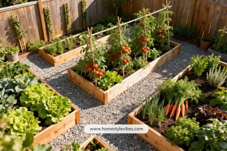
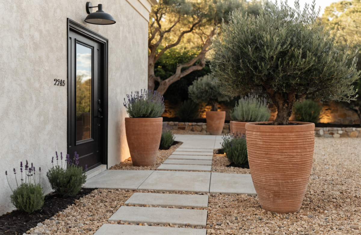
1. Modern Mediterranean Gravel Court With Terracotta Rhythm
We’ve all been there: a lawn that drinks water like a camel and still looks thirsty, a cracked path that’s become your daily eye-roll. You’ve tried tossing a few shrubs near the mailbox, but the front still reads “unfinished.” This Modern Mediterranean setup uses budget-friendly gravel, warm terracotta pots, and sculptural, drought-tolerant plants to bring that sun-baked, olive-grove charm—without constant maintenance. The mood skews relaxed resort meets breezy hillside: think pale stone, silver-green leaves, and soft glints of brass at sunset.
Why it works in real homes? It’s drought-smart and HOA-friendly (check local rules for gravel), great for small lots because it doesn’t break up into fussy green patches, and it handles high-traffic areas beautifully. Lighting matters here: place low, warm LEDs along the gravel edge so the ground sparkles at dusk. Pro tip: choose 2700K to keep the glow buttery, not harsh.
Why It Looks Expensive: The repetition makes it feel curated. Matching terracotta planters in varied sizes create rhythm, and a restrained plant palette (olive, lavender, rosemary, and one dramatic architectural aloe or agave) reads designer instantly. Mixed gravel sizes—fine path gravel with a border of chunkier river rock—deliver depth and shadow like a professional landscape photo.
Materials dominate with pale gravel, terracotta, rough clay, matte black metal edging, and the silvery sheen of Mediterranean foliage. Photographs sing because the palette offers high contrast—sun-bleached gravel against inky shadows from sculptural plants—and the terracotta pots add warm chroma that catches sunlight.
Variations:
- Budget: Upcycle mismatched pots with a terracotta-tinted masonry paint and use local pea gravel.
- Small-space: Create a mini court by widening the path and nesting three pots door-side with one hero plant.
- Darker version: Charcoal gravel with deep-green shrubs (pittosporum, boxwood) and black clay pots for a moody, modern twist.
- Renter-friendly: Use interlocking gravel mats for containment and cluster movable pots—no digging needed.
Key Design Elements:
- Main materials: Pale gravel, terracotta/clay pots, matte black metal edging, limestone or concrete stepping pavers
- Color palette: Sand, clay, olive-silver, soft charcoal accents
- Lighting strategy: Low-profile path lights, up-lighting a single hero plant near the entry
- Furniture silhouettes: Simple metal bench with slatted seat, rounded clay stools for plant stands
- Texture layers: Crunchy gravel, chalky terracotta, fuzzy lavender, glossy olive leaves
- Accent details (hardware, decor pieces, plants): Brass door hardware, woven doormat, rosemary topiaries, lavender drifts
How To Recreate This Look:
- Start with a clean edge: Define borders with metal edging to keep gravel neat.
- Add a paver path: Set large-format concrete or limestone pavers on leveled sand/gravel base.
- Layer gravel: Fill the court area with pea gravel; add chunkier rock at edges for depth.
- Install pots: Group terracotta planters in threes; vary heights for rhythm.
- Style with scent and glow: Plant rosemary and lavender; add 2700K path lights on dusk-to-dawn sensors.
Why This Looks Expensive: Consistent materials and a tight plant palette whisper “custom build.” The negative space of gravel feels intentional, while the terracotta repetition gives gallery-level cohesion.
Common Mistakes To Avoid: Don’t skip weed barrier under gravel; you’ll regret it. Avoid too many plant species—four or five is plenty. Don’t dot lights everywhere; fewer, better-placed fixtures keep it elegant.
Pro Styling Tip: Photograph just after sunset so the path glows and the terracotta reads saturated; kneel low to angle across the gravel for shadow-rich texture.
Keep scrolling—next up solves the awkward front foundation that never looks polished, no matter how many shrubs you plant.
2. Soft-Modern Foundation Bed With Layered Hedges And Painted Brick Base
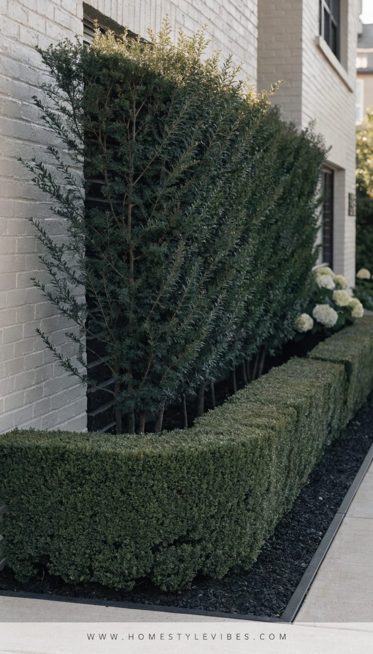
It’s that one strip against the house that always feels off—too bare in winter, too messy in summer. You’ve tried random perennials, but your foundation line still looks choppy. This layered hedge approach builds a soft-modern backdrop that hides vents and utilities while giving your facade a crisp, camera-ready edge. The vibe: quiet luxury meets easy maintenance.
Why it works in real homes: You’ll use evergreen structure for year-round shape, then tuck in one or two seasonal bloomers for personality. The lighting? Indirect and flattering—think wash lights that graze the lower wall, making everything look taller and more intentional. Painted brick or a color-tuned masonry stain on the foundation instantly unifies old and new elements.
Why It Looks Expensive: Designers love layering. A tall hedge sets the stage, a mid-layer of mounding shrubs adds volume, and a low evergreen or ornamental grass fronts the bed for softness. It reads as tailored but never stiff, like a cashmere blazer over a tee.
Materials you’ll lean on: masonry paint or stain, breathable landscape fabric, steel edging, compost-rich mulch, and reliable evergreens (boxwood, inkberry, dwarf yew) paired with textural switchgrass or mondo grass. It photographs beautifully thanks to horizontal layering and shadow bands across the foliage—depth city.
Variations:
- Budget: Keep the hedge to one species and paint only the visible foundation strip; add mulch for polish.
- Small-space: Use dwarf varieties and compress layers to 18–24 inches deep.
- Darker version: Go deep green hedges with a near-black foundation color like “soft charcoal” to anchor light siding.
- Renter-friendly: Use modular planter boxes lined up along the foundation; paint them the same color as the trim.
Key Design Elements:
- Main materials: Masonry paint/stain, steel edging, rich mulch, evergreen shrubs, ornamental grasses
- Color palette: Deep green, soft charcoal or warm white foundation, natural bark brown
- Lighting strategy: Wall washers aimed at the foundation; adjustable spot on a specimen shrub by the entry
- Furniture silhouettes: Minimal—maybe a low, modern house-number plinth
- Texture layers: Glossy evergreen leaves, feathery grass plumes, matte painted brick
- Accent details (hardware, decor pieces, plants): Modern house numbers, simple black mailbox, one flowering hydrangea or camellia
How To Recreate This Look:
- Start with paint: Clean and paint (or stain) the visible foundation to match or complement trim.
- Add structure: Install steel edging to define a clean, shallow bed that mirrors your facade length.
- Layer shrubs: Tall hedge at back, mounding mid-layer, low grass front; repeat in segments for rhythm.
- Install lighting: Softly wash the foundation with 2700K wall lights; add one adjustable spotlight near the door.
- Style with restraint: Top with mulch, tuck a single seasonal bloomer, and keep accessories minimal for impact.
Why This Looks Expensive: The quiet, consistent foundation color and tiered planting imply a landscape plan, not a weekend errand. The repetition reads architectural and intentional.
Common Mistakes To Avoid: Don’t choose fast-growing hedges you’ll constantly hack back. Skip mixed mulch types—stick to one. Don’t overplant; leave room for growth and airflow.
Pro Styling Tip: Shoot from a slight angle so you catch the stair-step planting heights and the light washing the wall—shadows add drama without clutter.
Ready for a front entry that steals glances from the street? The next idea turns your walkway into a wow-moment runway.
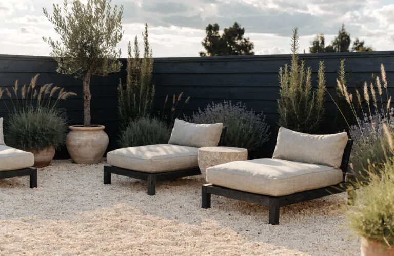
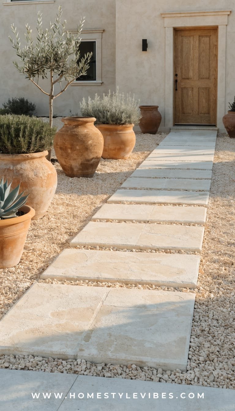
3. Staggered Paver Walkway With Ribbon Planting And Hidden Solar Glow
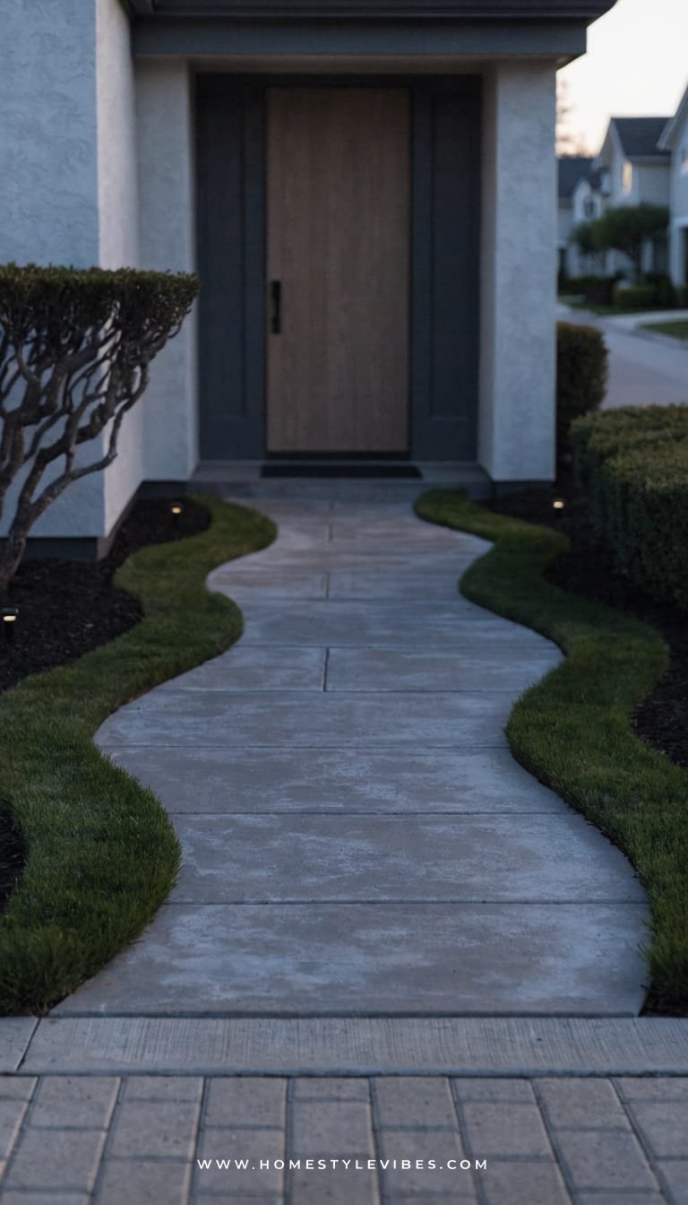
You know that narrow, cracked path that makes guests walk single-file like they’re sneaking into a club? You’ve tried pressure-washing it. Still blah. This design widens the walkway visually with staggered, oversized pavers and “ribbon” planting strips that soften every edge. The mood is quietly dramatic—like a hotel entry where the lighting guides your steps and the plantings feel curated, not crowded.
It works for real homes because the materials are affordable and forgiving. Large-format concrete stepping stones look luxe, and the planting ribbons handle splash zones and foot traffic better than fussy flowers. Lighting does the heavy lifting here: low, shielded solar or plug-in path lights hide in the planting bands so the pavers seem to float after dark.
Why It Looks Expensive: Big geometry, small palette. Oversized pavers spaced with consistent joints give architectural heft. Narrow plant bands filled with mondo grass, creeping thyme, or sedge add velvety texture, while hidden lights create that runway effect without visible fixtures screaming “hardware store special.”
Materials: 24- to 36-inch pavers, polymeric sand, steel edging, low tufty plants, and barely-there path lights. Photography payoff? The interplay between crisp paver lines and soft green ribbons makes the shot feel layered and editorial. Shadows from the plant fringe read as quiet movement.
Variations:
- Budget: Use concrete stepping stones and fill joints with pea gravel and thyme.
- Small-space: Use narrower pavers laid on a diagonal to visually widen a tight front yard.
- Darker version: Charcoal pavers with bright lime mondo grass and warm 2200–2700K lights for moody contrast.
- Renter-friendly: Lay pavers atop leveled sand in a “floating” format; remove later without damage.
Key Design Elements:
- Main materials: Large-format pavers, polymeric sand or gravel, steel edging, shade-tolerant low growers
- Color palette: Cool gray or charcoal with deep green and soft lime accents
- Lighting strategy: Concealed path lighting within plant ribbons; one discrete uplight at the house number
- Furniture silhouettes: If space allows, a slim entry bench with simple lines
- Texture layers: Smooth concrete, tufted foliage, fine gravel, matte black edging
- Accent details (hardware, decor pieces, plants): Modern doorbell, sleek house numbers, aromatic thyme for a little scent as you walk
How To Recreate This Look:
- Start with a plan: Map a gentle curve or straight-line path that’s at least 48 inches wide.
- Add base: Excavate, add compacted gravel and sand to keep pavers stable.
- Layer pavers: Set with equal spacing; fill joints with polymeric sand or gravel.
- Install ribbons: Plant mondo grass or thyme along path edges inside narrow beds.
- Style with light: Tuck low solar/path lights inside plant ribbons so you can’t see them from the street.
Why This Looks Expensive: The floating effect sells it. Clean geometry plus soft greenery and hidden lights looks custom and composed.
Common Mistakes To Avoid: Don’t skimp on base prep or the pavers will wobble. Avoid overly tall plants that will flop onto the path; keep the foliage low and tidy.
Pro Styling Tip: For photos, wet the pavers lightly to deepen the gray and let the plant texture pop; shoot from a corner to show the stagger and rhythm.
If your porch feels like a missed opportunity, the next idea turns it into a warm, layered entry moment you’ll want to linger in.
4. Porch Pot Trio + Statement Door Color With Brass Glow
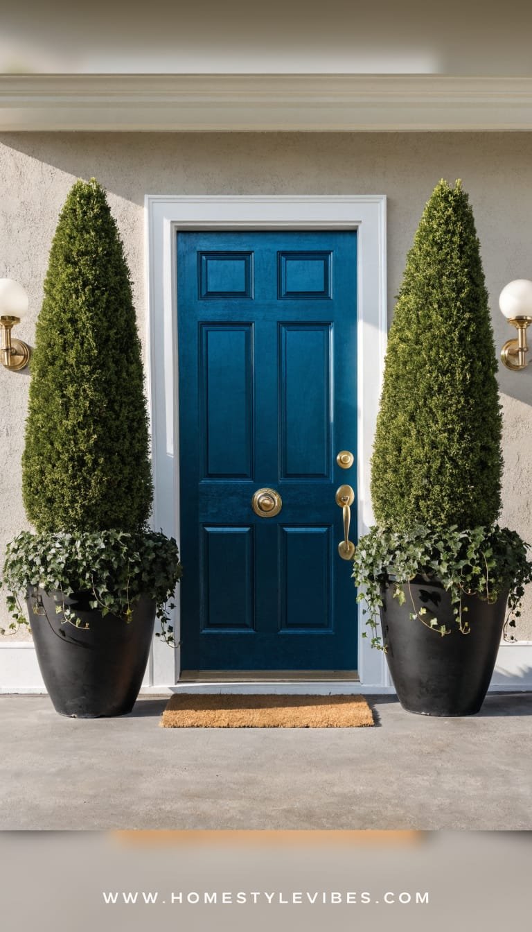
You’ve got a decent porch, but every time you add a wreath and a welcome mat it still looks… temporary. You’ve tried colorful annuals, but the look fades after a month. This design leans on a high-saturation door color, a trio of large-scale planters with evergreen structure, and warm brass accents so the entry reads finished and inviting year-round. The mood? Boutique hotel—warm, tailored, and a bit showy in the best way.
Real-home magic: Scaling up makes everything feel intentional. One big planter beats three tiny ones. A bold door color that ties into your roof or shutter tones turns the whole front into a cohesive moment. Lighting here accents the jewelry—brass sconces, a kickplate, or a sleek handle—that throws a soft gleam on the porch at night.
Why It Looks Expensive: Repetition and scale. Three planters in a cohesive material (ceramic, fiberstone, or faux terracotta) with varied heights frame the entry like columns. The door color becomes the artwork—think deep blue-green, rich oxblood, or earthy clay—designed to hold up in bright sun and shade. Brass or aged bronze accents catch light and add that “custom millwork” vibe.
Materials: Exterior-grade paint in a bold but earthy hue, matte or satin finish; fiberstone or ceramic planters; evergreen shrubs like dwarf olive, cypress, holly, or a faux-olive for shade; dimmable LED sconces at 2700K. Photogenic because the glossy door contrasts with matte planters and textured evergreens—layers on layers.
Variations:
- Budget: Repaint an existing door, thrift planters, and refresh with a single clipped evergreen per pot.
- Small-space: Use two tall planters tight to the door frame and a slim boot tray with river stones for texture.
- Darker version: Charcoal door with burnished brass hardware and deep green planters—moody and luxe.
- Renter-friendly: Paint a removable door slab or use a peel-and-stick door wrap; cluster pots you can take with you.
Key Design Elements:
- Main materials: Exterior door paint, fiberstone or ceramic planters, brass or aged bronze hardware, natural coir mat
- Color palette: Bold door color + neutral facade; greenery for balance
- Lighting strategy: Pair of sconces flanking the door; LED filament bulbs for soft glow
- Furniture silhouettes: Slim bench or stool for parcels; simple lines to avoid clutter
- Texture layers: Glossy door, matte planters, woven doormat, structured evergreens
- Accent details (hardware, decor pieces, plants): Kickplate, oversized house numbers, evergreen topiary or olive, trailing ivy
How To Recreate This Look:
- Start with color: Sample two bold door paints and view at different times of day; choose the one that holds depth in shade.
- Add planters: Place a tall, medium, and low planter grouped to one side, or mirror on both sides if space allows.
- Layer greenery: Use evergreen backbone plants; add seasonal accents like white cyclamen in winter or trailing bacopa in summer.
- Install lighting: Upgrade to warm, dimmable sconces; align the centerline of each sconce with upper third of the door.
- Style with brass: Swap in a new handle set, mail slot, kickplate, and large house numbers for a tailored finish.
Why This Looks Expensive: The bold door color and coordinated metal finishes read as a custom entry package. The large planter trio adds architecture without renovations.
Common Mistakes To Avoid: Don’t go too small on planters—scale up. Avoid too many colors in flowers; stick to one bloom color for cohesion. Don’t choose cool white bulbs; they cheapen the look.
Pro Styling Tip: Shoot with the door slightly open to show a sliver of interior warmth; the brass will catch the light and the evergreens frame the scene like a portrait.
If lawns make you sigh (and not in the romantic way), our final idea replaces thirsty turf with a tapestry that hums with color and texture—on a budget.
5. Native Meadow Strip + Flagstone Landing For Low-Water Charm
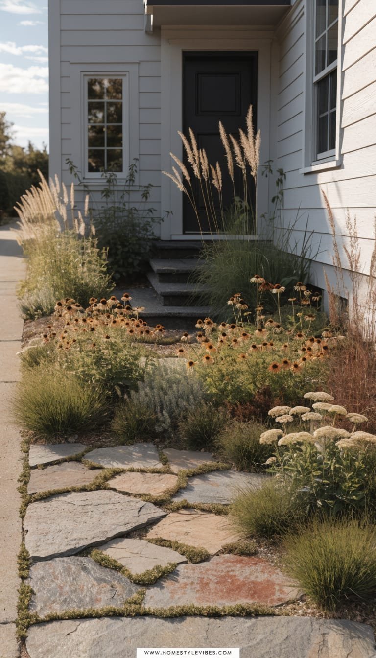
You’re tired of mowing a tiny front patch that never looks great in heat waves. You’ve overseeded, fertilized, pleaded. Still meh. Enter the native meadow strip paired with a simple flagstone landing near the curb or steps. The mood speaks modern cottage meets ecological chic—buzzy, light-catching seed heads, soft movement in the breeze, and a grounded stone moment for structure.
Real-life win: Natives or climate-appropriate plants mean less water and more resilience. Group them by height and bloom time for a tapestry that looks deliberate. The landing gives a place to pause—perfect for packages or a bench—while avoiding a sea of stone. Night lighting? Minimal. A couple of stake lights set low keep it magical without turning your yard into an airport.
Why It Looks Expensive: Contrast and choreography. Wild-ish meadow textures meet crisp-cut flagstone edges. The controlled landing feels like a design choice, not an afterthought. Bonus: The meadow shifts week to week—photographs never look the same twice, which keeps your feed fresh.
Materials include irregular flagstone (or concrete faux-flag), decomposed granite for joints, compost-rich planting soil, and a native seed or plug mix chosen for your region. Photography thrives on the feathery layers—think warm golds at sunset, dew-sparkled seed heads in morning light, and a grounded gray stone plane that anchors the shot.
Variations:
- Budget: Seed your meadow area and use reclaimed stone for the landing.
- Small-space: Create a narrow 2–3 foot wide meadow band along the sidewalk only; keep the rest gravel or mulch.
- Darker version: Choose deep purple coneflower varieties, dark-stemmed grasses, and charcoal gravel edging.
- Renter-friendly: Plant meadow containers—yes, mini-meadows in troughs—lined up along the edge; lay a temporary paver pad for the landing.
Key Design Elements:
- Main materials: Flagstone or concrete faux-flag, decomposed granite, native grasses and perennials, steel or stone edging
- Color palette: Sun-washed taupe stone, green to golden grasses, seasonal bloom accents
- Lighting strategy: Discreet ground stakes set behind the landing; optional soft uplight on a small tree
- Furniture silhouettes: Backless bench or simple log stool for a natural note
- Texture layers: Rough stone, fine grass blades, airy seed heads, gritty DG joints
- Accent details (hardware, decor pieces, plants): Bee hotels, bird-friendly water dish, ceramic stepping stones
How To Recreate This Look:
- Start with a plan: Mark a curving meadow band where lawn now struggles; keep a 12–18 inch clean edge to the walk.
- Add landing: Set flagstone on compacted base; sweep DG into joints for a natural look.
- Layer soil: Amend meadow band with compost; rake smooth.
- Install plants: Use plugs or a seed mix of region-appropriate natives; group in informal drifts.
- Style and light: Edge with steel for crispness; add two low, warm stake lights behind grasses to backlight seed heads.
Why This Looks Expensive: The contrast of tamed stone and artfully wild planting looks handcrafted. Native layers feel curated, not random, when you repeat species in drifts.
Common Mistakes To Avoid: Don’t mix too many seed mixes—choose one reputable source for your region. Avoid overwatering once established; natives prefer lean conditions. Don’t forget the clean edge; it’s your “frame” that keeps the meadow looking intentional.
Pro Styling Tip: Photograph at golden hour from knee height; backlighting turns seed heads into halos and the flagstone into a moody, grounded anchor.
Here’s the thing: curb appeal isn’t about blowing your budget or copying a neighbor’s landscape plant-for-plant. It’s about choosing one clear idea—texture, rhythm, light, or color—and turning the volume up just enough. Pick the design above that solves your biggest pain point, then commit. Maybe that’s the gravel court that finally ends the lawn drama. Maybe it’s the layered foundation bed that makes your home look taller and newer. Or maybe it’s a door color that makes Amazon drivers smile and neighbors pause.
Luxury outside comes from restraint and detail. Limit your palette, repeat materials, and let lighting do half the work. Texture plus lighting plus clean lines equals a front of house that whispers “designer” without shouting “expensive.” Edit accessories, choose plants that thrive in your light and climate, and don’t be afraid of negative space—gravel and clean mulch read sophisticated when you frame them well.
So, brew something warm, step out front, and look with fresh eyes. Where could you place a hero moment? A wider path, a statement door, a calm hedge, a sunlit pot trio, a meadow that sways like a screensaver? Start there. Today’s small shift becomes tomorrow’s “wow, what did you do?” And seriously—send pics when golden hour hits. Your new curb appeal is about to trend on your own block.